A rebranding story, this is not.
It is a rebuilding, recovering and remembering project.
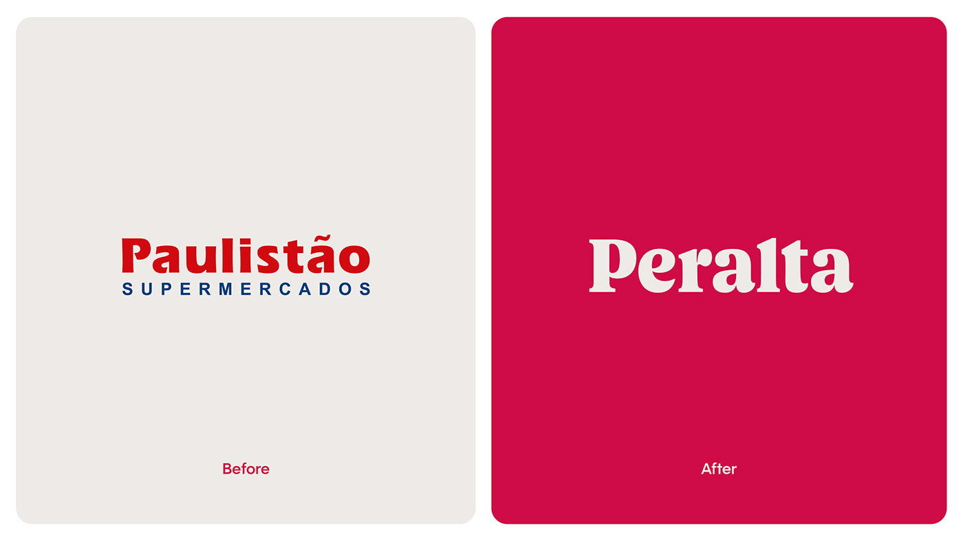
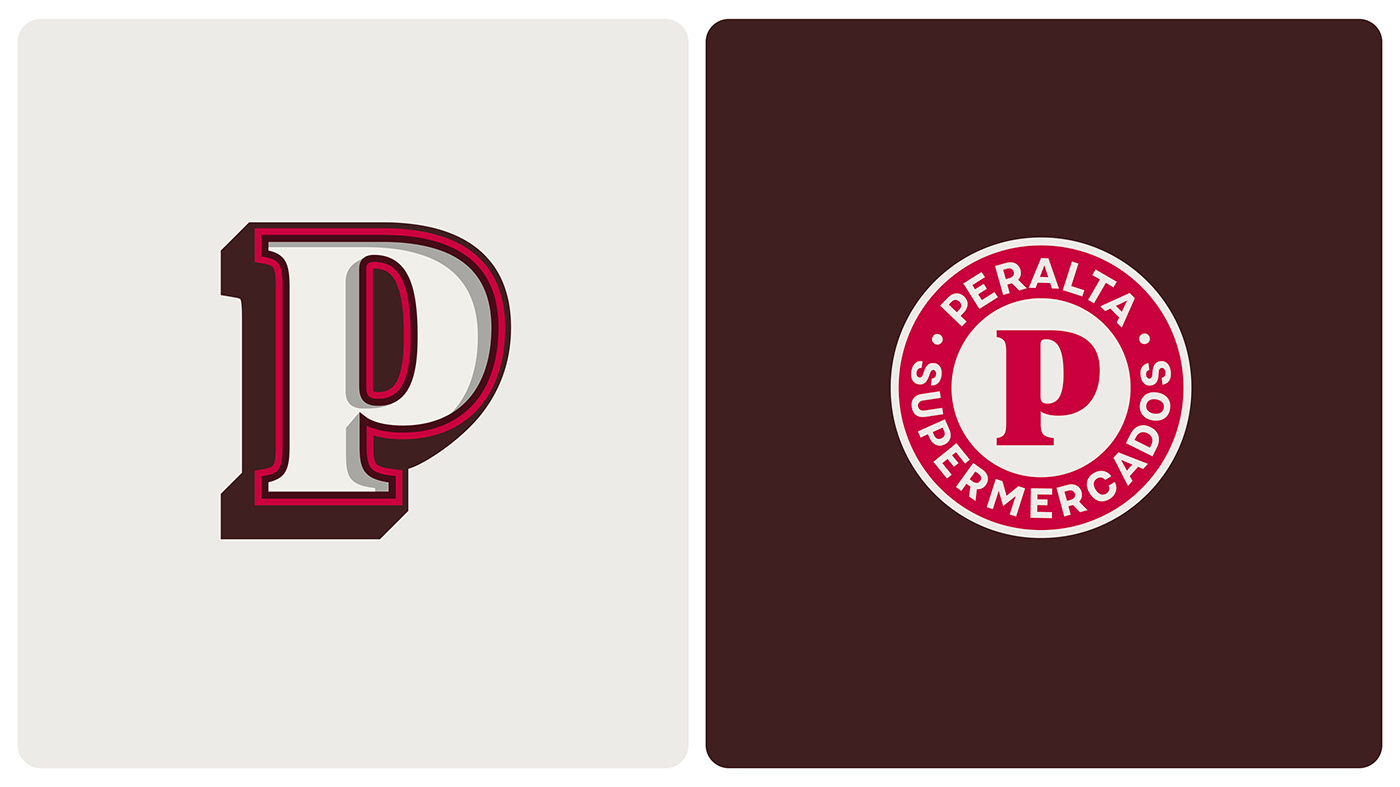
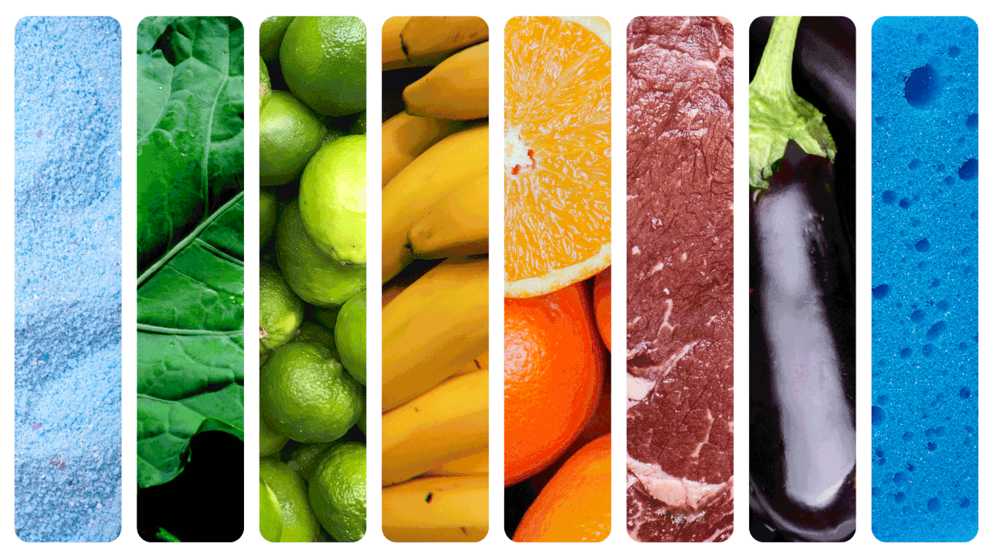
Peralta is a Brazilian supermarket chain formerly known as Paulistão. Well, formerly known as Peralta some 50 years back, then renamed to Paulistão after a merger operation. And 50 years later, Peralta is back. We are strong believers that traditions go left and right, past and future. We can always rescue them, recreate them, refresh them. That is what this project is about. A family business that reached out to find its roots.


The purpose
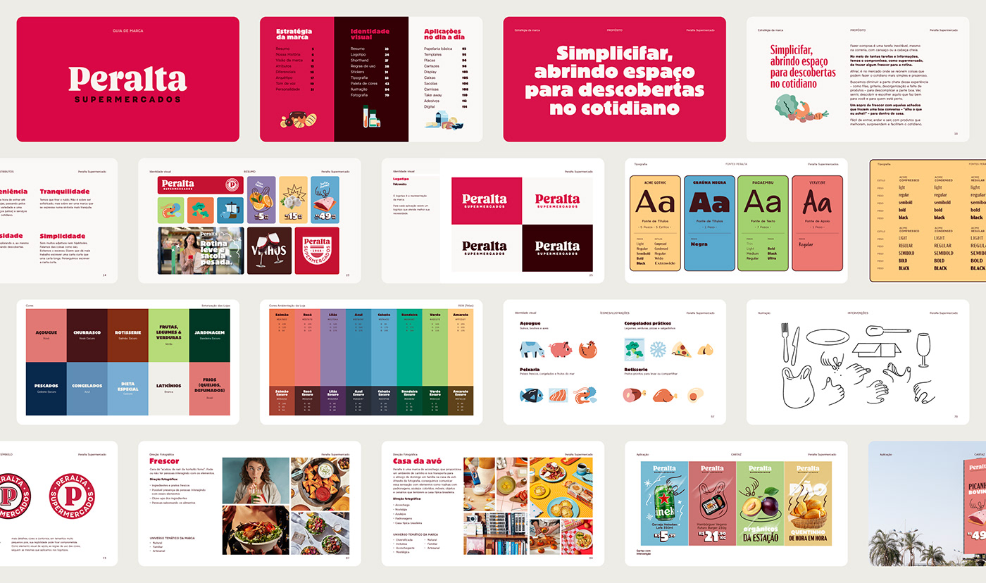
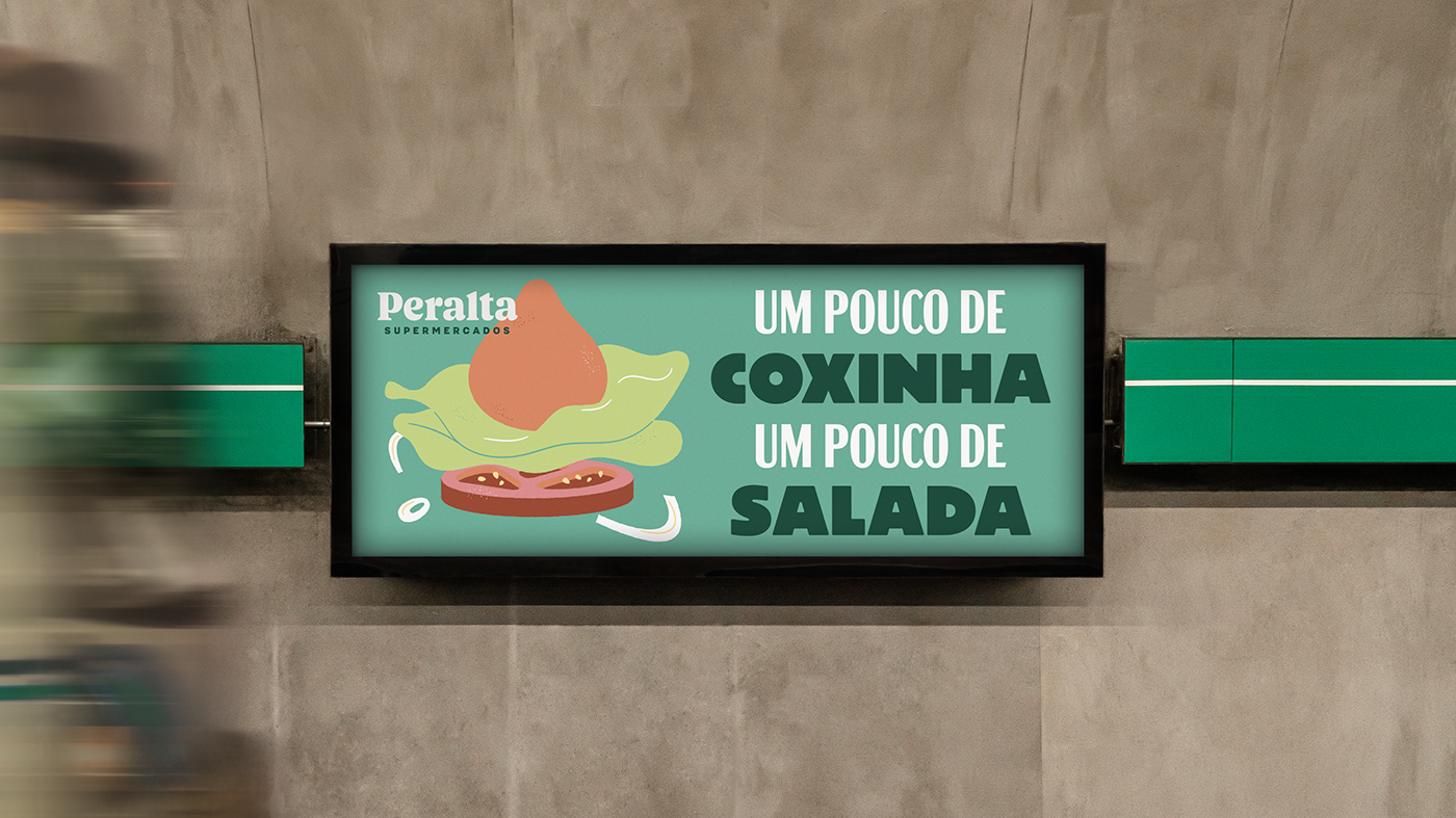
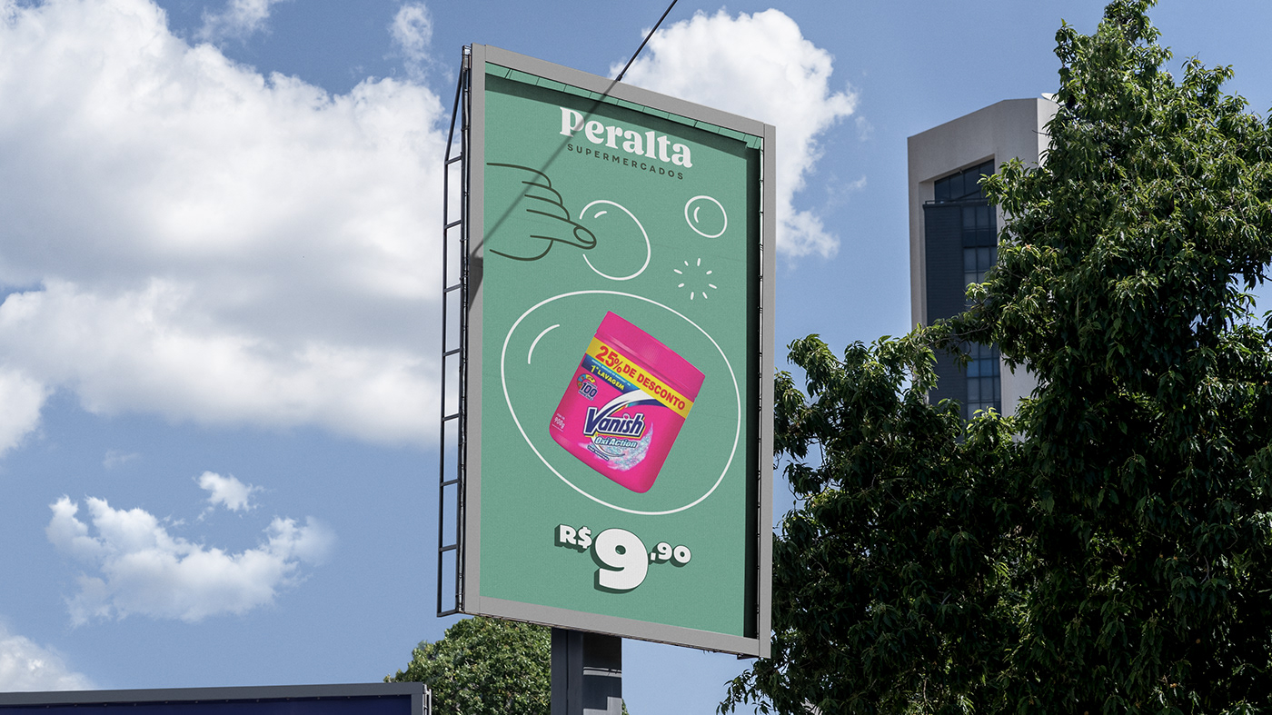
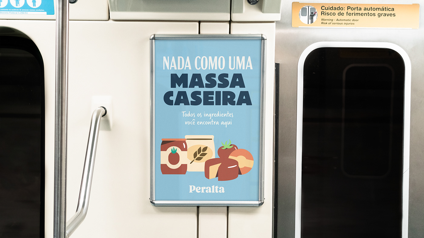
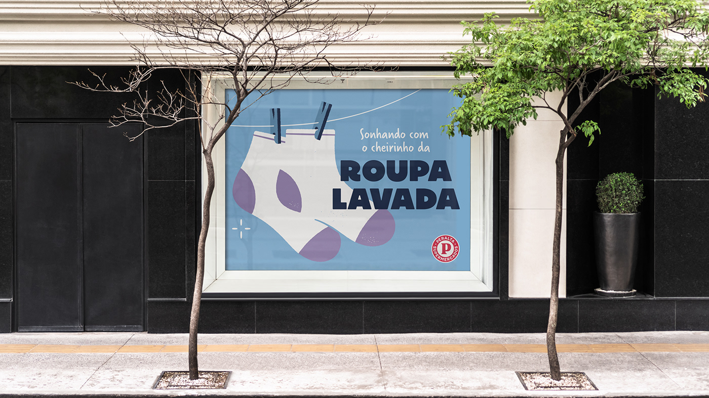
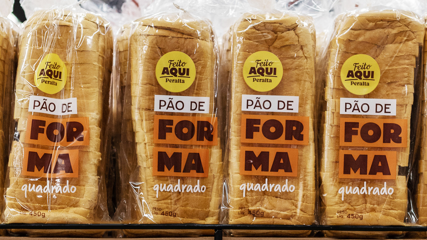
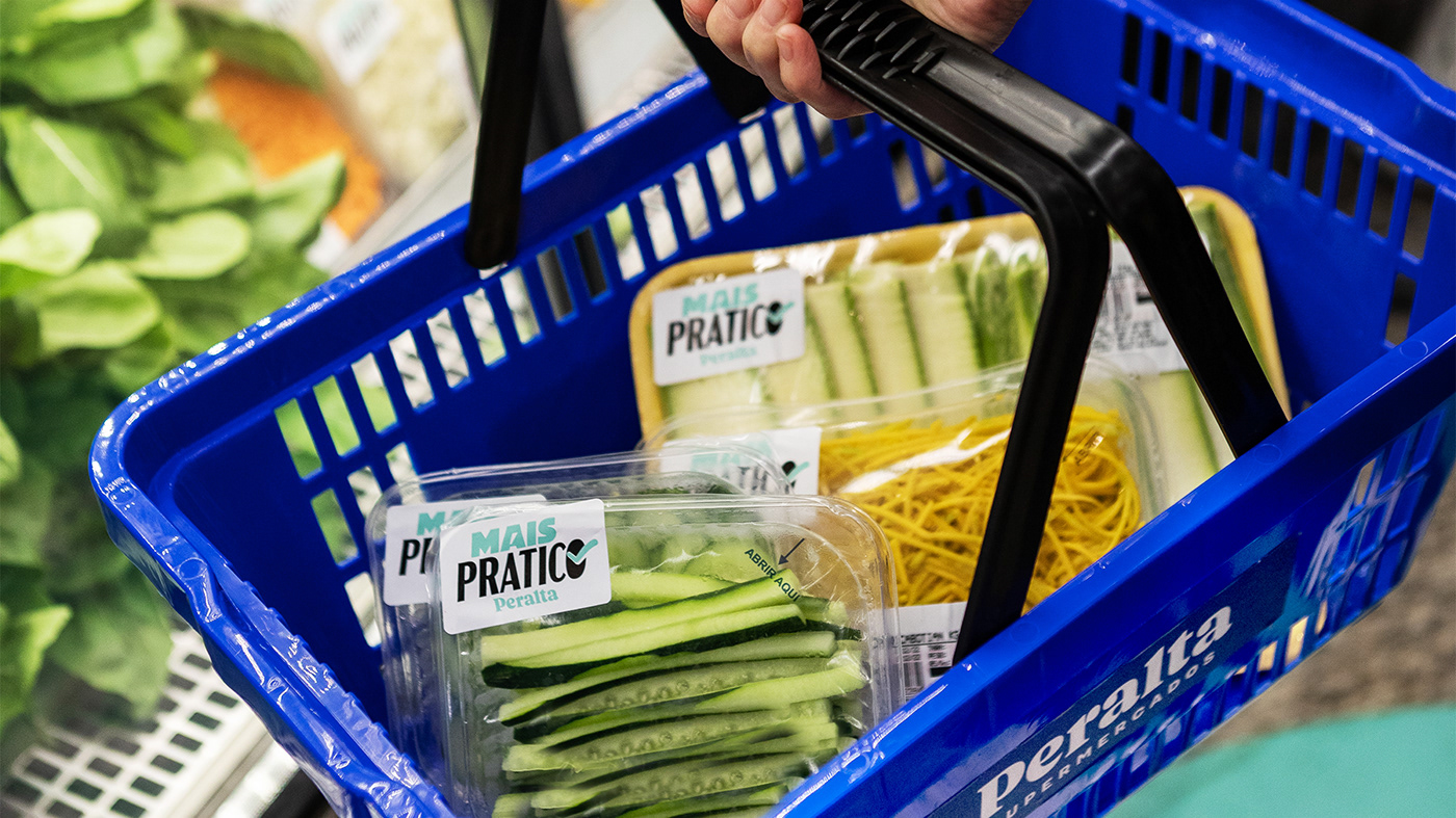
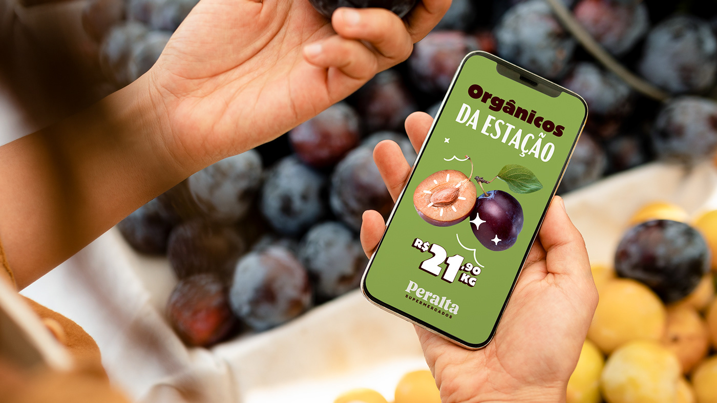
Peralta's biggest wish as a company is to be a facilitator, making daily life a bit easier. They are not the type of brand to scream at the top of their lungs there are the best in the market or the cheapest. Rather, they want to achieve that by being a loyal companion to costumers on a day-to-day basis, offering them pleasant discoveries on their routine. For that, we developed a visual language that feels warm and close. There are touches of nostalgia, like the logo, and touches of renovation, specially on the illustrations.
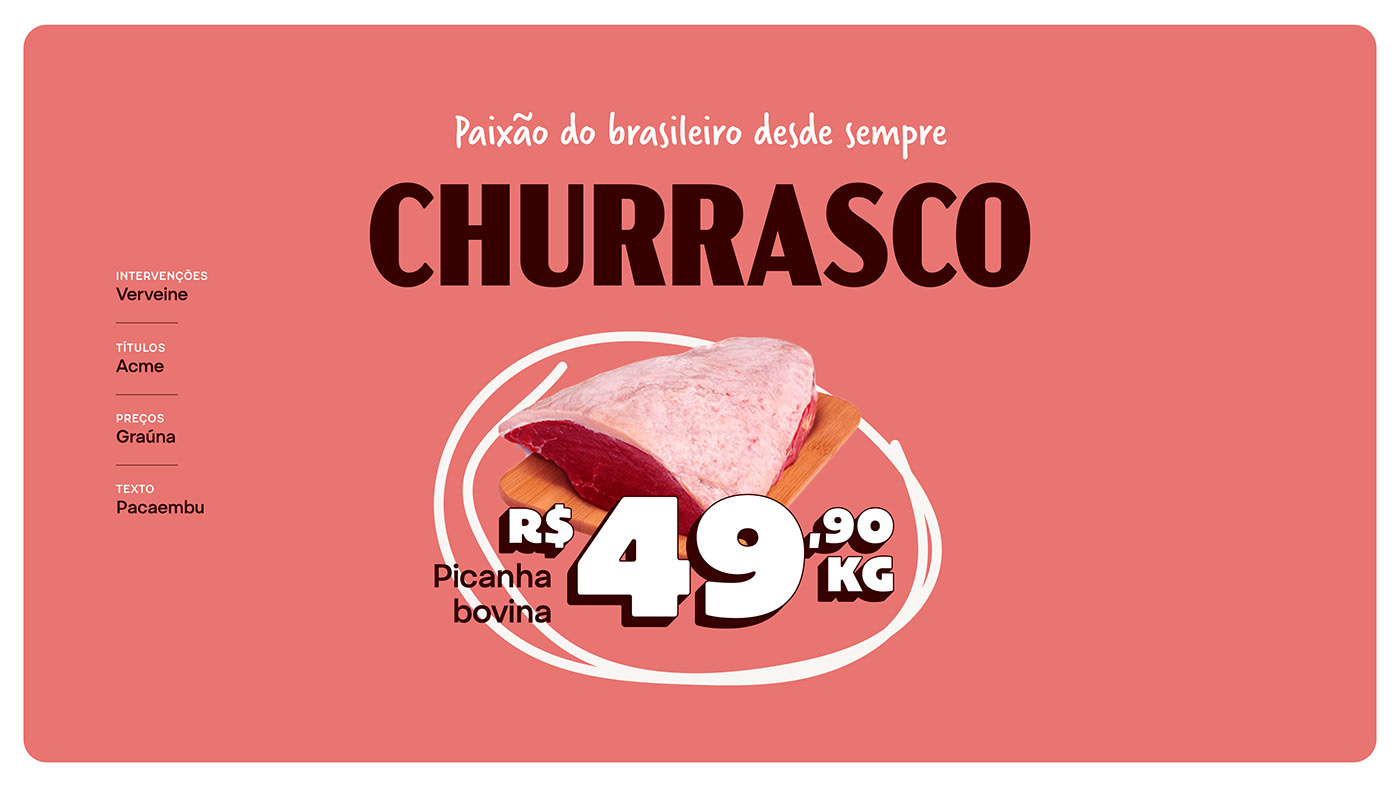
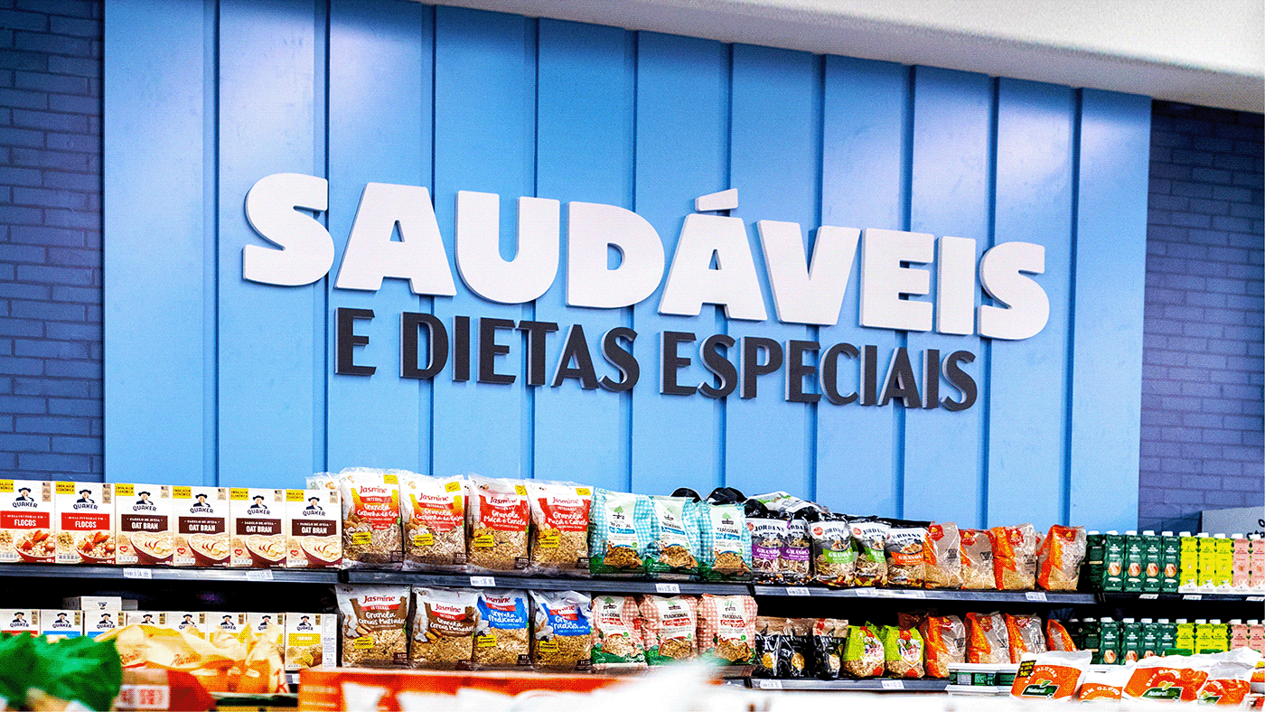
The typographic shopping list for this project is stacked with four items, each thought of for a specific function. Combined, they create a 60s feel, recalling Peralta's history. The palette is as efficient as a supermarket needs it to be, but at the same time it carries most of the brand's DNA.
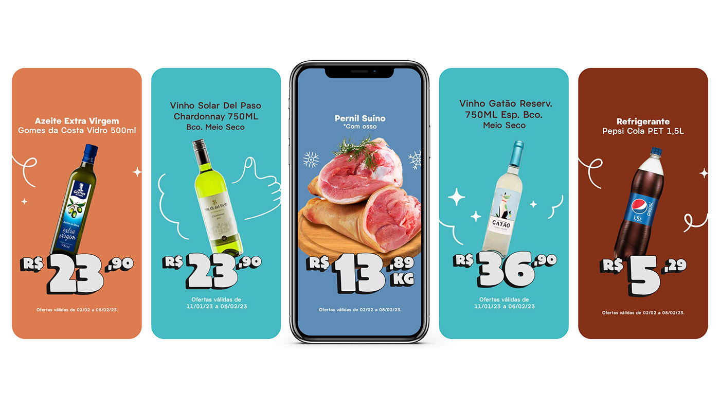
As for the color palette, we consider it to be a project of its own. It involved a high level of complexity, because we had to balance two separate applications: branding and wayfinding. Graphics and communication have a simpler palette, whereas for wayfinding we had to go deeper. Both these instances are low saturated, which contributes to the overall friendly look and feel of the brand.
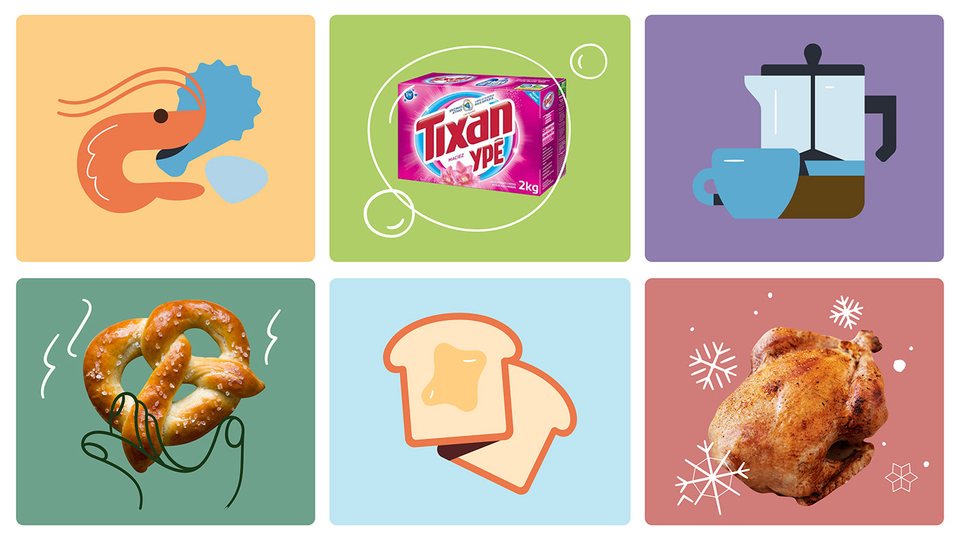
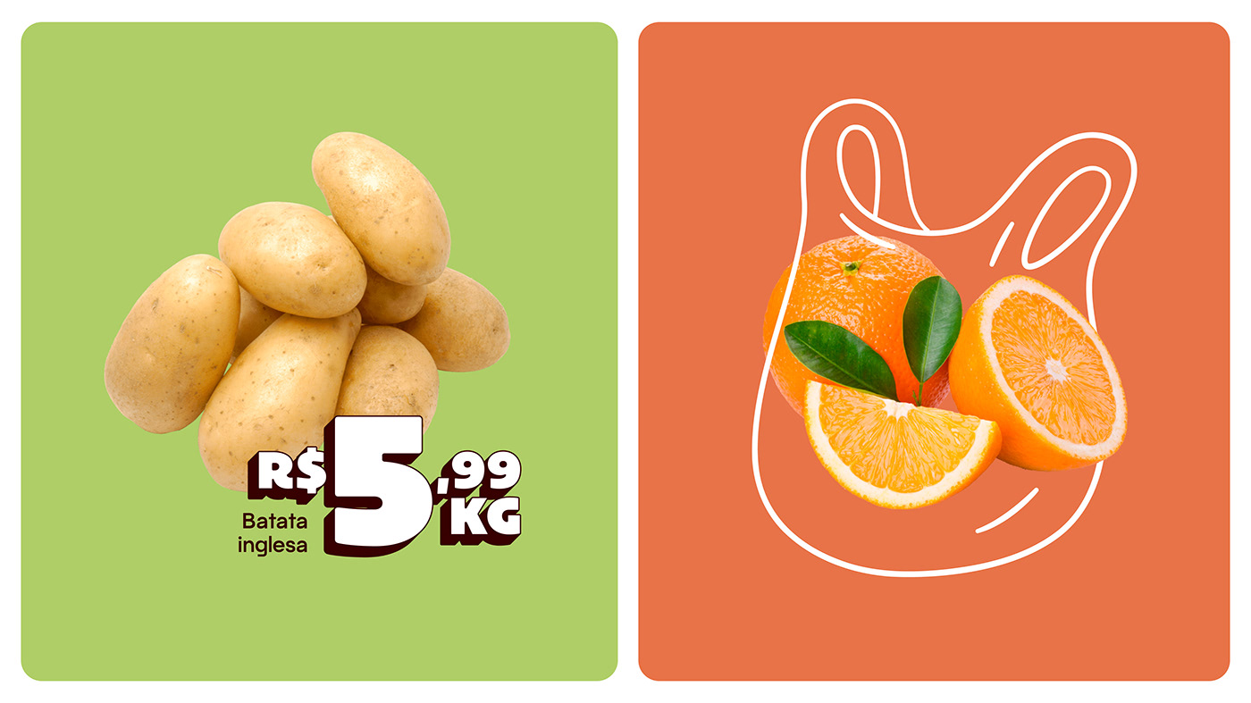
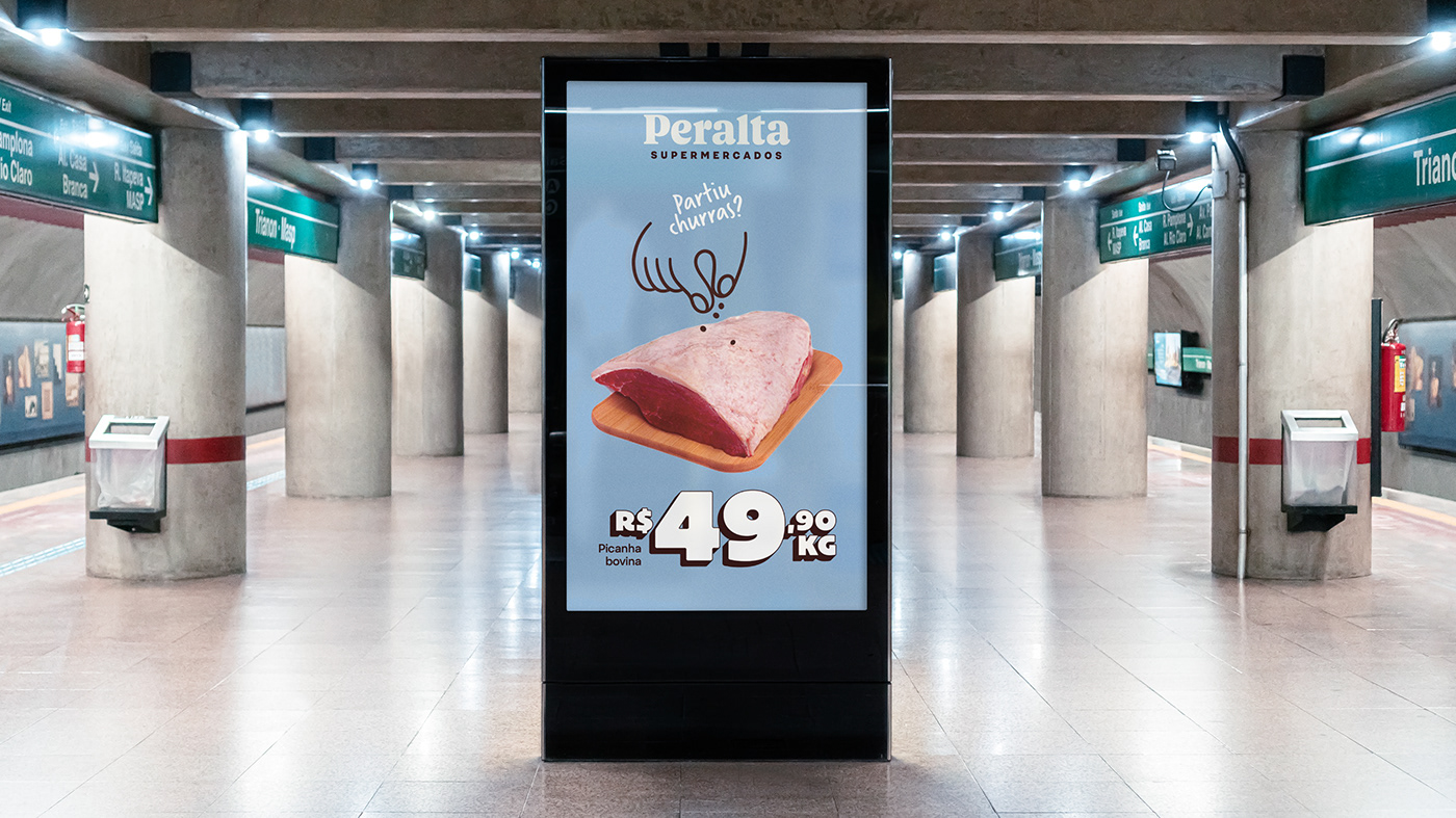
Illustrations and icons also play a big part on the project, as they are not what you would expect from a supermarket. Just look at the posters and the illustrated photo interventions!


Project Credits:
Strategy + Naming: Leandro Peralta, Felipe Teobaldo e time Plau
Design: Plau - Aline Caruso, Ana Laura Ferraz, Carlos Mignot, Gabriel Mesoma, Gabriela Fiks, Rodrigo Saiani and Valter V Costa
Illustration: Dominique Kronemberger (Estúdio Salsicha)
Illustration: Dominique Kronemberger (Estúdio Salsicha)
Architecture: Opus Design
Sub-brands and Packaging: Estúdio Caxa
Advertising Agency: Agência Way
Sub-brands and Packaging: Estúdio Caxa
Advertising Agency: Agência Way