

Proposta
Criar um álbum ilustrado silencioso e ilustrar 4 duplas.
Create a silent-book and illustrate 4 spreads.

Sinopse
"Frágil" é um álbum ilustrado silencioso com uma reflexão sobre a beleza e fragilidade do feminino. Através da premissa "porque é que aquilo que faz a borboleta bela nos torna nós, mulheres, frágeis?" surge a exploração da imagética, assim como a comparação entre a borboleta (animal frágil, mas belo) e a figura feminina (anima belo, mas frágil). O objetivo do livro é esmiuçar o limbo que é ter complexos e aprender a gostar deles.
“Fragile” is a silent illustrated album with a reflection on the beauty and fragility of the feminine. Through the premise "why do the things that make the butterfly beautiful turn us, women, fragile?" the exploration of imagery emerges, as well as the comparison between the butterfly (a fragile but beautiful animal) and the female figure (a beautiful but fragile animal). The aim of the book is to exploit out the limbo of having complexes and learning to like them.

Conceito
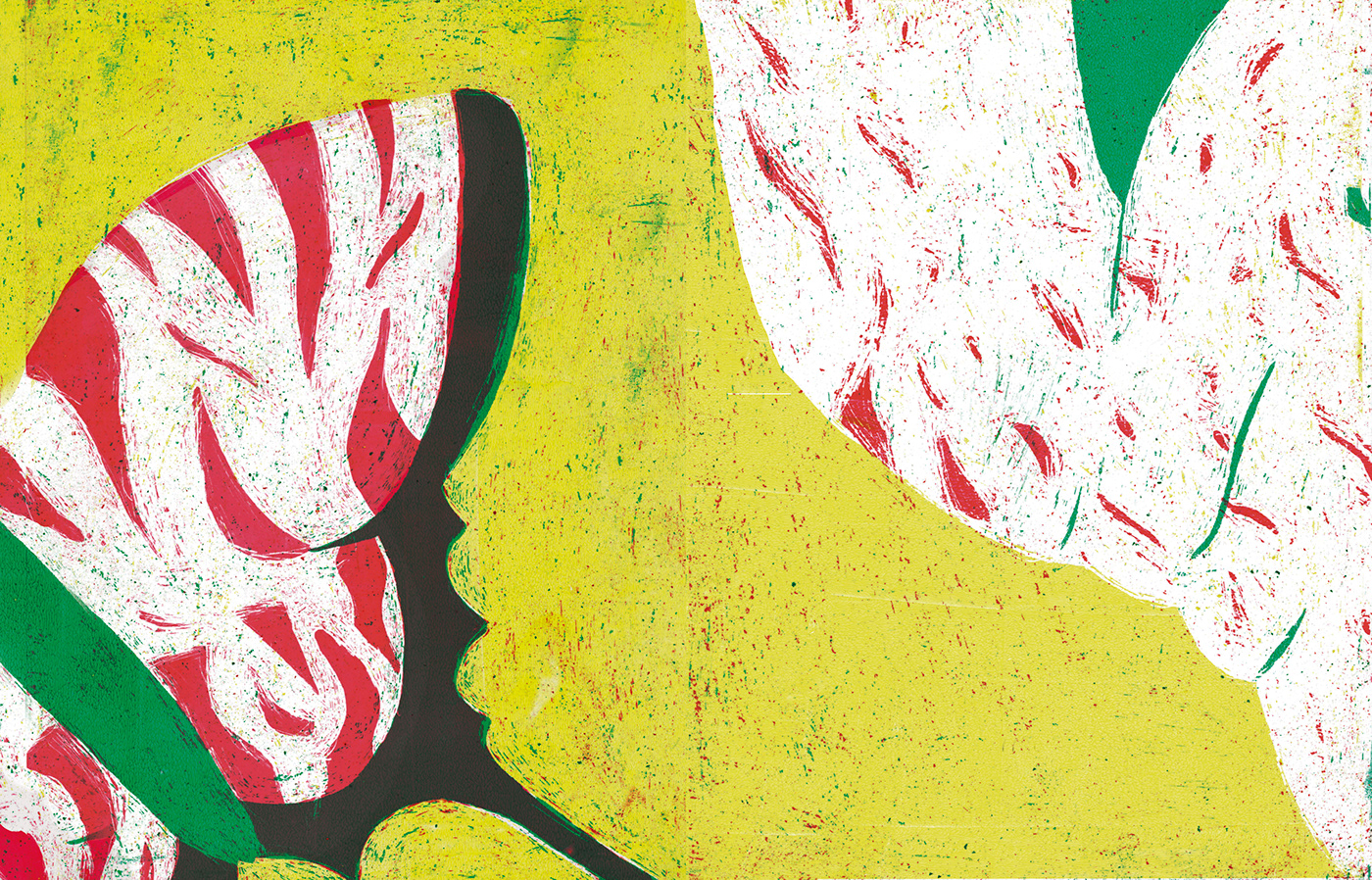
O material utilizado foi acetatos pintados com tinta acrílica e raspados na forma desejada. O uso da sobreposição permitiu a criação destas imagens, assim como trouxe uma riqueza e uma aceitação do erro (visto que os limites e a sincronia entre manchas por vezes falhava).
Porquê acetatos? Porque, após uma pesquisa exaustiva no animal que foi a musa deste trabalho, descobri que a borboleta tem asas transparentes (tal como o acetato). As cores que ela tem são escamas coloridas que a cobrem, então achei interessante explorar este paralelismo entre a natureza e o material de desenho.
For this project I used acetates painted with acrylic paint. Those were scraped until the paint acquired the desired shape. Stacking the acetates allowed the creation of these images, as well to bring a richness and an acceptance of the error (since the limits and the synchrony between patches sometimes failed).
Why acetates? Because, after an exhaustive research on the animal that was the muse of this work, I discovered that the butterfly has transparent wings (just like acetate). The colors she has are colored scales that cover her, so I found it interesting to explore this parallelism between nature and the drawing material.
As cores, na mesma linha da escolha do material, são o amarelo, verde e vermelho, e são as mesmas cores que a visão da borboleta consegue alcançar. Porém, tirei partido desta paleta e peguei no vermelho para simbolizar o "erro", ou a falha, o complexo em questão em cada página. Quem estiver muito tempo a observar as duplas poderá encontrar este padrão. Para finalizar utilizo também a mesma cor como simbologia para o amor(próprio), passando a mensagem de que temos que amar as nossas falhas.
The colors, with the same thinking process as the choice of the material, are yellow, green and red, and they are the same colors that the butterfly's vision can achieve. However, I took advantage of this palette and chose red to symbolize the "error", or failure, the complex in question on each page. Anyone who takes a moment to analyze the spreads will find this pattern. Finally, I also use the same color as a symbology for (self)love, passing on the message that we must learn to love our flaws.

Resultado Final


Obrigada!
Thank you!


