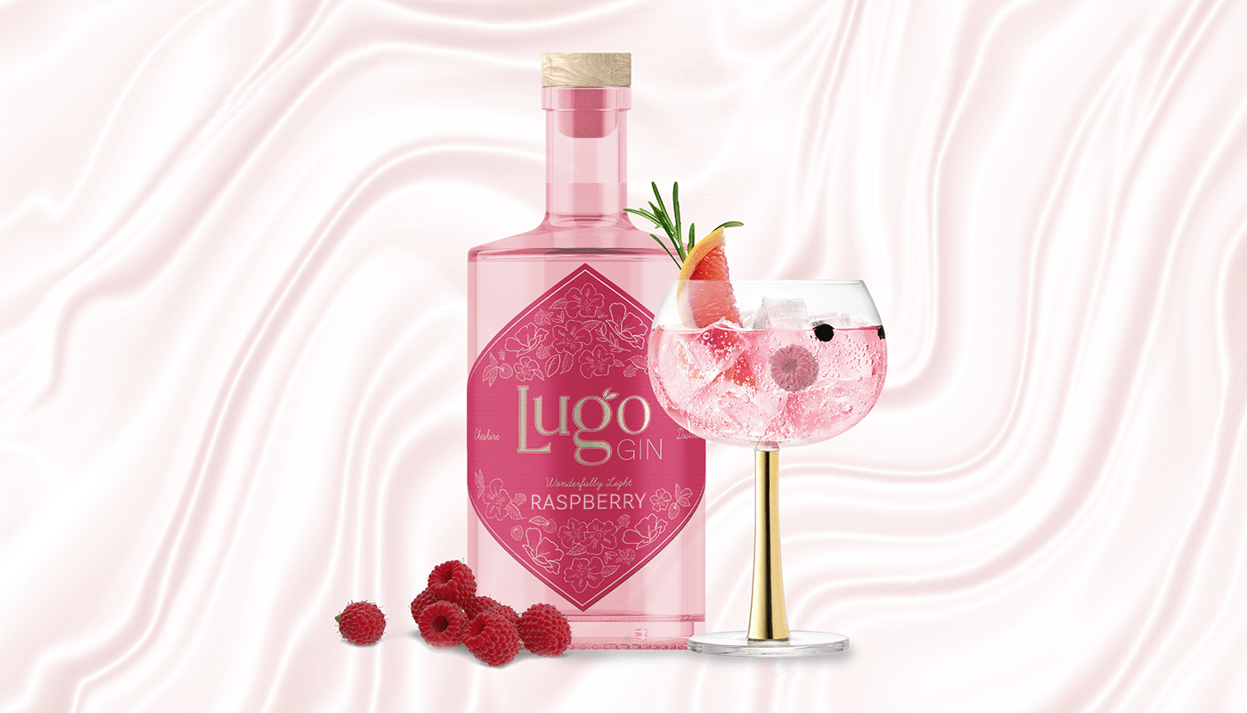
Wonderfully Light. A beautifully light gin with a sweet hint of raspberry.

Introducing the newest gin on the market: a light, crisp, and refreshing spirit that's sure to be a hit with gin-lovers everywhere. Crafted from the finest botanicals and distilled to perfection, this gin has a unique flavour that sets it apart from the rest.
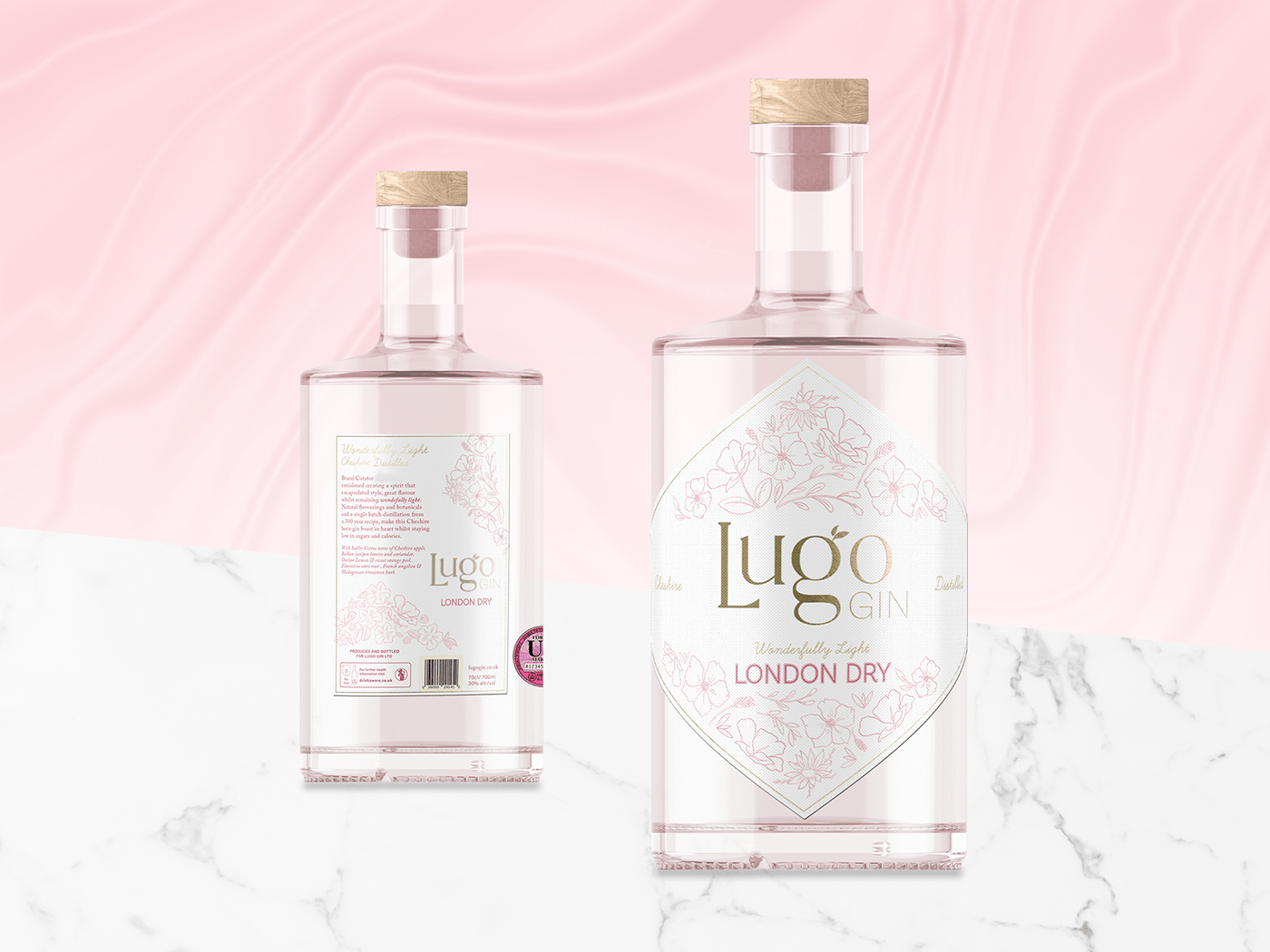
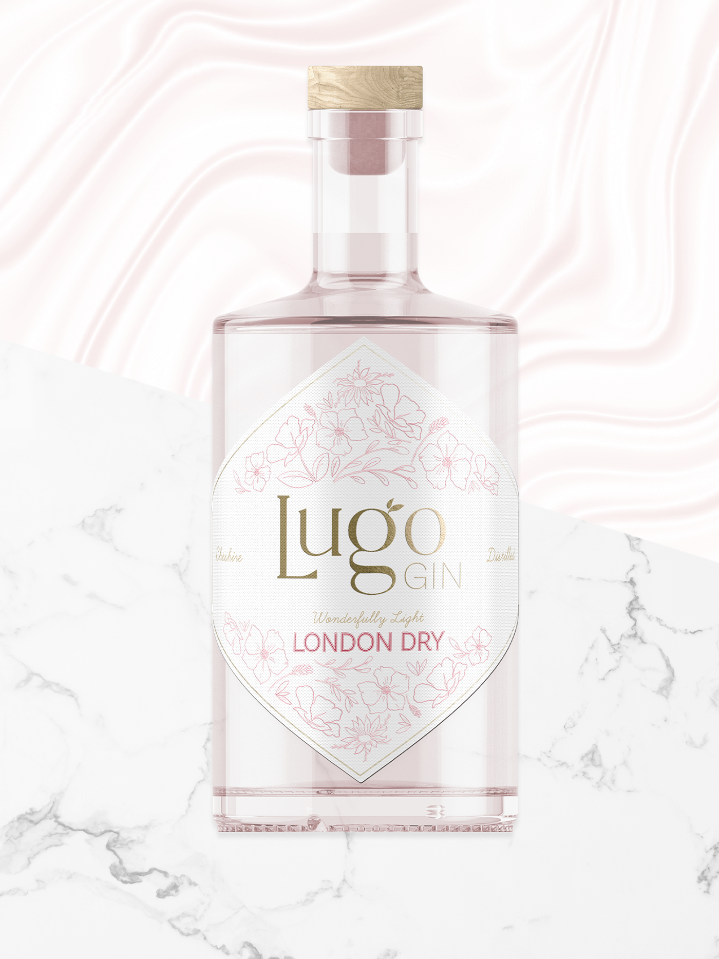
Lugo gin is the epitome of class, originating from the heart of Cheshire and its taste is just as remarkable as its origins. This project included branding, packaging design, product mock-ups and photography, with the brief being to brand an elegantly light and refreshing gin.
When launching a new gin brand, one of the most important elements of the brand is its logo. In the competitive gin market a great logo can be the difference between success and failure. The brand needs to be instantly recognisable and memorable to the customer. To showcase Lugo’s sophistication, a typographical logo was created with a subtle nod to gin botanicals, coupled with light and floral illustrations to mirror the brand values.
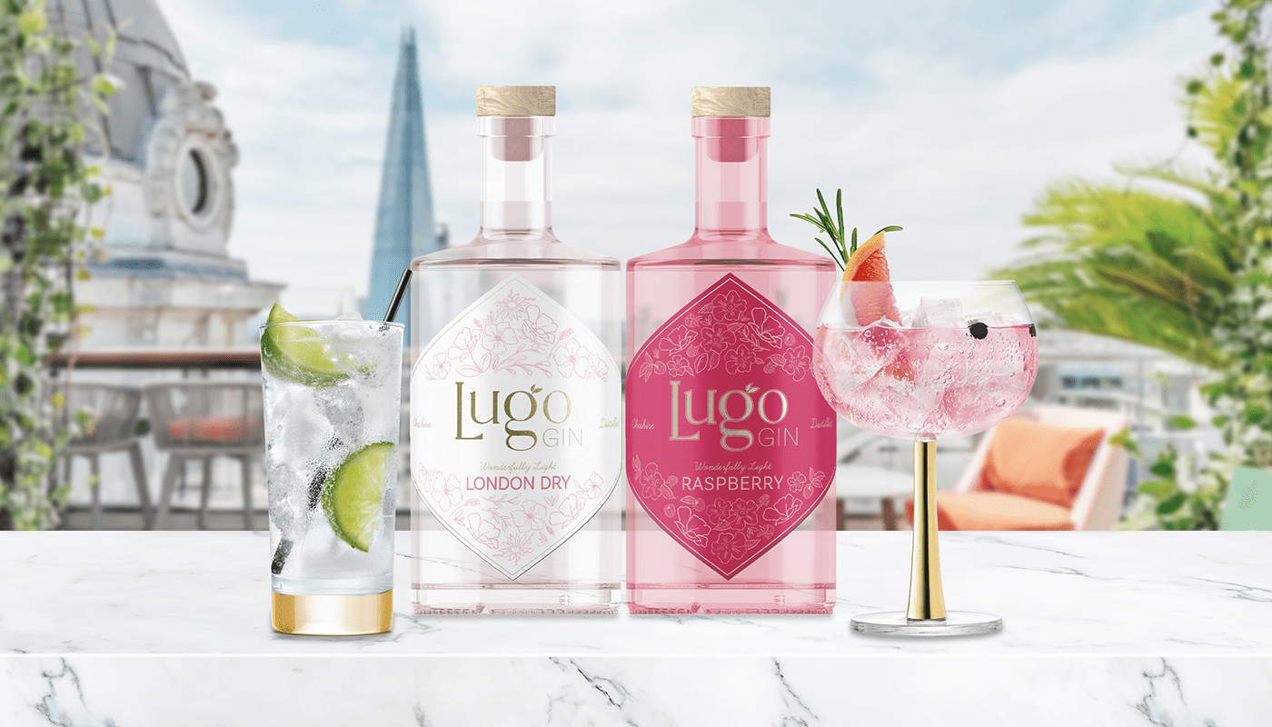
Two bottles were created, a London dry and a unique raspberry flavour. As a unique feature the latter is highlighted with raspberry illustrations, as well as a raspberry pink bottle and label.