Asaloda

A line of electric juicers and electric dehydrators required branding. With the help of a name and package design the client wanted to not only stand out on the highly competitive shelf, but also to look decent on online shopping sites.

Work on the lineup began with the creation of a bright Belarusian name Asaloda. The agency's team decided to abandon the traditional category's technological sophistication, and lead the audience to pleasant associations with freshly squeezed juices, fruits and vegetables. In Russian, the name translates as "delight" and in its sound refers to the word "sweetness".
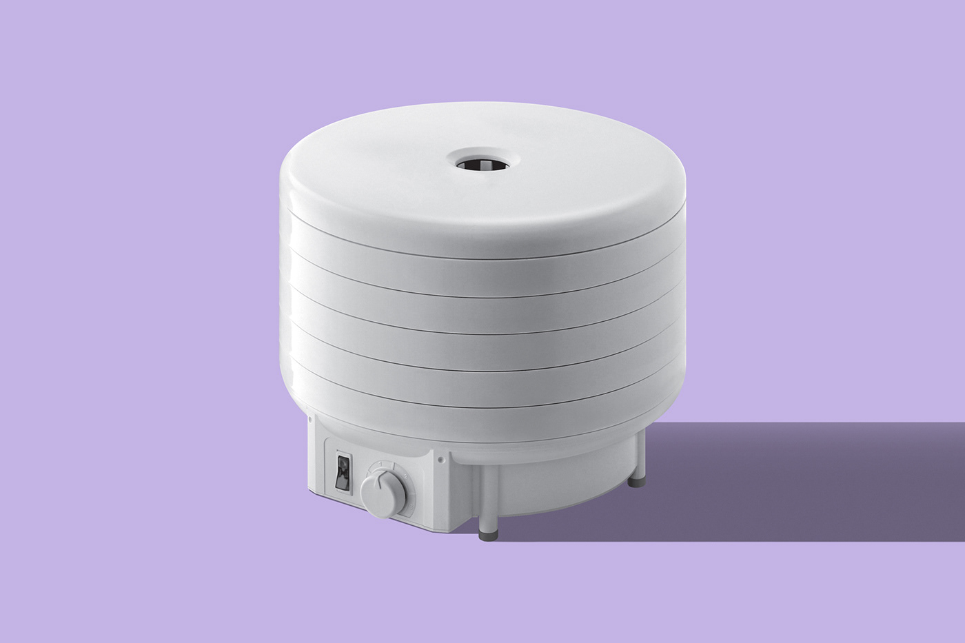
The packaging design is based on the unusual combination of purple and grey for the shelf, which has helped the product to stand out from the competitors. The massive, concise logo clearly presented the brand, enhancing its memorability. And the minimalist photography of the electric dryers and juicers with contrasting drop shadows emphasised reliability and quality.