At Home With:

We recently popped over to Frankfurt am Main to pay a visit to
FF Utility designer Lukas Schneider for our latest installment of the
‘At Home With’ series.
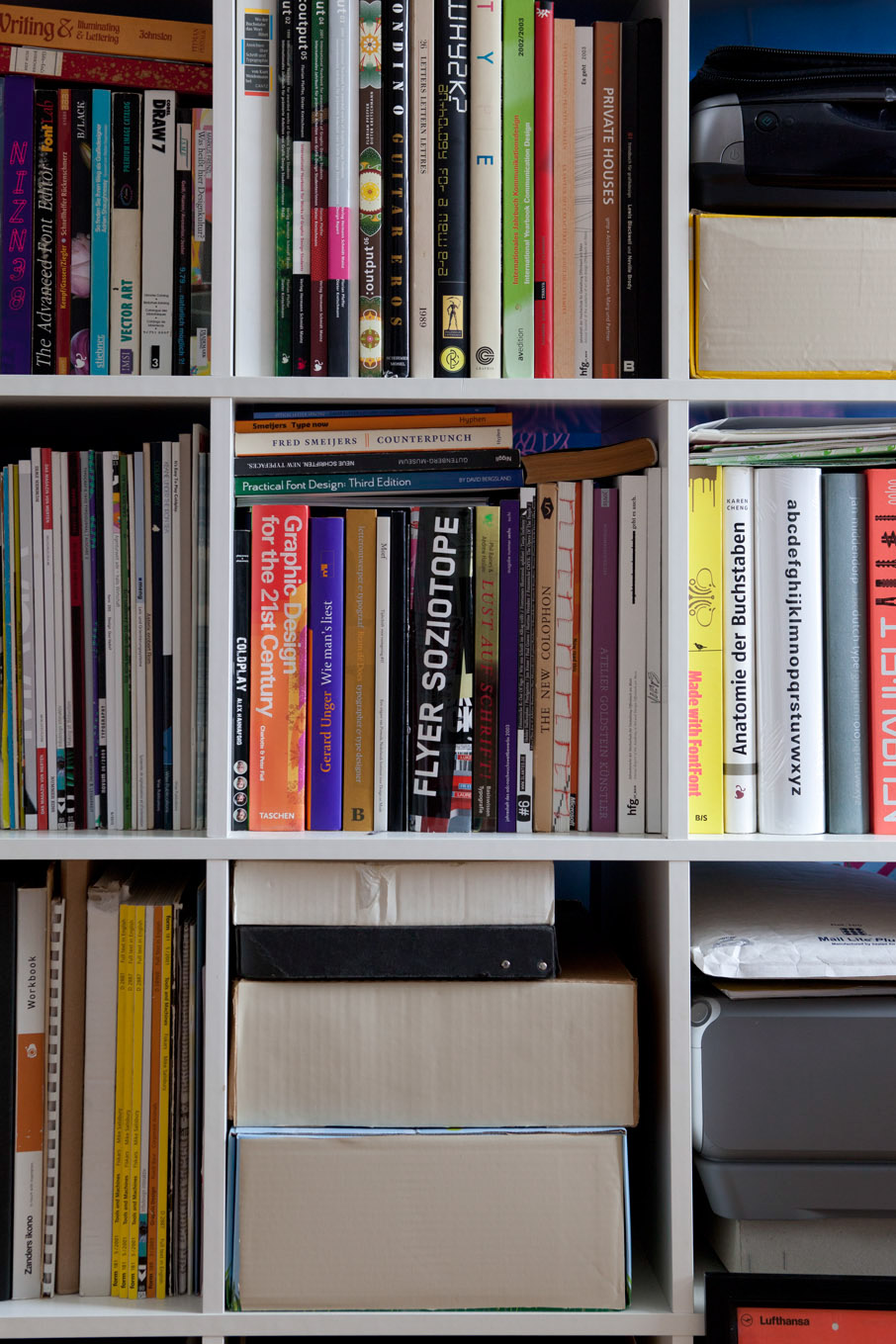
From the images of Lukas in his home it is clear to see how his lifestyle transcends into his type design. Contemporary, creative and clear are descriptions that can be applied to both Schneider’s typeface and home, showing that in this case life truly reflects art!
Photography by Max Zerrahn.


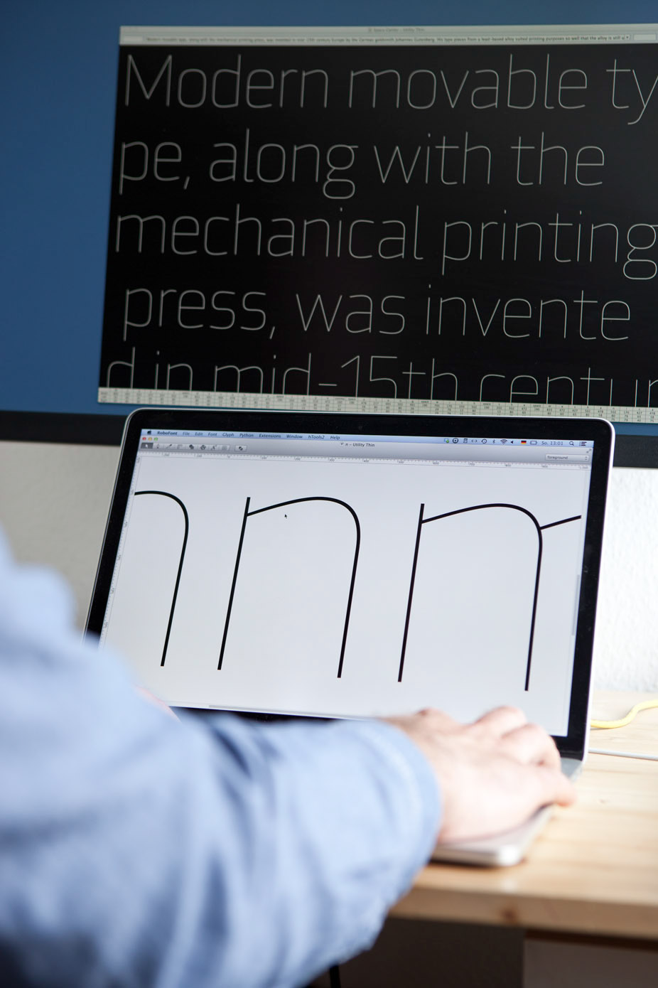
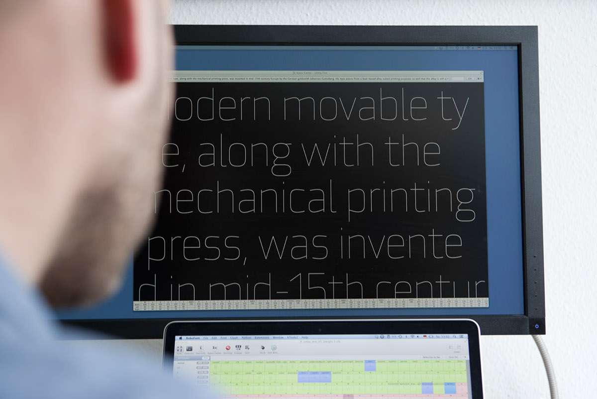


About FF Utility
FF Utility is a creative, contemporary sans serif. The design grew out of Lukas Schneider’s graduate thesis project at the HfG Offenbach in Germany – a small family of typefaces named Gazoline. FF Utility reads clear, and sets a mean line of text. You can use it for almost anything. The family includes five weights, from light through black. There isn’t an italic, but with a family like this, one does not really need them: the better typographic solution is to use weight for emphasis – bold with light, or black and regular, for instance. FF Utility’s fonts contain four figure sets, as well as alternate a and g characters for added typographic flexibility.


