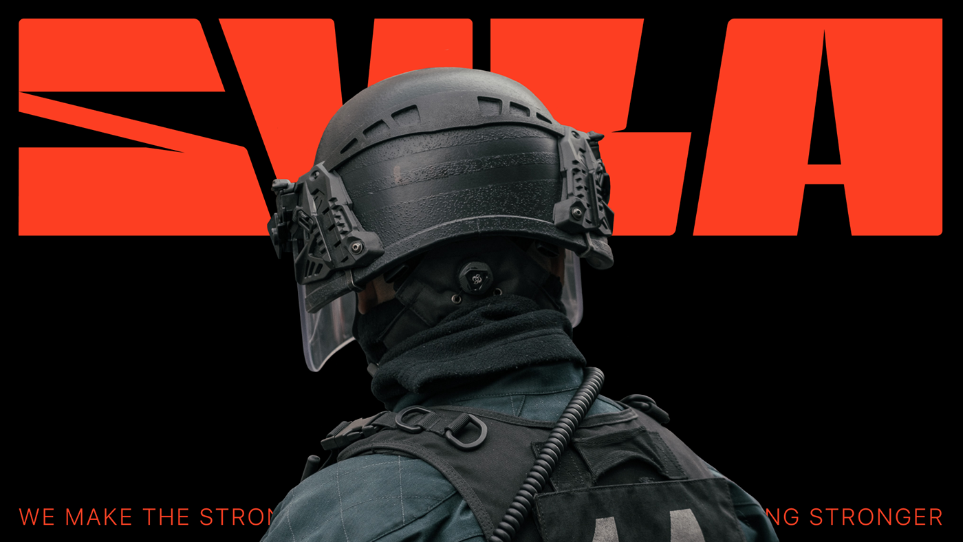

A STRONG BRAND FOR THE STRONGEST
naming, identity
naming, identity
BACKGROUND
SYLA is a manufacturer of military ammunition, tactical equipment and clothing. The brand was created in 2022, at the beginning of the full-scale Russian invasion of Ukraine, and because of it directly. We worked on creating the naming and identity of the brand in the first months of the Great War. The process of our work was distinguished by the fierce emotions that were raging in the soul of every Ukrainian at that time.
SYLA is a manufacturer of military ammunition, tactical equipment and clothing. The brand was created in 2022, at the beginning of the full-scale Russian invasion of Ukraine, and because of it directly. We worked on creating the naming and identity of the brand in the first months of the Great War. The process of our work was distinguished by the fierce emotions that were raging in the soul of every Ukrainian at that time.
NAMING
In the naming of the brand, we put the energy with which we lived and live to this day. Each person this year has become stronger, more enduring, stronger. Strength of spirit, willpower, strength of resistance - this is what drives each of us. The brand slogan originated from the name - "We make the strong stronger".
In the naming of the brand, we put the energy with which we lived and live to this day. Each person this year has become stronger, more enduring, stronger. Strength of spirit, willpower, strength of resistance - this is what drives each of us. The brand slogan originated from the name - "We make the strong stronger".

IDENTITY
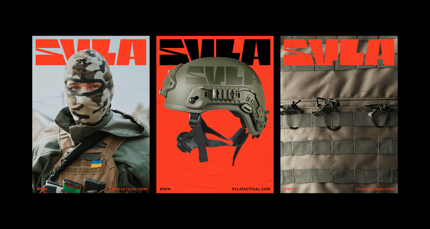
We reproduced the emotionality of the name in the logo and typography. Each letter is like a rock. The logo combines a rough base of letters and thin sharp cuts inside, which visually resembles the structure of the stone. Magma orange color emphasizes the passion of our nation.
Additional graphic elements of the identity dilute the fierce character of the brand and bring fanaticism. Ukrainians are different from ruzzians: we fight for our values. And what are these values without light humor, pixel graphics and kittens?


Creative Director: OLEKSANDR TOPOLNYTSKYY
Art Director & Brand Designer: ANNA VYRSTIUK
Web Designer: SOFIA NEBORAK
Post-production: NAZAR YAREMCHUK
Project manager: YULIANA KOVALIUK


