Waku Waku is kind of a mess.
But that's by design.
Andrea came to us with a simple idea: a haven for university students in the form of a coffee shop.
Seemed simple, but the process wasn't as straight forward as one would expect.
Every project is a little different. We probably should have a more structured game plan for every case scenario (we're working on that), but for the most part, we assess the challenges and strategy according to each project.
In this case [and we had never done this before] we started with the architecture.


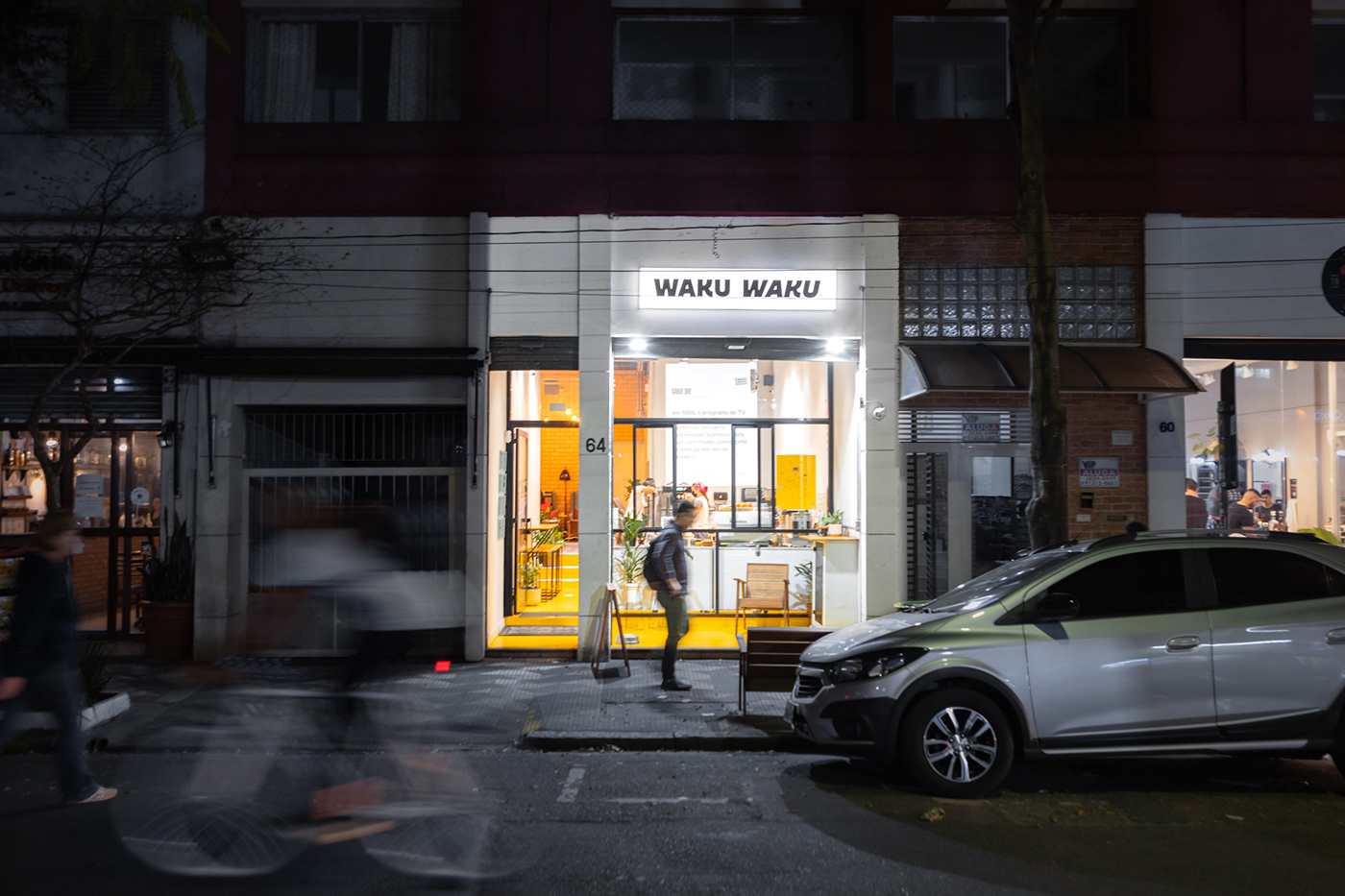
Now, we are by no means architects, but one thing we've learned over the last few years is that there is no part of a brand that we can't or shouldn't be involved in. Andrea had already found the perfect place: a little narrow spot right next to Mackenzie, one of São Paulo's biggest universities. Problem was, the layout of the place was a little wonky.
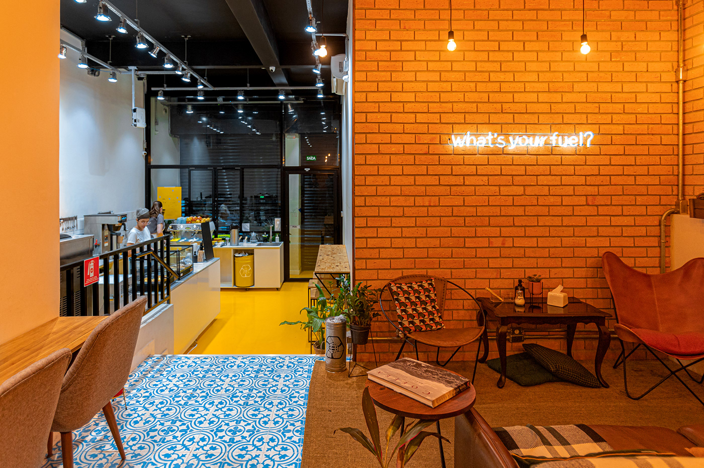
A long and narrow spot squeezed between a parking lot entrance and a residential building, the place consisted of 2 separate areas, kinda like if two different rooms got smooshed together.
We had a hard time trying to think about the visuals of the brand without addressing the address first.

Another stumbling block happened when looking at their references. Colorful and cozy. Modern and boho.
A lot of their inspirations seemed to clash in aesthetics, though at the same time making sense for the project as a whole. We felt like there were two different coffee shops that could come out of their moodboards.
That's where the biggest little nugget of idea that would influence the whole project happened:
What if we didn't have to come to a compromise? What if we could do it all under a single roof? I mean we do have a space with 2 separate areas in it.

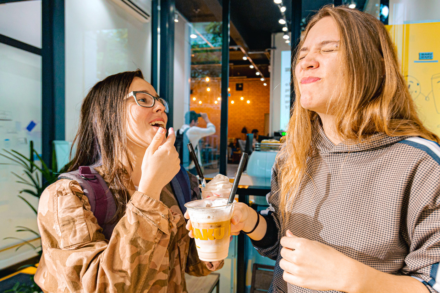
Here's another first: Isabela Raposeiras from Coffee Lab (which we also did the branding for – check it out here) was working as a coffee shop consultant for the project and had the brilliant idea of involving the students, our main audience, early on in the process. This whole place was made with them in mind. It only makes sense that they should have a say in what goes on in it.
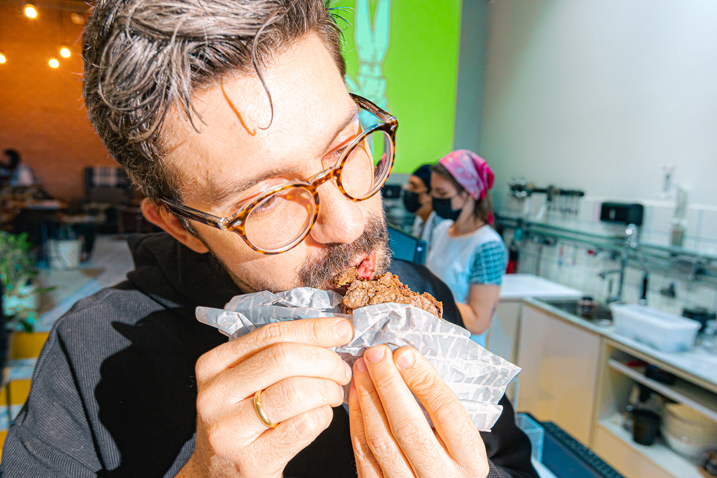
We used the students as a bounceboard. We presented every step of the project to them as if they were our clients, and there were actually a lot of really rich and thoughtful conversations around brands. Turns out young people are pretty smart, wouldn't you know it. You can actually see some of them acting as models in some of our photos here in the project.


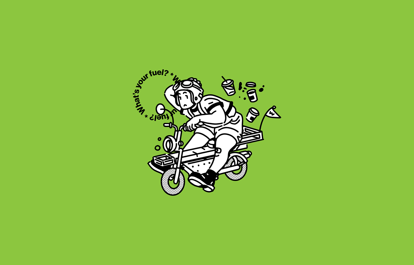
The trend of ecstatically happy non-human, gender, race and body type non-specific characters has been really prevalent in the illustration branding space and nobody actually likes it. When thinking about the possibility of including illustration for the project, we asked ourselves: what does illustration even do for a brand? What's the purpose?
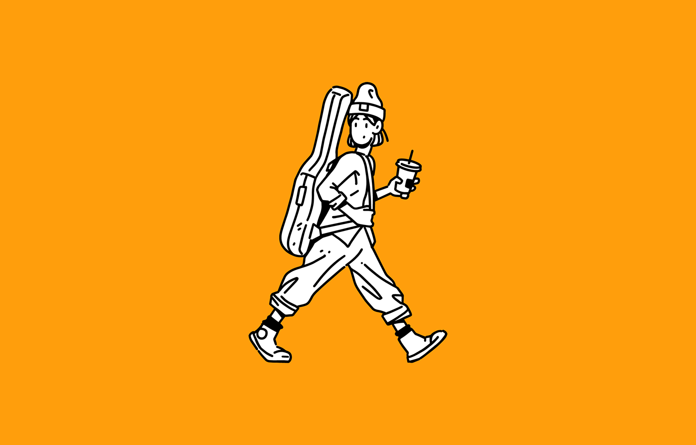
Out of those discussions came the characters you see here.
We wanted to do something weirder, quirkier and more real. Something that felt closer to our audience.


The purpose of design is not just to make a project aesthetic, it is also about positioning, defining objectives and strategy. So a big part of this project was to help them understand and express themselves.
They fight for social and environmental causes, without forgetting their affectionate and pulsating tone.
For them, it was always more about people having a good time than the coffee itself.
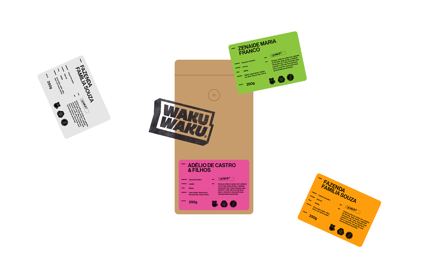
From the graphic identity, name and copywriting, illustrations to the photographic identity, everything reinforces Waku Waku's unique feeling.