Sobre
PT - BR | Curiô é um ateliê de costura criativa que busca criar peças que acompanham as tendências de moda e levam a mensagem de que a mão de obra artesanal deve ser valorizada.
A responsável pelo negócio tem uma personalidade forte e extravagante, indo contra o que geralmente esse tipo segmento apresenta; portanto surge como desafio unir esses dois universos em um sistema que mostre o tipo de serviço que é vendido e a dona do negócio.
-
About
EN - US | Curiô is a creative sewing workshop that seeks to create pieces that follow fashion trends and carry the message that artisanal work must be valued.
The person responsible for the business has a strong and extravagant personality, going against what this type of segment usually presents; therefore, it is a challenge to unite these two universes in a system that shows the type of service that is sold and the owner of the business.

Público-alvo
PT - BR | O público-alvo da Marca são mulheres de 25 a 45 anos de idade, pertencentes as classes B e C que querem se sentir empoderadas e originais, utilizando produtos 100% artesanais e personalizados.
Em sua maioria localizam-se nas regiões próximas a residência da responsável,
devido a rede de relacionamentos construída com o tempo de mercado.
Apresentam como maiores dores: falta de organização, falta de originalidade e baixa autoestima.
-
Target
EN - US | The Brand's target audience are women aged 25 to 45, belonging to classes B and C who want to feel empowered and original, using products that are 100% handcrafted and personalized.
Most are located in regions close to the residence of the person in charge,
due to the network of relationships built over time in the market.
They present as major pains: lack of organization, lack of originality and low self-esteem.

Arquétipo do Rebelde
PT - BR | Fiel a seus próprios valores e não aos valores vigentes, o rebelde é um ser carente por natureza. Ele precisa chamar atenção para si, mesmo que para isso seja preciso chocar.
Maior Desejo
Chocar, Revolução ou vingança
Maior Medo
Ser comum ou não ter poder.
-
Rebel Archetype
EN - US | Faithful to his own values and not to the prevailing values, the rebel is a needy being by nature. He needs to draw attention to himself, even if that means shocking him.
Greatest Desire
Shock, Revolution or Revenge.
Biggest Fear
To be common or to have no power.

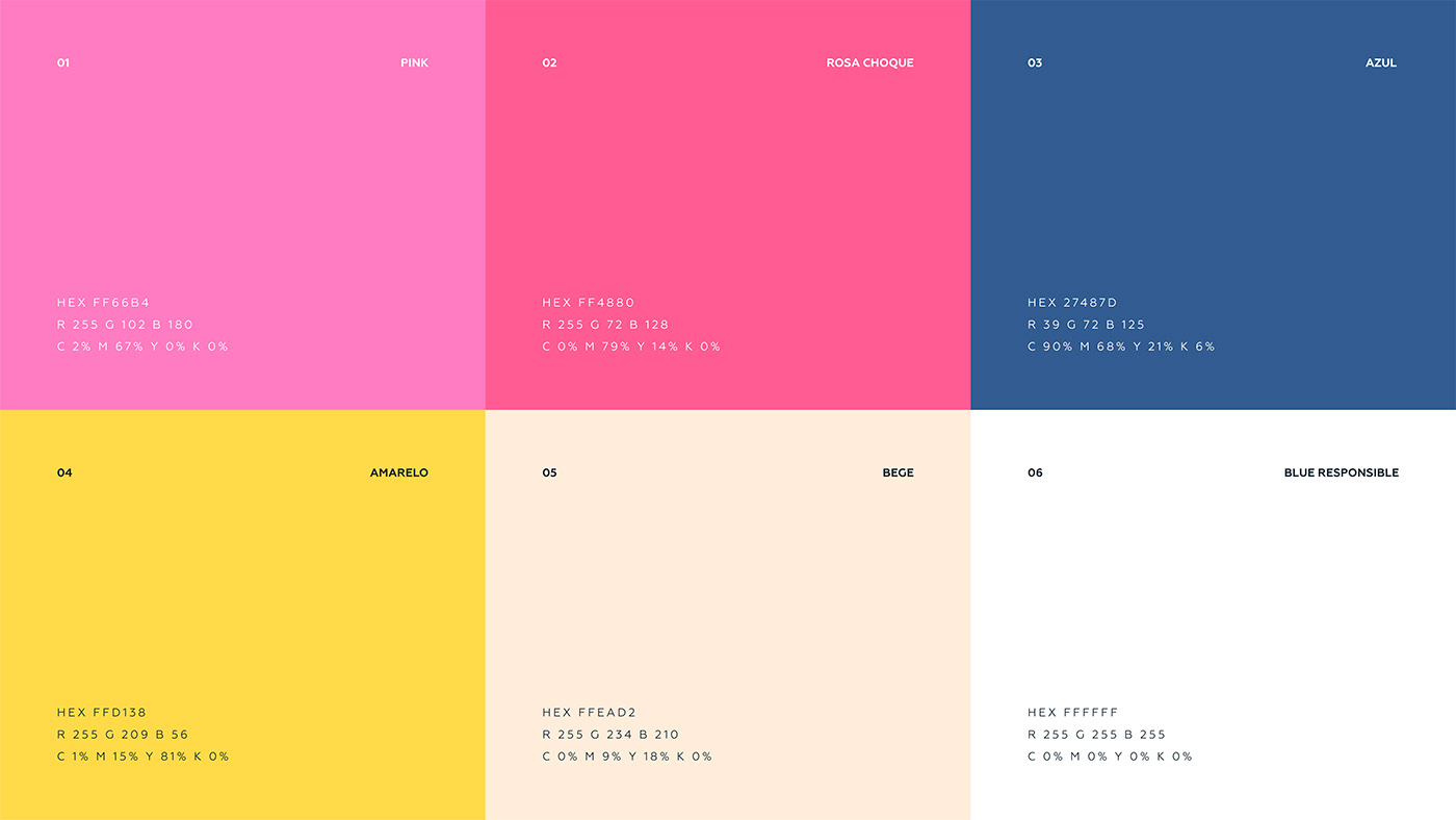
Paleta de Cores
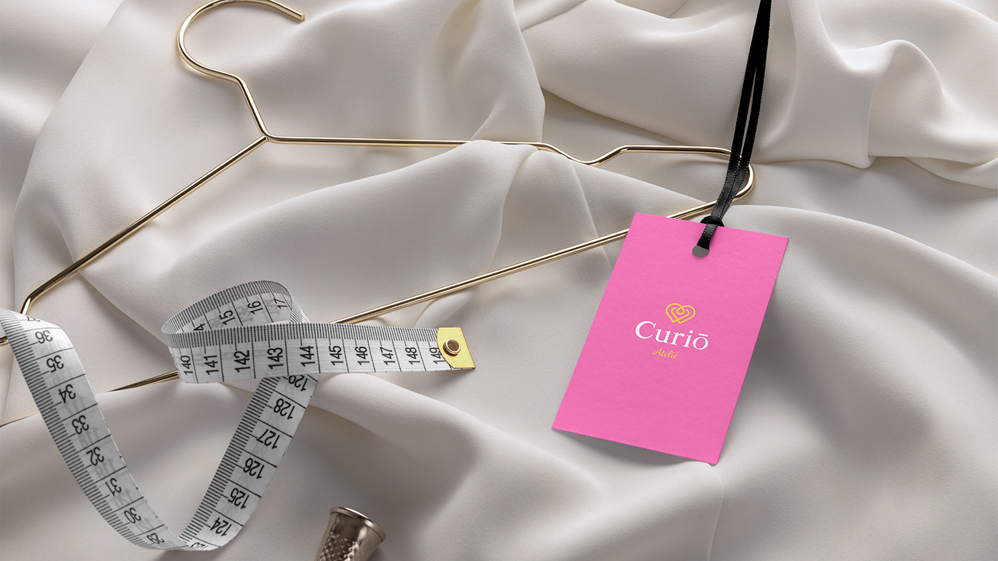
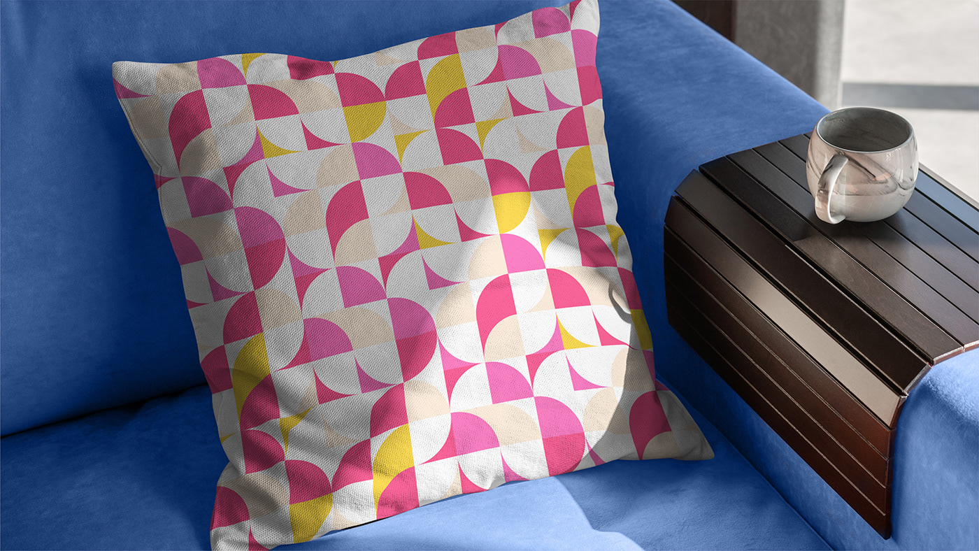
PT - BR | A paleta de cores escolhida esta diretamente ligada a intensidade e emoções da dona, unindo sua personalidade à marca; os tons de rosa, comumente associados a algo meigo, expressão algo intenso e feminino (indo contra a cultura popular); a cor amarelo esta ligada a criatividade e alegria; as cores azul e beje vem como regulador de intensidade trazendo um aspecto mais responsável e sóbrio para a marca, afinal ainda se trata de um ateliê.
-
Collor Palette
EN - US | The chosen color palette is directly linked to the owner's intensity and emotions, uniting her personality to the brand; shades of pink, commonly associated with something sweet, expressing something intense and feminine (going against popular culture); the color yellow is linked to creativity and joy; the blue and beige colors serve as an intensity regulator, bringing a more responsible and sober look to the brand, after all it is still a studio.
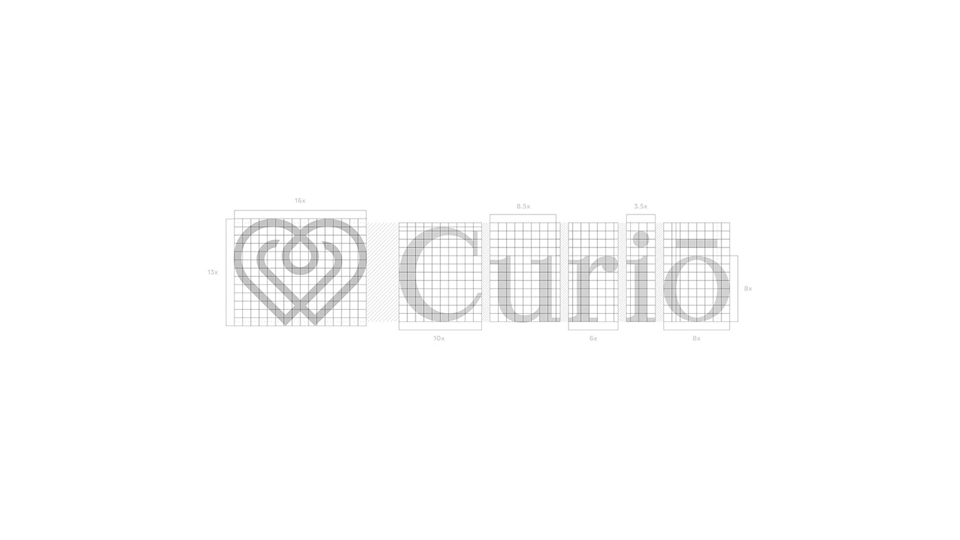
Conceito
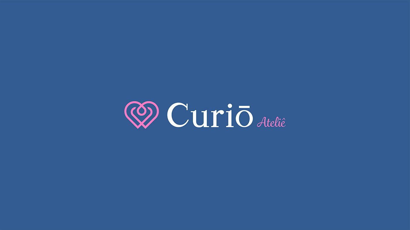
PT - BR | Foi utilizado como ideia central para o símbolo um coração feito de linhas,
o que representa o ato de “unir com amor”; os traços são grossos e mantém uma linearidade, expressando força e persistência.
A tipografia foi desenhada do zero para proporcionar mais originalidade para o projeto, e nela encontra-se a mistura de dois estilos: serifa transicional e serifa moderna, expressando ousadia, autoridade e sofisticação. Para a tipografia da tagline foi escolhida uma fonte Script passando a ideia de algo manual e orgânico.
Assim , com a junção destes elementos, forma -se uma identidade única que
humaniza a empresa, unindo negócio e dona.
-
Concept
EN - US | A heart made of lines was used as the central idea for the symbol,
what the act of “uniting with love” represents; the strokes are thick and maintain a linearity, expressing strength and persistence.
The typography was designed from scratch to provide more originality to the project, and it combines two styles: transitional serif and modern serif, expressing boldness, authority and sophistication. For the typography of the tagline, a Script font was chosen, conveying the idea of something manual and organic.
Thus, with the combination of these elements, a unique identity is formed that
humanizes the company, uniting business and owner.