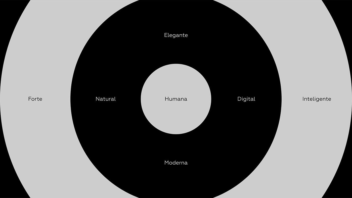
Sobre
PT - BR | A For.us é uma empresa de produtos naturais que tem como seus principais pilares a sustentabilidade e a saudabilidade; dito isso, colocam como objetivo levar para o mundo um estilo de vida e rotina mais saudável, de uma forma consciente e prazerosa. Seus produtos são escolhidos “a dedo” e vem na quantidade certa para o consumo diário, o que demonstra a preocupação que o negócio tem com seu público.
-
About
EN - US | For.us is a natural products company whose main pillars are sustainability and healthiness; That said, they aim to bring a healthier lifestyle and routine to the world, in a conscious and pleasurable way. Its products are handpicked and come in the right amount for daily consumption, which demonstrates the concern that the business has with its audience.
Público-alvo
PT - BR | O público da Marca é qualificado enquadrando-se na classe B+, e estão dentro de uma faixa etária que vai dos 25 aos 60 anos de idade, sendo majoritariamente feminino.
Se localizam nas grandes metrópoles e buscão uma rotina e vida mais saudável; este pensamento é o que os influencia a comprar produtos que facilitem alcançar o objetivo.
Dito isso, um sistema de identidade visual aliado a uma estratégia de humanização fará total diferença na prosperidade do negócio, visto que o target, por ter um poder aquisitivo maior, escolherá com mais consciência, observando as promessa e qualidades apresentadas.
-
Target Audience
EN - US | The brand's public is qualified as being in the B+ class, and they are within an age group that goes from 25 to 60 years of age, being mostly female.
They are located in large cities and seek a healthier routine and life; this thinking is what influences them to buy products that make it easier to achieve the goal.
That said, a visual identity system combined with a humanization strategy will make a total difference in the prosperity of the business, since the target, due to having a greater purchasing power, will choose more consciously, observing the promises and qualities presented.

Arquétipo do Prestativo
PT - BR | O arquétipo do Prestativo é percebido em praticamente quaisquer atividades relacionadas à prestação de serviços, cuidados com a saúde e o bem estar ou alimentação.Fornece para a marca um tom de altruísmo, movido pela compaixão, pela generosidade e pelo desejo de ajudar os outros.
Maior Desejo
Proteger os outros do mal
Maior Medo
Egoísmo e Ingratidão
-
Helpful Archetype
EN - US | The Caregiver archetype is seen in virtually any activity related to service delivery, health care and well-being or food. It provides the brand with a tone of altruism, driven by compassion, generosity and a desire to help others.
Greatest desire
Protect others from harm
Greatest Fear
Egoism and Ingratitude

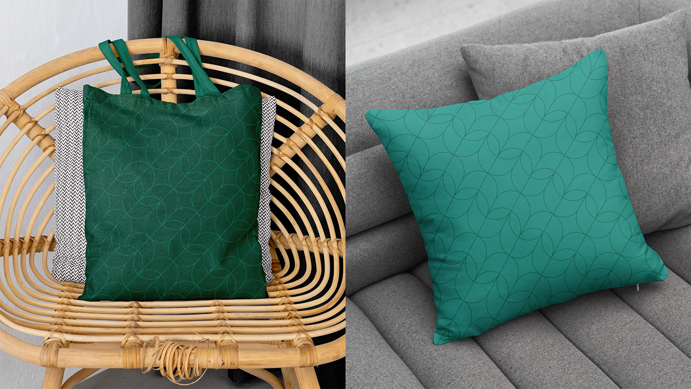
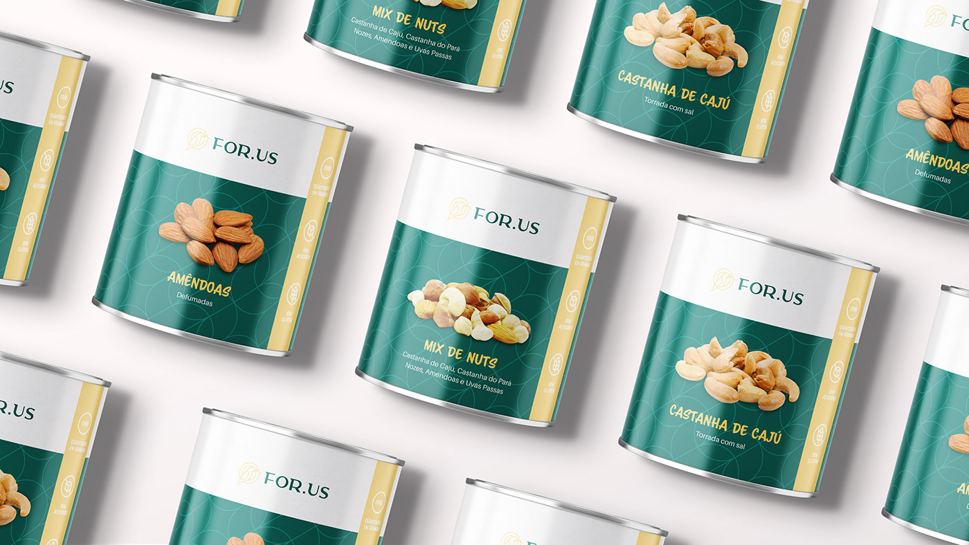
Paleta de Cores
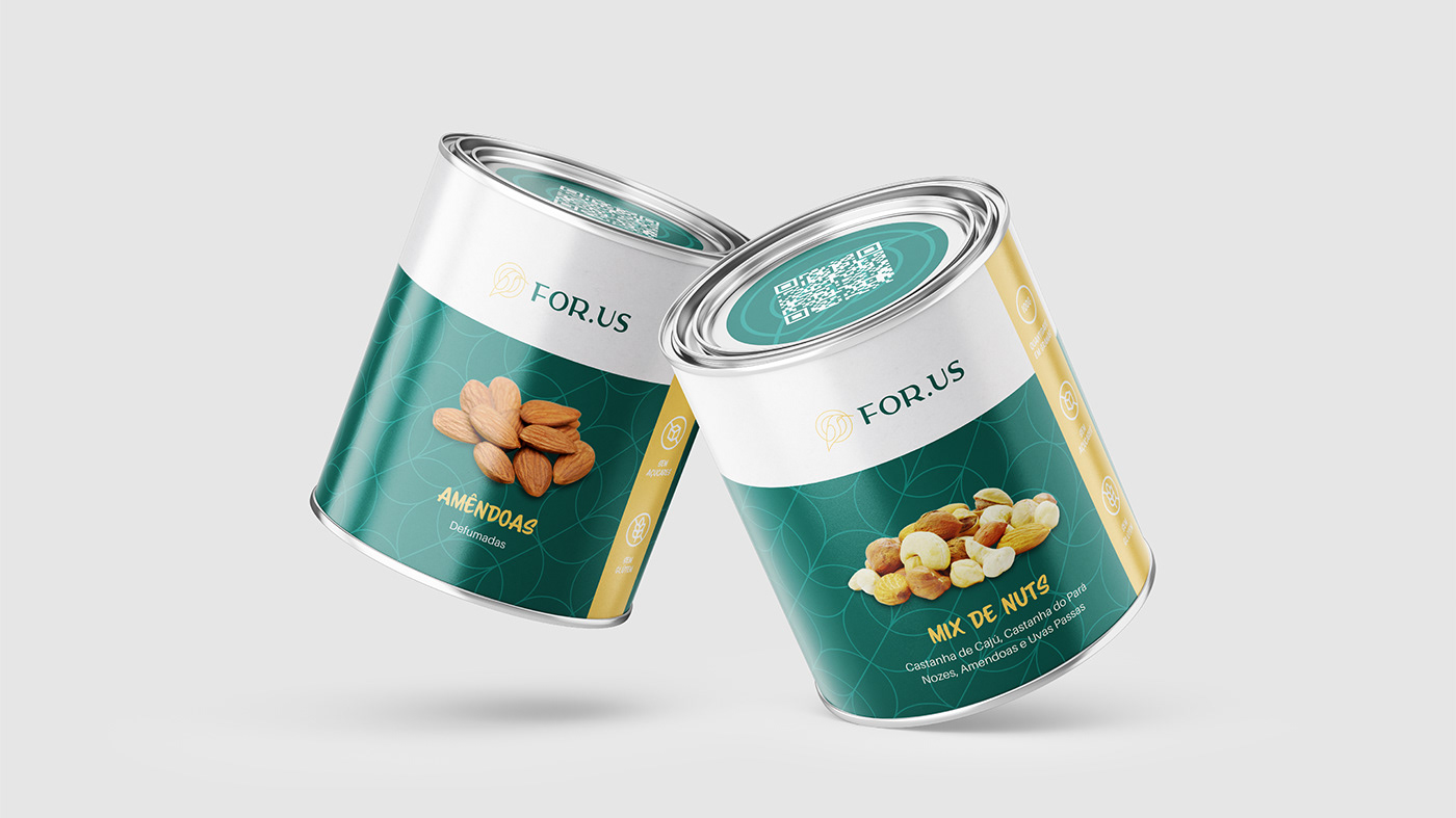
PT - BR | A paleta escolhida esta diretamente ligada a união que existe entre cura e natureza.
Os tons de verde, expressão saúde e vitalidade; a cor amarelo transmite alegria e energia; as cores beje, marrom e rosa claro têm o papel de vincular a Marca com as castanhas, oleaginosas e outros grãos que ela comercializa.
-
Color palette
EN - US | The chosen palette is directly linked to the union that exists between healing and nature.
The shades of green, expression of health and vitality; the color yellow conveys joy and energy; the beige, brown and light pink colors have the role of linking the Brand with the chestnuts, oilseeds and other grains that it sells.

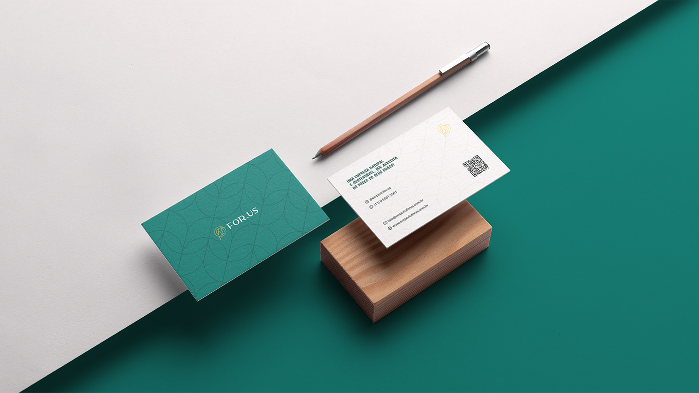
Conceito
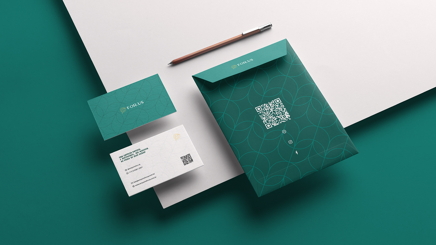
PT - BR | O objetivo do projeto era construir um sistema de identificação eficiente e que transmitisse para o consumidor a ideia de que os produtos da marca são saudáveis, curam e melhoraram a qualidade de vida.
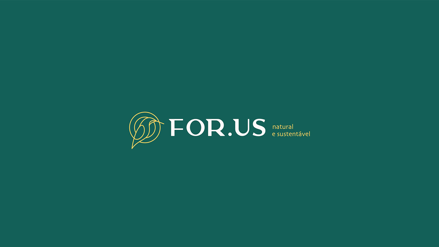
Pensando nisso, foi utilizado no símbolo um beija flor inscrito em dois círculos com traços finos, para representar o renascimento, a delicadeza e a cura.
A tipografia foi construída do zero para trazer mais exclusividade para o projeto, e tem características específicas, como seu comprimento e serifas triangulares que permitem que ela transmita um ar mais sofisticado e aerodinâmico.
-
Concept
EN - US | The objective of the project was to build an efficient identification system that would convey to the consumer the idea that the brand's products are healthy, heal and improve the quality of life.
With that in mind, a hummingbird inscribed in two circles with thin lines was used in the symbol to represent rebirth, delicacy and healing.
The typography was built from scratch to bring more exclusivity to the project, and it has specific characteristics, such as its length and triangular serifs that allow it to convey a more sophisticated and aerodynamic air.