


Botox Packaging.
The polished outer casing compliments the orange textured finish of the inner packaging. Using contrasts of textures, our consumers can move through the layers, feeling their way towards the bottle.

Botox Bottle Design
We originally wanted to use the iconic Lea & Perrins design, however, for this product it was impractical. Taking aspects from the original, we designed a small glass bottle embossed with the distinct Lea & Perrins signature, located near the neck of the bottle.

Needle Packaging
We designed the needle and Botox packaging very similar. We incorporated the recongisable Gill Sans Lea & Perrins title as the dominant feature of our branding. We also kept the white Lea & Perrins signature, as a symbol to show our consumers this is the genuine and original product.

Implant Box
Our original design was a rectangular white box lined with orange velvet ruching. However, as our product is high-end we needed the velvet to be a tailor fit. This would convey to our consumers that the products are custom made for the individual.
The shape of the box developed from the distinctive neck and shoulder of the original Lea & Perrins bottle.
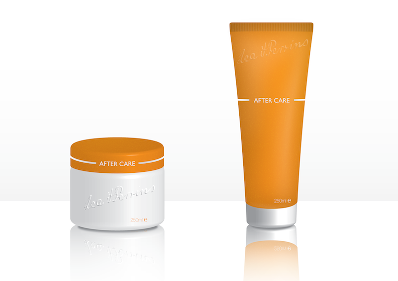
Aftercare Service
Our consumers are not just paying for the products but the entire service. Our brand would offer multiple aftercare treatments; two will be small 250ml lotions to combat scarring and bruising.


