


Hoisthope is a Canadian healthcare recruiting agency that focuses on providing staffing solutions to medical professionals across the country. The ask for this project was to create a distinctive and minimalist brand which embodies professionalism and reflects the medical field.


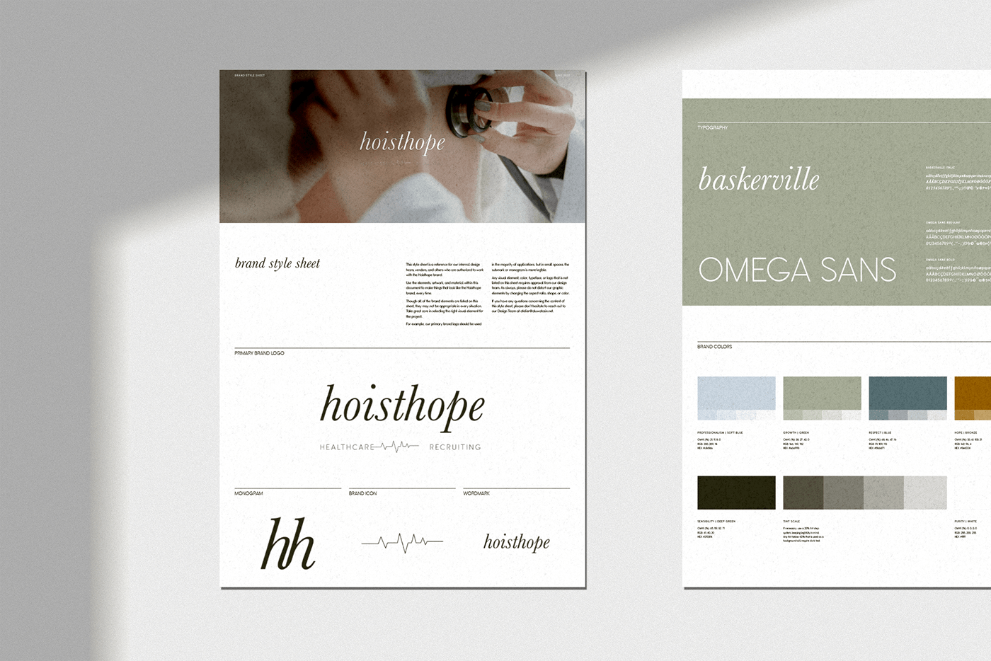
The lockup our team created works on multiple levels as it can be deconstructed for use in various applications while still being recognizable as part of a larger whole. Below you can see how the different elements of the lockup are utilized as a monogram & brand icon for instances in which a streamlined look is desired.


The Hoisthope lockup is further refined into a simple serif wordmark which can be used in instances where the full lockup is unnecessary.


Below is a sample of the Hoisthope brand style guide we crafted to ensure the agency is able to utilize all their brand elements in an informed and unified manner. It details the different elements, colours, fonts, and language which Hoisthope should use to maintain brand consistency as they grow and collaborate with external developers, vendors, and designers.
Here are some examples of how the Hoisthope brand elements can be used across different mediums and platforms. This serves as an example as how to best utilize their newly crafted logo, monogram, icon, and wordmark.


