


Rebranding the revenue optimization tool of the future
Objective
Buynomics is an End-to-End revenue optimization service for various industries. Its unique and innovative Virtual Customer Technology enables fast and highly accurate commercial decisions by creating limitless virtual customers that act just like real ones, foreseeing consumer behavior transparently and straightforwardly. As part of upcoming funding rounds that underline Buynomics’ growth and constant development, we were invited to revise the initial brand positioning and corporate identity. The objective intended to sharpen the brand image, clarify the brand language and tone of voice and maximize the potential of Buynomics, translated into visual elements that reflect the company’s purpose.
Approach
Buynomics had already defined its market segment and potential customer structures. However, our analysis revealed that the brand doesn’t adequately express a distinctive personality and differentiate itself from competitors, resulting in a generic and difficult-to-recognize brand image. A key issue of many B2B companies is as their sole focus lies on product benefits while neglecting to formulate an identifiable and tangible personality. Thus, our strategy concentrated on a holistic approach, channeling the product solution and its benefits in a sharpened and coherent brand identity with its unique tone of voice, attributes, and values.
Solution
We used two themes, light and dark, to allow a distinct separation between the brand Buynomics and the software tool while still conveying consistent branding by using key design elements for both themes.This approach allowed a two-layer communication tailored to the brand needs for a distinctive brand image on the one hand and clear product communication on the other. We carefully choose a color palette for maximum flexibility to ensure a perfect contrast in dark and light environments. We also drew inspiration from computer terminals and consoles used in programming to underline Buynomics AI-driven services while also picking up cues from the brand’s defined tonality and values.

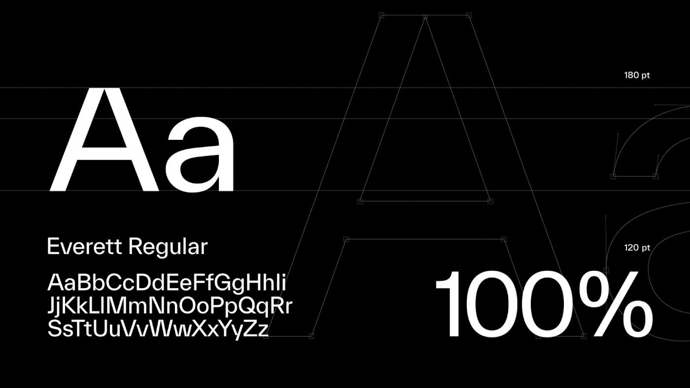
We used Weltkern’s Everett throughout the whole Identity for its symmetrical structure and opposing organic features. Its strong typographic details add a technical appeal without being too intrusive. The low ascenders and descenders allow the text to be set even with tight line spacing, which is especially useful inside the software. We enhanced some characteristics to create a distinctive wordmark and added additional ink traps to improve readability in small type sizes.

The color palette is carefully chosen to work in light and in dark themed environments. The mostly grey scaled palette was complemented with a broad range of accentual colours to be used in infographics and to categorise content. The selection of colours and its tints provides good contrast on light and dark background without the need to adjust them. Therefore the palette enables a huge amount of flexibility being especially useful in pitch decks and the software itself.

Utilizing our strategic proposition for Buynomics, the website uses a two-colored theme. The light theme relates to all corporate topics, while the dark theme is associated with Buynomics as a software solution for revenue optimization. This solution enables Buynomics to communicate effectively and clearly to its specific audience.


Credits
Client: Buynomics
Year: 2022
Industry: SaaS / Technology / Finance
Region: International


