


Client: Safari Daisies®
Industry: Plant Nursery and Breeding
Location: New South Wales, Sydney, Australia
Scope: Logo Design and Packaging
Year: 2022
Magic Moments of Colour — This time with an African touch.
Straight out of the plains of South Africa and bred to the finest quality in Australia, Safari Daisies® is one of the most resilient Arctotis flower that is bred by Nuflora International P/L, New South Wales.
On our second collaboration with the visionary entrepreneur Mal Morgan, we wanted to create a strong and charming brand for the product, while transmitting the origins and the heritage behind it: South Africa.
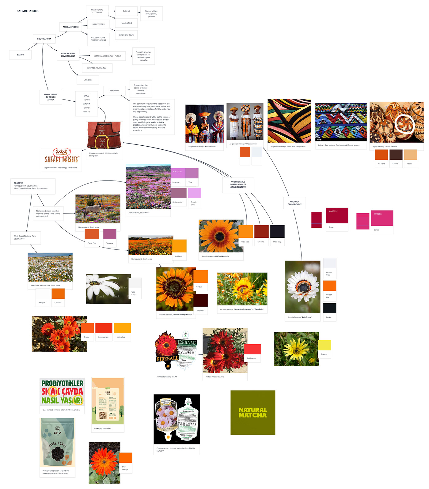
Above: Research and exploration study before moodboarding. I use the online tool called Milanote for it, and you're welcome :)
Our Goal and the Challenges
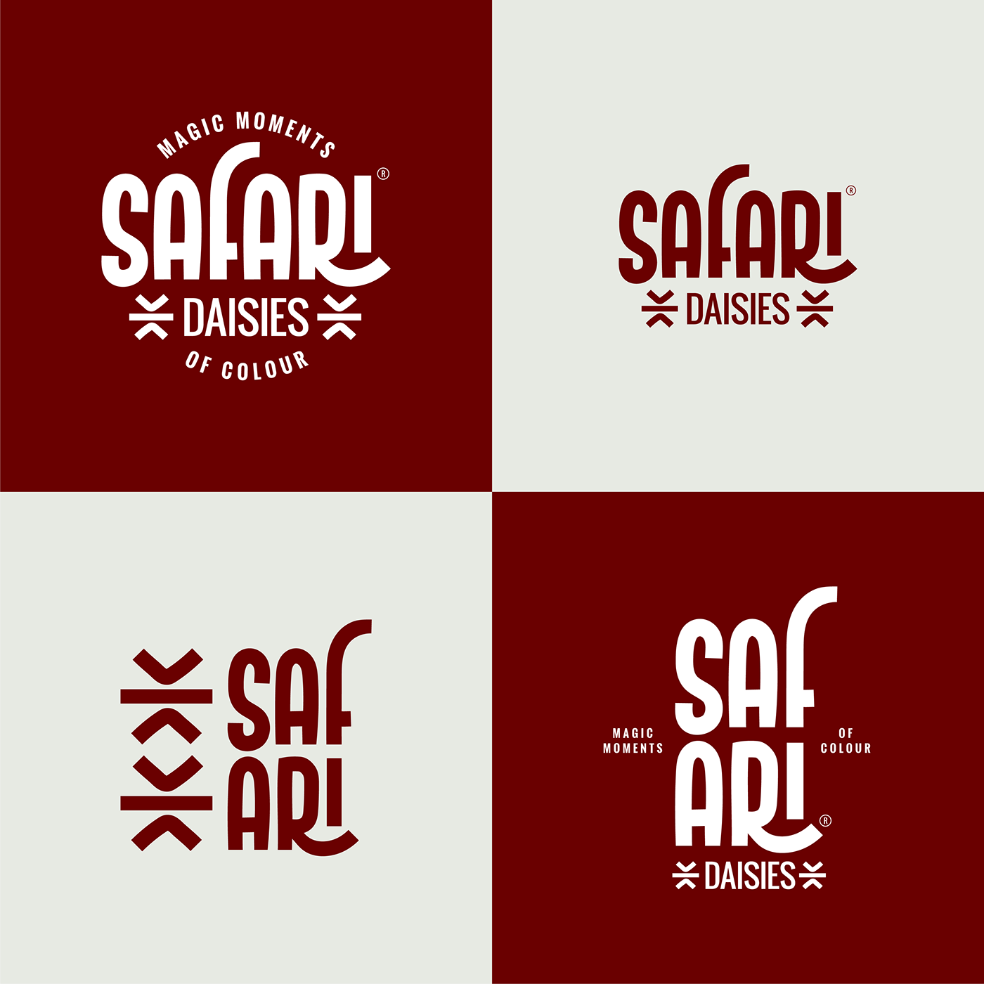
In a market of full of same colored and packed brands, Safari Daisies had to be different and recognizable easily by the end customer. It would be sold on the shelves at garden/hardware stores and local retails mainly in Australia but also in other countries. The biggest challenge was to combine the wordmark within a stacked logo that had to include the tagline—"Magic Moments of Colour", and a simple yet strong icon.

Logo Design — Concept Evolution, Research and Moodboarding
To make the memories of the product alive and to commemorate its origins, I first looked through the local tribes of South Africa. It didn't take long that I found out there still are dominant local tribes who have shaped the culture: Zulus, Bantus, and Xhosas.
After a deep dive in their culture, I got help from #Midjourney (the AI-bot that generates digital art) to build up a moodboard for me to visualize the concepts better.


Logo Design — Concept Refinement
Following this all 2-week of research, study and moodboarding processes, I got to the logo concept development.
I had to create such a logo that would be unique, bold and attractive to the end-customer. To fulfill those requirements, I started with sketching the base for custom letters, and then turned them into a refined design within hours (see the logo creation video below).

Logo — Finalization and Approval
Logo had to be custom typefaced, include the tagline and still had to work in even the smallest areas. Keeping that in mind I ended up refining the wordmark, introducing the icon (of which the idea was inspired directly from the Zulu patterns), making it double to cover the word "DAISIES", and locking up everything in an invisible circular shape.
The one and only option that I proposed to my client was approved on the first pitch (with a little revision on getting bolder with the font of the tagline).
Here below is the logo and its applications after that.


Above: Details from the custom letters.


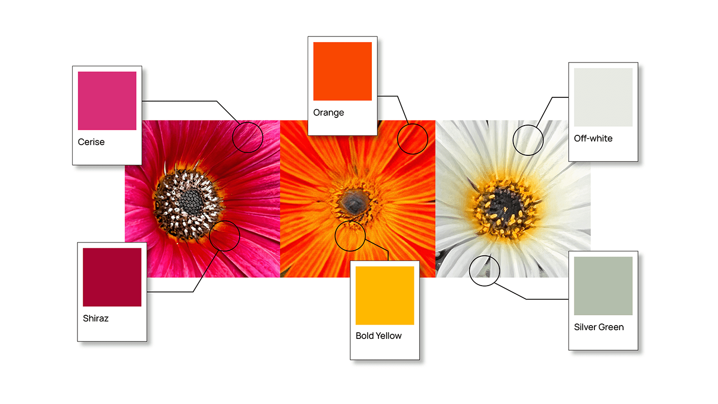
Colors — where the magic happens.
When it came to picking the right color palette for the brand, I got help from the product itself: Colorful Arctotis daisies with mainly three color group:
— cerise and shiraz,
— orange and yellows,
— off-whites, whites and silvers.
However, there was a problem...
And the problem was, things would got way crazier if we used them all in the logo. They seem to work well together, but still, the number of colors was high enough to make everything get a lot complex if they were used in the same design.
At that point, I just had the most creative idea ever (haha, joking... maybe the second most).
And it was...
"What if we mix all these six colors to create one strong color?"
And that's how our main color SAFARI PASSION was born.


Thanks for watching!
Did you like it?
—
For collaboration inquiries
and my other branding works,
be a guest on: itsdace.com


