


Client: Özge Uzer
Client Industry: Astrology Consultancy
Location: Istanbul, Türkiye
Project Scope: Brand Positioning, Visual Identity, Landing Page
Year: 2022
Elegance, minimalism, and brightness.
If I had to choose three words to describe the feeling that needed to be born for Özge Uzer, these would fit best.
When our paths have crossed with Özge, the entrepreneur-spirited postmodern astrologer and consultant, she was about to launch her own personal brand on this ancient wisdom of the sky and space. With her previous branding experiences, she was a bit unclear about the next steps when we first met for the discovery phase.
This case study you are about to see in detail includes the phases of exploration, concept development, refinement and the full expansion of the brand identity within about one month.
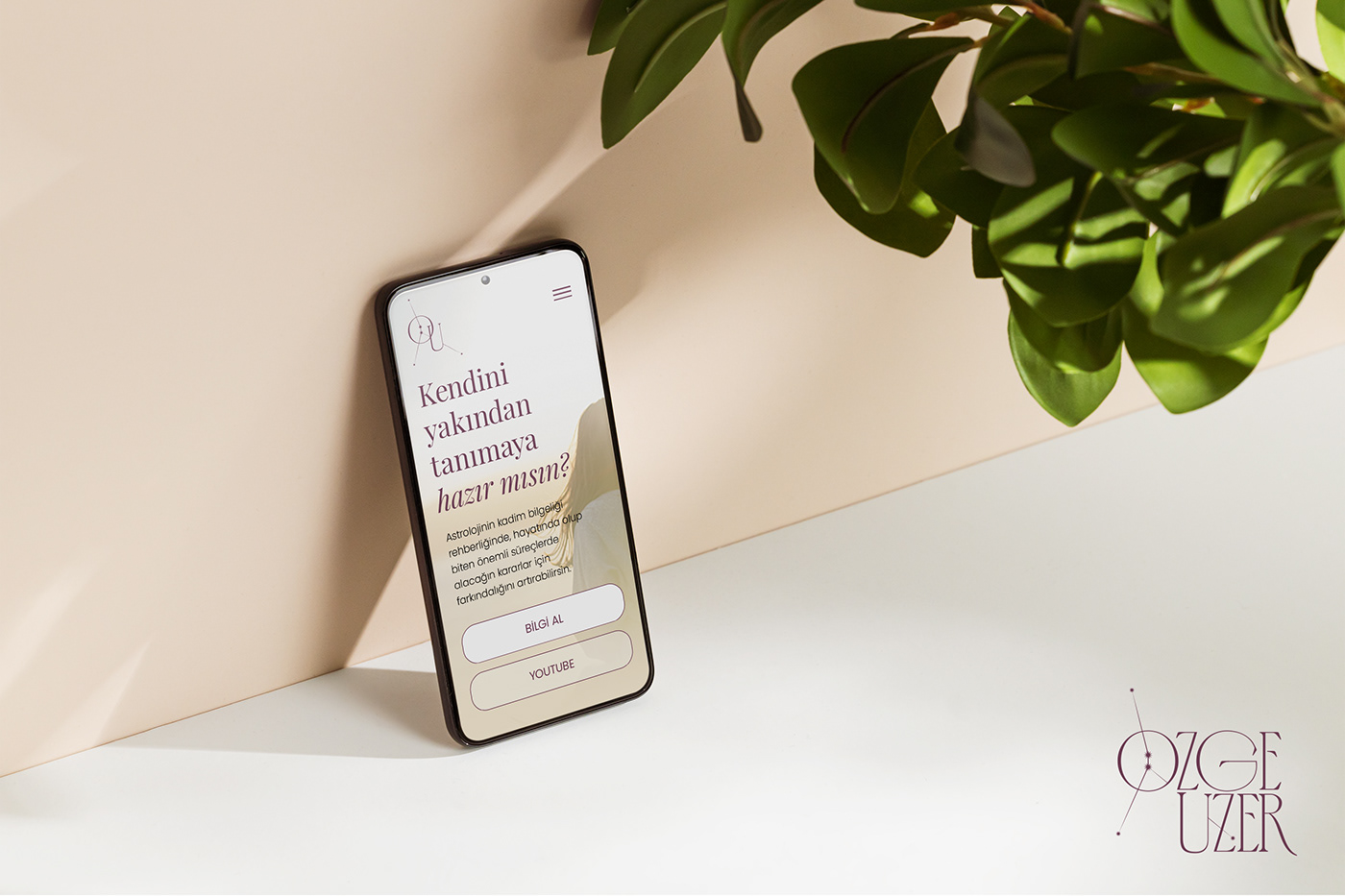
"Are you ready to know yourself deeper?" — One of the provocative headlines of Özge Uzer.
Strategy and Style Exploration Sessions
At the kick-off phase, we began with the 2-day Strategy Workshops to uncover the situation to the deepest layer. We underwent vitally important exercises for discovering the WHY, HOW and WHATs of the brand, positioning, values, archetypes and brand personality.
Following the Strategy phase, the second part of the kick off was art direction meetings where we ended up which path to go with our logo and visual identity. It included determining the style of the potential logo options, and was indispensable for the design process.
Below images show output of the strategy talks and moodboards that I proposed regarding our style direction meeting. Özge chose the first moodboard, where the general vibe is elegant, bright, optimistic, calm, peaceful and minimal.


Below: Three logo options proposed in the second week of the process. No.2 and No.3 were the k-lled options.


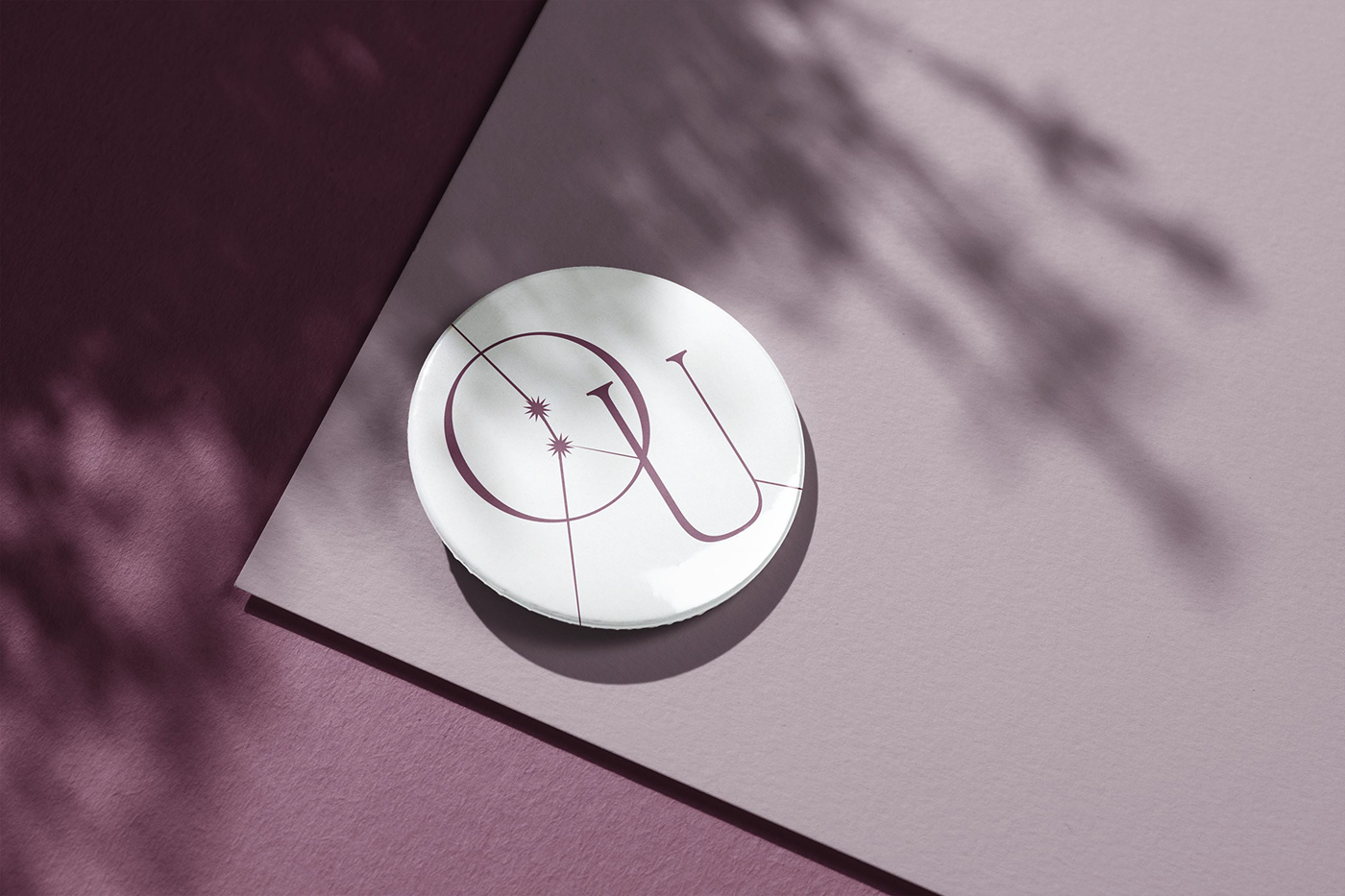
Above: Cancer constellation, the Zodiac sign of Özge herself.
Star constellations have always been wonderful and intriguing for the human societies for tens of thousands years.
It was impossible to avoid using constellations for the logo design.
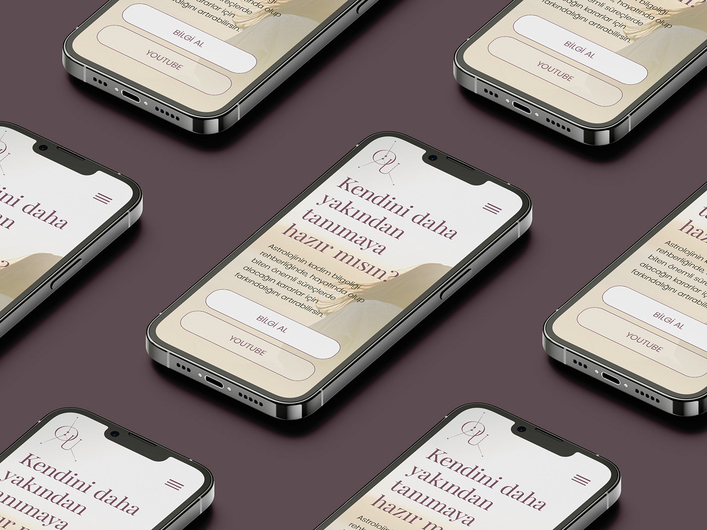
The Logo
Having a modern and elegant design was sought as we want to look mildly exclusive and friendly at the same time, yet the elegance was the first focus to create.
The icon that is also the letter "Ö" (pronounced as /oe/ in Turkish) is formed by a cancer constellation shining in the heart of our brand's initial.


Enjoy the Rest
Below you will walk through the brand identity expansions and executions including stationery, post cards, stamps, stickers and pins, brand patterns, imagery, social media posts and the landing page design.


"Daçe asked well thought questions to understand my needs, targets and expectations clearly on discovery meeting. He clarified the entire process and explained in detail. After meeting, I totally believe that he has more than enough wisdom and capacity to create my personal brand. [...] All the ideas, thoughts that we shared with each other in our strategy meeting got totally real thanks to Daçe Studio."
Özge Uzer, the founder


