Asia Design Prize
Trophy ReDesign.
©Designed by 250Design.
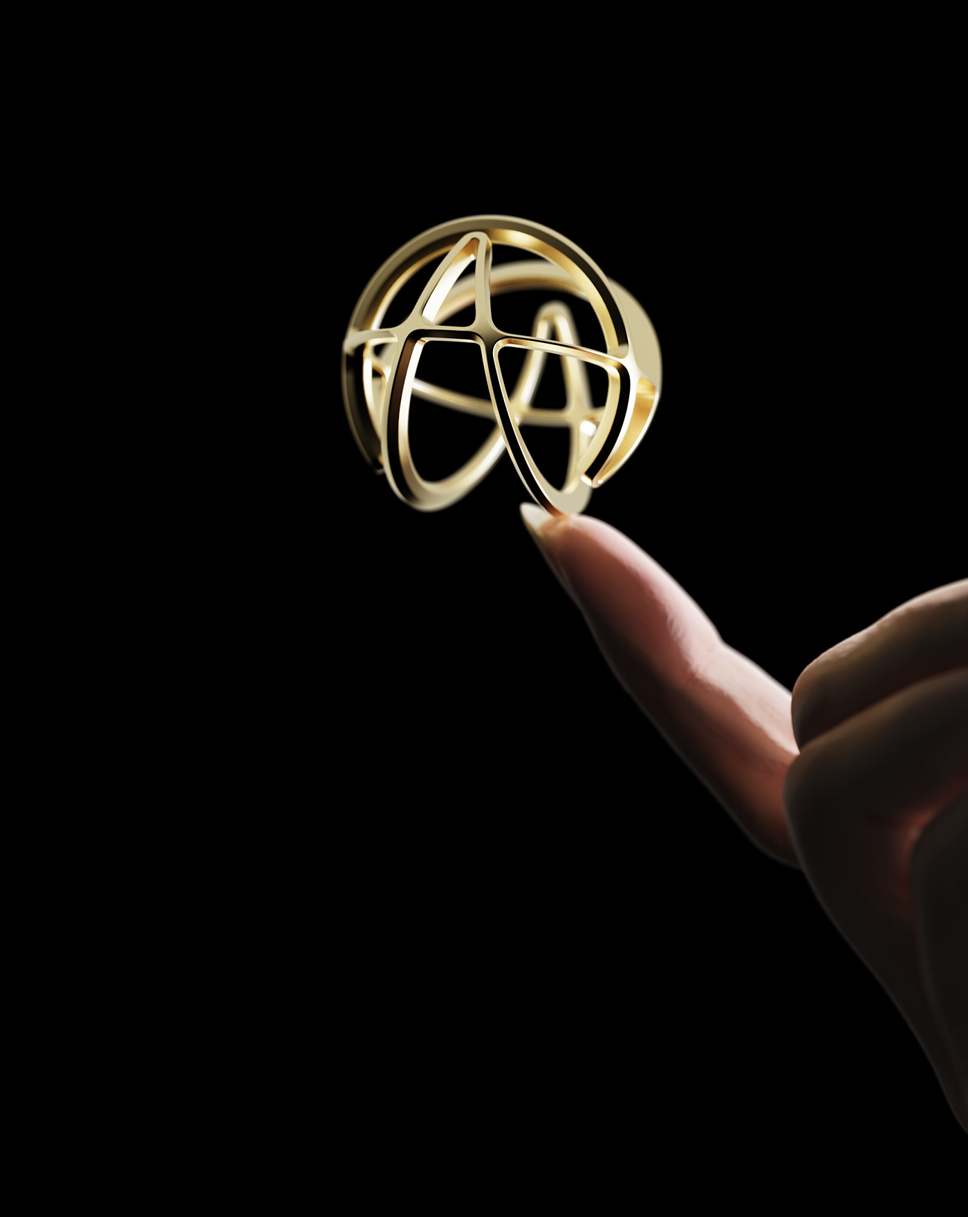
We redesigned the trophy to give it a new look. What ADP requested was to study how to pursue novelty while maintaining the identity of the existing trophy, but this was the most difficult part. Since the design of the existing trophy expressed the line of the ADP logo in 3D, the only way to pursue novelty was to add form to the existing trophy design. However, I was worried because this part was far from the direction of 250 design.
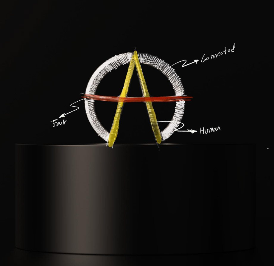
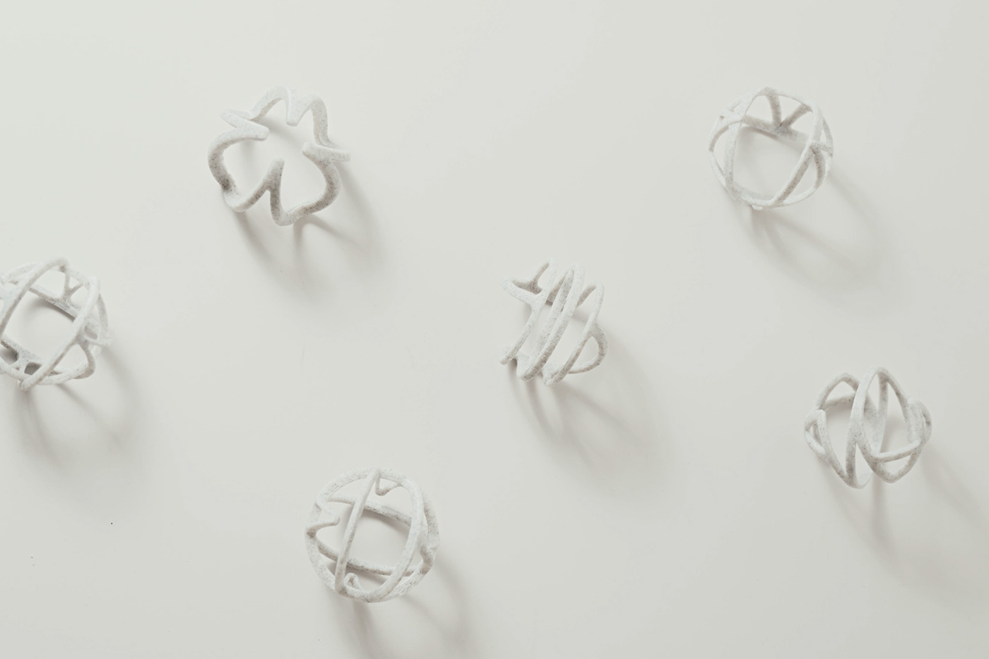
The circular part is Connected, the horizontal line is Fair, and the A shape is Human.
The first 'Connected' is a circular representation of the part where companies, professional designers, and students are all judged in equal positions. So, in the process of screening, we organized the characteristics of the designers' connection into the design that all lines are connected in the existing trophy as the first trophy design identity.
The second 'Fair' is a horizontal line representing the most important fair screening system in ADP. The second trophy design identity summarizes the expression that horizontal lines are connected in a circle in the repetitive A of the existing trophy and are always judged fairly and firmly.
Third, 'Human' is a part of ADP's designers, design for people, etc. that values people-centered design. So, in the existing trophy, by repeating A, we organized the meeting of designers, pride of designers, and pride of rising high into the third trophy design identity.
Process


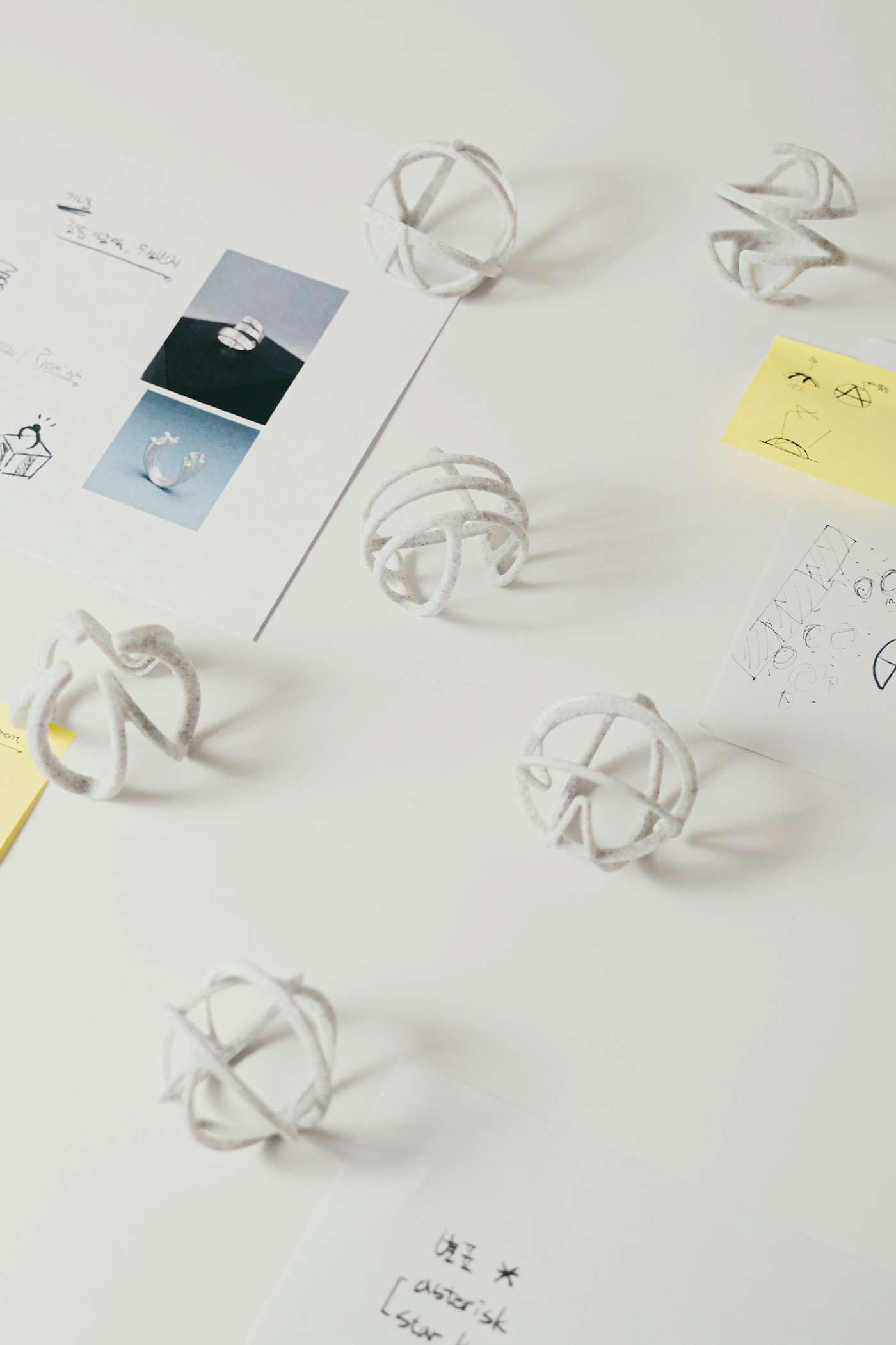
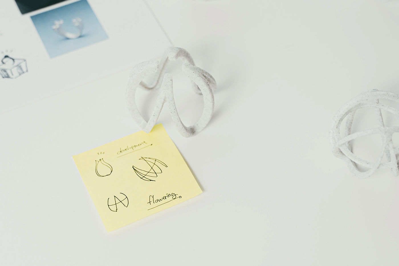
Getting to know the design awards was a priority. I think I have listed all the emotions and actions that people can feel through their participation in ADP, such as what the purpose of the exhibitors is, what emotions they feel during the participation process, and why they should be ADP. I tried to set the design direction through the listed words. We also analyzed the meaning of the existing ADP trophies to maintain their identity. The three main keywords above were derived from this. We selected as many sub-keywords as possible that could be derived from the three main keywords, and from here, the direction of the design began to be established.


After that, based on the sub-keywords, related reference images were found, and images designers thought for each keyword were found and collected without division of roles. I printed out all the images I found, listed them by keyword, and pasted them on a form board, and from this point on, I freely sketched and shared my opinions after looking at each image.
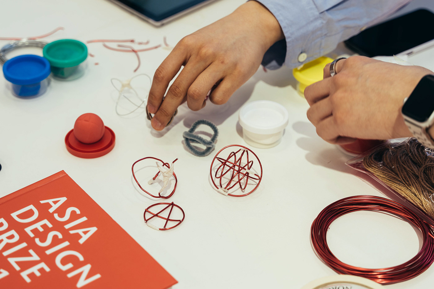
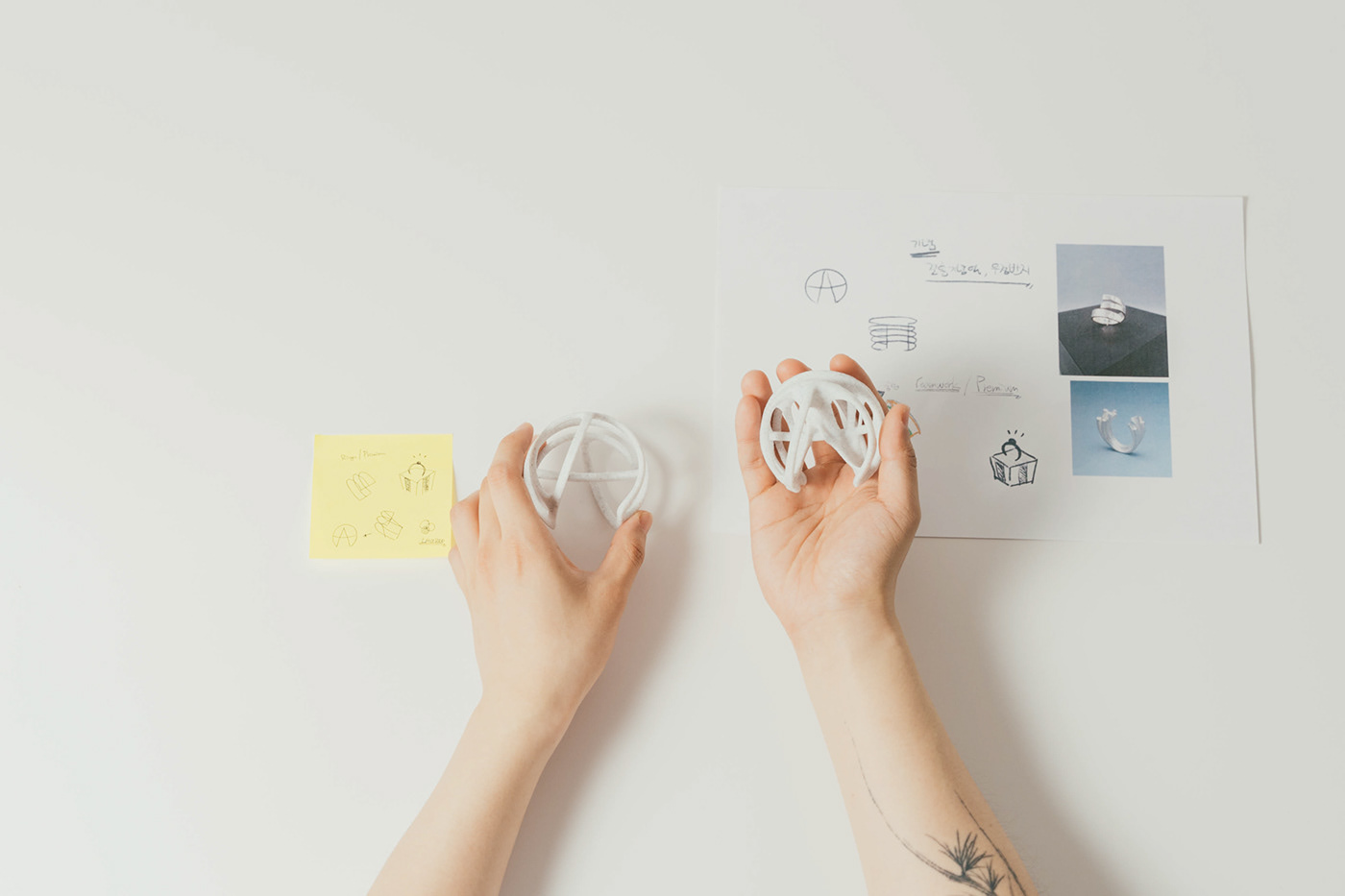
scale Mock-up


It was difficult to express with a hand sketch, so in order to see a clearer sense of scale, we also conducted a soft mock-up in our own way using different materials such as paper, wire, rubber clay, and twine. All the designers who participated in the project had different styles and different ways of visualizing them, so a lot of different and novel drafts came out.


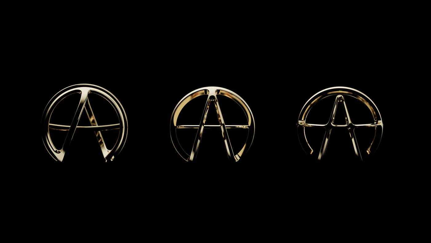
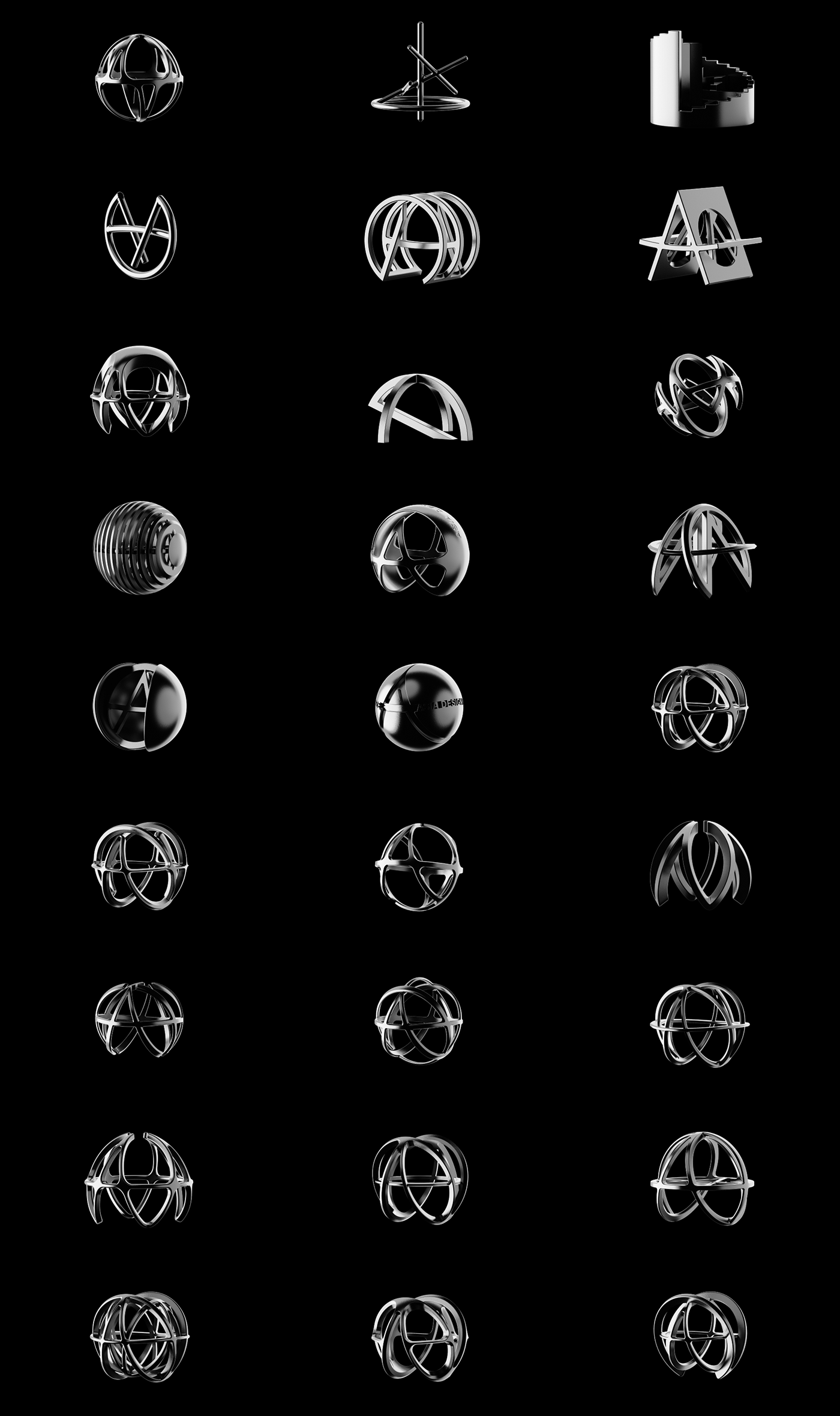
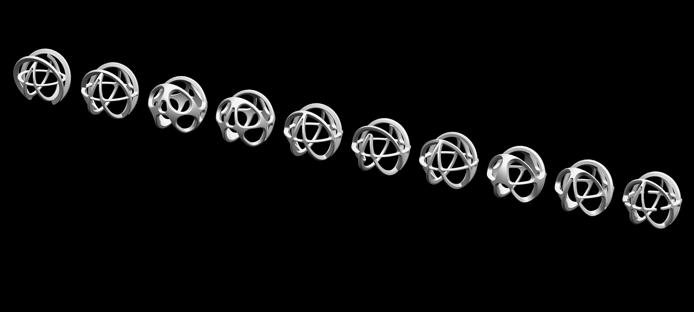
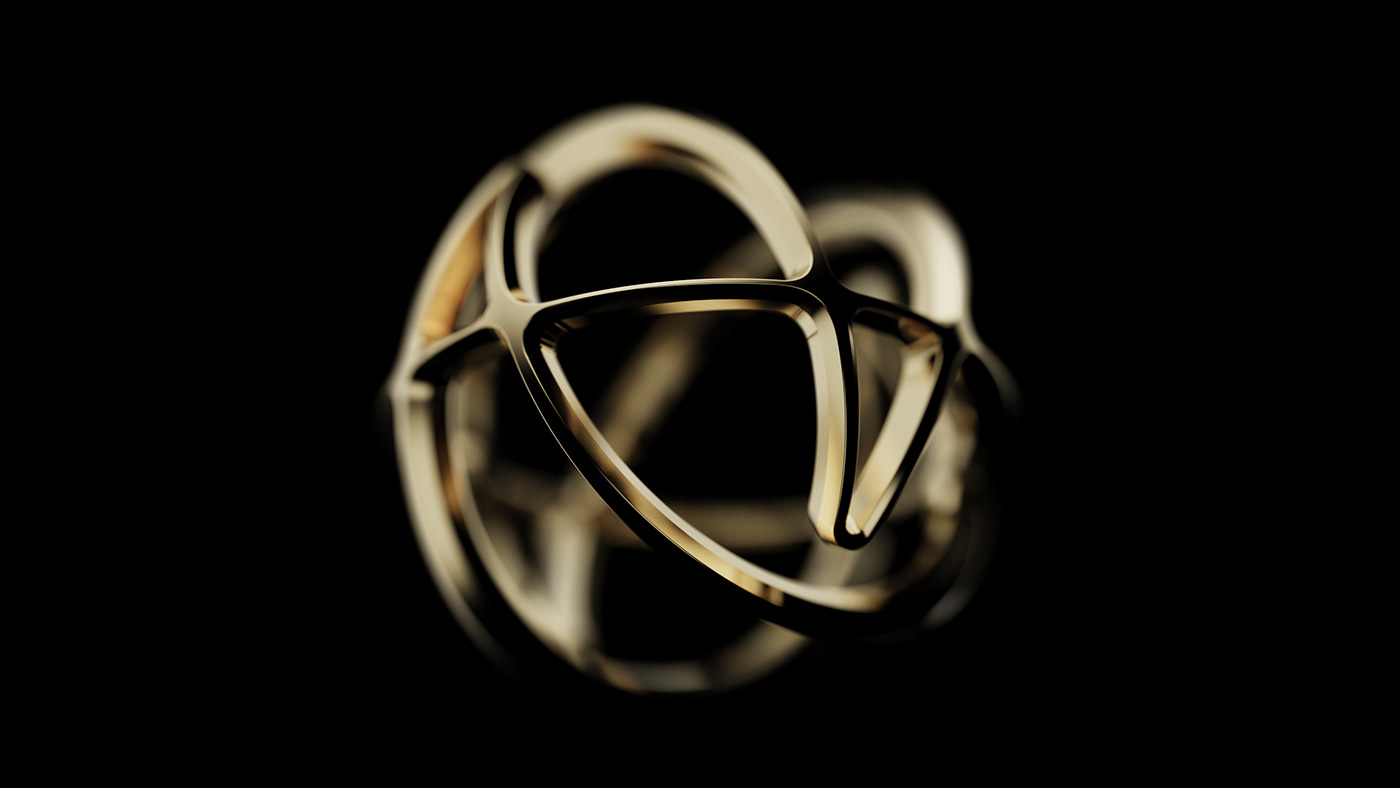
Final selected trophy 01

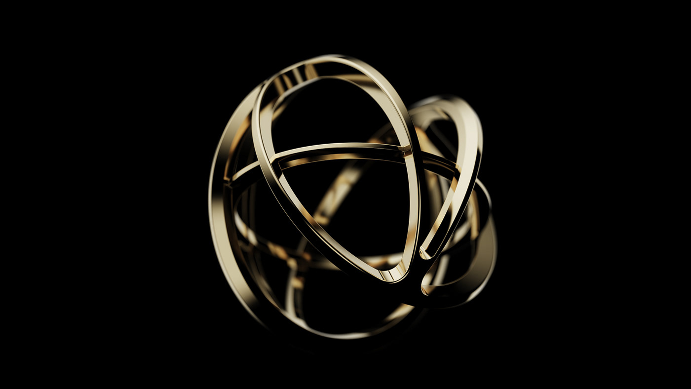


The first draft was approached morphologically. In the existing ADP trophy, an unintended R value was created when the shape of A and the lines met, and these factors were thought to affect the creation of the perfect shape of A. In the second draft, with the keyword Depth, to express a sense of space, the depth of the circle was given more than the existing trophy, so that A and the circle were perfectly formed, and a sense of weight was given to the point where each side met to give a sense of stability.
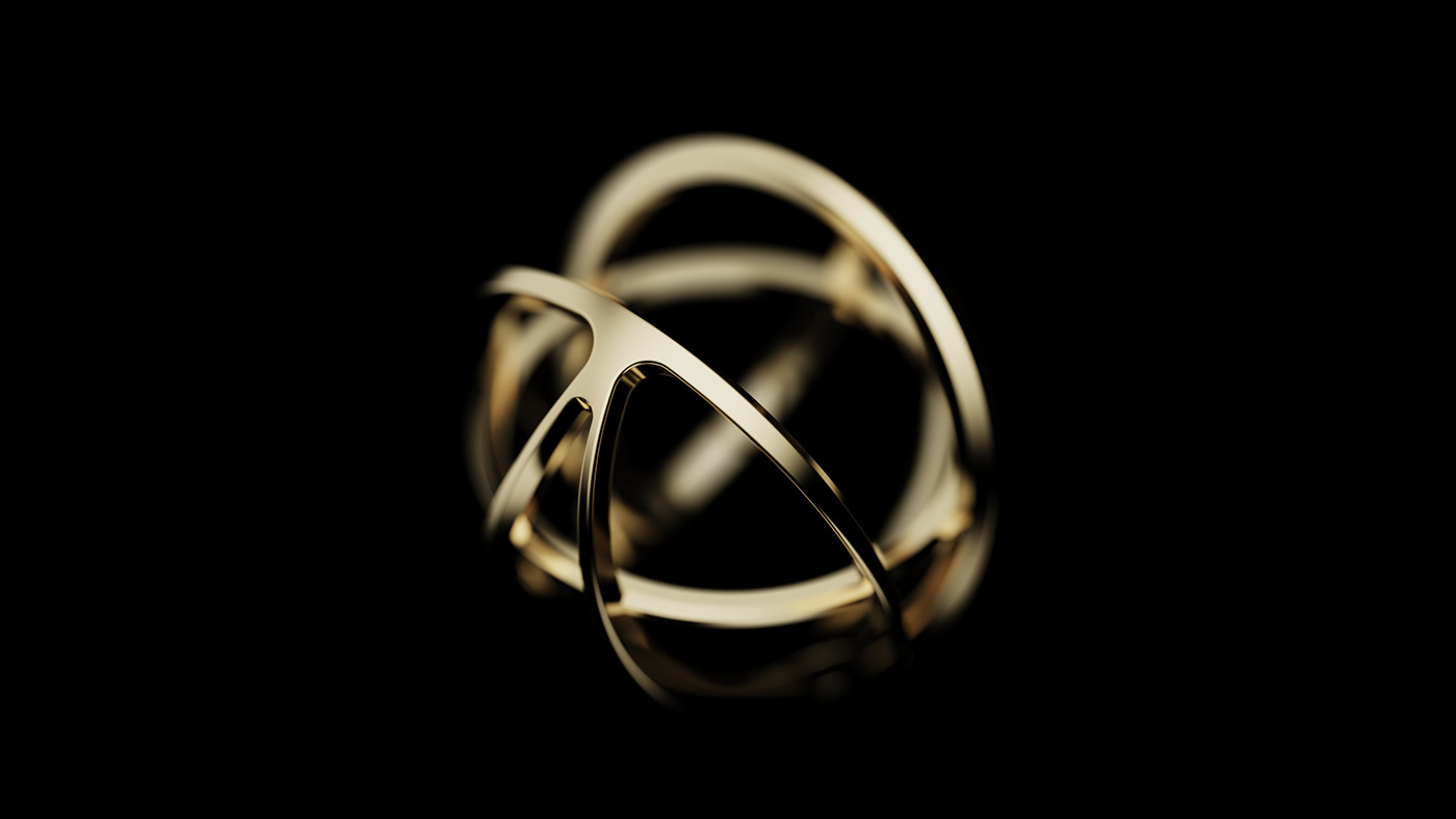
Final selected trophy 02


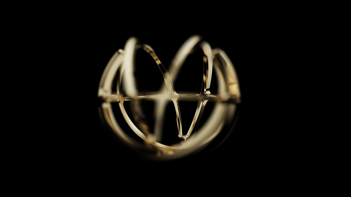


The second draft represents balance and innovation. If most of the trophy designs are in a form where all the lines are connected, I wanted to break that mold with this trophy. By breaking the frame of the original circle, a sense of broken form was saved. The apex of A was cut off to focus attention on the meaning of the summit, and through each cut, the line of sight formed a triangle to stabilize the balance of the design.
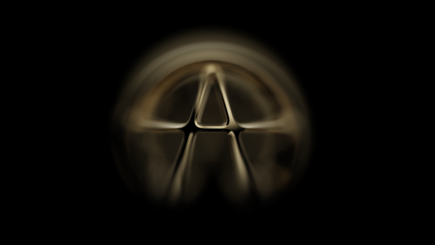
Final selected trophy 03


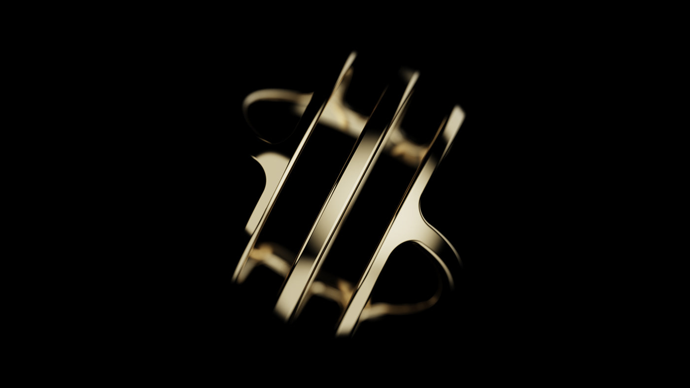


The third draft represents the design process. Layered was expressed by designing the logo of ADP, which did not appear when viewed from a different perspective, to appear when viewed from the front. The three circular lines on the side represent the three screening processes of ADP, which means that the design is becoming perfect through these design processes.


