


Typographic Restaurant...
... is a restaurant based solely on typography, punctuation and sentence structure.
The name of the restaurant is a stand alone mark of the three dots that make up an ellipsis. These dots represent the silence that occurs when people are eating. Using this mark without text invites customers to think about the meaning of the dots.
Each element of the restaurant follows this theme of using punctuation to represent different aspects of a meal.

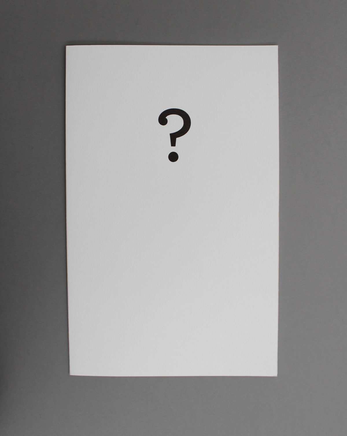
The menu uses a question mark to represent the question asked by the waiter- "What would you like to order?"

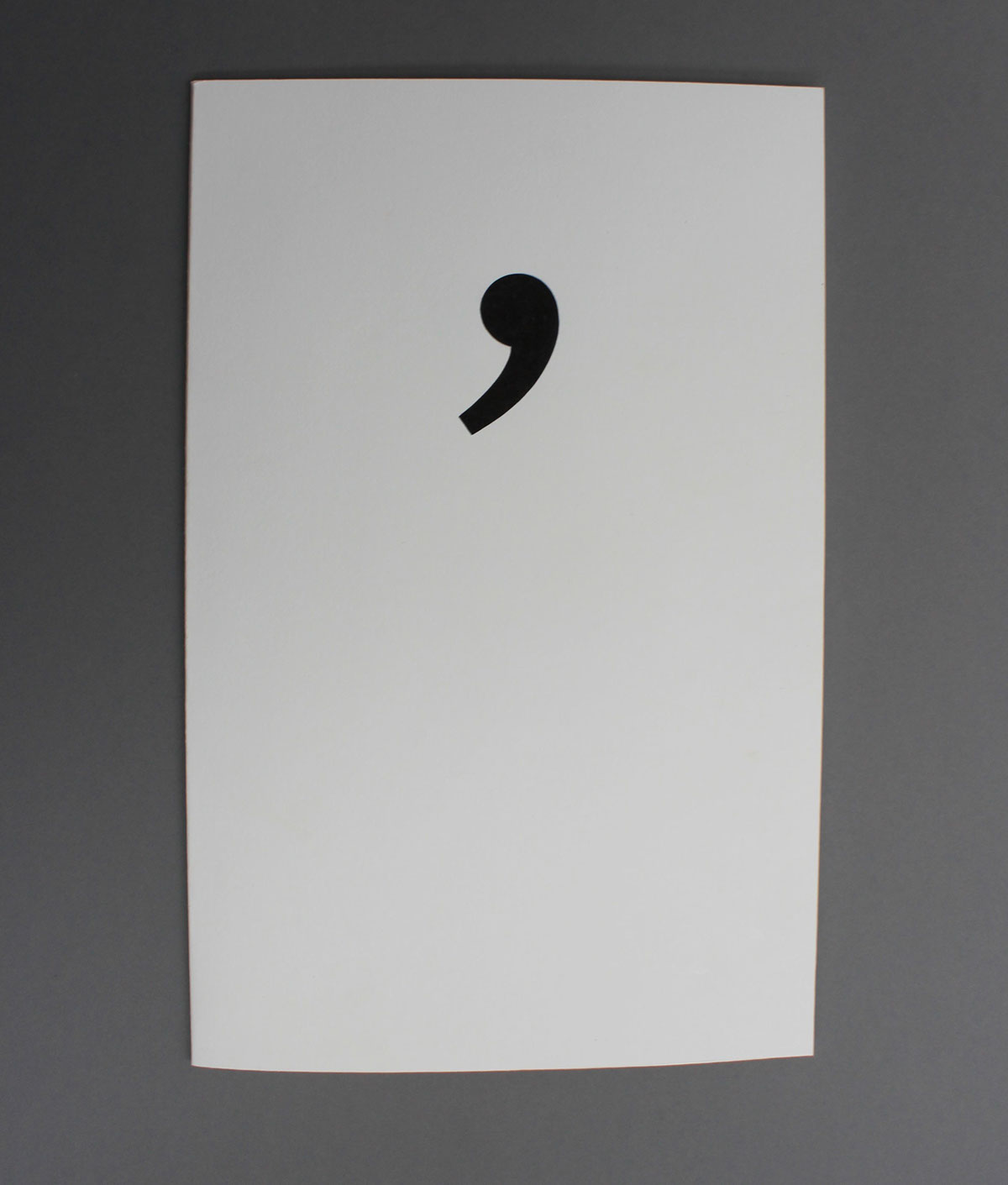
Inside, the punctuation theme continues. Brackets that are usually used to indicate additional information are used here to represent side dishes. The comma that is used to indicate pauses is used to represent pauses for drinks.


The menu itself is based on sentence structure. The starters are named after the beginnings of sentences, main courses after main bodies and deserts after the conclusions of sentences. The idea being when you order all three courses, you create a complete sentence.
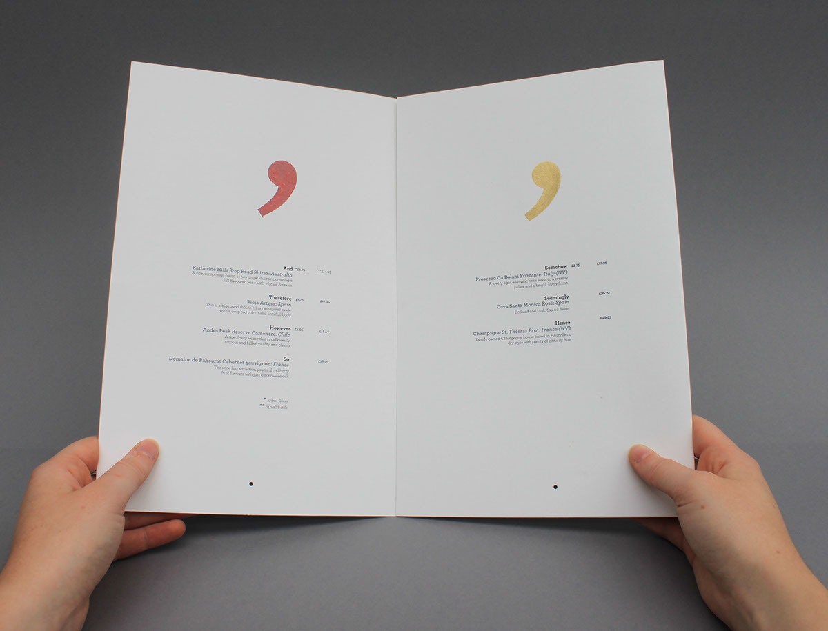
The wine list uses colour coded commas for the appropriate wines. For example, burgundy for red wine, gold for champagne etc.


Stationery (clockwise): Letterhead, Waiter's Order Sheet, Comment Slip, Customer Business Card, Bill Sleeve,
Client Business Card.
Client Business Card.


The bill slip contains the restaurant name and section to note drinks orders. This is presented in a sleeve with a large full stop on the front to indicate the end of the meal.

To bring the theme to life, speech marks will be placed above seating in the restaurant to indicate
people conversing. The ampersand indicates additions, and here represents condiments.
people conversing. The ampersand indicates additions, and here represents condiments.


