Visual Identity
Introduction
Hi! I’m Christian Timothy Daamo, a logo designer who empowers brands by creating responsive logos to elevate their brand presence. As a designer, I assist my clients in reaching their goals and aim to fulfill their visions to the best of my abilities.
For graphic designers to stand out from the competition, I believe it is vital for us to establish our personal brand. This enables us to showcase our personality as a designer, have a clearer image of whom we cater to, and present ourselves better to our target market. Thus, I have decided to produce my own visual identity.

Logo
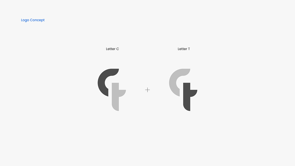
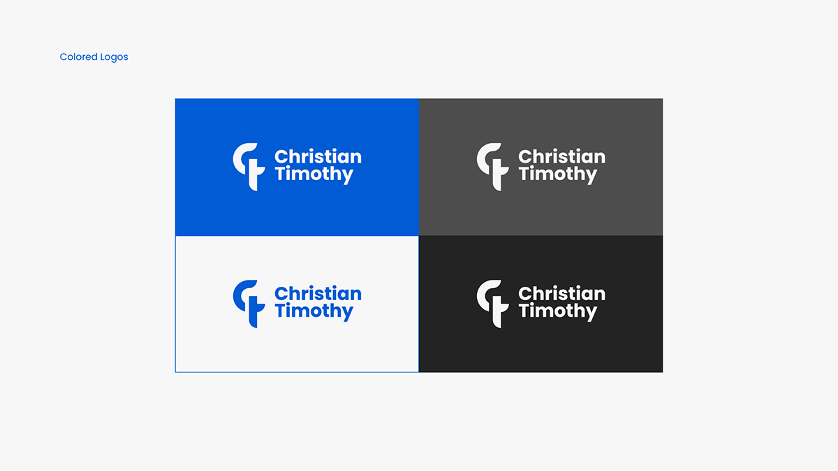
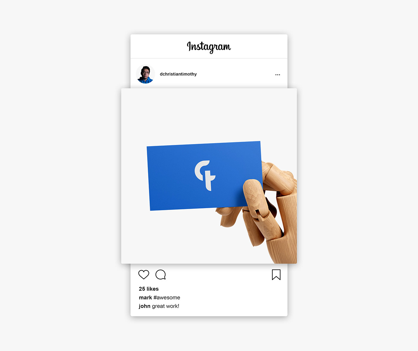
The logo that I have designed consists of the letters C and T. These stand for my first name, Christian Timothy. To come up with this logo, I used basic shapes such as circles and rectangles for it to have a geometric look.
Since I wanted the logo to have a professional and robust appearance, I retained the sharp edges of the shapes and made the lines thick to reinforce this feeling. Throughout my designing experience, I have noticed that I resonate more with minimalistic designs, thus my personal logo was developed with minimalism in mind.


Colors
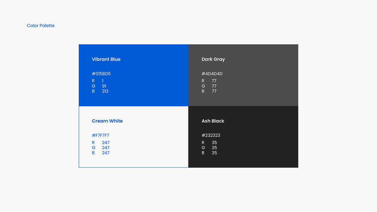
The dominant color for my brand is a vibrant shade of blue. I chose this color because I wanted my brand to be perceived as a trustworthy brand that my clients can rely on for the problems that they face.
On the other hand, the vibrancy of the color represents my passion as a graphic designer, full of energy and enthusiasm.


Thanks for watching!
Need a logo?
Contact me here on Behance or through my e-mail:
d.christiantimothy@gmail.com
LinkedIn