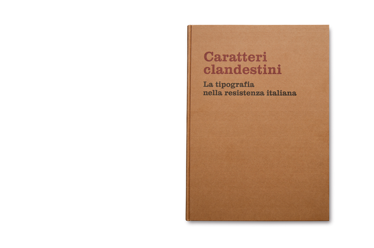


Partendo dalla convinzione che la grafica possa essere considerata solo in funzione del proprio tempo, ho deciso di dare un taglio storico alla mia tesi di laurea, dal titolo Caratteri clandestini. La tipografia nella resistenza italiana.
L’idea centrale era quella di evidenziare la figura del grafico come mestiere artigianale, contrapponendola alla visione artistica che spesso la contraddistingue nella nostra epoca, dove il concetto di creatività viene interpretato in maniera ambigua.
Ho scelto quindi di approfondire lo studio delle tipografie che funzionarono in Italia durante la resistenza.
A causa delle condizioni in cui si trovarono a operare, i tipografi clandestini sperimentarono tutti gli aspetti propri del mestiere in maniera esponenziale. La velocità di produzione doveva essere costantemente la maggiore possibile, perché ciò che si rischiava non era la perdita di un cliente, ma della vita. Inoltre non erano concessi errori: un refuso stampato a Bologna su dei documenti falsi in lingua tedesca, costò la vita a molti antifascisti.
Le scelte grafiche erano dettate non da filosofie né da vezzi, ma da esigenze che potevano significare la sopravvivenza stessa delle persone, il che colloca quest’esperienza in maniera particolare rispetto alla storia della tipografia convenzionale. Da qui il titolo, a indicare che la scelta dei caratteri era dettata dal fatto che questi non dovessero essere rintracciati dai nazi-fascisti.
Metodologicamente, dopo aver optato per un criterio geografico, ho approfondito parallelamente la storia della resistenza italiana e la storia della tipografia di quegli anni, arrivando alla conclusione che, almeno a livello nazionale, le questioni riguardanti gli stampati clandestini difficilmente sono state analizzate in maniera esaustiva, e che la prospettiva ‘grafica’ rispetto a quella storica non è mai stata presa in considerazione.
Mi sono poi dedicato alla lettura delle pubblicazioni scritte in merito a livello locale, intervistando contestualmente le persone che di quel periodo storico furono protagoniste.
Infine, per quel che riguarda le fonti, d'obbligo è stata la visita agli archivi ospitanti le migliori raccolte di stampati della Resistenza, e di quelli strettamente correlati alle ricerche locali che stavo svolgendo.
Per una limitazione prettamente temporale, ho scelto di concentrarmi su due tipografie clandestine operanti a Lerici e Forlì, soffermandomi puntualmente sulle storie delle persone che ne permisero l'attività.
Tuttavia, ho deciso di inserire anche tre capitoli iconografici, sia per spronare la prosecuzione della mia ricerca, sia perché questo materiale non è mai stato pubblicato; inoltre ritengo interessante poter avere un impatto visivo con delle scelte tipografiche così simili sotto alcuni punti di vista e così diverse sotto altri.
Ho riconosciuto un volantino stampato a Lerici e conservato a Roma solo perché ne avevo riconosciuto il carattere da altre pubblicazioni (ritrovando così un importante documento creduto perso) e ho potuto confermare che uno stampato proveniva da Forlì piuttosto che Conselice grazie alla sola comparazione della lettera ‘a’: da questi presupposti sono giunto alla conclusione che lo studio della storia della grafica debba essere un prezioso strumento per gli storici, così come lo studio della storia dovrebbe essere un requisito di base per qualunque grafico.
The main idea behind the thesis is to draw attention to the role of the graphic designer as an artisan, in opposition to the artistic vision that often distinguishes it in our time, where the concept of creativity is interpreted ambiguously.
I therefore choose to deepen the study of printing presses that worked against the nazifascist occupation during the Italian Resistance.
Because of the conditions in which they operated, clandestine typographers experienced all aspects of the craft exponentially. The production speed must have been the highest possible, because what they risked was not the loss of a customer, but of their own life. Moreover, mistakes were not an option: a typographical error printed in Bologna on forged documents written in German costed the lives of many antifascists.
The graphic choices were made not dictated by philosophies or habits, but by taking in consideration needs that could mean the survival of people. All this sets apart this experience from the conventional history of typography. Hence comes the title, to suggest that the choice of typefaces was dictated by the fact that it shouldn’t have been possible to track them down by the nazifascists.
Methodologically, after having opted for a geographical criterion, I studied in parallel the history of the italian Resistance and the history of typography during those years, reaching to the conclusion that, at least nationally, questions about clandestine prints have not been analyzed comprehensively, and that the “graphic” point of view was never considered. Then I have read publications about the topic (always written by local authors), and I interviewed people that had a leading role during that period. Finally, I visited archives that host the best collections of stamps of the Resistance, and archives closely related to the local research I was conducting.
I focused on two clandestine printing presses, active in the small cities of Lerici and Forlì, polarising on the stories of the people who allowed these activities. I decided to insert three chapters focused on iconography in order to encourage the continuation of my work and also because these materials have never been published before. Moreover I think the visual comparison of typographical choices so similar in many aspects, and so different in others, is really interesting.
I recognized a leaflet printed in Lerici and conserved in Rome only because i have recognized the typeface from other publications (thus locating such an important document believed lost). I have also been able to confirm that a print came from Forlì and not Conselice (another clandestine printing press) only through the comparison of the letter “a”. From these assumptions I came to the conclusion that the study of the history of graphic design is a valuable tool for historians, and that the study of history should be a basic requirement for any graphic designer.
Le projet pour le mémoire de licence en design industriel consiste dans une recherche sur le sujet du matériel clandestin imprimé pendant la résistance italienne. Cette recherche a été développée à travers de trois fils rouges: les entretiens aux protagonistes et aux expertes de la résistance, la lecture des publications spécifiques et l’analyse des sources primaires auprès des archives, des fondations et des institutes concernés.
Suite à l’examen du contexte historique et graphique dans le quel le phénomène s’est développé, je me suis concentré sur les designers graphiques professionnels, italiens et européens, qui ont pris part activement à la résistance, en mettant à profit ses propres compétences. D’ailleurs, j’ai approfondis l’histoire de deux typographies clandestines, opérant à Lerici (Ligurie, Italie) et Forlí (Emilie-Romagne, Italie), en menant des recherches sur le terrain.
Enfin, j’ai conclu ma recherche en développant des chapitres entièrement iconographiques qui montrent le matériel imprimé dans les villes de Rome, Turin et Milan (Italie), tout en soulignant les différences et les analogies.
Au bout de cette recherche je suis arrivé à deux conclusions: la première c’est que la prérogative fondamentale qui déterminait les choix graphiques à l’epoque était celle de la clandestinité, dès lors que les caractères étaient choisis sur la base de l’impossibilité d’être reconnus par les nazi-fascistes.
D’ailleurs j’ai pu vérifier le fait que la typographie peut et doit être une clé de lecture e d’interprétation fondamentale dans l’approche aux études de caractère historique, ainsi que, de l’autre côté, la recherche historique doit être un instrument fondamental dans la formation d’un designer graphique.

