For this past year, one of my creative goals was to get more confident in design. I noticed myself avoiding design work because I felt I wasn't strong enough in it, and I didn't like how that became my default mindset. So I set out on a quest!
I found and took a few courses online. One of which, and the main driver behind these posters, was Julian Montague's Minimalist Graphic Design course. It was a great place to get back to the basics. Plus minimalist design can get real fun, so I was excited to dive in.
The Challenge:
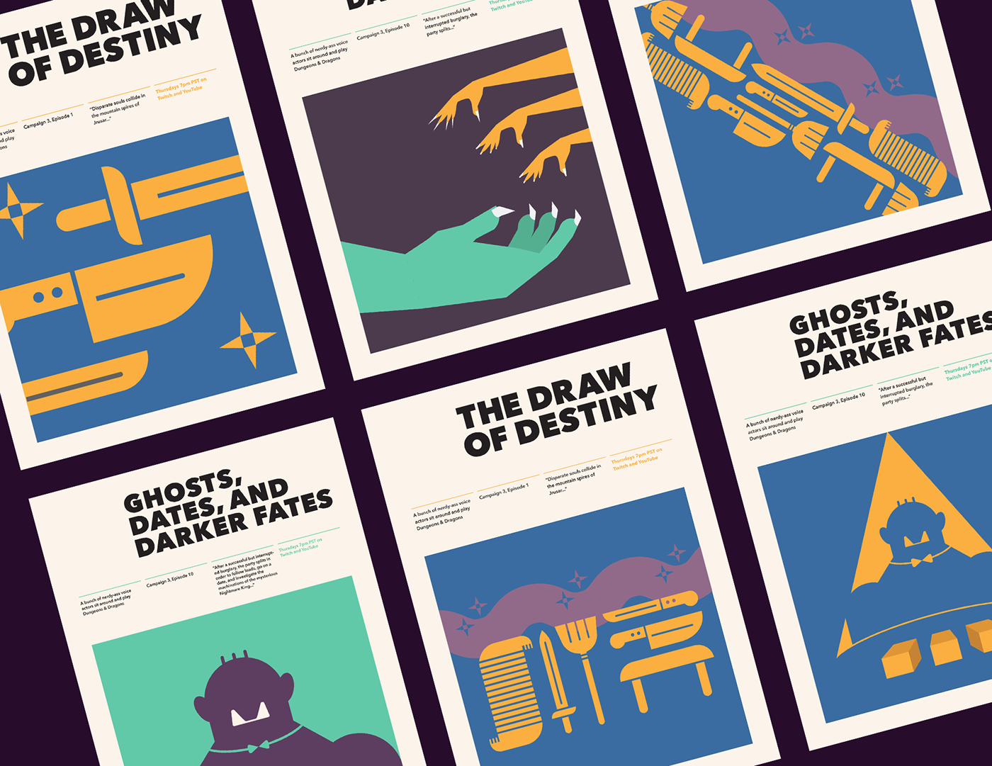
Make a series of 3 posters that had to both work individually, as well as part of a series.
The Goals:
1. Build trust in myself again, and follow the paths where I'm having the most fun.
2. Work with a grid. I haven't worked with many, and figured I should be more comfortable with them.
3. Let the important information be the hero. I tend to try to put too much into a design thinking that's what makes it strong, so learning to pare back would be a good exercise in critical decision making.


Where to Begin?
I started by gathering *a lot* of references of minimalist posters, taking note on what grabbed me for each one. Developing a critical eye is also important in understanding what works and what doesn't in design. I needed to practice that skillset more and stop resting on the noncommittal mindset of "I love this" or "this is bad".
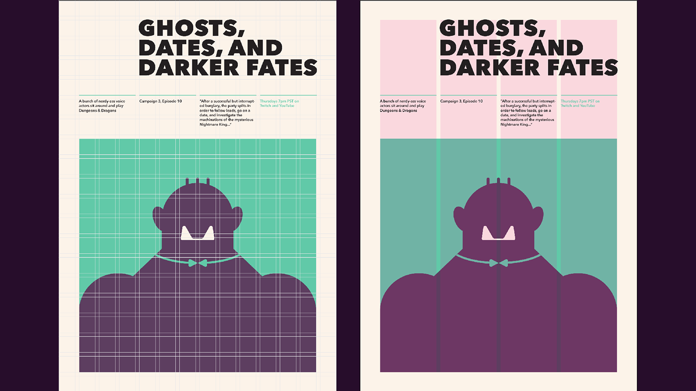
I found a layout I really liked, and decided the unifying factor between the 3 posters would be the layout design. The 4 column set up for the What the Butler Saw poster would make an interesting way to reveal information about the show and the episodes, but would force me to keep the info short and sweet so the illustration had room to shine. I also liked that it allowed a hero illustration to shine in a dedicated space (I love rules).

Getting On The Grid
The next step was finding the right grid, which if I'm being completely honest, I changed throughout the whole process. I felt the column worked better to keep the information legible and organized, and then stretched the grid to fit. From there I outlined the box where I would put the illustration, and used both sets of guides to make the other 2 posters.
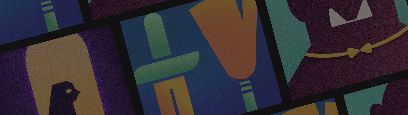
For the illustrations, I didn't stick to any grid. I just had fun playing around with the color palette and big bold vector shapes.
Vector to Texture
When I finished the vector illustration and stared at all the posters together, I couldn't help but think something was missing. I pulled the designs into procreate and messed around with some gritty texturing and shading to make them stand out more. Even though I was going for minimalism, this added character to the illustrations that were falling flat.


Alt Designs
Here were some of the "failed attempts". Some of these worked well alone, but not together. Some of these I just couldn't get right no matter how many pixels I adjusted. But through all these iterations (many more not shown) I was able to confidently say the ones that made it on the posters were the best of the bunch.
Applying what I learned to my client work
Through this process I learned how to be confident playing with design, and how to get the bad ideas out. I was so obsessed with only executing my best ideas, that I tricked myself into being afraid of executing anything at all. It was super important for me to learn how to be okay with creating designs that don't look right. It's all part of the process, bb.
Rules can help get you started, but don't stick to them if they become crippling. It was a funny accident that after taking this course, where I forced myself to stick to a grid, that I stumbled on David Carson's Masterclass where he basically tells you to throw that grid away. You should be intentional with your placement. This helped me step away from my idea of there being a "right way" to design something, and to learn to be loose and have fun (I still love rules, though. Some people never change).
And most importantly, reach out and ask a friend! My friend and I started meeting every Tuesday to talk about what we worked on that week design-wise. The sessions weren't long, and it was super casual. I was able to get feedback from him (an amazing designer), and he was able to get feedback from me on his projects. It was a great system and taught me how to give feedback as well as how to make my work better.
Thank you for following along my design journey!