Create a language instead of a logo.
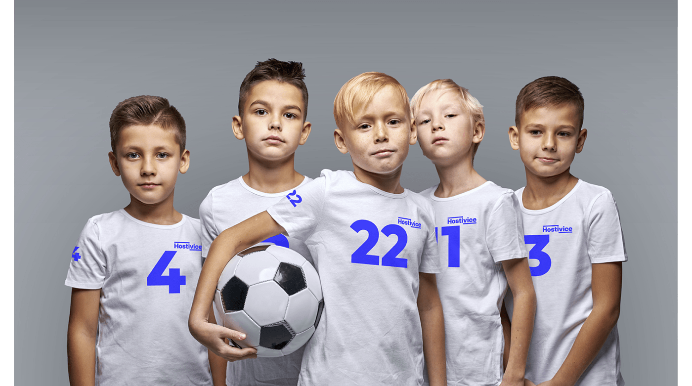
Hostivice is a typical Prague satellite characterized by rapid development of housing construction. Each village is made up of a community, a community of people connected by place. The aim of our design was to give the people of Hostivice, both old-timers and newcomers, a common language. A key to naming local events, actions and things shared together, connected to the life of the community. To help them build their own identity.

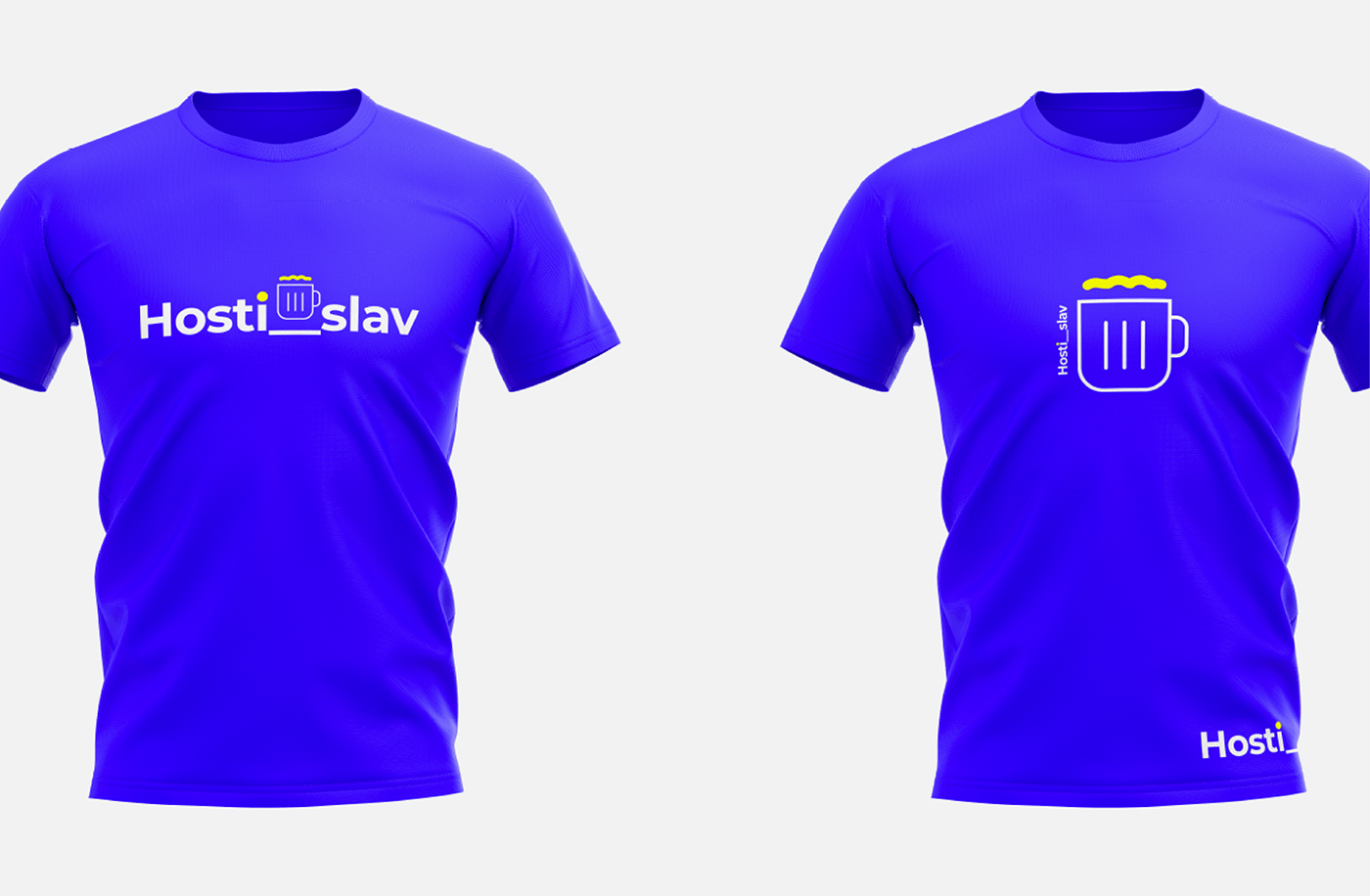
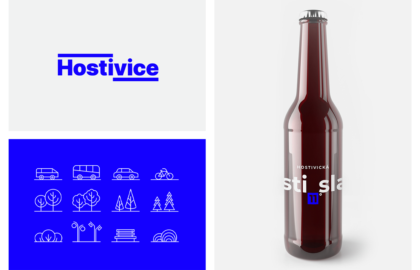
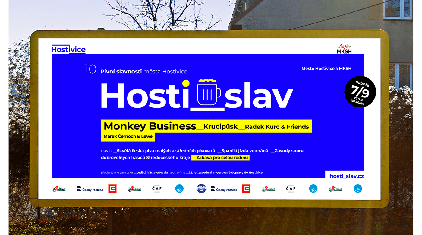
The real treasure of Hostivice is the name of the village itself. Hosti_vice can be translated as guest_more. The first thing that comes to mind is that it's a hospitable place. Everyone would like to live here! Based on this play on words, ideas suddenly start to hatch. How about integrating the name of the village into all local activities.The Hostivice beer festival could be called Hosti_slav (guest_fest), the local pub could be (quite unconventionally) Hosti_nec (pub in czech), the computer club at the local school could be called Hosti_ng and the local patriots' association could be called Hosti_mil (Hostivice_lover).
A new language begins to form around the root word.


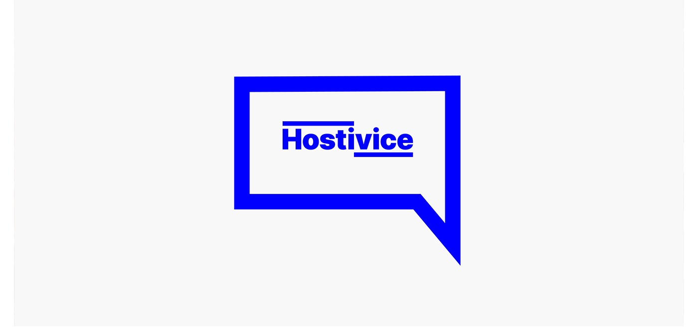
The application of the brand is as straightforward as the whole concept. The logo is only one part of the entire visual identity, which is based on distinctive typography and the principle of content frames.
The visual identity is designed in such a way that even a graphic "non-professional" can work with the concept. It is a solution for a small town, for a limited budget. One font in two weights, underline, frame and colour contrast. That's it.