
Client >
Reda
Reda
Date >
01/2020
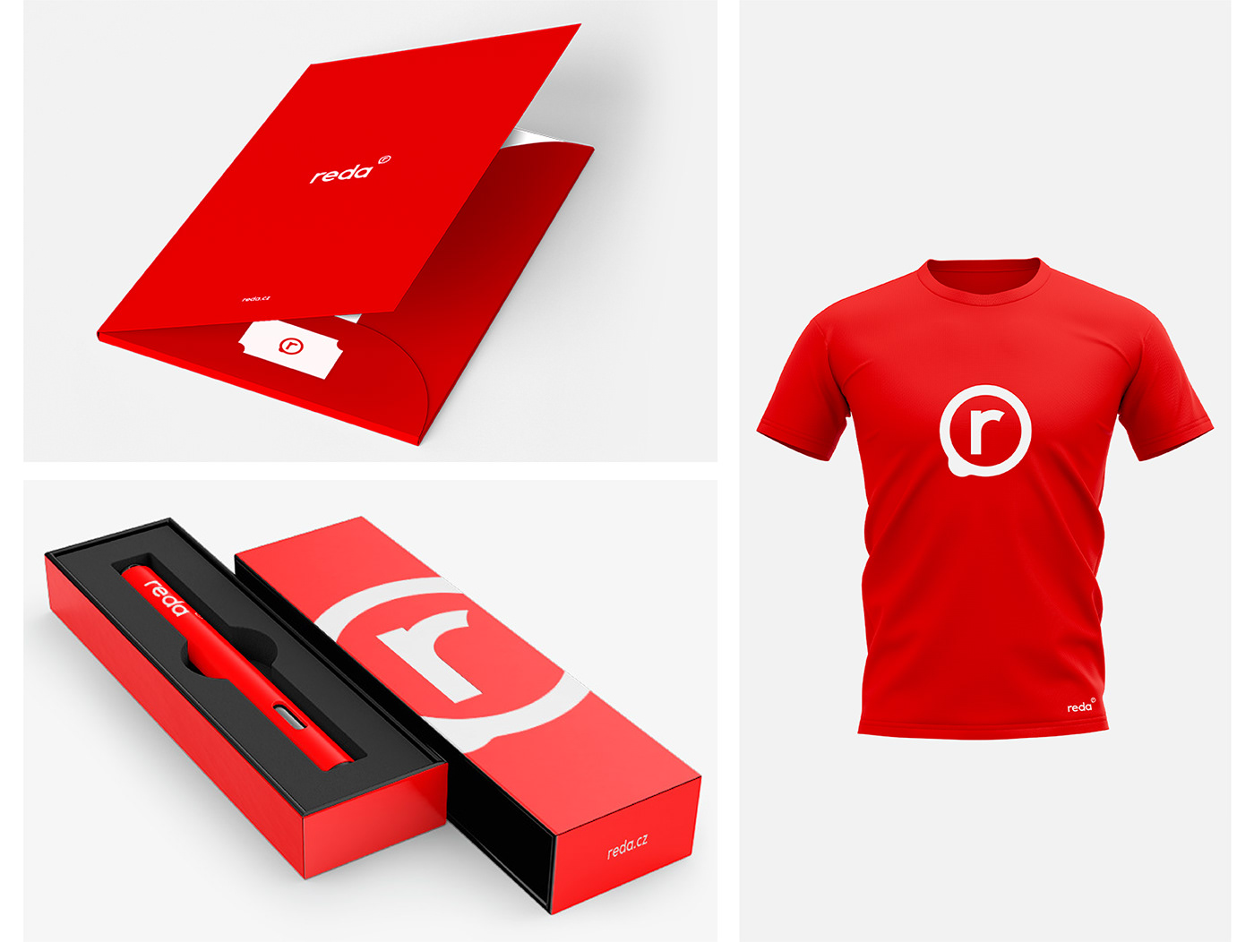
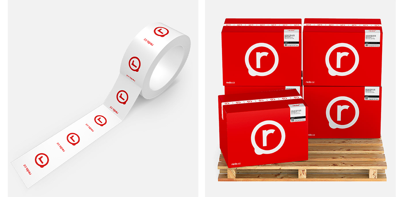
The key to the new REDA brand identity was application variability. The role of the brand in this case is not "only" to represent the company, but also to demonstrate the company's know-how directly. REDA is the largest retailer of promotional items in the Czech republic and the goal of the new logo is to demonstrate the possibilities of printing on various objects and surfaces. We were looking for a clear and straightforward solution that would work well when branding pencils, bottles, bags, t–shirts, lighters, caps, knives, tents etc. The brand is reproducible via any print technology, on any surface. The brand acts as a symbol of branding, and part of the marketing.
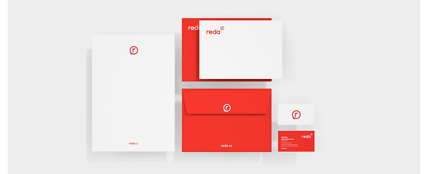
The goal was to design a brand that is easy and variable to apply, just like a sticker. The shape of the sticker was, after all, the initial reference for the construction of the symbol. The brand consists of the REDA logo, and the "r" symbol – this of course represents the name of the company, but is also associated with the ® trademark.

