The San Diego Padres have suffered from identity schizophrenia for decades. Since the team was founded in 1969, it has used six different logos and four different sets of team colors.
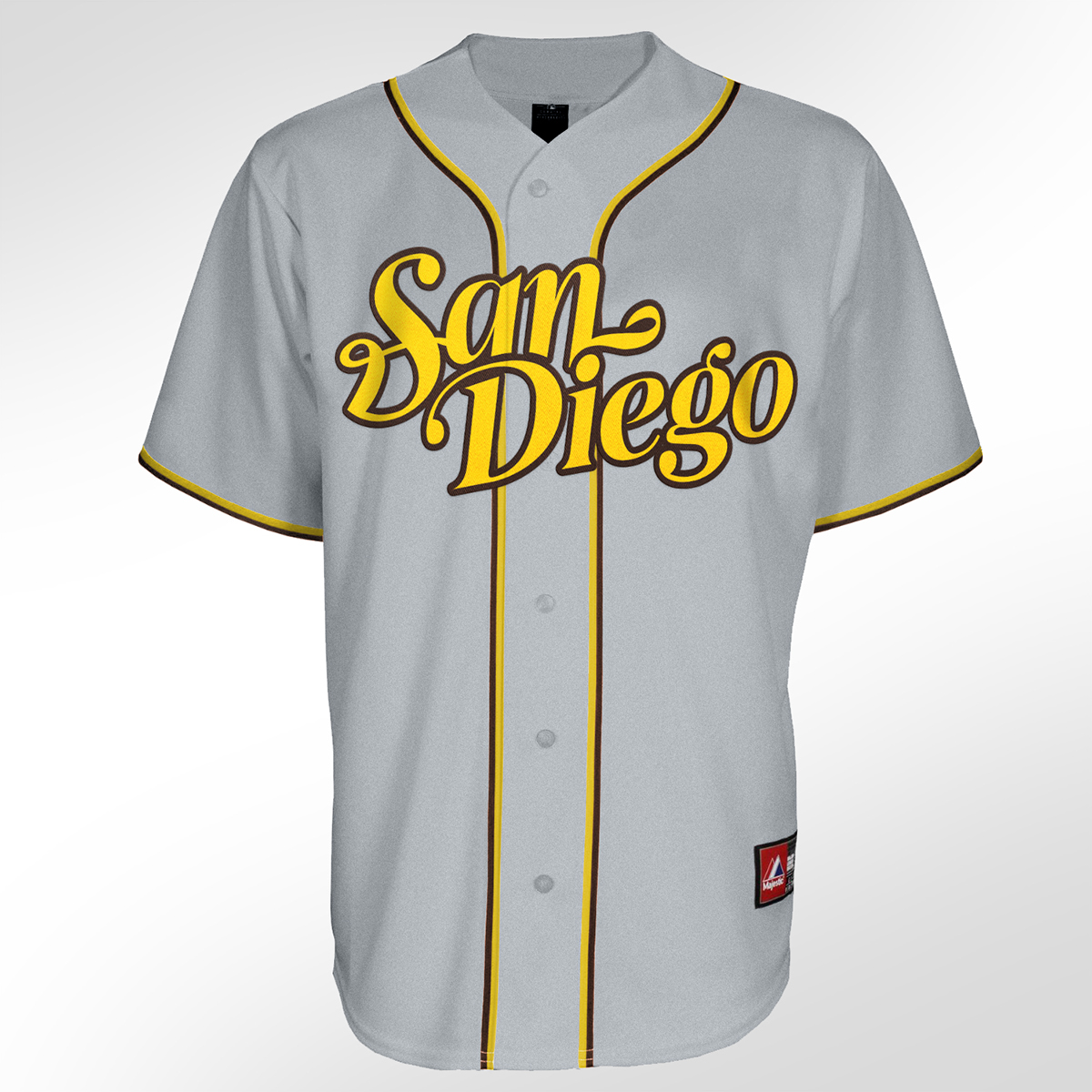
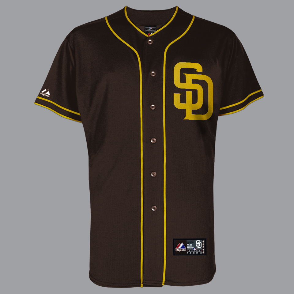
While the Padres current navy and white uniforms are modern and professional, they lack personality and flavor – and they certainly don't say anything unique about San Diego. And although the team’s throwback brown and mustard uniforms are unquestionably fan favorites, they don’t command respect or exude professionalism – even pushing the edge of gimmickry.
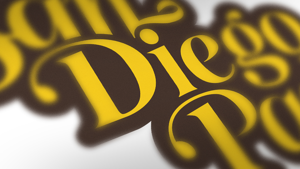
The new identity gently nudges the throwback mustard of yesteryear toward a brighter, more vivid yellow. Paired with dark brown, the colors bring contrast, energy, and heritage to the team. Elegant, re-imagined uniform script and a bold “Los Padres” wordmark speaks to local Spanish heritage and the gives a nod to the team’s large, enthusiastic Hispanic fan base on both sides of the US-Mexico border.