PT Fundada em 2012, a Memed tornou-se referência dentro de uma categoria emergente: é a marca de prescrições médicas digitas mais usada entre médicos no Brasil, com mais de 4 milhões de prescrições emitidas por mês, impactando atualmente 22+ milhões de pacientes por ano. O rebrand da Memed define as diretrizes de expansão do seu modelo de negócios para além da área médica. Mais do que apenas facilitar o acesso à prescrição digital perfeita, a Memed aplica a tecnologia para aproximar a relação entre médicos e pacientes, entre profissionais da saúde e soluções digitais, e entre pessoas e saúde.
EN Founded in 2012, Memed has become a reference within an emerging category: it is the most used digital prescription brand among physicians in Brazil, with over 4 MM prescriptions issued per month, impacting over 22 MM patients every year. The rebrand defines the guidelines for expanding its business model beyond the medical area. More than just facilitating access to the perfect digital prescription, Memed applies technology to bring the relationships closer between doctors and patients, between health professionals and digital solutions, and between people and health.


PT
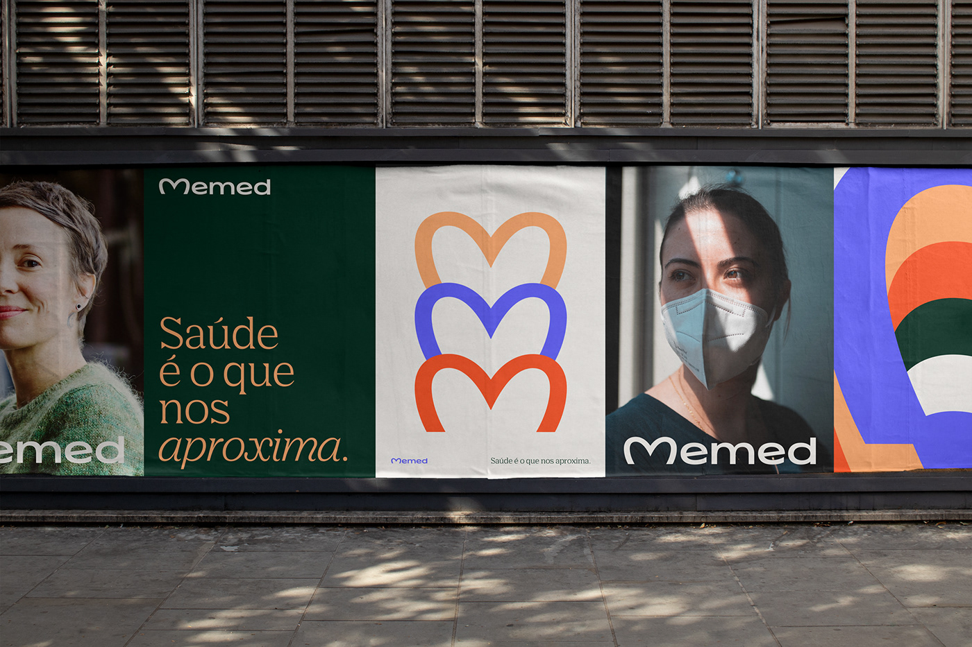
O novo logotipo foi construído com base no equilíbrio de dois pilares: cuidado e tecnologia. O monograma ‘M’, inspirado no coração, reflete no logotipo o aspecto cuidador da atuação da Memed na área da saúde. A tipografia clara e precisa reforça a sua inteligência tecnológica, e a sua nova proporção estendida incomum reforça a exclusividade no setor das healthtechs.
Estes pilares estão representados também em todas as escolhas da linguagem visual — uma nova paleta de cores a partir do novo azul Memed, uma nova tipografia de títulos que é amigável mas extremamente precisa e uma direção fotográfica humana, acolhedora e autêntica.
EN
The new logo balances two main pillars: care and tech. The heart-alluding ‘M’ monogram reflects the caring aspect of the brand's role in Health The sharp typography reinforces its technological intelligence, and its unique extended proportions reinforce exclusivity in the healthtech sector.
These pillars are also represented in all of the visual identity system choices — a new color palette based on the new Memed blue, a new display typeface that is friendly but sharp and a human, warm and authentic photographic direction.