

Website: Old Oakland Farmer’s Market
User Experience Design
Introduction: This project concept was completed for the 2013 Faculty Development Week course, UX and IxD Intensive, taught by David Hogue. It represents the collaborative efforts of four instructors who teach visual media design and mobile programming classes.
Business Goals: The primary objective of the Old Oakland Farmers’ Market (OOFM) is to draw in new customers and more repeat visits from current customers.
User Goals: Theoretically, the OOFM hired independent researchers to survey and interview current customers as well as attendees of other local, popular farmer’s markets. The primary needs of the customers were identified as follows: Which vendors will be present? What products will be available? What is new and in-season this week? Additional top requests were for: vendor location map, featured vendors, entertainment, recipes, and social features, including vendor reviews and the ability to share recipes and photos.
UX Team Process: Our team identified several personas based on our client’s user research as well as our collective experience and knowledge. We chose one persona, Adam the Office Worker, to work with for the duration of the class. We created a user scenario for Adam, identifying two key tasks, then mapped out a flow diagram. I created the accompanying artifacts.
Wireframes were built for the desktop version of the site, then transformed into a interactive prototype. Tapping into our team’s expertise, we choose Adobe InDesign as our prototyping tool, taking advantage of its master pages, styles and interactive PDF features. I built the wireframes with another instructor.
Finally, we elected someone from another team to test our prototype. I led the test, asking him to put on his “Adam” hat, imagining that he is sitting at his office desk and thinking about getting lunch at the farmer’s market. I gave him two tasks to accomplish, one at a time: 1) Find something interesting to eat (What products will be available/What’s new and in-season?), then 2) Find out who’s performing at lunchtime (entertainment). The tester explained his thought process out loud.
Results: Our prototype tester successfully completed both tasks, feeling satisfied that he got the information he wanted in a timely manner, although he did not follow the flow that we expected. As a result, we learned that the hierarchy and navigation worked well, but that we needed to add more detailed content and clear language in specific areas.
From a business perspective, our project was successful in meeting one of the primary goals, to encourage repeat visits from existing customers, as follows: Adam is an archetypal returning customer whose needs were met efficiently and effectively. As a result of this positive, easy experience with the new website and brand, he is likely to repeat his trips to the market more often, and will likely spread the word among his co-workers.

Wireframe created by Deanna Alcorn and Patricia Chytrowski.
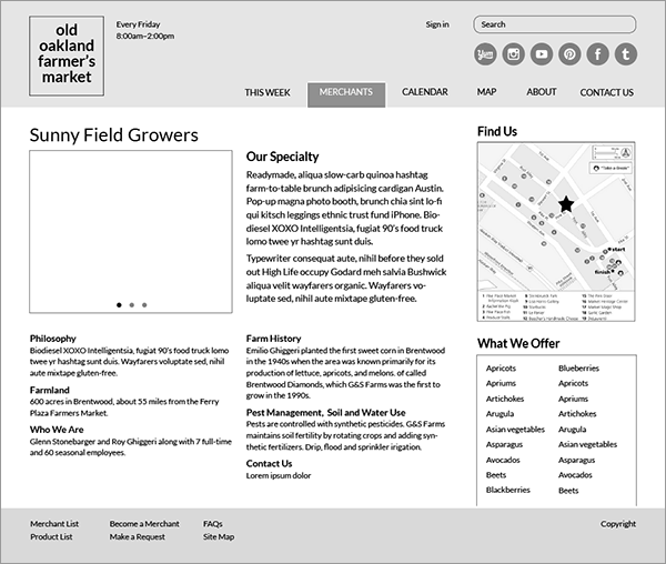
Wireframe created by Deanna Alcorn and Patricia Chytrowski.

Site map, conceptualized by the team and executed by Deanna Alcorn.

Persona and user scenario invented by the team, then edited by Deanna Alcorn.


