

You say notary and you think booooring? Not when it comes to the Kalina Bartecka Notary's Office.
Background
A team of strong and young women has just begun its journey into the law world. All they needed was just a clean visual identity that would match the way this notary office operates.
The owner of the Kalina Bartecka Notary Office approached asked us to create elegant yet strong image for her new office together with a new website.
The owner of the Kalina Bartecka Notary Office approached asked us to create elegant yet strong image for her new office together with a new website.

The process and solution
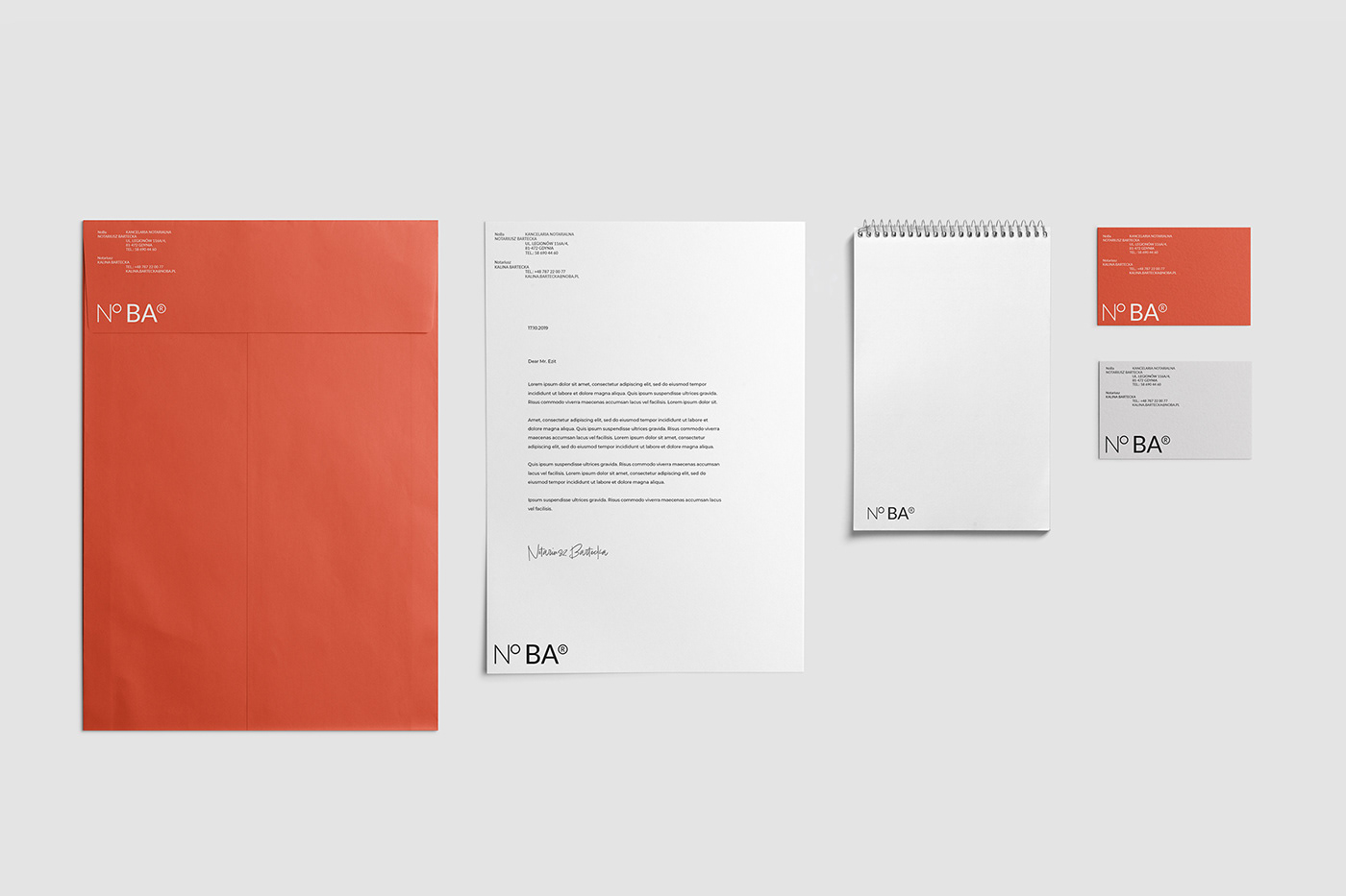
The process began with market research and workshops with the owner. The competitor audit helped to generate insights on how to build the brand and website. The word No BA in Polish means "sure yeah", and is very informal, but on the other hand represents a fresh, young approach in the old, bureaucratic sector.
The logotype is an acronym for the Noratiusz Bartecka (Notar Bartecka) - easy to understand and hard to forget.
The logotype is an acronym for the Noratiusz Bartecka (Notar Bartecka) - easy to understand and hard to forget.


Thank you for watching.
Have project in mind?
Send some details to:
hi@bepluspluser.com
and let's make something be++er, together.
See you on Instagram
And if you like it, don't forget to hit that button:


