


🇬🇧
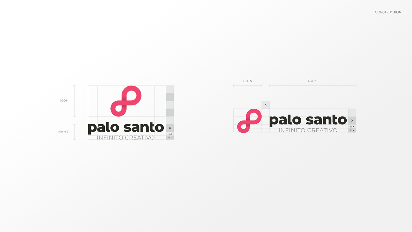
Palo Santo is a creative agency that contacted us to adjust their brand: they wanted the icon to look more like an infinity rather than two rings. For this, I did a thorough analysis of the markup to decide which objects needed to be kept and which ones needed to be changed. One of my proposals was to keep only the logo, since it had enough strength itself, and delete the icon. However, the icon was indefeasible, so I decided to explore different ways of redrawing this symbol, trying to give it strength and, at the same time, reduce the particularities of the rest of the brand. For this, I kept the typography reducing the interventions in them, and opting for a more classic letter "a" that would avoid confusion with the letter "o", improving its legibility.
🇪🇸
Palo Santo es una agencia creativa que nos contactó para ajustar su marca: querían que el ícono se pareciera más a un infinito en vez de dos anillos. Para esto, hice un análisis minucioso de la marca para decidir qué objetos era necesario mantener y cuáles cambiar. Una de mis propuestas era la de mantener solo el logotipo, ya que este tenia fuerza suficiente de marca, y prescindir del ícono. Sin embargo, el ícono era irrenunciable, por lo que decidí explorar diferentes formas de redibujar este símbolo, tratando de darle fuerza y, a su vez, reducir las particularidades del resto de la marca. Para esto, mantuve la tipografía reduciendo las intervenciones en ellas, y optando por una letra "a" más clásica que evitara la confusión con la letra "o", mejorando su legibilidad.


Credits
Logo redesign: Matías Gonzalo
Client: Palo Santo
Agency: Üasabi
Logo redesign: Matías Gonzalo
Client: Palo Santo
Agency: Üasabi


