About FF Bau
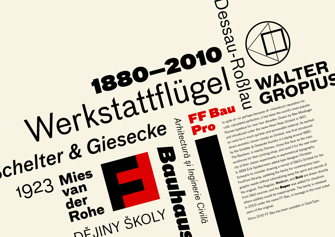
In spite of – or perhaps because of – Helvetica's reputation for cold, calculated perfection, it has been the world's most popular Roman typeface for over four decades. Drawn by Max Medinger and introduced under the name Neue Haas Grotesk in 1957, its roots lie in much quirkier and personable material. Its earliest direct ancestor, known simply as Grotesk, was first introduced by the Schelter & Giesecke foundry in Leipzig around 1880. The Bauhaus, in nearby Dessau, chose this face as the main workhorse for their printing shop, and used it for the vast majority of their classic experiments in asymmetrical typography. In 1999 Erik Spiekermann asked type designer Christian Schwartz to consider drawing a revival of S&G's Grotesk, updating the family for contemporary typographic needs without rationalizing away the spirit and warmth of the original. The Regular, Medium, and Bold are drawn directly from S&G sources, and the Super was added for situations where subtlety would be inappropriate. The family is released in 2002 under the name FF Bau, in homage to the most noted users of the original.
In spite of – or perhaps because of – Helvetica's reputation for cold, calculated perfection, it has been the world's most popular Roman typeface for over four decades. Drawn by Max Medinger and introduced under the name Neue Haas Grotesk in 1957, its roots lie in much quirkier and personable material. Its earliest direct ancestor, known simply as Grotesk, was first introduced by the Schelter & Giesecke foundry in Leipzig around 1880. The Bauhaus, in nearby Dessau, chose this face as the main workhorse for their printing shop, and used it for the vast majority of their classic experiments in asymmetrical typography. In 1999 Erik Spiekermann asked type designer Christian Schwartz to consider drawing a revival of S&G's Grotesk, updating the family for contemporary typographic needs without rationalizing away the spirit and warmth of the original. The Regular, Medium, and Bold are drawn directly from S&G sources, and the Super was added for situations where subtlety would be inappropriate. The family is released in 2002 under the name FF Bau, in homage to the most noted users of the original.