LOGO DESIGN:
I've been designing logos for over 30 years and teaching students how to design logos for 20 of them. I've won two NISOD awards for my instructional methods two times in Illustration, Title Animation, and Graphic Design.
For $200 USD I can design your logo with one (1) round of changes free!
Payment in full before project begins. The bigger your budget, the more changes can be made. Each additional change, no matter how small, costs $50 USD.
Changes are implemented once payment is received.
Your final files are emailed to you in JPG and vector PDF format so that you can provide them to any printer for wherever, and whatever, you want you logo on!
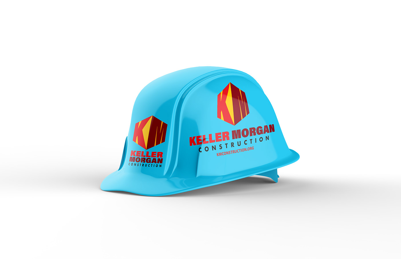
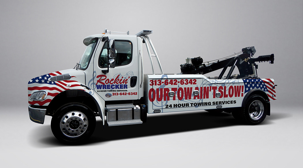
I also do fantasy league logo designs for your team(s) and can do digital mock ups on apparel and helmets similar to what you see below.
I tend to take payment, in full, up front. If that makes you nervous, I understand. It's typical of commissions, though. You can also pay half up front, no refundable, and half when completed.
I accept:
- PayPal/Venmo/CashApp/Square/GPay
- PayPal/Venmo/CashApp/Square/GPay
If you have any questions, please feel free to contact me directly here via Behance so we can discuss details.
Some of these logos were developed with purchased, provided, or created artwork.
If you have any questions, please feel free to email me at info@teddwalley.com
applying some rotations and mirror effects before applying Pantone Solid Coated Colors
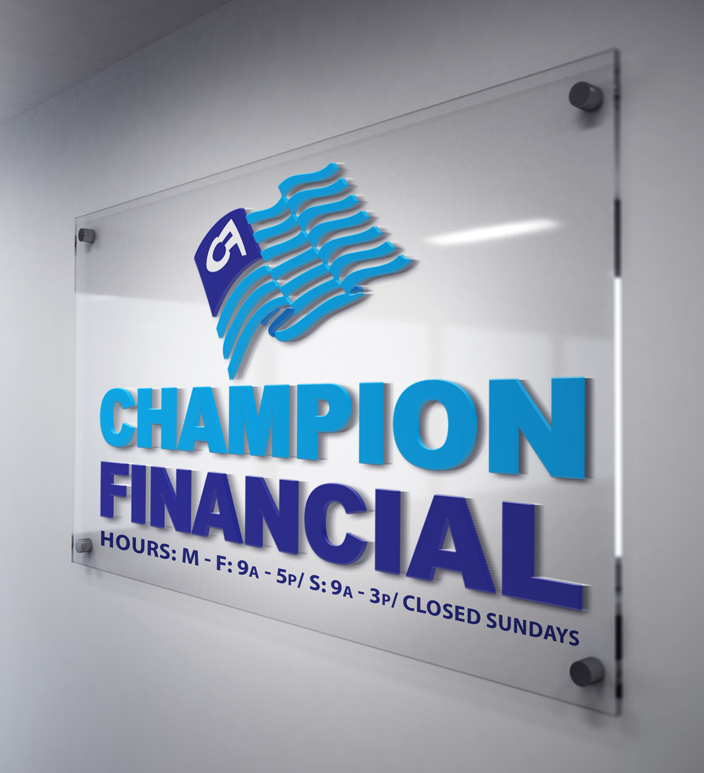
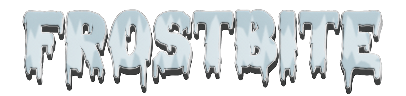
applying some 2D perspective grid and darker colors to indicate a faux light source, then carrying that on to the text below, before applying Pantone Solid Coated Colors
applying some 1pt perspective and exploring some sharper fonts as well as deeper complimentary colors in Pantone Solid Coated Colors
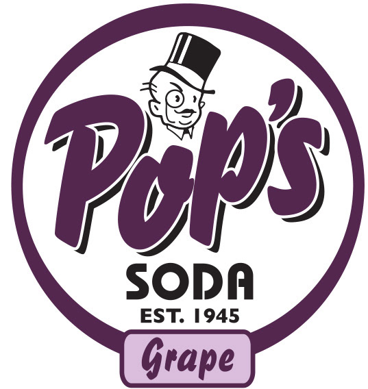
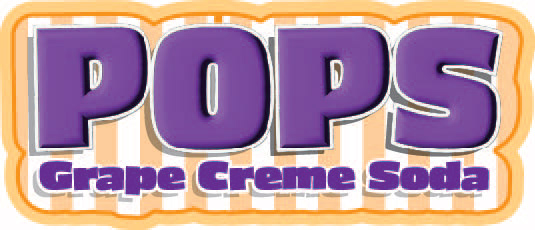
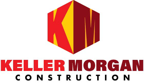
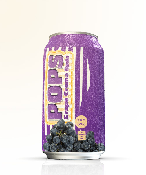
a rebranding of an existing logo I did, adding the peppermint stripes using the Pattern Tool, then masking it, to continue the vintage feel, but modernizing it with some 3D bevels, transparency drop shadows, and a stroke shield effect for background separation. Complimentary colors selected from the Pantone Solid Coated Colors book.

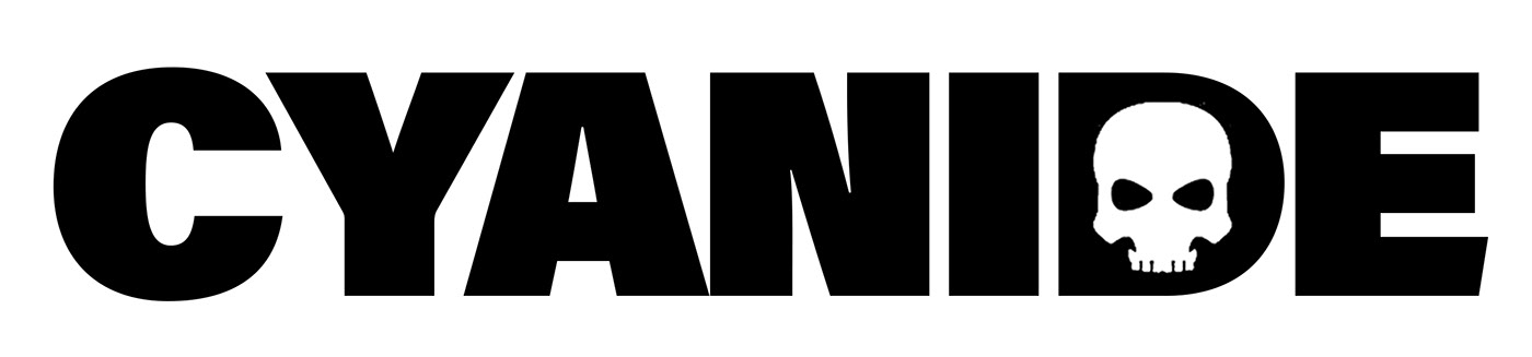
Playing with positive/negative space and pictographs, adding warp effects to a stroke shield, then selecting some complimentary colors from the Pantone Solid Coated Colors

Experimenting with subtle gradients and positive/negative space usage. Kept color palette to reflect common industry standards and used Pantone Solid Coated Colors


Revisiting a VERY old logo I worked on. Changed the color palette to reflect more of the Florida Seminoles color scheme. Applying warps, 3D bevels, and transparent gradient overlays to the text. Revised the image to look less like "Meeko" and more old school hockey with the Image Traced leather helmet, that i further edited with the pen tool and eraser tool to fit his head better, then offsetting him in a shield so that the image could be used independently from the type. Using colors. from Pantone Solid Coated Colors book.
I also do fantasy league logo designs and can do digital mock ups on apparel and helmets similar to what you see below.
I also do fantasy league logo designs and can do digital mock ups on apparel and helmets similar to what you see below.

I'm not one for putting my personal logo designs up, but I was always fond of my first company's layout and typography. I was going for a propaganda poster feel in the layout, imagery, and typography. The name was inspired from an obscure animation film, Twice Upon a Time.
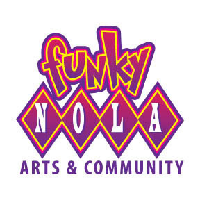
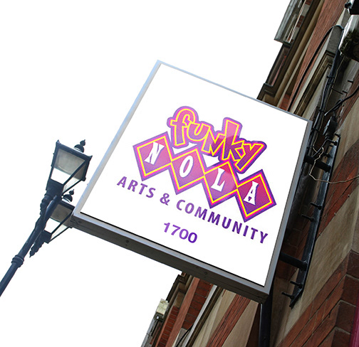
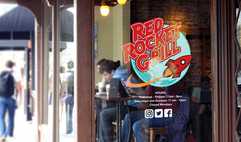
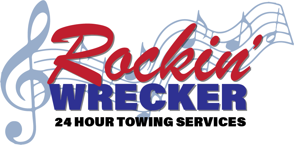
logo design for a recording studio/performance facility in New Orleans. Owner wanted a "retro/80s feel but funky vibe to the logo. Experimented with stroke shields and traditional design elements as shields. Pantone Solid Coated Colors used.
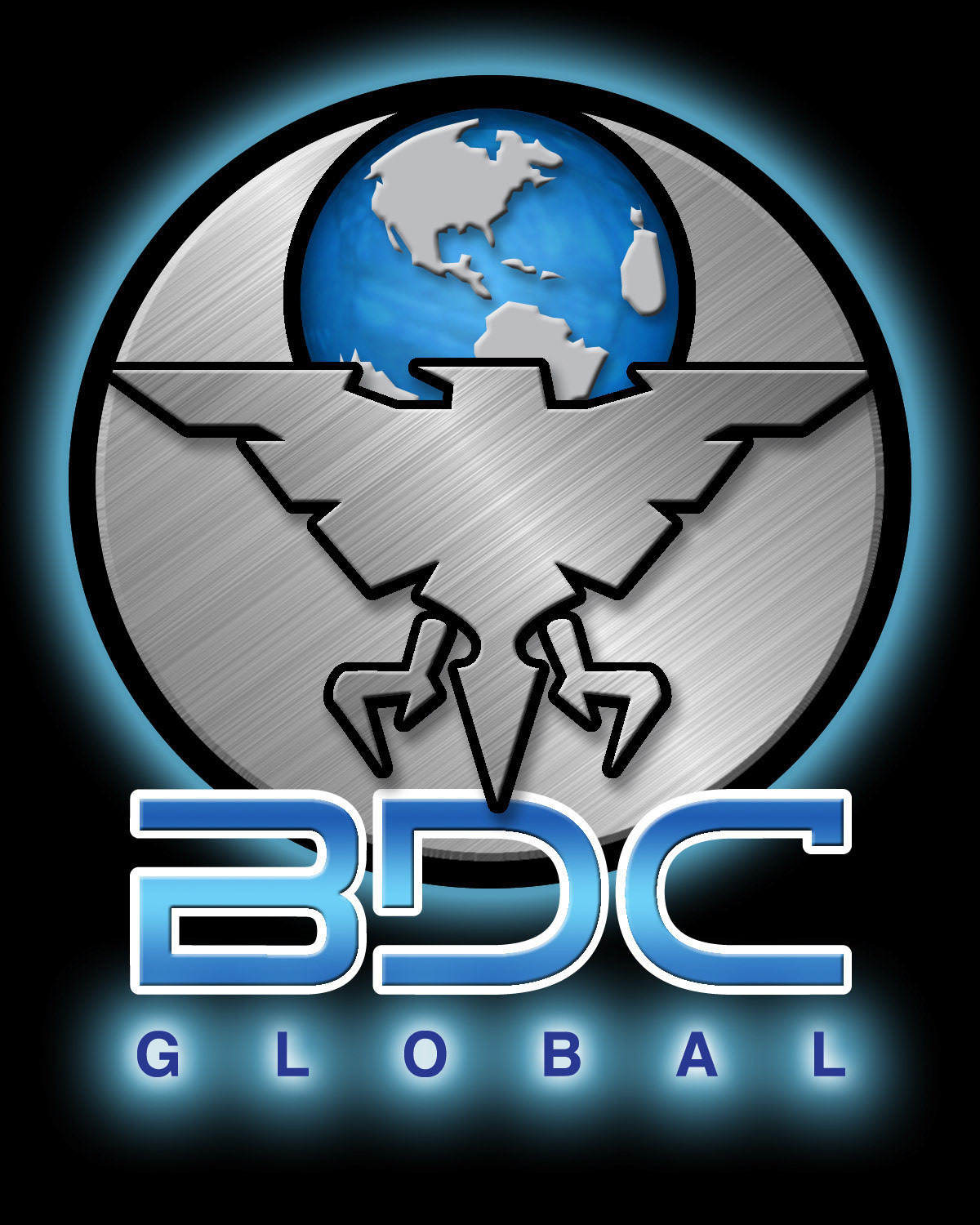
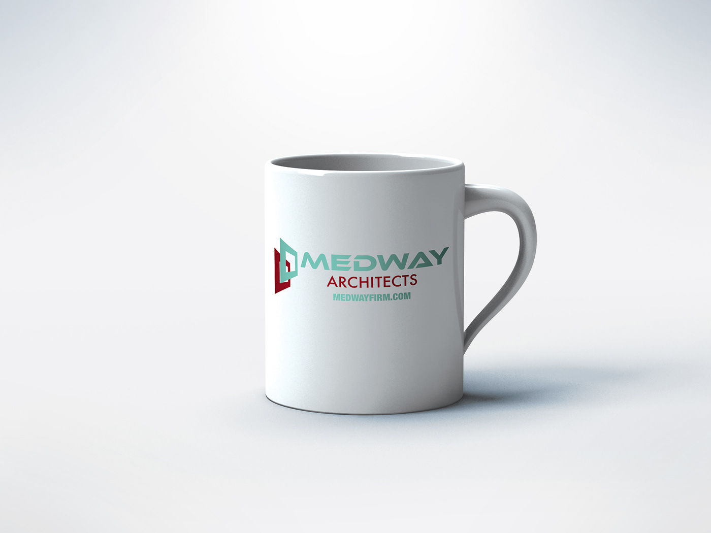
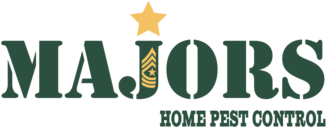
Client wanted a very hard-edge, almost military feel to their firm logo. Utilized as mask with a custom texture, stroke shields, bevels with a soft, corona glow. Pantone Solid Coated Colors used.
High contrast colors, "down home' personality fonts, subtle warp effect with subtle drop shadow. Pantone Solid Coated Colors applied. I think they've since re-designed it. The new design looks great!

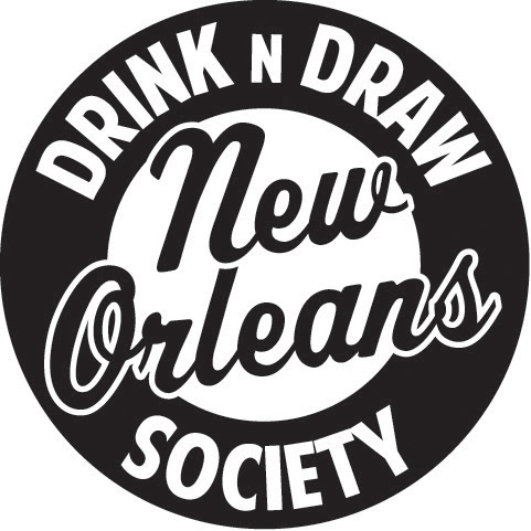
Trying to get a loose, almost undisciplined feel to the logo, while employing a shield and playful font for the subject matter. Kept in black and white for a classic look that also reflected the industry's origins. I believe this group has about 10K members now and is the longest running active groups on the topic on Facebook.
Done specifically in black and white per the client's request. Experimented with both a logographic symbol as well as a type shield so that both could be used either together or independently of one another. Fun Fact: This was the first professional logo i designed as a freelancer out of college.
Client had specific ideas on wanting a logo that featured fins. Pen traced references she provided and used a 'racing' font that I italicized using the the Skew features in Illustrator. Pantone Solid Coated Colors applied.

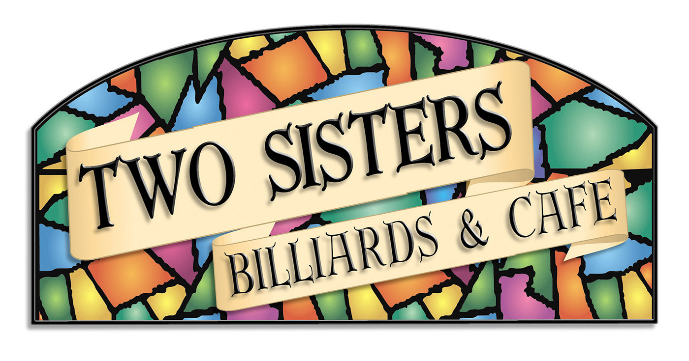
Client was specific of wanting to have an "old tavern feel" to their logo, so we went with scroll shields and Tiffany - style lamps using Pantone Solid Coated Colors and radial gradients. A bevel with a drop shadow was applied to the text to try and push the thin, font choice typeface forward more to the audience.
Experimenting with some positive/negative space usage in the type and shield. Artwork was provided. Pantone Solid Coated Colors applied.
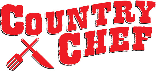
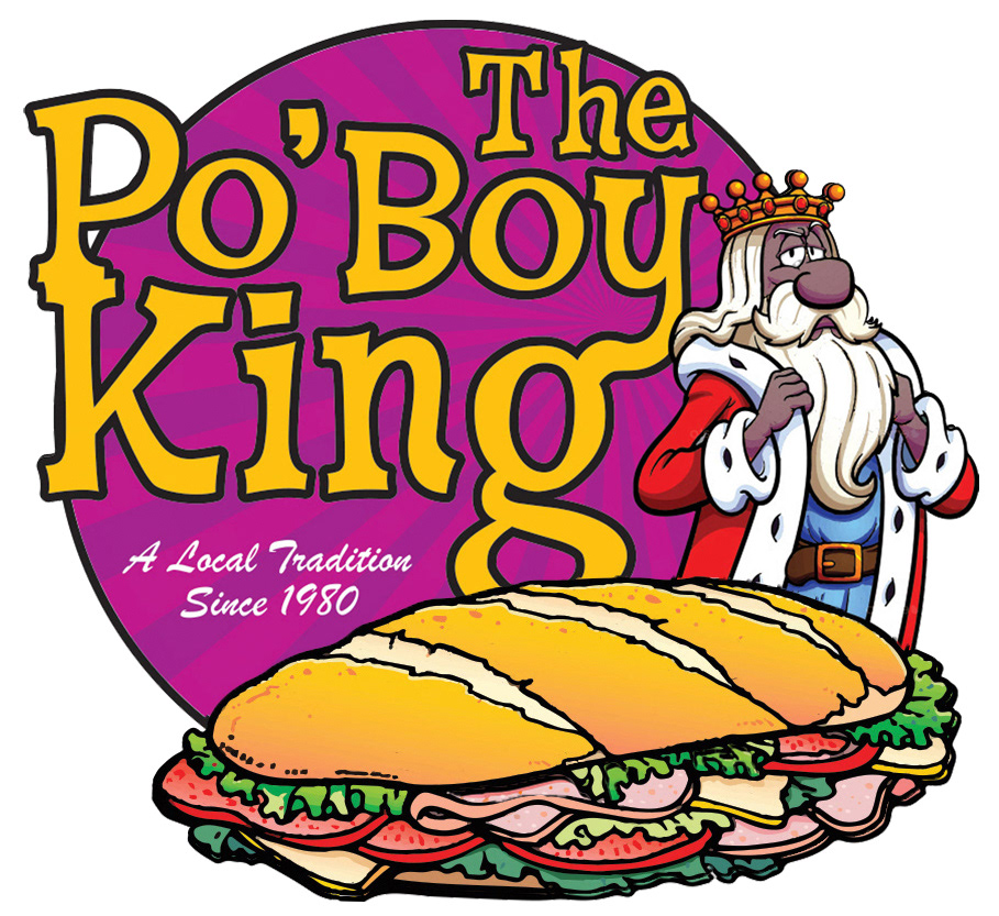
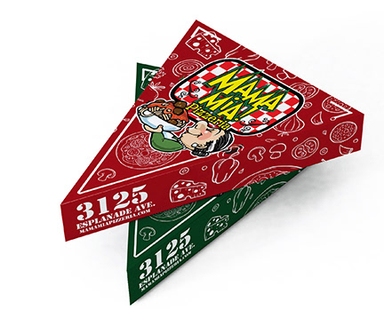
High contrast, primary colors were use for a bright effect for breakfast mornings. Shield with a stroke text and drop shadow for separation. Art work is a combination of a sketch and clip art provided. Pantone Solid Coated Colors applied.
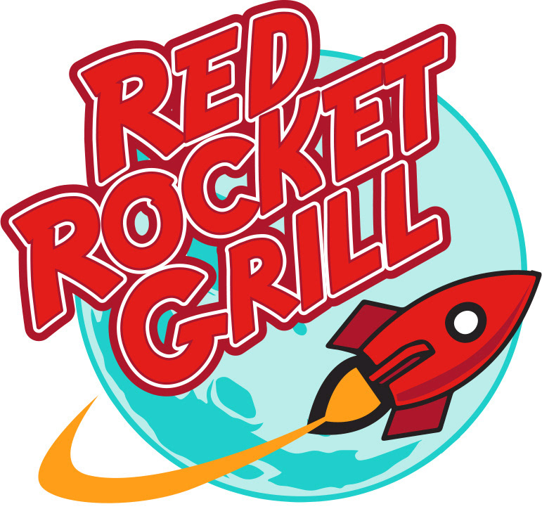
Utilizing stroke shields for text, drop shadows for separation, and overall shield for separation. This logo was inspired by the client specifically seeing some of my logos here and wanting something that used those solutions. Artwork was provided. Pantone Solid Coated Colors applied.
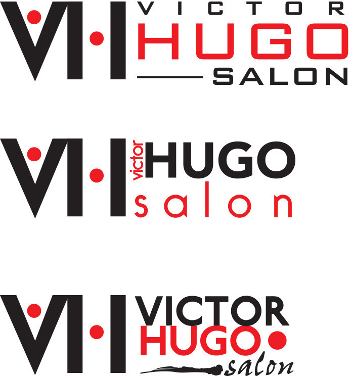
Client wanted a logo that reflected John Jay salons. These were the final versions before the project went dark. Pantone Solid Coated Colors applied.
Club wanted a feel of the David Letterman baseball style logo, but round shield for ease of making buttons.
Big and bold text, breaking the shield for depth. Artwork provided. Pantone Solid Coated Colors applied.
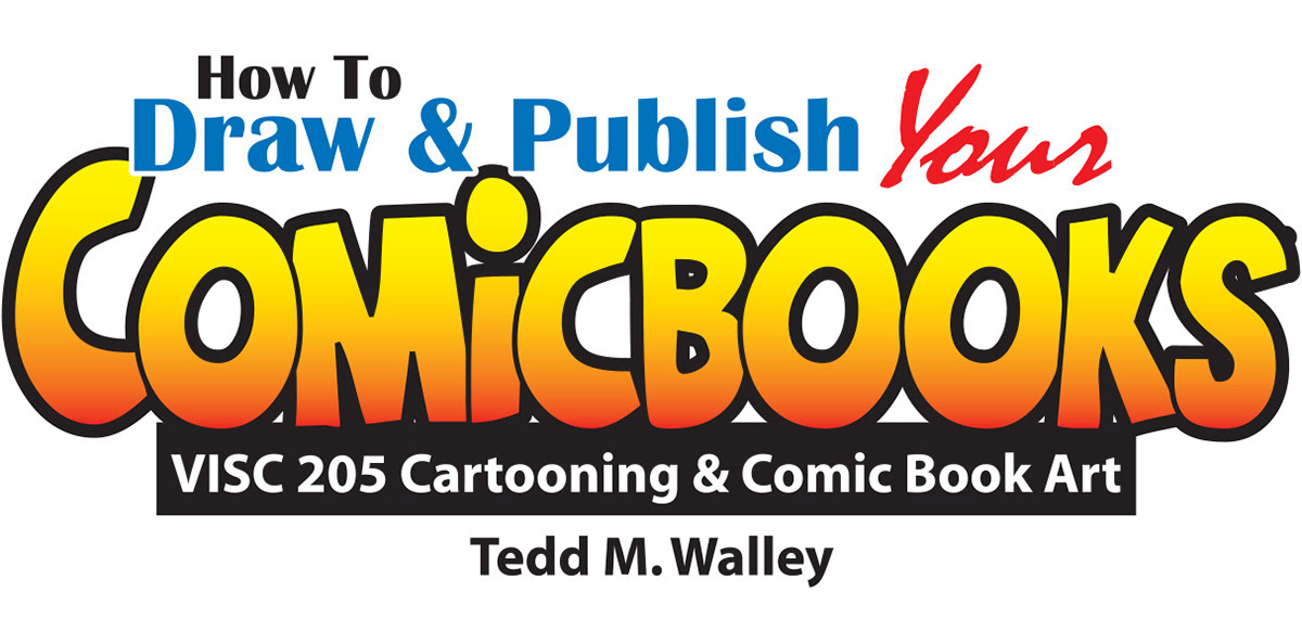
Utilizing a combination of solutions, from stroke shields and positive/negative space to primary colors and soft gradients. Pantone Solid Coated Colors applied. This was to advertise a course i teach/taught one of the only of its kind in New Orleans.
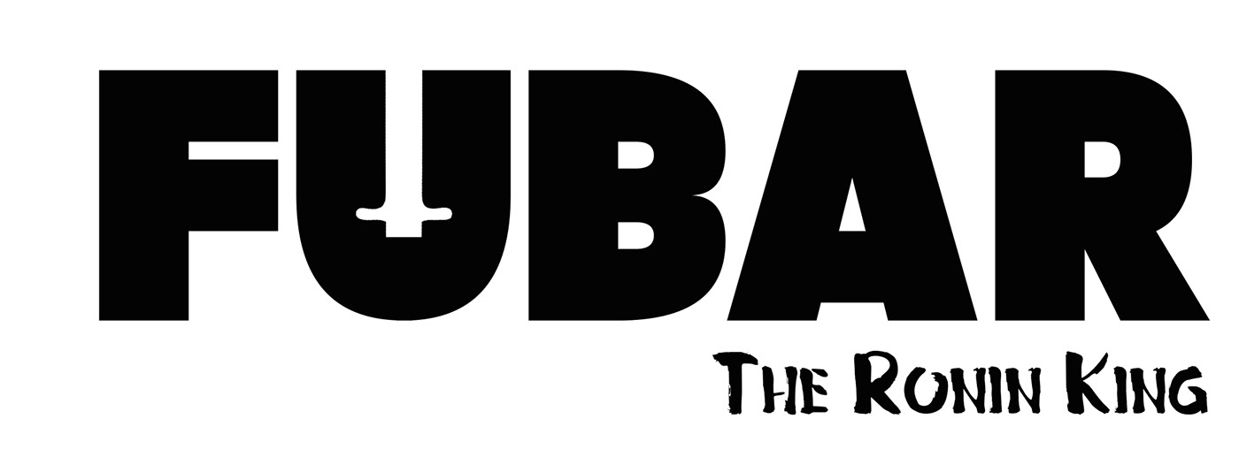
Logo design for a graphic novel i was working on, a samurai period piece in the vein of Usagi Yojimbo and Akira Kurosowa films. I enjoyed using the hilt of the main character's katana in the positive space for the U in the name.


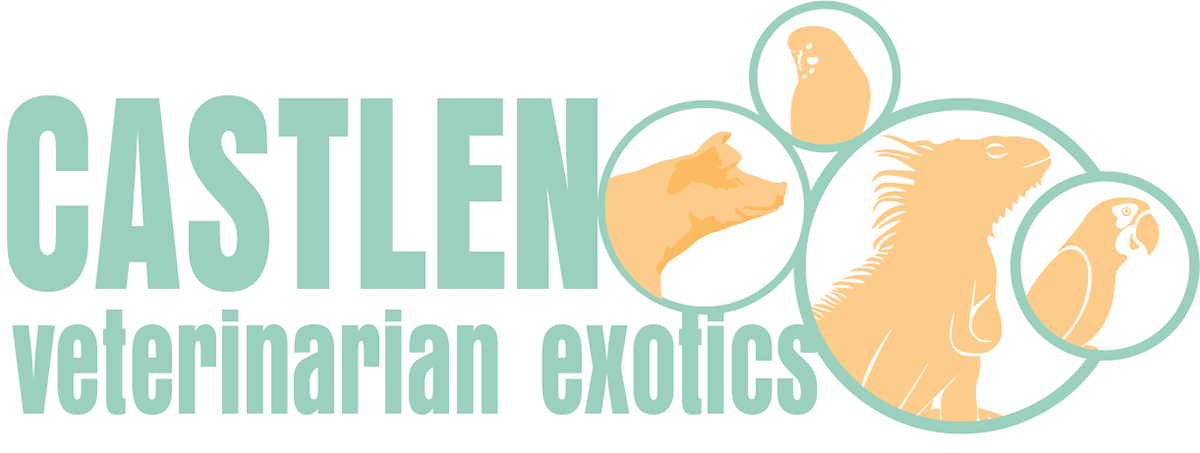
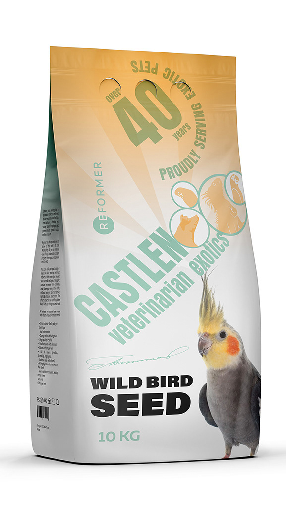
Enjoyed working with the graphics and masking them off into circles.


I love to do logos for some of the characters i get commissioned to do as well as for comics in general. If you need your comic's logo designed, let's talk.
Masthead for a comic book that I don't think was ever published. Edgy, rough fonts were edited to improve readability. Positive/negative space employed with a stroke shield for separation. Pantone Solid Coated Colors applied.