FONT: KLAVIKA

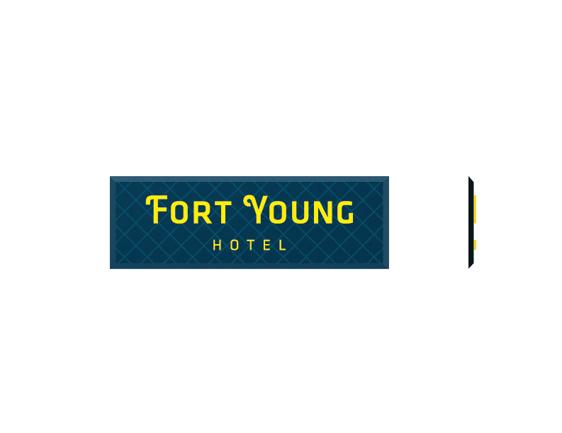
THE LOGOTYPE IS INSPIRED BY ONE OF THE ORIGINAL SIGNS AT THE HOTEL

DESIGN INSPIRATION FROM THE HOTEL, DOMINICA AND THE CARIBBEAN.

CUSTOM LOGOTYPE

MONOGRAM DEVELOPMENT

THE FORT YOUNG MONOGRAM

ICONS CREATED FROM THE BRAND DESIGN

INTERNAL SUB- BRANDING

BRAND PROPERTY/ BRAND GRAPHIC


SAMPLE OF BRANDED ITEMS


WEBSITE DESIGN

SIGNAGE DESIGN


BRANDING THE FORT YOUNG HOTEL IN DOMINICA
BRAND IDENTITY DESIGN, VISUAL SYSTEM, STATIONERY SYSTEM & SIGNAGE SYSTEM
For the Re-branding of the Fort Young Hotel, we were inspired by the lush greens of Dominica and the classic beauty of the hotel. With its historic charm, we focused on maintaining the original fort beauty with its stone-work and maze-like architecture.
The Fort Young Hotel originally had signage at different points with various typefaces. There was no consistency or fully established brand, but one of those signs inspired the typography for the new branding. An old gate on the compound entrance revealed decorative lettering that influenced the custom typography for the new brand identity.
Following the new identity design, the environment and rich textures of the hotel and Dominica informed the colour palette, brand property and design and marketing material that developed from that point.
This branding job was an exercise in making the old new without losing the classic and historic appeal that reflects the feeling of the actual hotel structure. www.fortyounghotel.com
Senior Design & Art Director: Tanya Marie
Agency: Abovegroup Ogilvy
CLIENT REVIEW:
“Tanya has been involved in various projects with us and her design capability is great. She keeps the aesthetic aspects tightly connected to the brand and positioning to ensure integrity throughout the process.” - Gregor Nassief, Chairman of the Fort Young Hotel, Dominica.


