New logo and visual identity system for an education platform that empowers teachers to transform Brazilian public education.
Founded in 1986, Nova Escola is a non-profit social impact association and digital platform. Today, they offer reports, courses, training courses, lesson plans, and educational materials to support Brazilian teachers and enable students to develop the most of their potential.
Accessed by around 2.7 million people a month, they invited us to take a closer look at their brand and see how we could help them.
CHALLENGES
-
We began the project by talking with teams from different areas of the Association. From there, we identified the clear goal for the project: to rethink and develop a new comprehensive brand identity system that organizes their products and expands their creative possibilities.
But before entering the visual language exploration phase, we looked at the Nova Escola logo, which had undergone a recent redesign and had good recognition within its community. During this stage, we understood that it was crucial to evolve it so that it could follow the transformation that was about to take place in the other phases. And so, respecting its legacy and keeping its structure, the new design incorporated a new typeface and gave up its solid shape, becoming more digital, lighter, and curious.
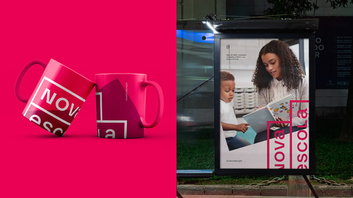
After that, we looked into every element of the existing visual language to better understand its complexity and limitations and how they were applied in Nova Escola's day-to-day materials. From this immersion, it became clear that the rectangular shape present in the logo was part of the brand's visual DNA and that we must continue with it. But it was crucial to set it free from all the constraints and make it bolder and more present.
The design team then explored endless combinations between the rectangular shape and its possible behaviors. Finally, they landed on intensities that work as cutouts, textures, highlights, and layers in the layouts, providing a rich visual system meant to be explored vividly and restlessly.
As part of the new look, the color palette was updated to more vibrant tones, helping to more clearly organize each product and service on the platform.
RESULT
-
Nova Escola was born to transform Brazilian public education, and evolving its existing visual universe was crucial for them. By reaching that new place, they now have a representation of themselves and creative flexibility to continue expanding their mission.
CREDITS
-
Papanapa
Creative Direction: Gustavo Garcia
Designer: Gustavo Kone, Luana Cordeiro, Thiago Bellotti
Motion: Gustavo Kone
Illustration: Eduardo Henrique (Nova Escola)