

ASSESSMENT TWO | TASK SIX
PICKING A GRID HEALTHY LIFESTYLE FLYER DESIGN
This task allowed me to put my knew grid skills to the test, and it was challenging!
First off I started researching and collating images of design styles I thought would suit the flyer. I found it helpful to look at past student work on Behance too. In the age on Instagram, it's important to be on trend when it comes to the students of generation Z. My research shows design style that are trending in 2022 are typography, retro futurism, symbolism, geometric shapes, art infusion and illustration.

ABOVE | My mood board, see references for artist credits (these are not my own works.
I decided to go with what I vibe with and what I see lots of other people in my demographic are attracted to, which is retro revival, geometric shapes, illustration and pop art colours. A flyer about being healthy needs to be enticing otherwise no one would really pick it up, especially in the digital age. So after my research I started my thumbnail sketches.


I decided to work with a 12 column modular grid on a tri-fold brochure, I was inspired by my research about modular grids and wanted to try one. Though, in hindsight I think I just made this really hard for myself, a 6 column grid would have sufficed (however I've enjoyed learning the ins and outs of creating grids in InDesign). I settled on my colours and fonts (Freehouse + Aktiv Grotesk) so I could focus on working with the grid.

Above | Screenshot of my first iteration using a modular grid (12 column + 8 rows)

Above | More iterations, I immediately found it hard to fir the information in the way I wanted. As you can see I was leaning into the grid aesthetic and I was trying to leave spaces for some illustration.


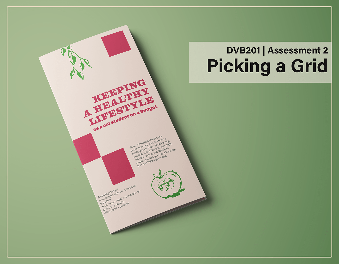
Above | Final iteration of the flyer, I played around a lot with placement and scaling and was able to create a much more cohesive flyer. The flow is more intuitive and there is more space to breather, and the folds don't interfere with the textual content.


Overall I'm pretty happy with my flyer, it is readable and informative yet appeals to a youth demographic with the cute illustrations and composite colours, and groovy font. I enjoyed the challenge of using the grid to create this, though it will take practice to perfect. In reflection I think I could have used a 6 column grid perhaps on a bi-fold template, as there is a lot of information that would be hard to read on such a small space. I'd love to have tried to create some more geometric/ retro futurism inspired illustrations, maybe in future!
REFERENCES
Mockup from Graphic Pear
https://www.renderforest.com/blog/graphic-design-trends
https://www.behance.net/gallery/144227295/DVB201-Week-10-The-Grid
https://www.behance.net/gallery/133296431/Henry-Mantecas
https://www.behance.net/gallery/140912325/Beyond
https://www.pinterest.es/pin/293859944429996593/
https://www.pinterest.com.au/pin/566961040588201789/


