


有餘能安頓自己
有隅能好好生活
設計理念 /
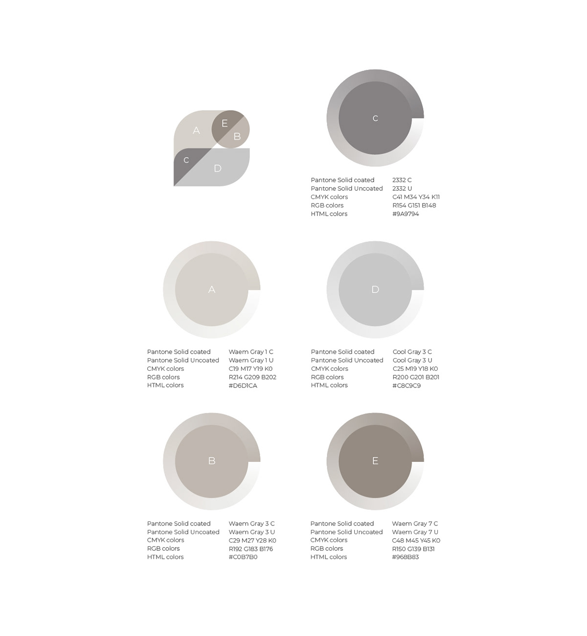
有隅空間設計標誌,以規劃所中文名稱的”隅”字作為視覺設計主軸發想,隅有角落、牆角之意,取其字體的左右部首”阜”與”禺”的外觀輪廓結合字意,相近的外形加上平面設計圖常用之線條,以幾何圖塊呈現來代表各種裝潢元素,而整體標誌的左上與右下角以導弧線設置,提升了溫和與圓潤感;再將其三個元素彼此作位置的排列及堆疊組合,而交疊處會產生兩色混合之新的疊加色彩 ,加強豐富及層次感,也隱喻規劃所服務的彈性及設計多樣性,達到給業主獨特、平易近人且具溫馨的設計氛圍。
有隅空間設計標誌,以規劃所中文名稱的”隅”字作為視覺設計主軸發想,隅有角落、牆角之意,取其字體的左右部首”阜”與”禺”的外觀輪廓結合字意,相近的外形加上平面設計圖常用之線條,以幾何圖塊呈現來代表各種裝潢元素,而整體標誌的左上與右下角以導弧線設置,提升了溫和與圓潤感;再將其三個元素彼此作位置的排列及堆疊組合,而交疊處會產生兩色混合之新的疊加色彩 ,加強豐富及層次感,也隱喻規劃所服務的彈性及設計多樣性,達到給業主獨特、平易近人且具溫馨的設計氛圍。
Design concept /
Yuyu space design logo is conceived with the Chinese name of the design office as the main axis of the visual design. The corner means corner and wall corner, and the left and right radicals of the font are combined with the appearance outline of "Fu" and "Yu". In other words, the similar shape and the lines commonly used in graphic design are presented in geometric blocks to represent various decorative elements, and the upper left and lower right corners of the overall logo are set with leading arcs, which enhances the sense of gentleness and roundness; The elements are arranged and stacked with each other, and the overlapping will produce a new superimposed color of two-color mixing, which enhances the sense of richness and layering, and also metaphors the flexibility and design diversity of the planning service, so as to achieve unique, approachable and unique to the owner. With a warm design atmosphere.


Year |2021
Client|有隅空間規劃所
Director|Cheng-Yu Chu
Client|有隅空間規劃所
Director|Cheng-Yu Chu
Designers|Cheng-Yu Chu
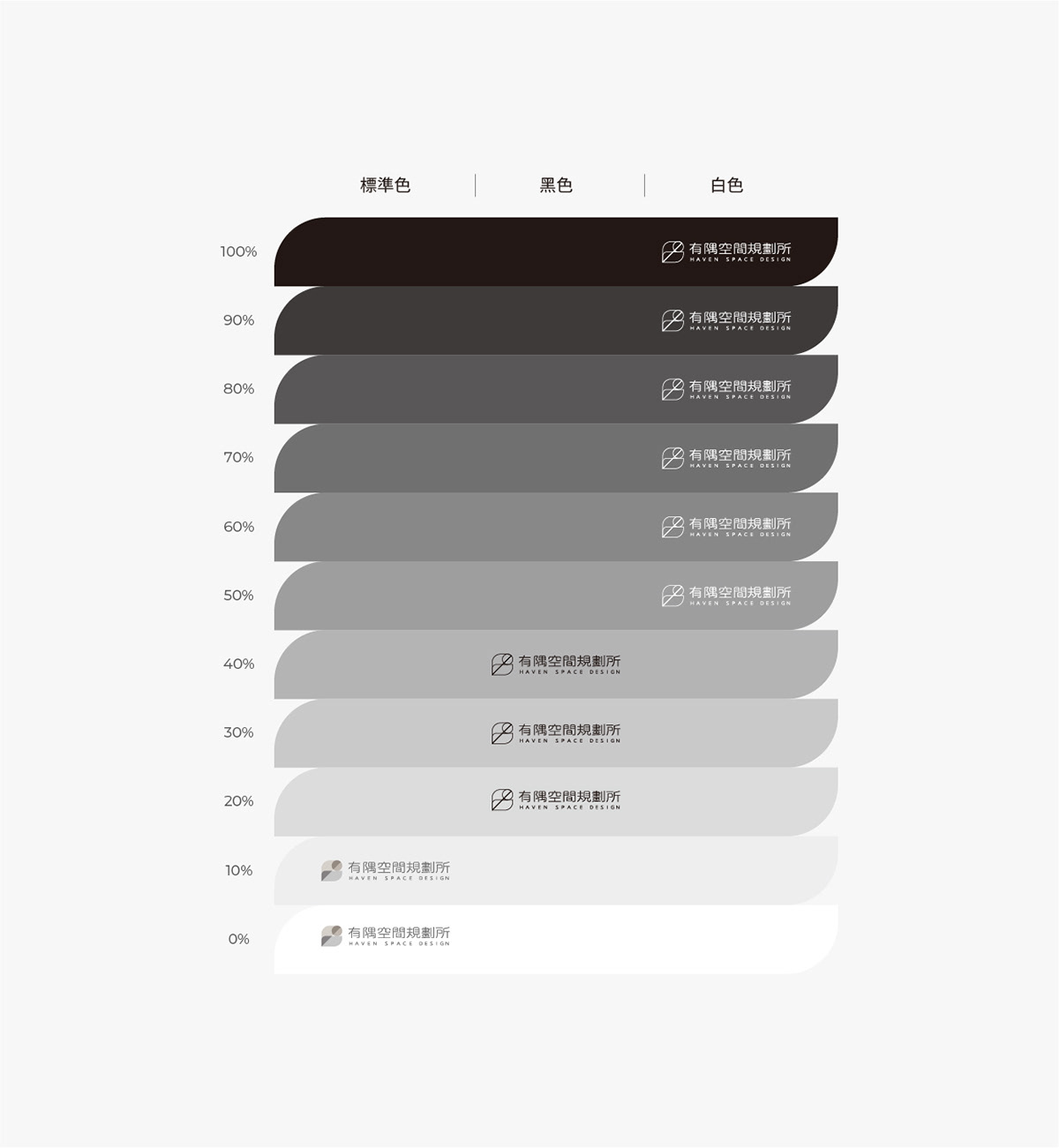
Service| VIS

