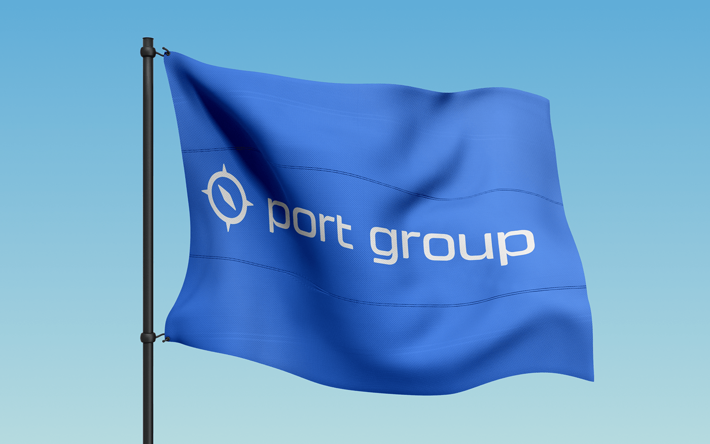
Port Group
The port of Rostov-on-Don was founded in 1750. It is considered one of the oldest ports in Russia and the center of foreign trade in the south of the country. Now the "Port" is a group of companies that includes 55 subsidiaries.
Art director & designer: Paul Matvienko.
Task
At the end of 2021, "Rostov Port" decided to rebrand. Its task is to unite all subsidiaries and the "Rostov Port" itself into a single ecosystem with the "Port" master brand.
Solution
We carried out a successful rebranding, developed a new logo, created an identity, described the principles of building an ecosystem and subbrands. To do this, we previously carried out analytics in several stages. Namely:
— Studied competitors;
— We met with each subsidiary (55 organizations in various business segments);
— Selected categories and segmented sub-brands;
— Determined the approach to the formation of the ecosystem;
— Described the principles and approaches to building subbrands;
— Described the principles and approaches for the rapid integration of the sub-brand into the ecosystem;
— Formed a single visual language of the ecosystem.

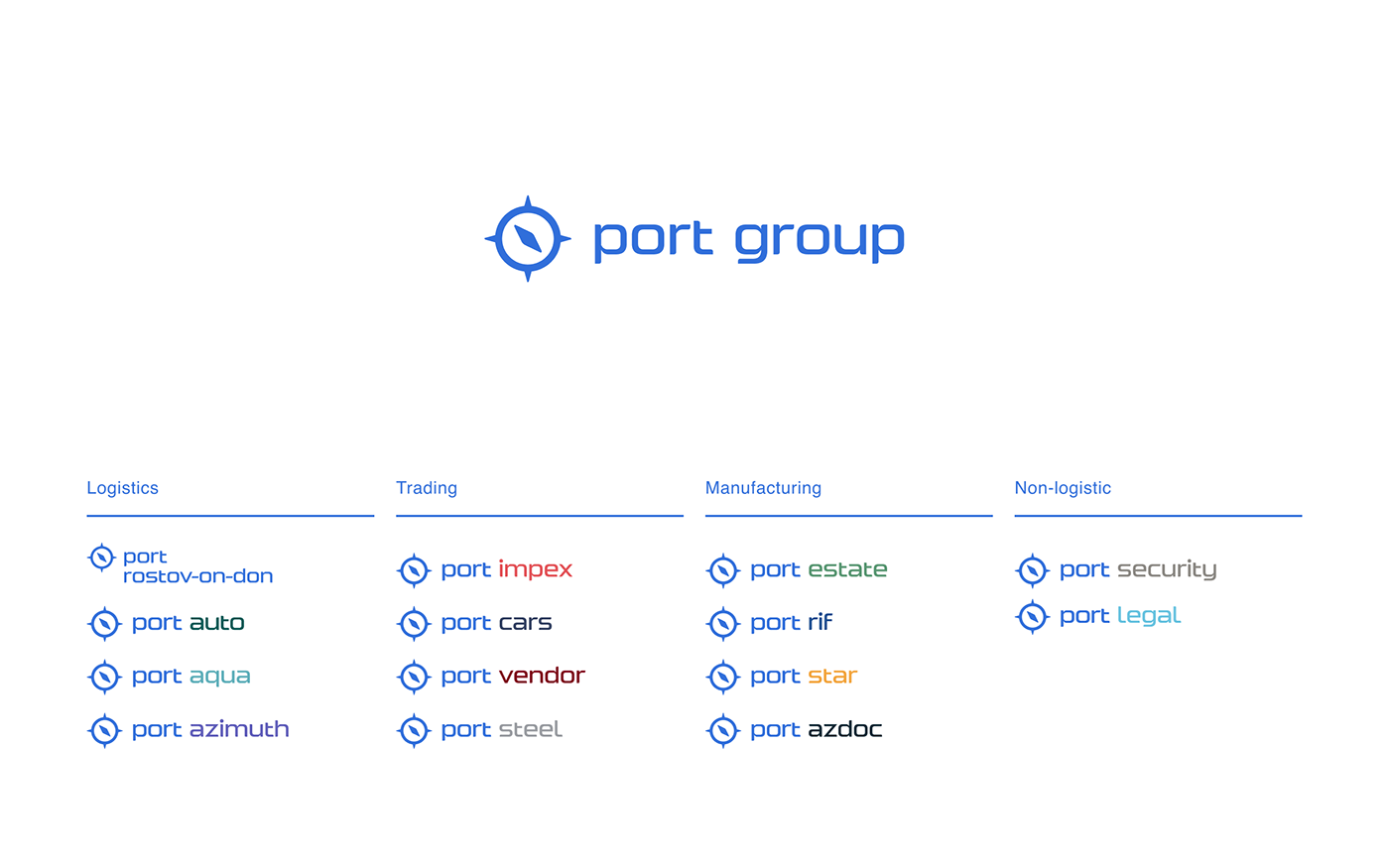
Ecosystem
During the rebranding, we followed the concept of "from private to general" - when the name of one product applies to the entire ecosystem. The new name of the company was chosen on the principle of recognition, since the name "Rostov Port" is known to a large number of the population of the south of Russia.
Since Port is an ecosystem, we have developed rules for the formation of new sub-brands:
— We propose to rename some sub-brands without a strong own brand (PortAuto, PortEstate, PortLegal, etc.).
In this way, we will create a new sub-brand, add value to it from the "Port" master brand, and reduce the costs of promoting these brands;
— We will make some of the sub-brands with endorsement (we will add a small signature/logo "Port"). Thus, we will not lose the brands that are valuable to us and strengthen them with the support of the "Port" master brand.
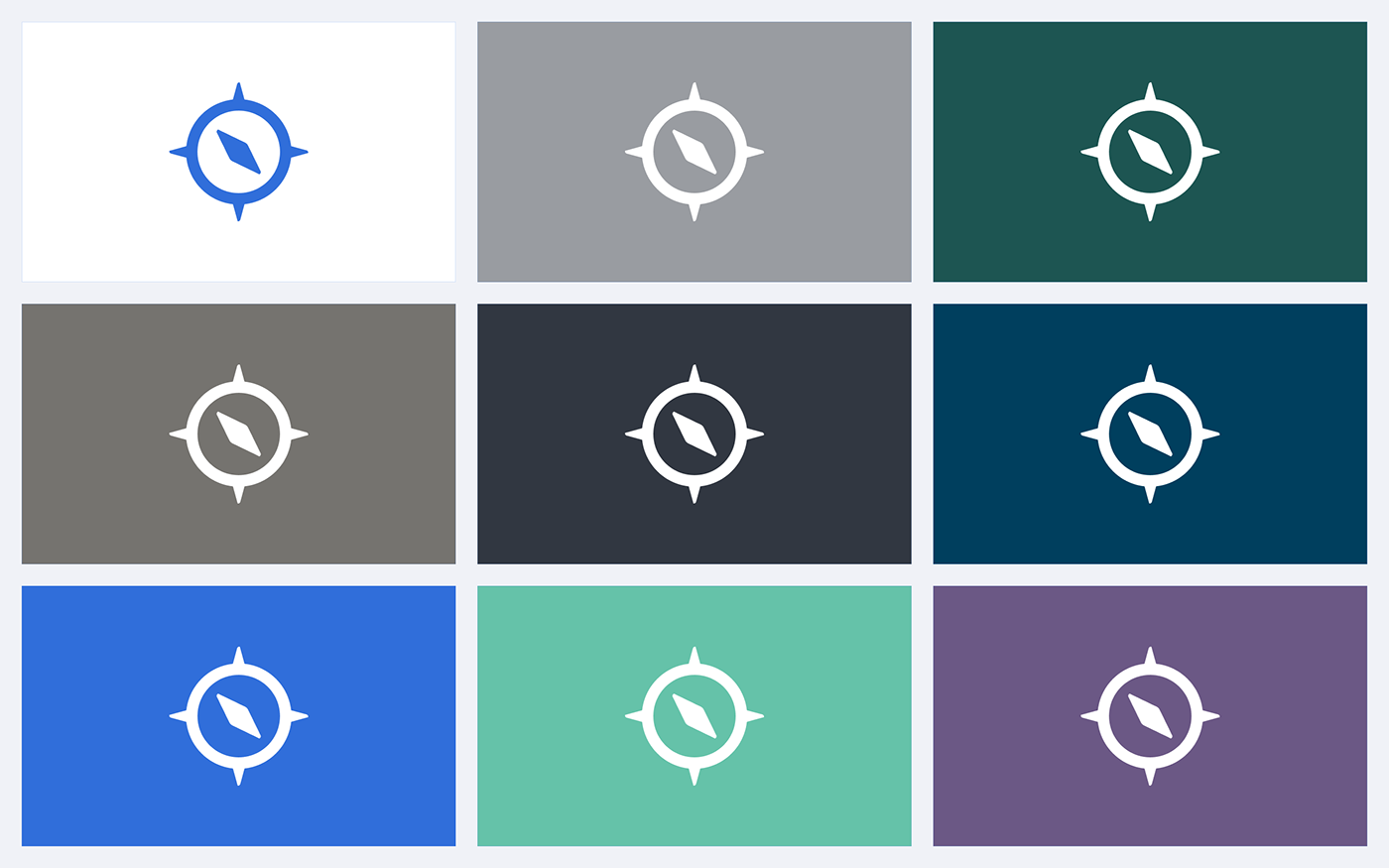
Ecosystem logos
The name of the sub-brand is always written in one line with the master brand. The only exception is for "Port of Rostov-on-Don", as the second word is too long to be written in one line. The master brand is always used in corporate blue. An exception is the location on a colored background - in this case, the entire logo will be white.
Sign
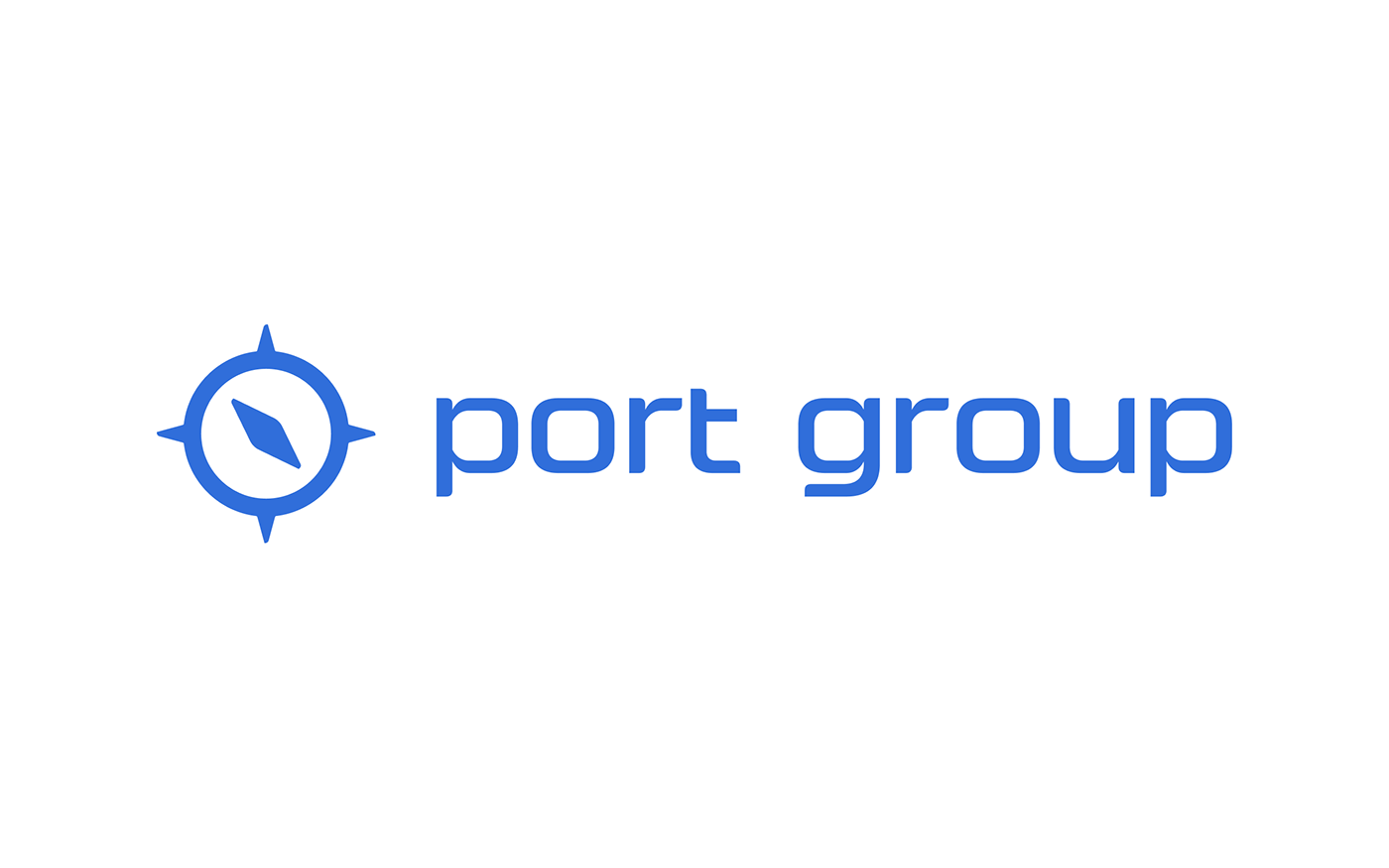
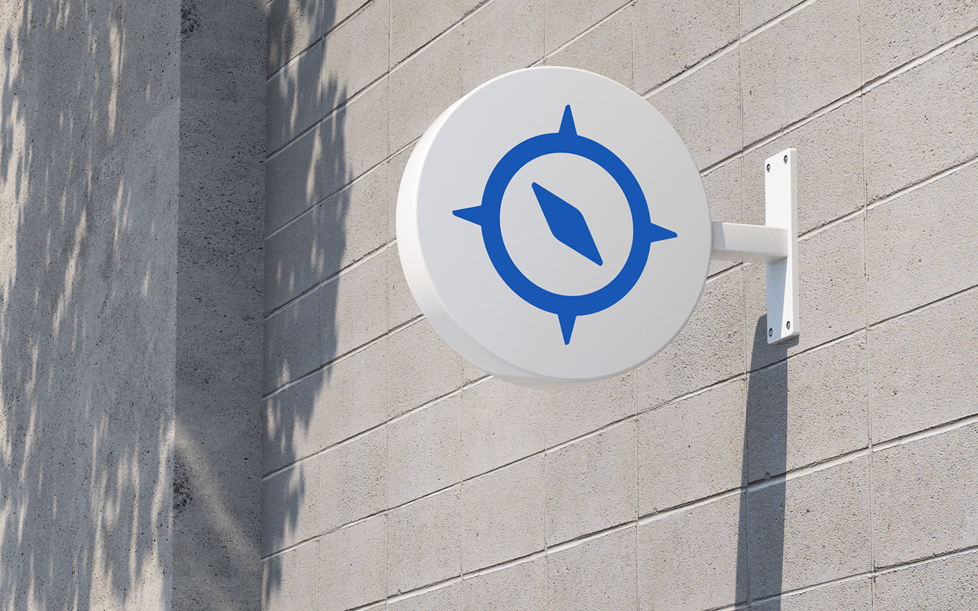
The idea of the sign combined images of a compass, a wind rose and a ship's steering wheel. The resulting sign can be used separately from the logo.

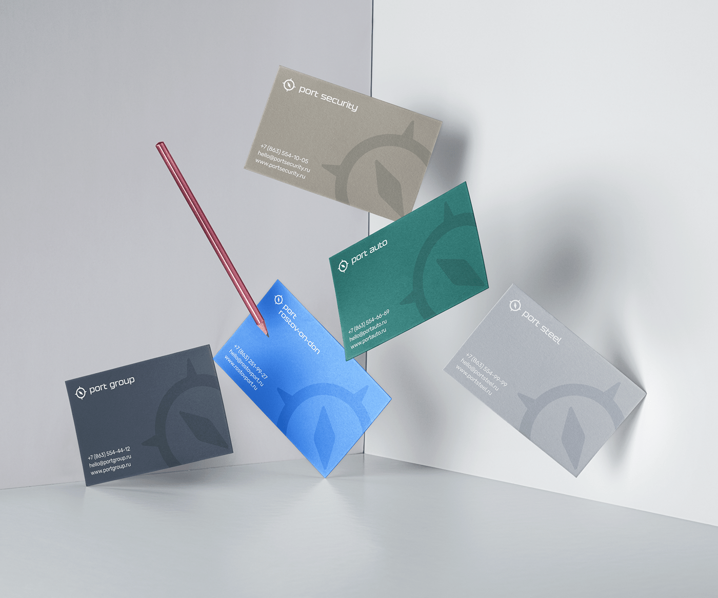
Identity
The main task was to create a coherent and recognizable brand. We have developed the design of printed products: letterheads, envelopes, business cards. Now the documents look stylish, fit into the overall concept and complement the brand.


Thank you for watching
If you like what I do and have a project that you would like to work with me — I am available for collaboration, so feel free to contact me at paul@matvienko.me or in telegram @paulmatvienko
Made with love in Charisma Studio.


