
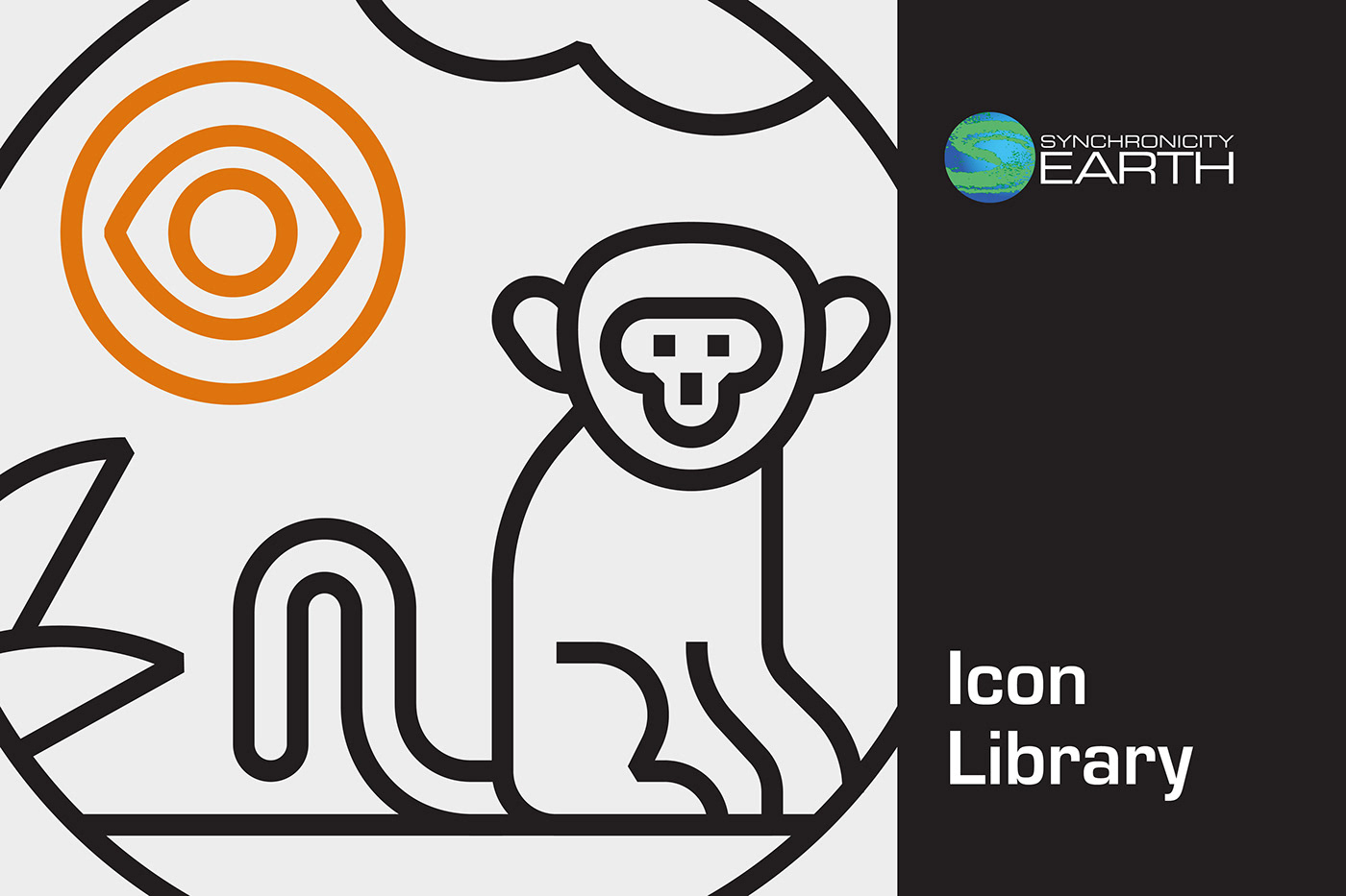
Synchronicity Earth Icon Library
Client • Synchronicity Earth
–––
An extensive icon library for a different kind of conservation organisation.
I was thrilled to work with Synchronicity Earth, a charity that analyses gaps in conservation action and funding to support overlooked issues in the sector, on an icon library to represent their broad range of research and conservation work. They wanted a collection of iconography to help communicate all aspects of their organisation, from donations and training to support and research programmes, and much more. The style needed to sit comfortably within their current branding and provide clear depictions of often complex concepts.
This was a wonderful project to work on, which offered some fun challenges along the way; a lot of the required icons needed to portray complicated ideas in a very simple style. In the end, I created over 50 icons, along with a smaller series of even simpler compositions for use at small sizes. Below is a detailed run through of the project, from initial creative routes through to the final deliverables.

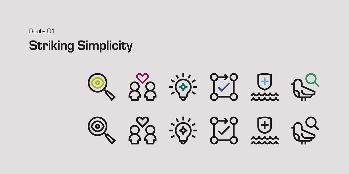
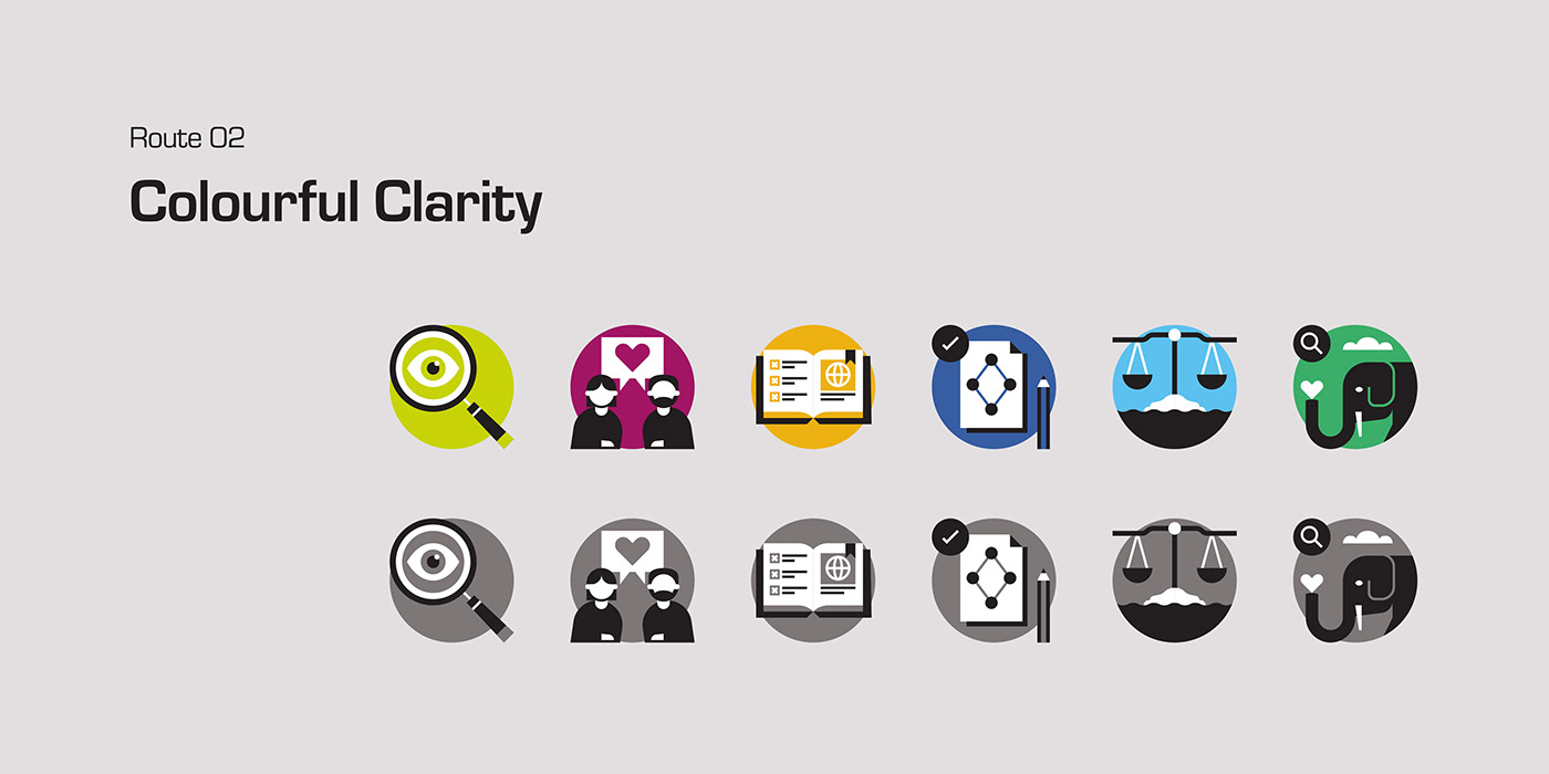
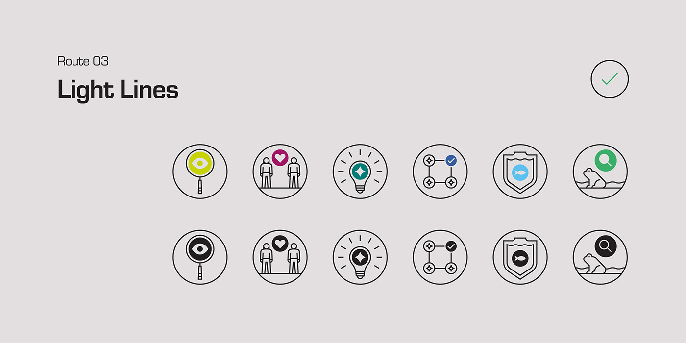
Creative Routes
–––
To kick off the project, I presented a series of three creative routes to better define our approach, with each one catering to the broad requirements of the brief while providing a slightly different end result.


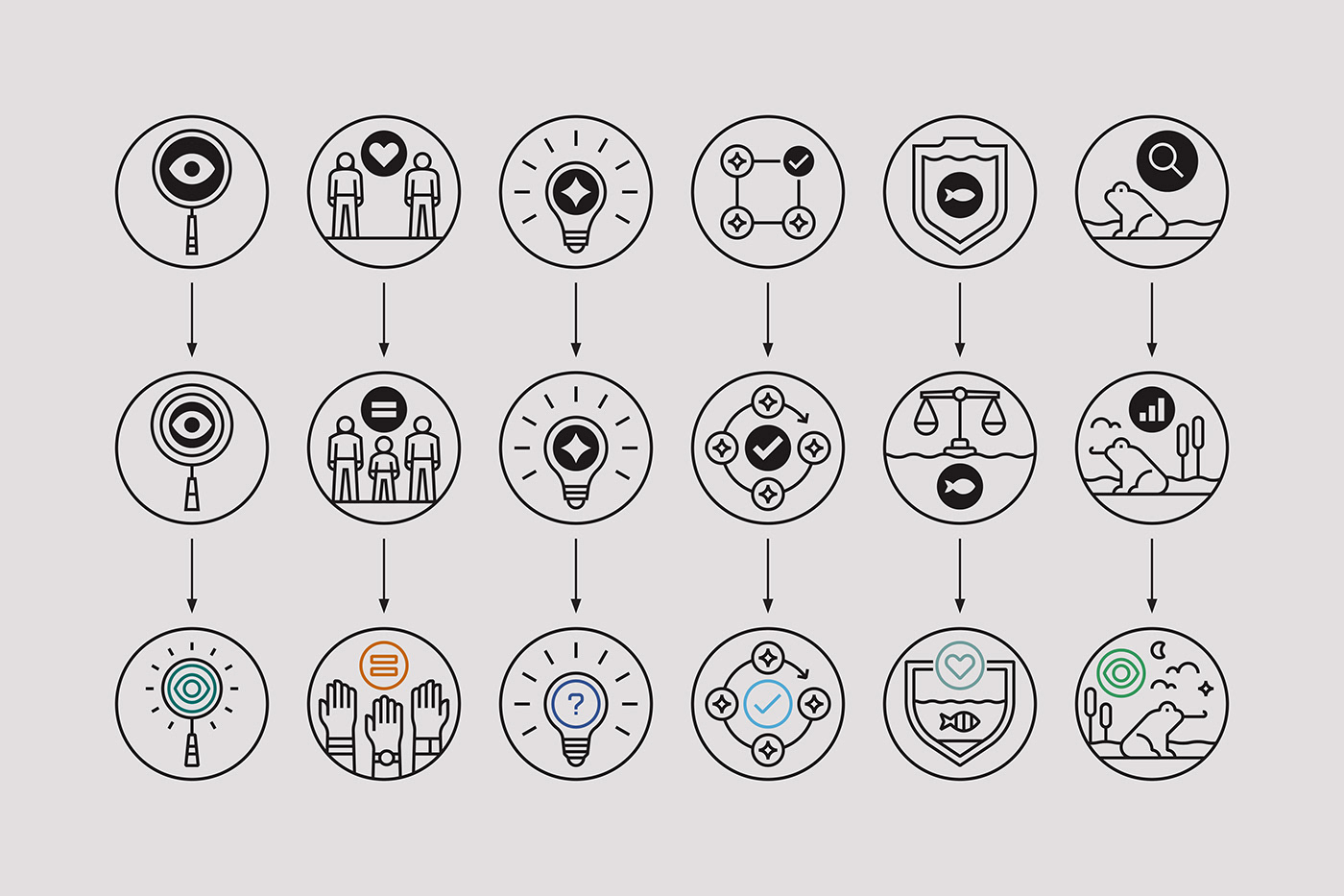
Creative Development
–––
After selecting a creative route, we went through a couple of rounds of feedback to reach the final approach. The image below shows how the artwork developed through each of these stages.
Design Principles
–––
The icon library utilized a number of underlying principles to ensure everything was on brand, had a good sense of visual continuity, and would allow the library to be further developed with ease in the future.


Final Creative
–––
The creative direction uses solid lines and minimal forms, to convey authority and a serious tone, while depicting complex things in an accessible and attractive way. Light strokes help to provide a sense of clarity, and the addition of beveled joins give the designs a consistent and ownable feature across the library.
Each icon also includes a coloured ‘highlight’, which draws the eye and adds in a little bit of colour. This feature, almost an ‘icon within an icon’, helps to provide more context to the more complicated concepts and can draw focus to a key element within each composition. The colour can also be used to link the icon to specific programmes or initiatives.
Overall, the artwork is clean and visually uncomplicated, in order to best support and communicate the work of Synchronicity Earth.


Simplified Variations
–––
In addition to the main library, I also developed a set of simplified icons to be used at smaller sizes. These used the same basic underlying principles as the main set, but with no colour highlight, and simplified compositions.


