


CHALLENGE
In the summer of 2013 I took an Identity Systems class with instructor, Gloria Kondrup. In this class, we were given the challenge of rebranding an existing Las Vegas hotel. Having just stayed at the Luxor recently, I chose to rebrand it. The Luxor was originally built as an Egyptian themed hotel but later went through a modern remodel. My goal was to find a way to bring it back to it's Egyptian roots, but in an elegant and mature way.

The Luxor Hotel is one of Las Vegas’ older and more iconic hotels. In fact, at the time of it’s opening it was the tallest hotel on the strip. This is hard to believe considering the strip today. Fashioned after ancient Egypt, it was built as a giant black pyramid.
It officially opened on October 15th, 1993 at 4am (typical Vegas fashion) to a crowd of 10,000 people. The resort cost $375 million to build and was funded entirely on petty cash from other Circus Circus Enterprise properties and had no outside investors. At it’s inception it had 2,526 rooms and was 100,000 sq feet. In 1998, another tower that included 2000 rooms and a theater was added.
When the resort opened it features a Nile River Tour that carried guests to different areas of the hotel and featured ancient Egyptian art work on a river that encircled the casino. They also had a King Tut’s Tomb and Museum, a duplicate of King Tutankhamen’s tomb as found in the Valley of the Kings near Luxor, Egypt. So it goes without saying, it was very Ancient Egyptian inspired in a family friendly way. However, in 2007 the hotel went through a major $300 million dollar remodel in which the river and tomb were removed and replaced with more adult friendly decor such as modern lounges, restaurants and LAX nightclub.

The new Luxor Hotel and Casino incorporates the glamour and class of old Hollywood, in the style of Ancient Egypt. We want our hotel to make our guests feel the wonder of Ancient Egypt. When stepping into our hotel they will feel comfort and awe that they could never have imagined.


LOGO
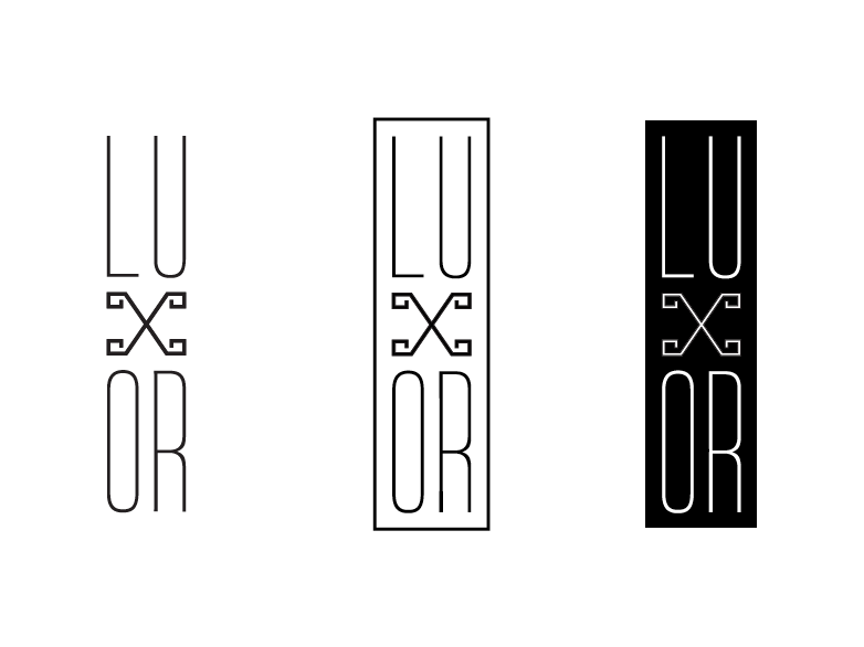
The new Luxor logo conveys a feel of elegance, glamour and opulence. The embellishments on the “X” and the way it is stacked also brings in the style of Ancient Egypt and hieroglyphics. Stacking like this also emphasizes the “X” and the way it is reminiscent of a pyramid. The logo can be used on it’s own, in a box or reversed out on one of the colors from the color palate.
LOGO LOCK UP
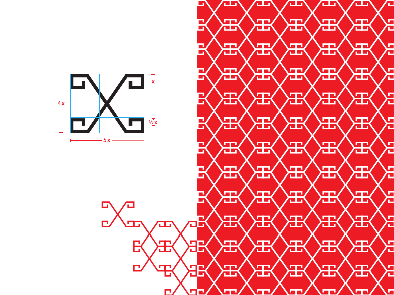
The number one rule for using this logo is that it must be able to breathe! This means not putting it tightly in a corner or placing it too closely to other graphics. It is imperative for the integrity and grace of this logo that it stands strongly on it’s own. Here are the lock-ups for each of the logo variations above. Each one must have at least 3x of space between it’s outer most part and whatever it will be placed next to. To find “x”, the embellishment curl on the x of the logo makes an x by x square. If being placed on top of a pattern, the logo must have it’s clear zone without the pattern so it is not too cluttered.

SECONDARY LOGO
This secondary logo can be used more freely than the primary Luxor logo. It doesn’t have a clear zone and can be placed either by itself or in a variety of patterns, as shown below. The embellishment on the corners of the X can also be duplicated for a border, but not if attached to the logo itself.
PRIMARY AND SECONDARY TYPE
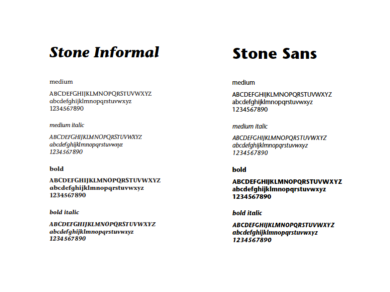
The logo was inspired by the font, Huxley. It conveys the glamorous, elegant feel that the new Luxor identity embodies. The font was modified and embellishments were added to the x to bring in a hieroglyphic element, more specifically the hieroglyphic “H.” Ultimately, stacking the logo helped to further give a feel of both glamour, stature and hieroglyphics. For the secondary type, Stone Informal and Stone Sans were chosen to compliment Huxley.

COLOR PALATE
The colors chosen are based mostly off of jewelry that the ancient Egyptians wore. These include gems such as onyx, turquoise, carnelian, malachite, jasper, lapis lazuli, quartz and gold. These rich jewel tones display both the glamour and opulence that this identity system is about as well as bring a sense of fun and excitement that fits well with the Las Vegas scene.

LOGO TREATMENTS
The logo can be used in any of the colors from the color palate. This enables a lot of flexibility for the identity system. Separate sub-brands of the hotel can be designated their own colors. Such as turquoise for spa and malachite for the casino. The only time the logo can be in two colors is when gold is incorporated. Black and gold are the main colors of the line but the other primary and secondary colors can be used as well. When using a gold tone, the logo can be used in any of these fashions listed below.

SUB BRANDS
Each sub-brand of the resort is assigned it’s own main color from the secondary color palate. These colors are shown below.

IMAGE TREATMENT
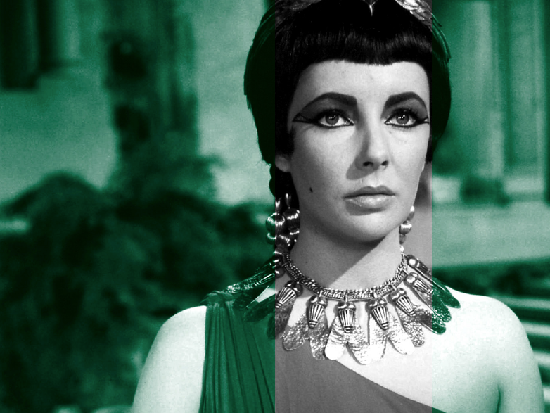
All imagery used for the Luxor identity will either be in black and white or duo tone. There will be a lot of Ancient Egyptian photos used as well as photos from classic Hollywood films such as: Cleopatra (1917), The Loves of Pharaoh (1922), The Ten Commandments (1923), The Mummy (1932), Cleopatra (1934), Caesar and Cleopatra (1945), The Egyptian (1954), Land of the Pharaohs (1955), Cleopatra (1963).


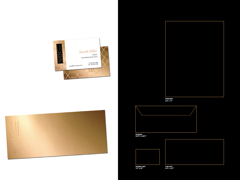
STATIONERY
The Luxor stationery is in the main colors, black and gold. It is made using both white and metallic gold papers with the onyx color from the color palate and metallic gold ink (PMS 874). The pattern is made with the secondary logo and is printed with gold ink on gold paper. This stationery system highlights the richness and luxuriousness of the resort.

KEY CARDS

WEBSITE
The website uses mainly the gold that is prominent in the identity as well as photos of the classic Hollywood Egyptian movies and other Egyptian artifacts such as the sphinx and the pyramid. Only black and white and duo-tone images will be used on the website. Actual images that show the hotel can be shown in shadow boxes. Each sub-brand has it’s own color and the display images are in that tone.


SMART PHONE APP
The smart phone application has the same look and feel as the website but the focus is on ease of use. Functional and easy to see buttons make everything from exploring the hotel to reserving a room easy to do on the go.

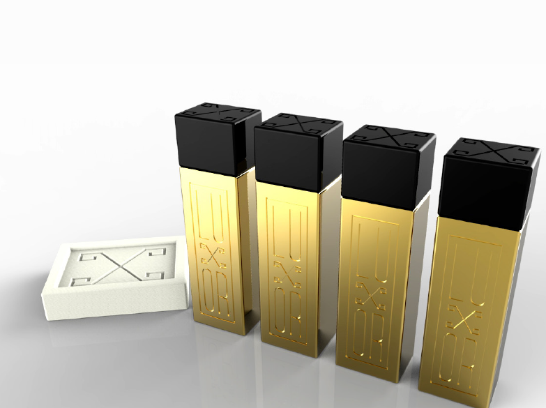
BATHROOM AMENITIES
These are the bathroom amenities that will be in each room. They are designed to look like gold bullion pieces. Both the dimensions of the height and width are modeled after both the primary and secondary logos. The bottles are made out of metallic gold painted plastic with glossy black plastic caps.
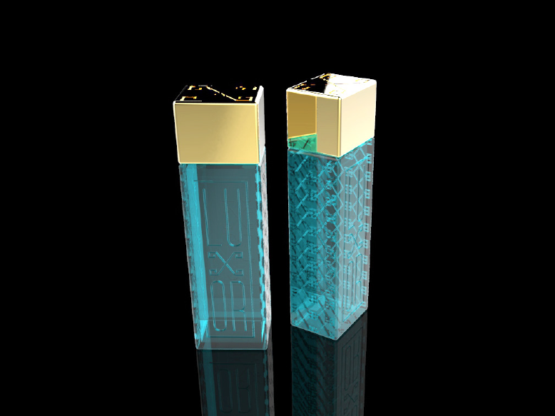
WATER BOTTLES
These are water bottles that are designed to be complementary in the suites of the hotel, as well as given to special guests. They are made using glass in the color “turquoise” from the color palate and chromatized plastic gold caps. The logo and the pattern made with the secondary logo are debossed into the front and sides of the bottle. The focus on this design was to make a bottle that showcases the opulence and glamour of the new hotel. We wanted to make something small but memorable to give to the guests.
LOBBY BAR
The lobby of the Luxor will be as grand and indulgent as the great pyramids of Giza. Gorgeous gold tones contrasting with dark woods and marbles, Egyptian reeds in the flower bouquets, large scale patterns and high ceilings will be incorporated. It will make the guests’ jaws drop in amazement when they walk through the doors.

CONCLUSION
In conclusion, I believe this rebranding of the Luxor was successful in bringing back more of the Ancient Egyptian roots that the hotel was originally built around, but in a more elegant and mature way.


