THE WEATHER CHART
______________
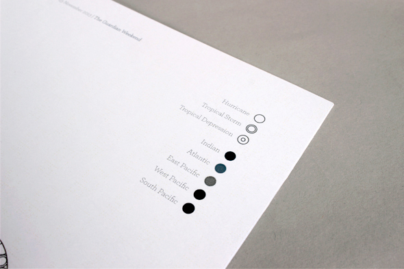
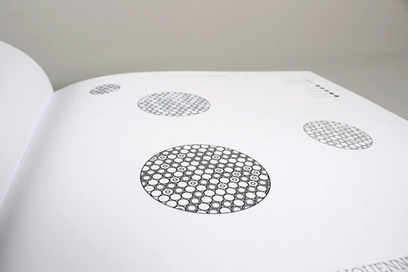
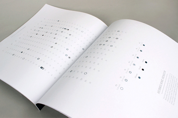
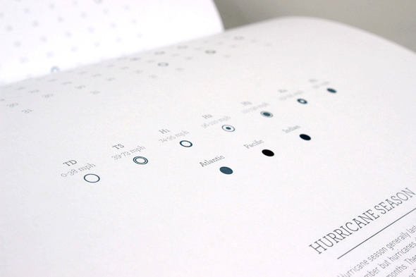
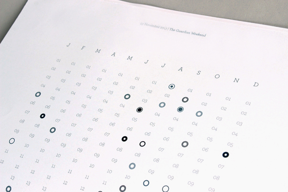
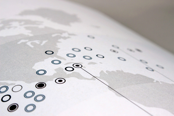
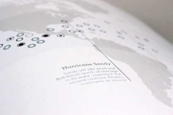
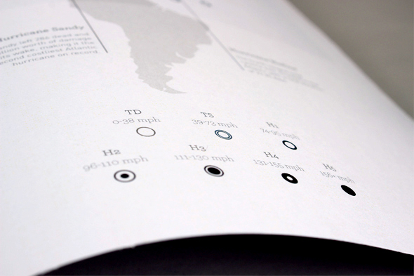
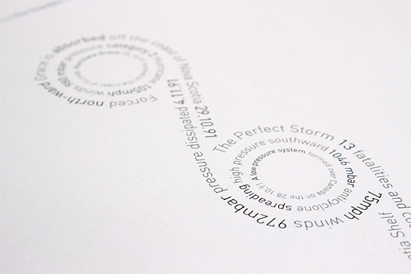
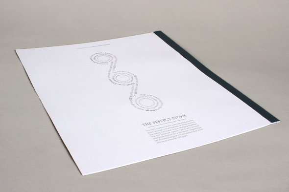
This is an infographic interpretation of hurricane statistics from the most affected countries in the world to the most active months of the year. In the form of a newspaper supplement, this piece is intended for The Guardian newspaper. The use of circles and dark colour tones is replicated throughout to reflect the shape of hurricanes as well as the terror they cause.