Berço Nacional da Soja - Santa Rosa
BR
O projeto "Berço Nacional da Soja" foi desenvolvido para o concurso gerado pela FENASOJA buscando estabelecer a criação de uma marca para o título recebido pelo município de Santa Rosa, no Rio Grande do Sul.
__
EN
The project "National Cradle of Soja" was developed for the contest generated by FENASOJA, seeking to establish the creation of a brand for the title received by the municipality of Santa Rosa, in Rio Grande do Sul.


BR
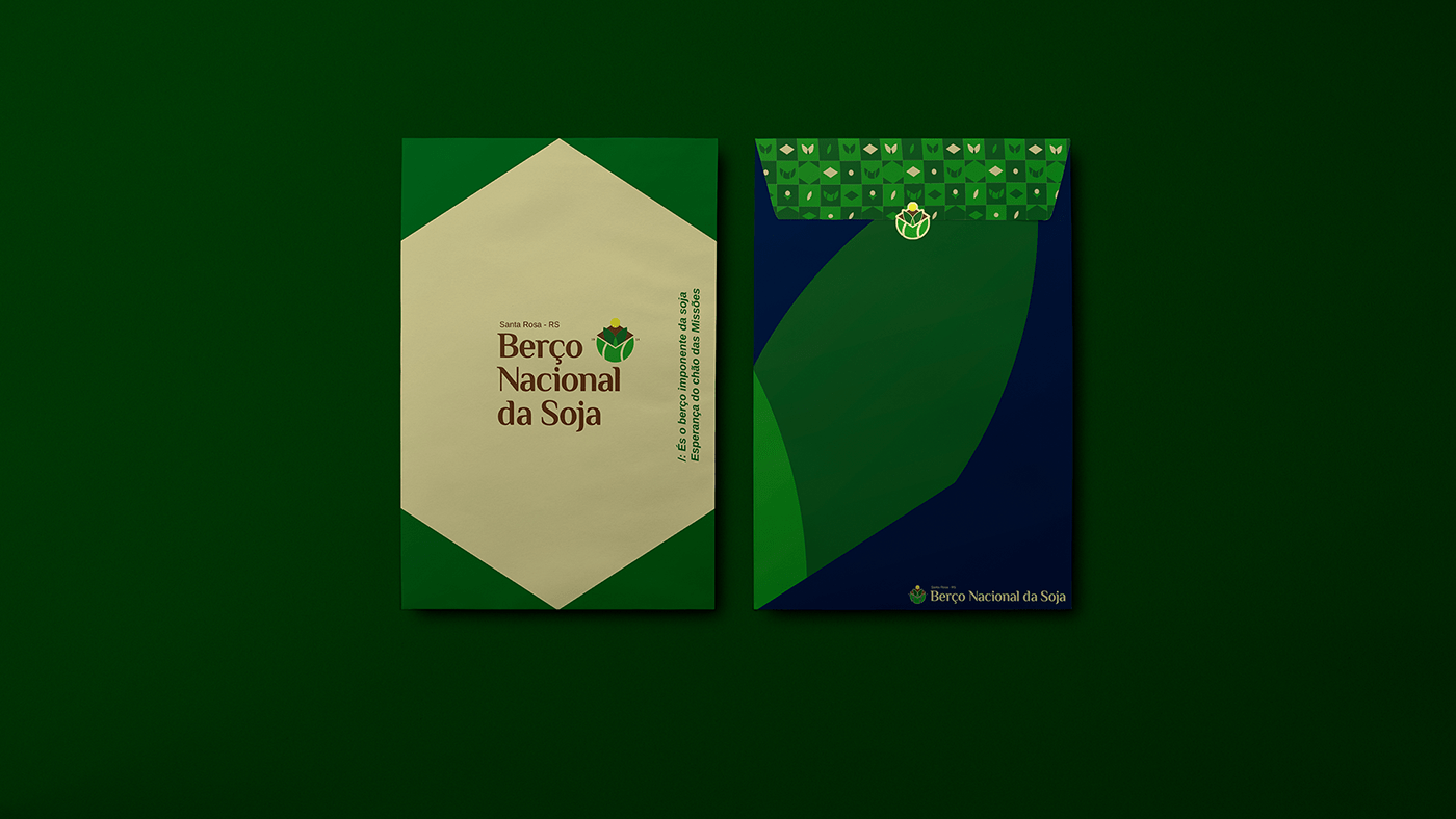
O símbolo do Berço Nacional da Soja foi construído tendo como base os pilares principais do título: o solo fértil, as folhas de soja saindo de um local que faz referência a um “berço” no sentido de estar bem mantido e cuidado, o losango da bandeira do Brasil como indicação ao nacional, a semente indicando o início do plantio ligado ao solo e o sol iluminando o símbolo como indicação direta ao brasão do município de Santa Rosa, trazendo ligação afetiva à bandeira, bem valioso da cidade.
Em sua aplicação principal o símbolo traz conjunto o ano de início do plantio no município “1914”, trazendo o fator histórico ao elemento presente na identidade da marca.
A identidade visual traz em todos seus aspectos, desde símbolo, tipografia à cores e elementos a presença de pontos históricos e representativos de Santa Rosa e seu título de Berço Nacional da Soja.
__
EN
The symbol of the National Cradle of Soy was built based on the main pillars of the title: the fertile soil, the soybean leaves coming out of a place that refers to a “cradle” in the sense of being well maintained and cared for, the lozenge of Brazilian flag as an indication to the national, the seed indicating the beginning of planting linked to the soil and the sun illuminating the symbol as a direct indication to the coat of arms of the municipality of Santa Rosa, bringing an affective link to the flag, a valuable asset of the city.
In its main application, the symbol brings together the year of planting in the municipality “1914”, bringing the historical factor to the element present in the brand identity.
The visual identity brings in all its aspects, from symbol, typography to colors and elements, the presence of historical and representative points of Santa Rosa and its title of National Cradle of Soy.


BR
O símbolo foi construído em um grid formado por círculos usando proporção áurea, buscando trazer estabilidade e consistência aos elementos trabalhados no logotipo.
O logotipo foi todo diagramado também com o uso de proporção áurea, com repartições, alinhamentos e distribuições estáveis e visualmente agradáveis. Com isso, resultamos em um logotipo harmônico e que traz representatividade ao título do município de Santa Rosa em cada detalhe.
__
EN
The symbol was built on a grid formed by circles using the golden ratio, seeking to bring stability and consistency to the elements worked on in the logo.
The entire logo was also diagrammed using the golden ratio, with stable and visually pleasing partitions, alignments and distributions. With this, we resulted in a harmonic logo that brings representation to the title of the municipality of Santa Rosa in every detail.


BR
A paleta de cores desenvolvida para o Berço Nacional da Soja deu-se de forma seletiva, com razões lógicas, idealistas e contextualizando sua marca em todos seus pontos de afeto, história e conquista. Sendo assim, temos uma paleta exclusiva e repleta de força, onde cada cor traz referência a um ponto de contato que a identidade busca representar: Azul (Confiança), Marrom (Solo árido, trazendo referência ao início do plantio), Verde escuro (Solo fértil, representando o título do munícipio), Verde claro (Folhagem da soja), Amarelo (Riqueza/Iluminação) e Bege (Grão da soja)
__
EN
The color palette developed for the Berço Nacional da Soja was carried out selectively, with logical, idealistic reasons and contextualizing its brand in all its points of affection, history and conquest. Therefore, we have an exclusive palette full of strength, where each color refers to a point of contact that the identity seeks to represent: Blue (Confidence), Brown (Arid soil, referring to the beginning of planting), Dark green (Soil fertile, representing the title of the municipality), Light Green (Soybean foliage), Yellow (Wealth/Illumination) and Beige (Soybean grain).