


🛒 Tai Fung Supermarket Branding✨
🛒 泰豐超級市場 品牌形象✨
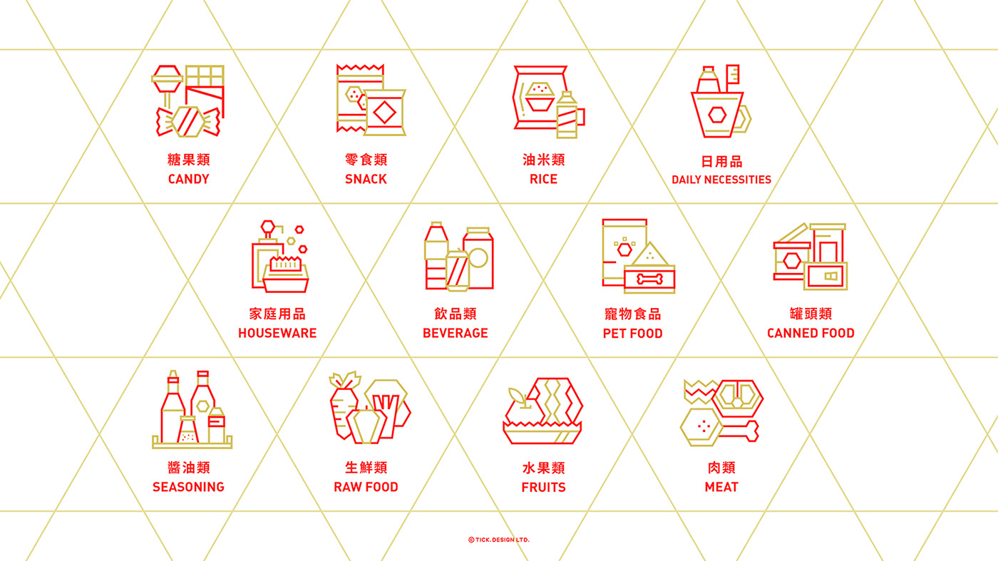
Tai Fung Supermarket has been rebranded with a new and systematic image, which brings a brand new visual effect. Red, gold, and white are used as the standard colors. The hexagonal geometric pattern is used as the design identification element, which is extended to various design projects of the brand. The fresh and modern matching presents an image of affinity and simplicity. ✨
Rebranding creates a unified new image to enhance brand recognition and brand uniqueness, bringing a sense of innovation and making the brand more distinctive. Various exquisite pattern designs signifies a wide range of goods, providing excellent, fresh and healthy products, which suggests that Tai Fung Supermarket is a trustworthy supermarket. 🛍🥬🍞✨
泰豐超級市場品牌形象重塑,建立全新、更具系統化的品牌形象,帶來煥然一新的視覺效果。品牌採用紅、金、白色作為標準顏色,以六角形幾何圖案為設計識別元素,延伸應用至品牌的各個設計項目,清新且具現代感的配搭,呈現親和力與簡約的形象。✨
品牌重塑打造一體化的新形象,以提高識別度並與時並進,增加品牌獨特性及帶來新穎改革的感覺,讓品牌個性更為鮮明。各項精緻的圖案設計象徽泰豐超市貨品齊全,為大眾提供優質、新鮮、健康的產品,成為市民信賴的超市。🛍🥬🍞✨


THANK YOU! :)
Branding Design by TICK.DESIGN
Follow us on:
☑️ Facebook: TICK.DESIGN
☑️ Instagram: @tickdesignltd
☑️ Behance: https://www.behance.net/tickdesign
☑️ Instagram: @tickdesignltd
☑️ Behance: https://www.behance.net/tickdesign


