


💎 Seng Fung Jewellery Branding ✨
💎 盛豐珠寶 品牌形象 ✨
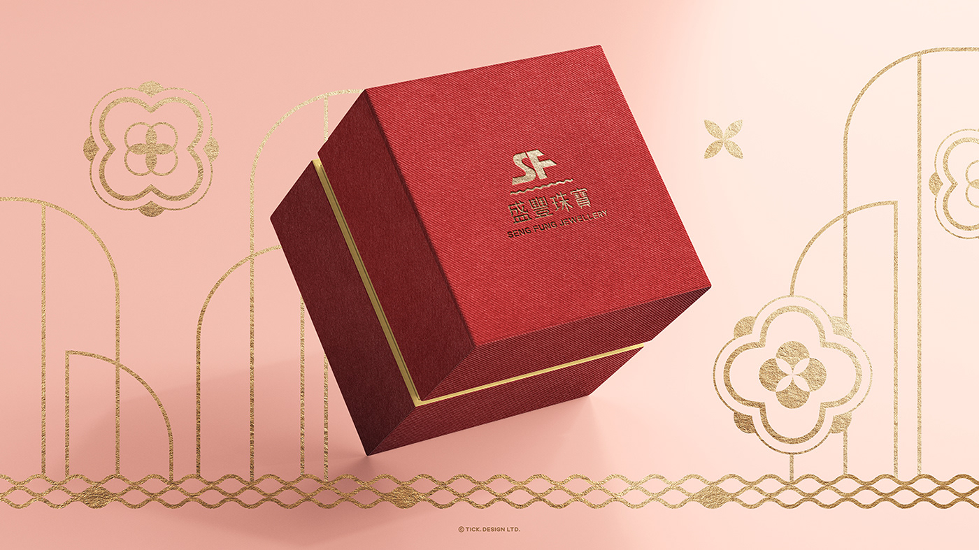
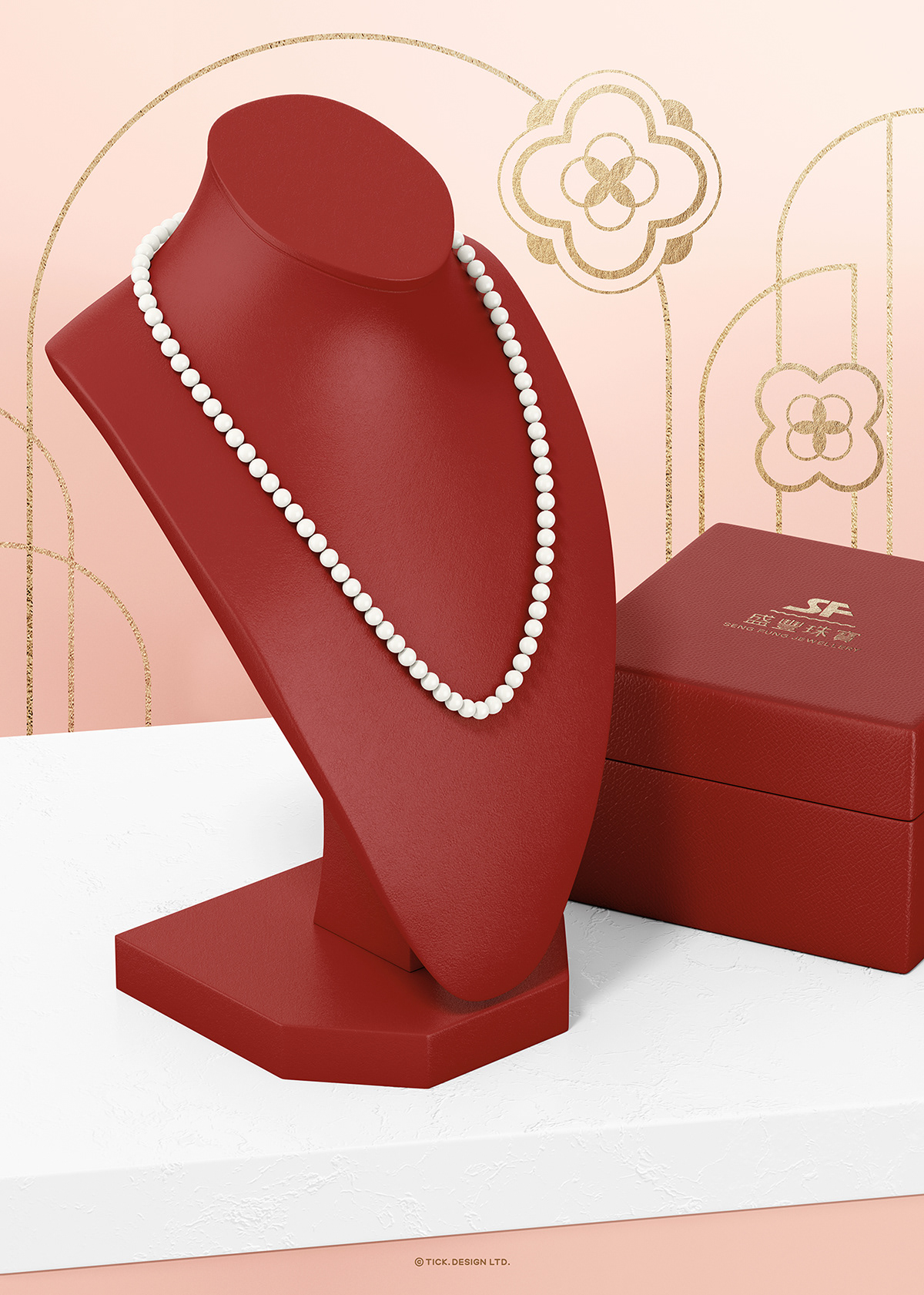
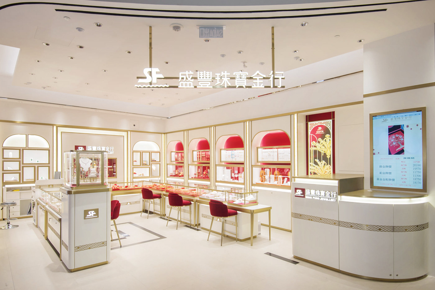
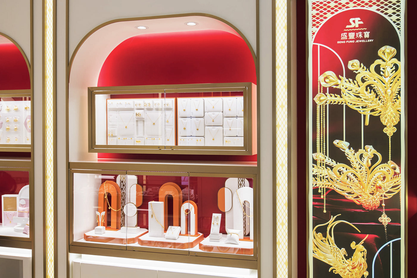
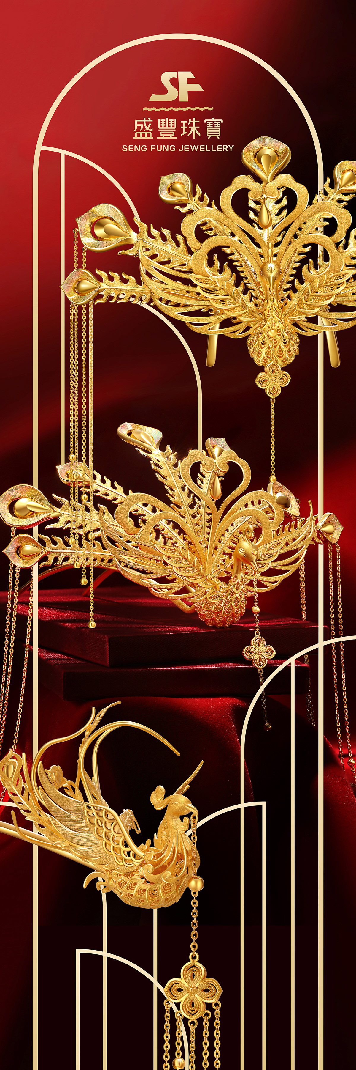
The rebrading of Seng Fung Jewellery has been transformed from the original calligraphy font of the logo to the standard logotype with a sense of design. The color scheme of the overall store image is dominated by red and gold, with simple decorative lines, which are extended to various brand application items, highlighting the noble and elegant feeling. 💍✨
The rebrading of Seng Fung Jewellery has been transformed from the original calligraphy font of the logo to the standard logotype with a sense of design. The color scheme of the overall store image is dominated by red and gold, with simple decorative lines, which are extended to various brand application items, highlighting the noble and elegant feeling. 💍✨
盛豐珠寶品牌形象更新項目,由標誌原有書法字體統一變更成富設計感的品牌標準字。整體店舖形象配色以紅、金色為主色調,配搭簡約的裝飾線條,延伸應用至品牌的各個設計項目,突顯尊貴、典雅感覺。💍✨


THANK YOU! :)
Branding Design by TICK.DESIGN✨
Branding Design by TICK.DESIGN✨
Follow us on:
☑️ Facebook: TICK.Design
☑️ Instagram: @tickdesignltd @tramy_lui
☑️ Behance: https://www.behance.net/tickdesign
☑️ Facebook: TICK.Design
☑️ Instagram: @tickdesignltd @tramy_lui
☑️ Behance: https://www.behance.net/tickdesign
📩 For enquiry, please contact us at: info@tick-design.com
🔎 如有合作意向,歡迎與我們聯絡 🤗✨
🔎 如有合作意向,歡迎與我們聯絡 🤗✨


