This project was an exercise in problem solving, as much as design. Users were unanimously displeased with the current version of My Ford Touch (the software installed on Ford vehicle's touch screens). The task at hand was to solve not only the visual pitfalls, but to correct trouble spots in content access and information architecture as well.
This is not an easy problem to solve. Interaction with a touch screen while operating a vehicle poses several issues, the most obvious of which being that the driver's eyes should be on the road, and not the screen. A drastic departure from the current interaction paradigm was necessary to provide a safe and effective solution.

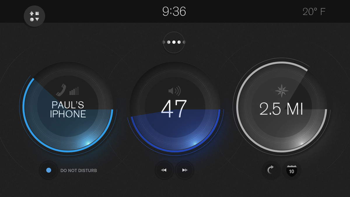
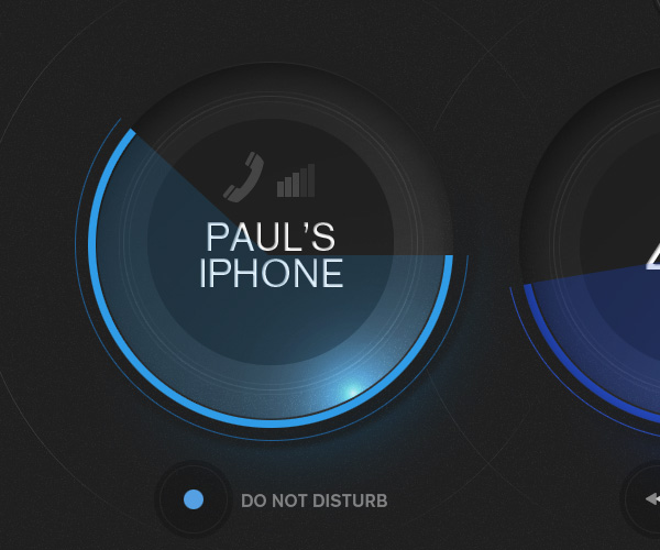
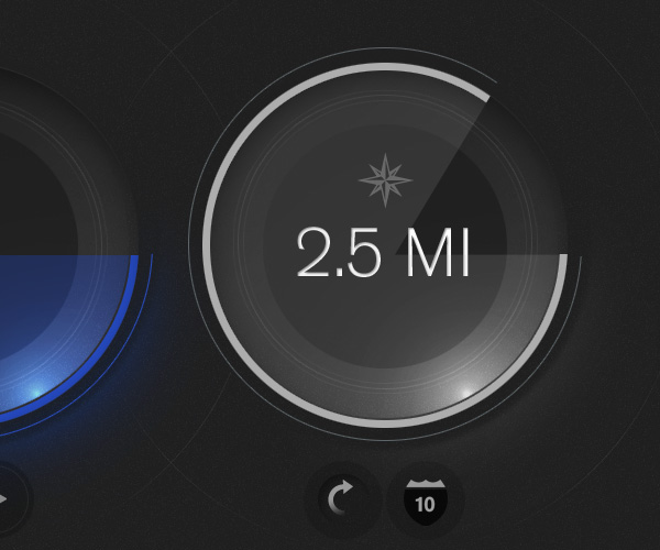

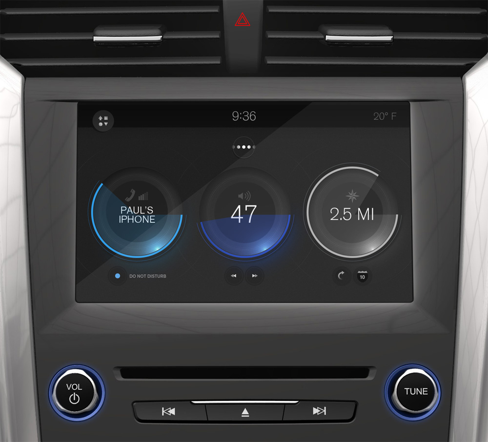
The home screen consists of three multi-function information displays (MFID's), which the user may customize by selecting their chosen MFID's from a large library.
The first function is to display basic information a driver can absorb with a quick glance. The second is to act as a launch point, allowing the driver to dive into a particular piece of detailed content, upon tap. In some cases, MFID's also allow a driver to adjust aspects of their environment without diving into deeper content. For example, the audio MFID allows for volume adjustment, and the ability to skip tracks, from the home screen.


An overt change of color and visual style is used when launching deeper content from the home screen. The abrupt difference is noticeable in a driver's periphery, creating visual confirmation that their interaction registered, without having to look directly at the screen.


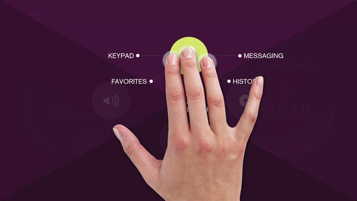
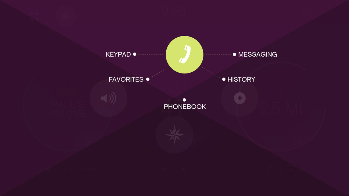
For the practiced user, a marking menu makes for a very powerful, and quick means of accessing specific commands, without following a typical click path. This ancillary menu system is accessed by a three finger tap and hold gesture. Activating this menu completely takes over the screen, and divides it into quadrants, each representing one of the four main content areas of the interface. The driver may then swipe into one of the quadrants, revealing submenu items for that section. A directional swipe then activates the submenu item. This all sounds complex, but with a bit of repetition, gestures soon become ingrained in muscle memory. For example, to access the phone book from anywhere in the application, the driver need only tap with three fingers, swipe up, and swipe back down, keeping their eyes on the road.

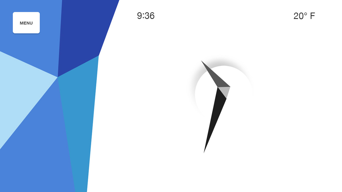


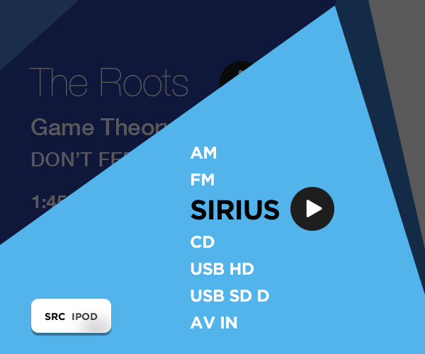
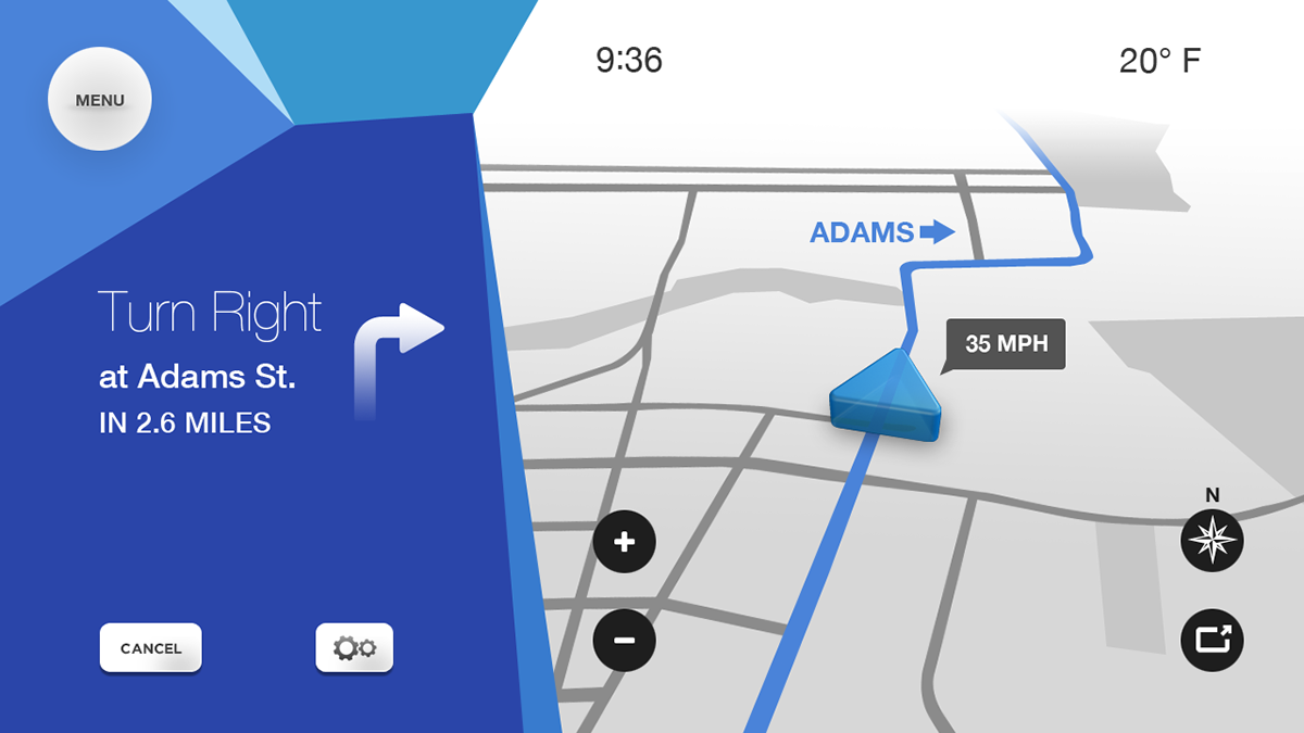

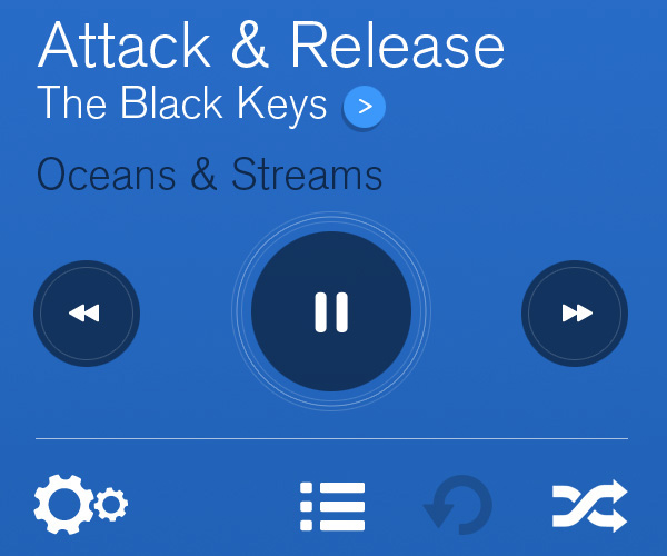
The central idea in this concept is adaptive content. The on screen interface is directly tied to the vehicle's current speed, and driving conditions; what is displayed on screen, the options the driver is presented with, even the size of icons and buttons are completely dependent on these factors. When the car is stopped, all menus and submenus are fully accessible, but as the vehicle's speed increases, less important elements are removed, presenting the driver with only the most pertinent information. In the example above, the driver is listening to an iPod on shuffle. The most important, and therefore largest button is "skip track", as the driver should be doing little else while driving at speed.