


The name, Speak Easy was derived from the Prohibition Era in the USA, where drinking and selling of
alcohol in secrecy was a commonplace. The name Speak Easy has struck through the ages and has become
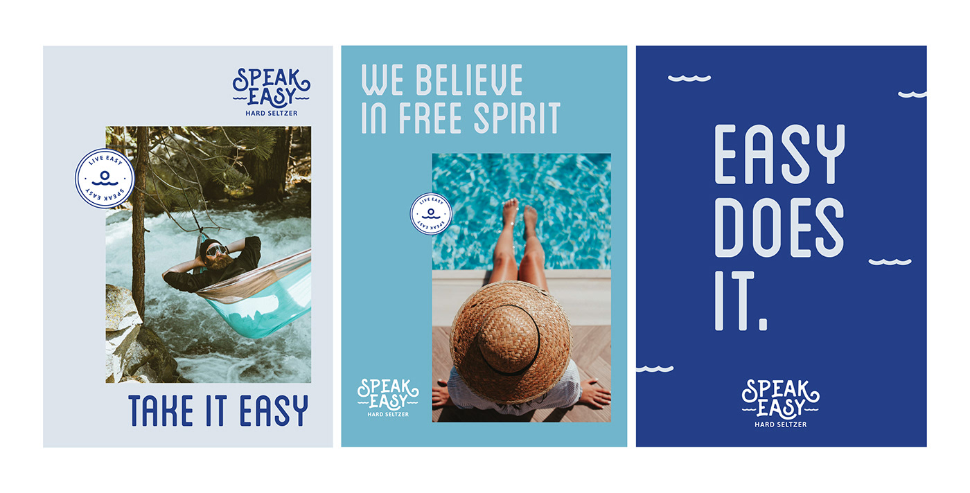
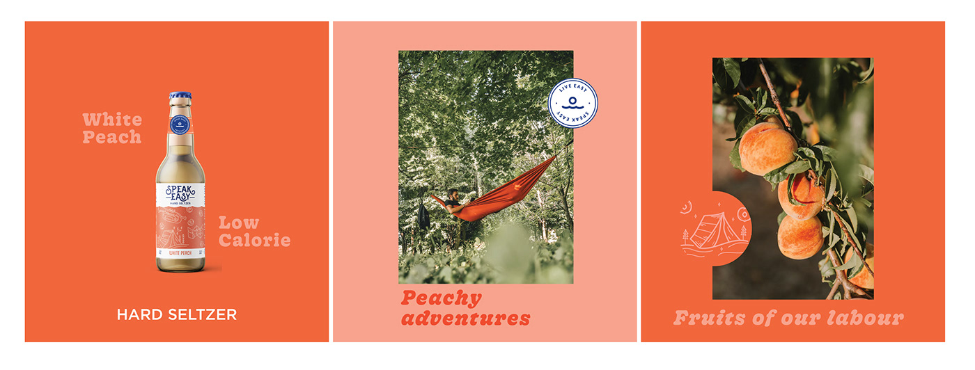
synonymous with having a good time. We wanted the brand to be a testament to an 'Easy life' where life is simple, slow and relaxed.
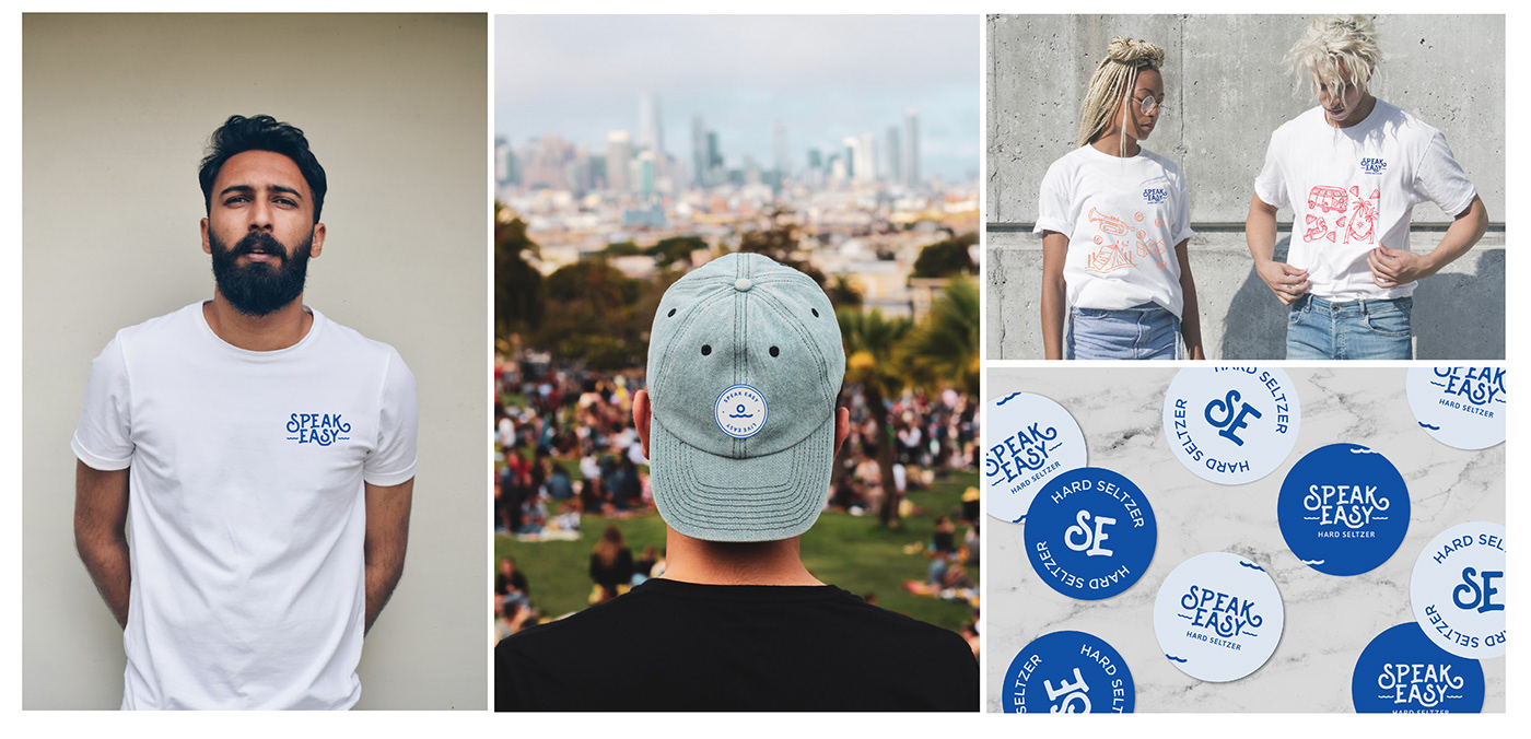
The identity created had a free flowing vibe which transports your mind far away from the daily rut, helping reinforce the idea of easy-living.


It's all about having a good time, conversations and friendships. We wanted to tap into the emotion of drinking and move beyond the functional nature of alcohol.
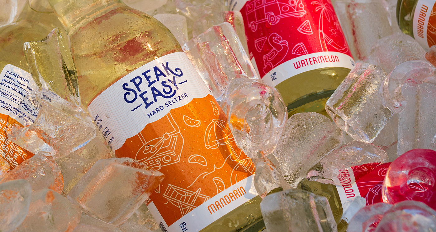
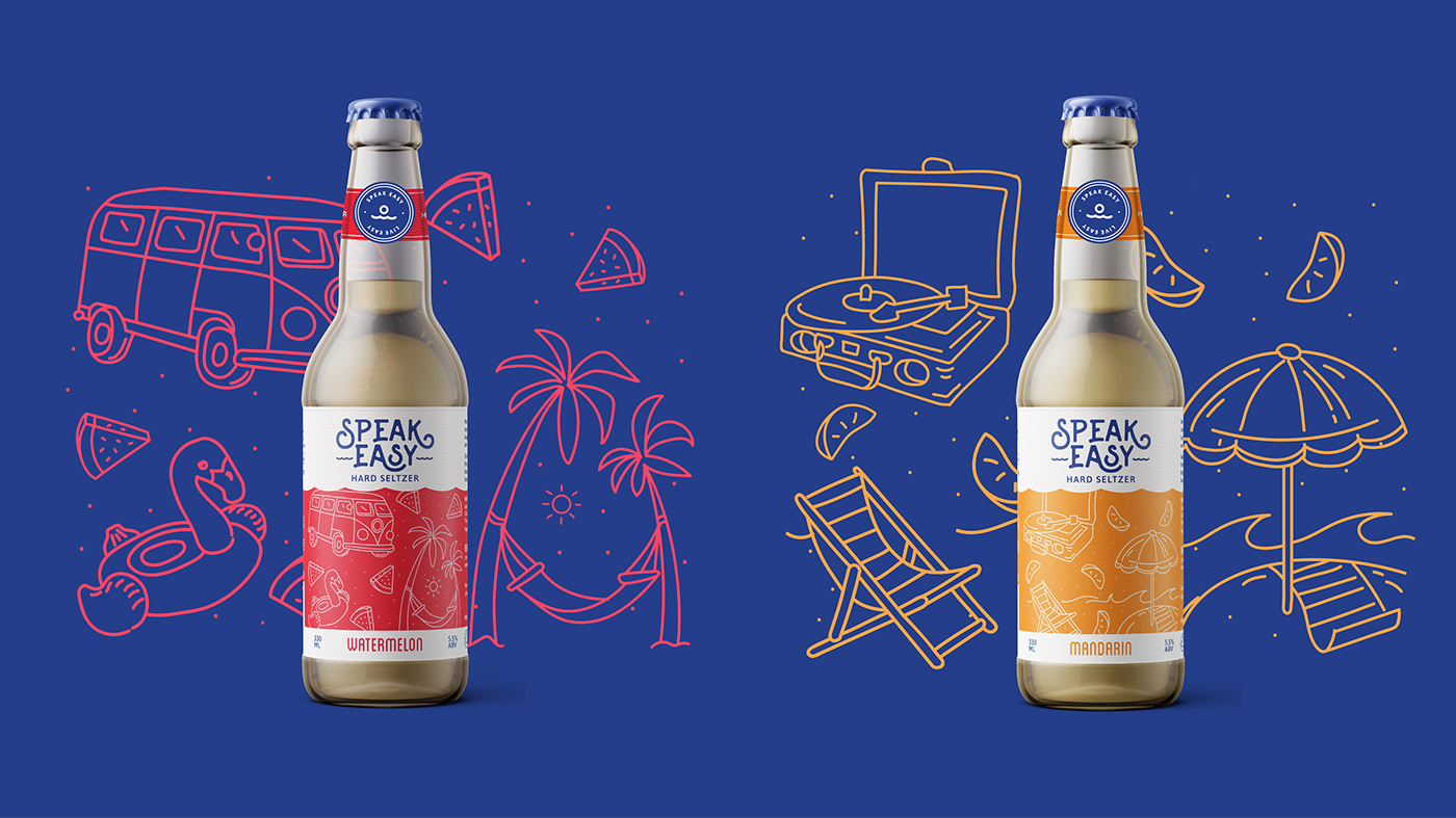
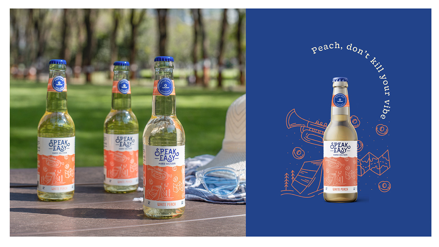
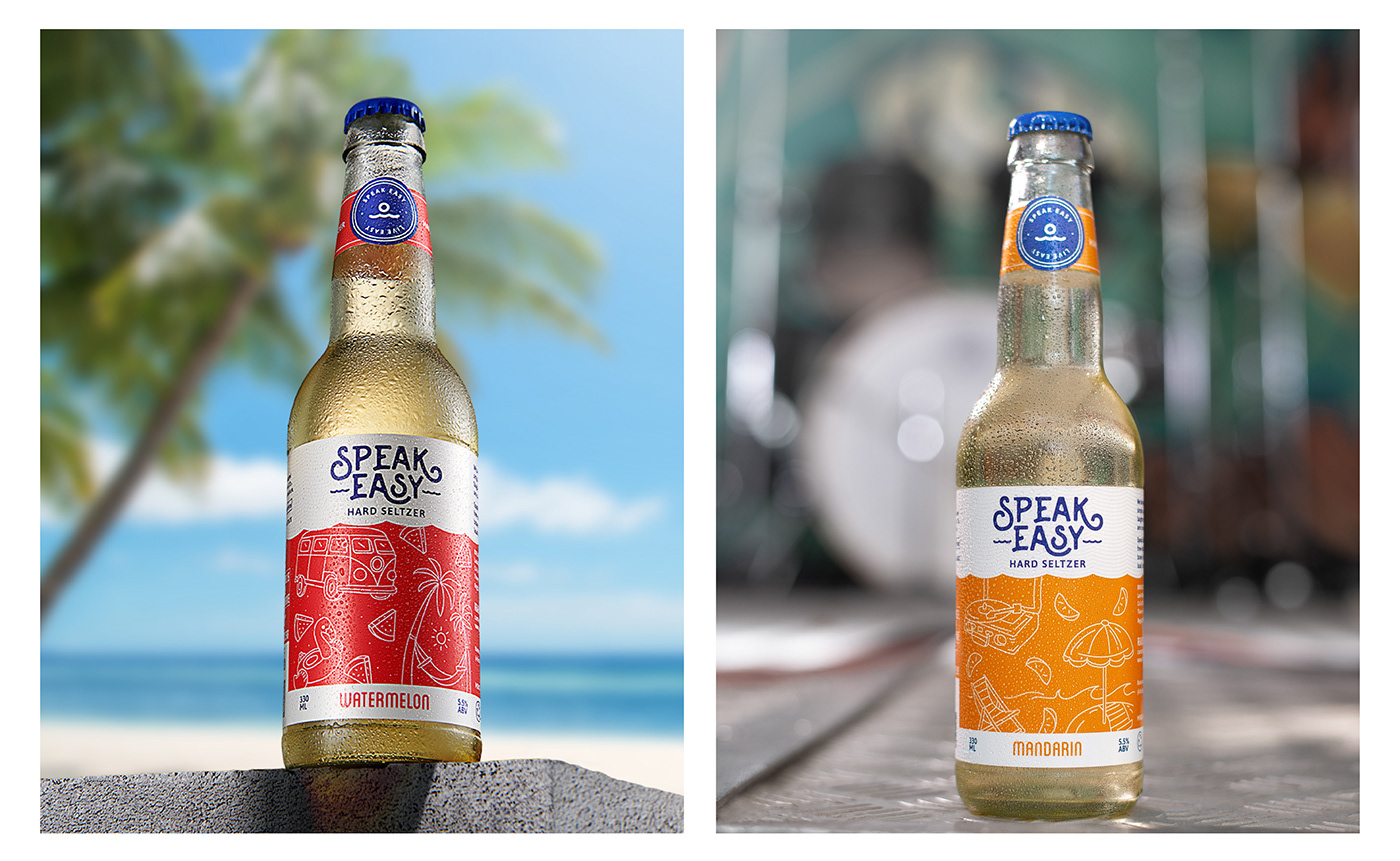
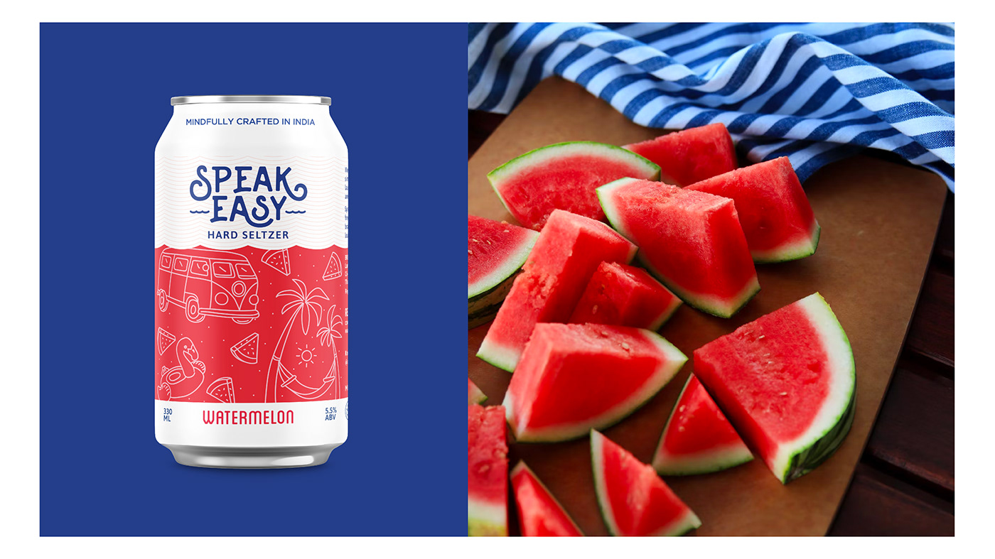
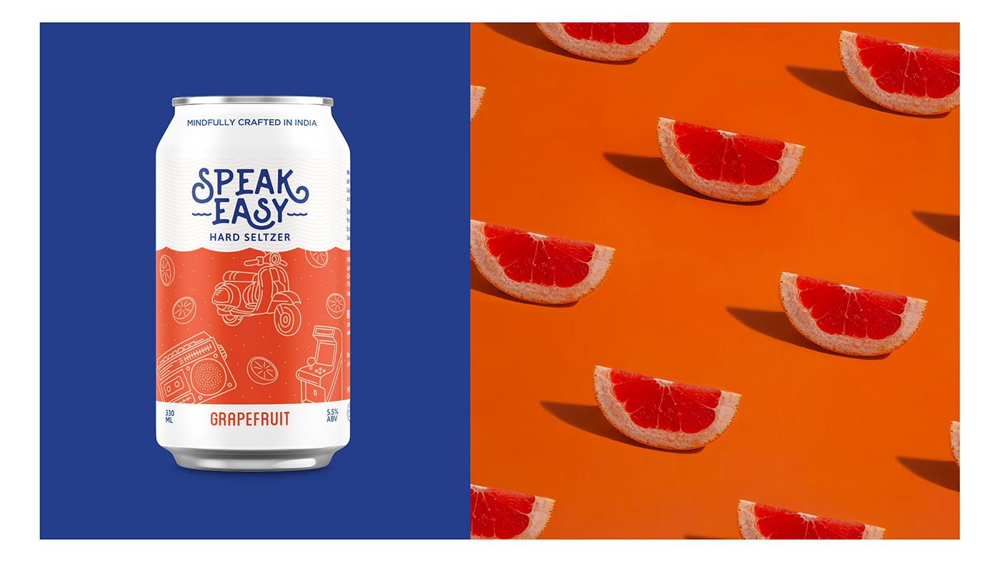
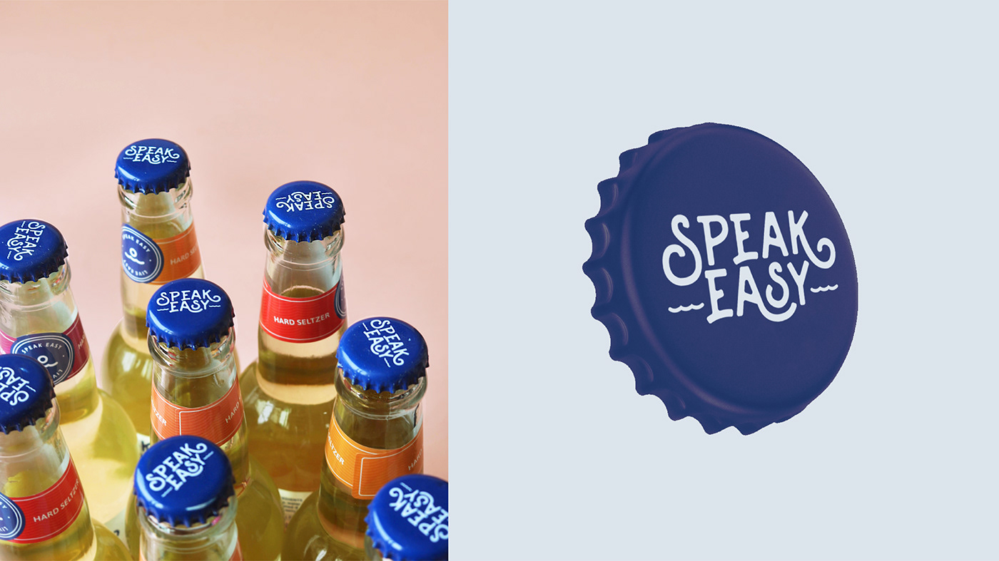
Speak Easy seltzers were launched with 6 distinct flavours - Watermelon, White Peach, Passionfruit, Mandarin, Pink Guava and Grapefruit. For each label, we created hand drawn illustrations to revolve around a story, a conversation and a vibe.
Drinking is now more than just bars and pubs. People now enjoy it at beaches, treks, road trips, music festivals etc. And these scenarios became the central concept for each label. The scenarios are expansive which enables us to keep the system flexible for future addition of flavours.


This Project was done while I was working at Firebrand_India
Client: Speak Easy - Lark Winery LLP
Design Agency: Firebrand India
Brand Design and Packaging: Chirag Shah
Photography: Aarish Bhathena & Siddharth Chavan
Instagram | LinkedIn
Client: Speak Easy - Lark Winery LLP
Design Agency: Firebrand India
Brand Design and Packaging: Chirag Shah
Photography: Aarish Bhathena & Siddharth Chavan
Instagram | LinkedIn


