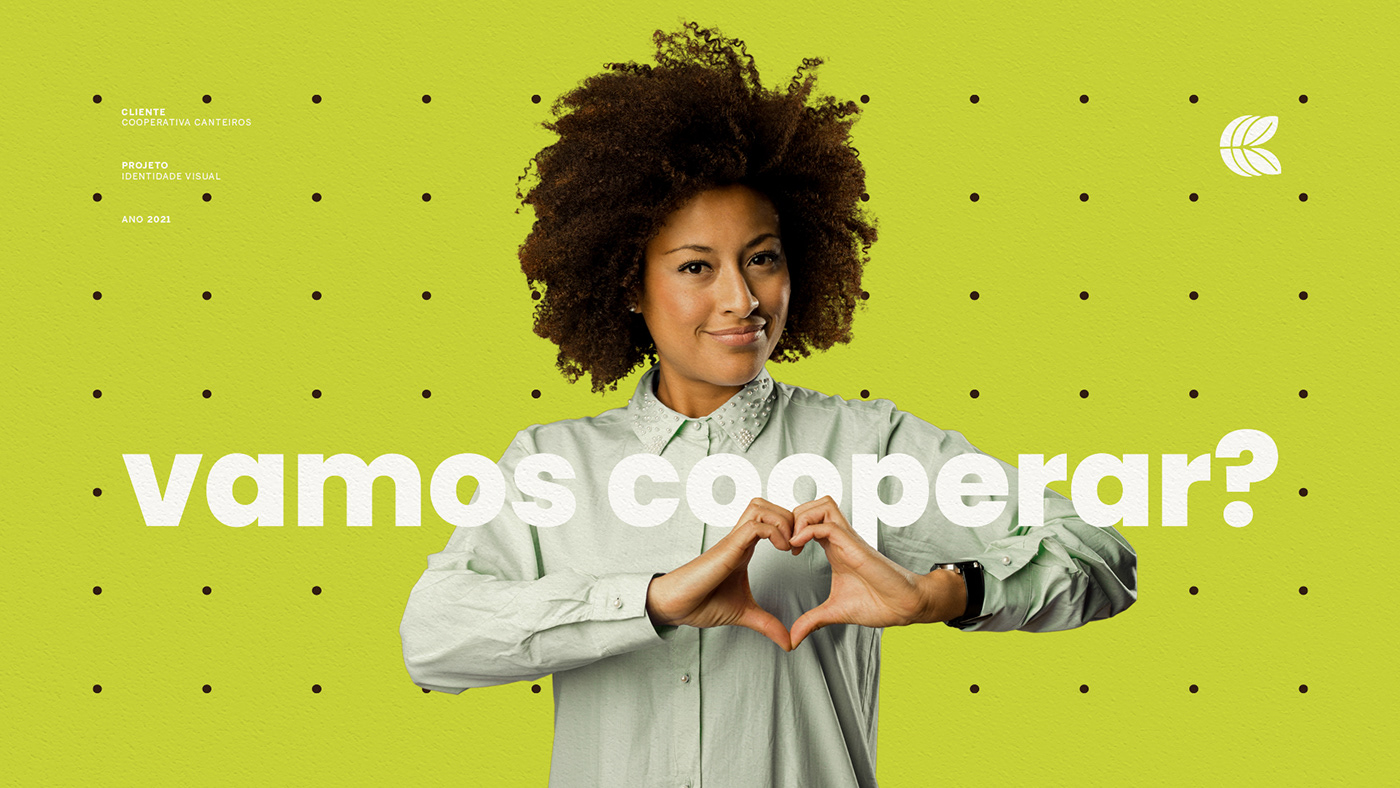


BRIEFING
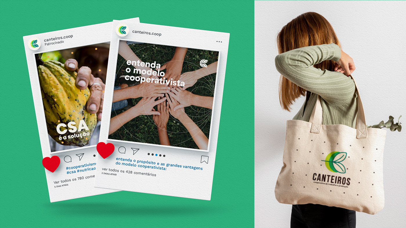
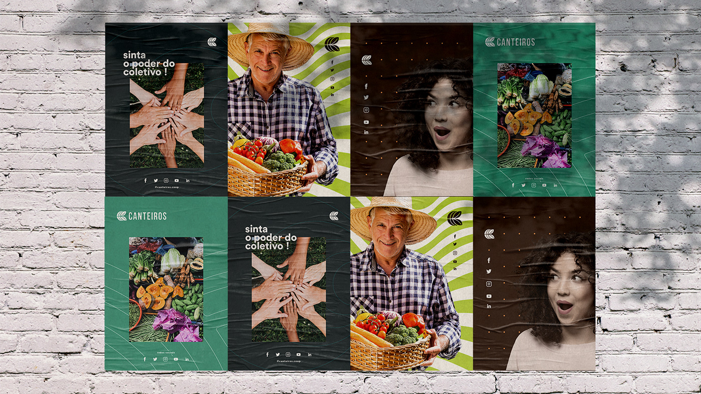
Canteiros is a mixed work and production cooperative, created in May 2020, dedicated to scale restoration of landscapes (pasture, agriculture, forest and people). Areas of expertise: agroecology and organic production; sustainable livestock; forest restoration and agroforestry systems. The initial challenge was to hear from a good number of members, since the cooperative was just founded and they still needed to discover the identity.
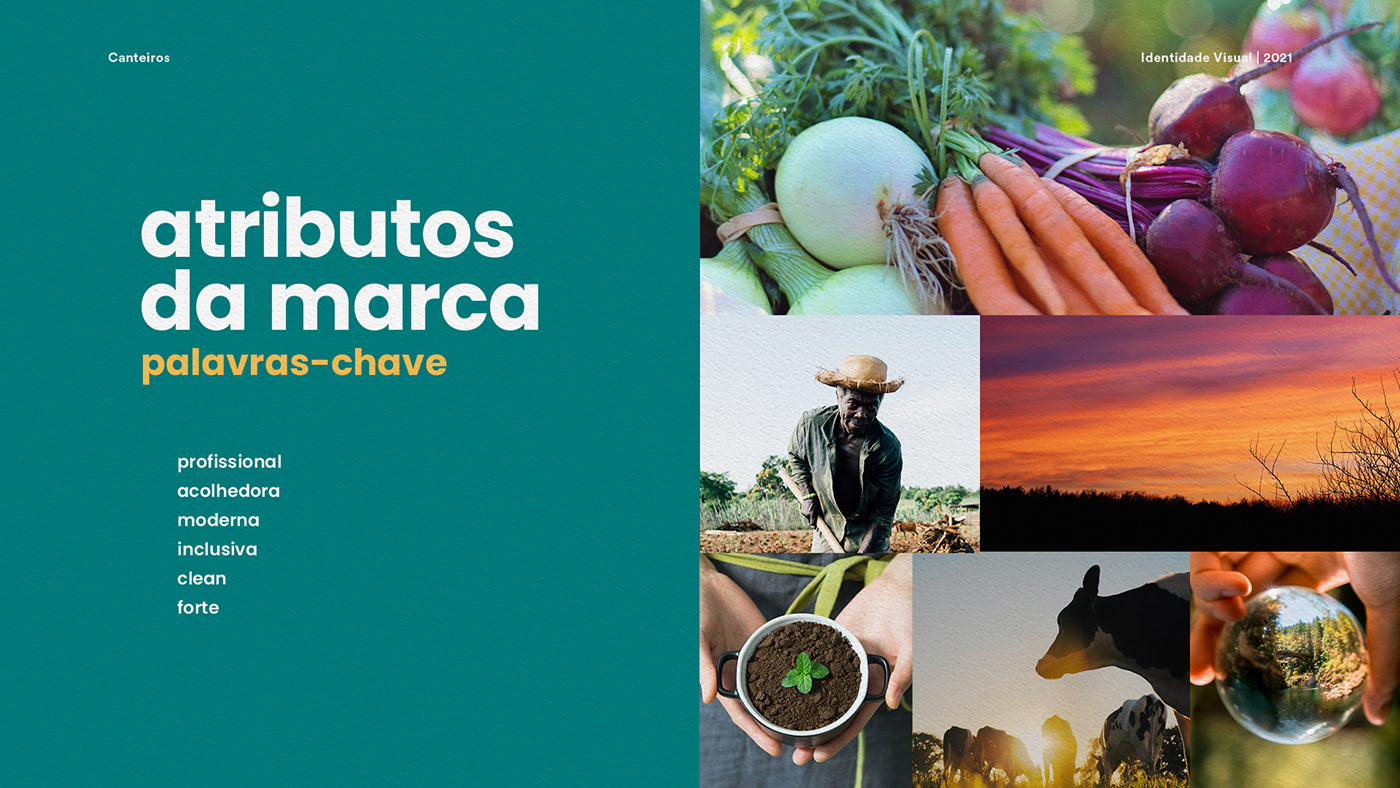
KEYWORDS
Strong / Professional / Clean / Welcoming / Modern / Inclusive
BRAND
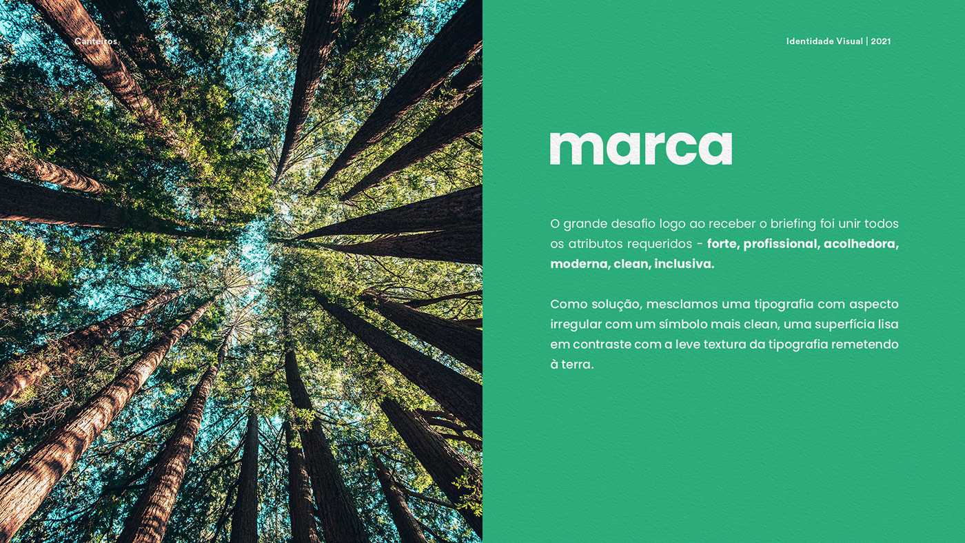
The big challenge in the sequel was to unite all the required attributes - strong, professional, clean, welcoming, modern, inclusive. As a solution, we mixed a typography with an irregular appearance with a cleaner symbol with a smooth surface in contrast to the light texture of the typography referring to the earth.
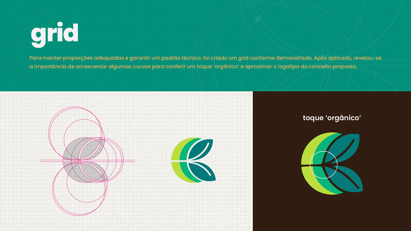
SYMBOL CONSTRUCTION
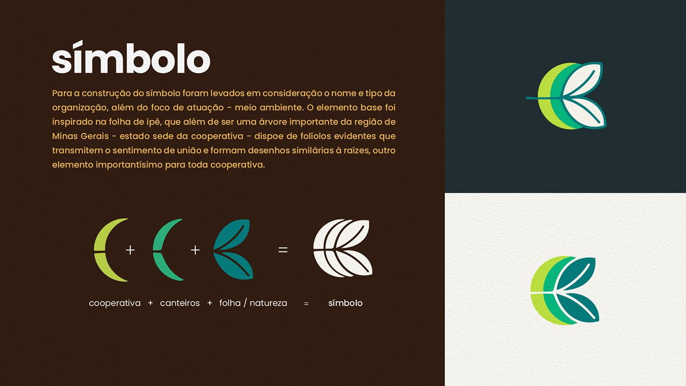
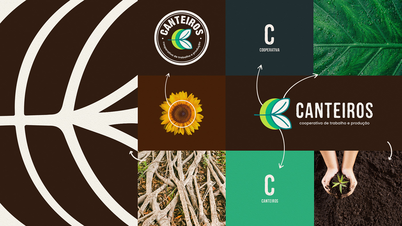
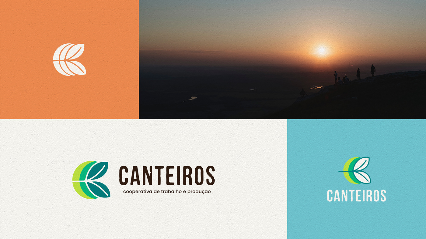
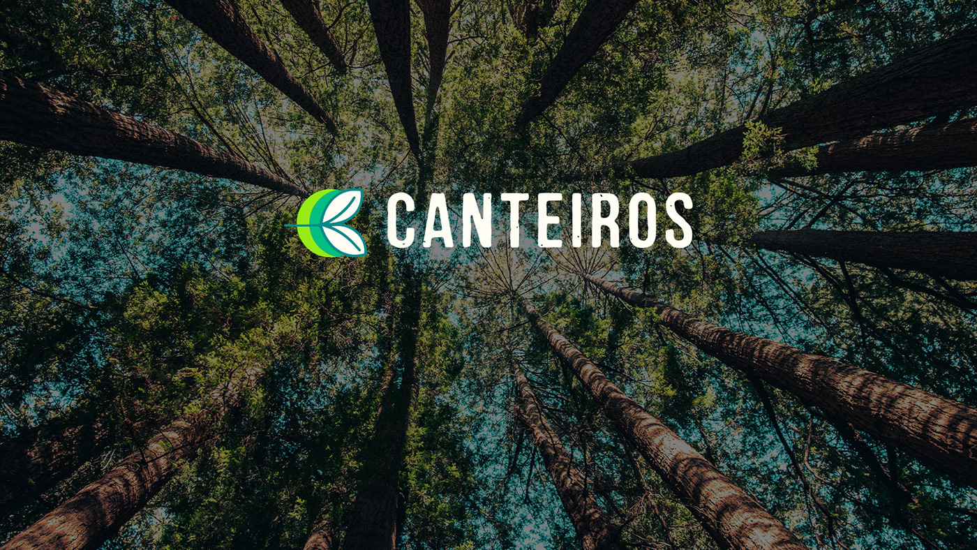
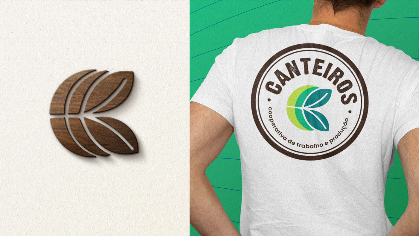
The brand was created from elements suggested by the cooperative members - tree, leaf, seeds, nature, forest - in harmony with the message needed to convey - lightness, strength, and above all, the power of integration.
The colors used refer to nature. And the base element was inspired by the IPÊ leaf, which in addition to being an important tree in the region of Minas Gerais, the cooperative's headquarter state, the arrangement of the leaflets conveys the feeling of union.
The two 'Cs' of Cooperativa and Canteiros can be seen as the first elements from left to right integrating with the stem of the leaf hollowed out to "infinity".

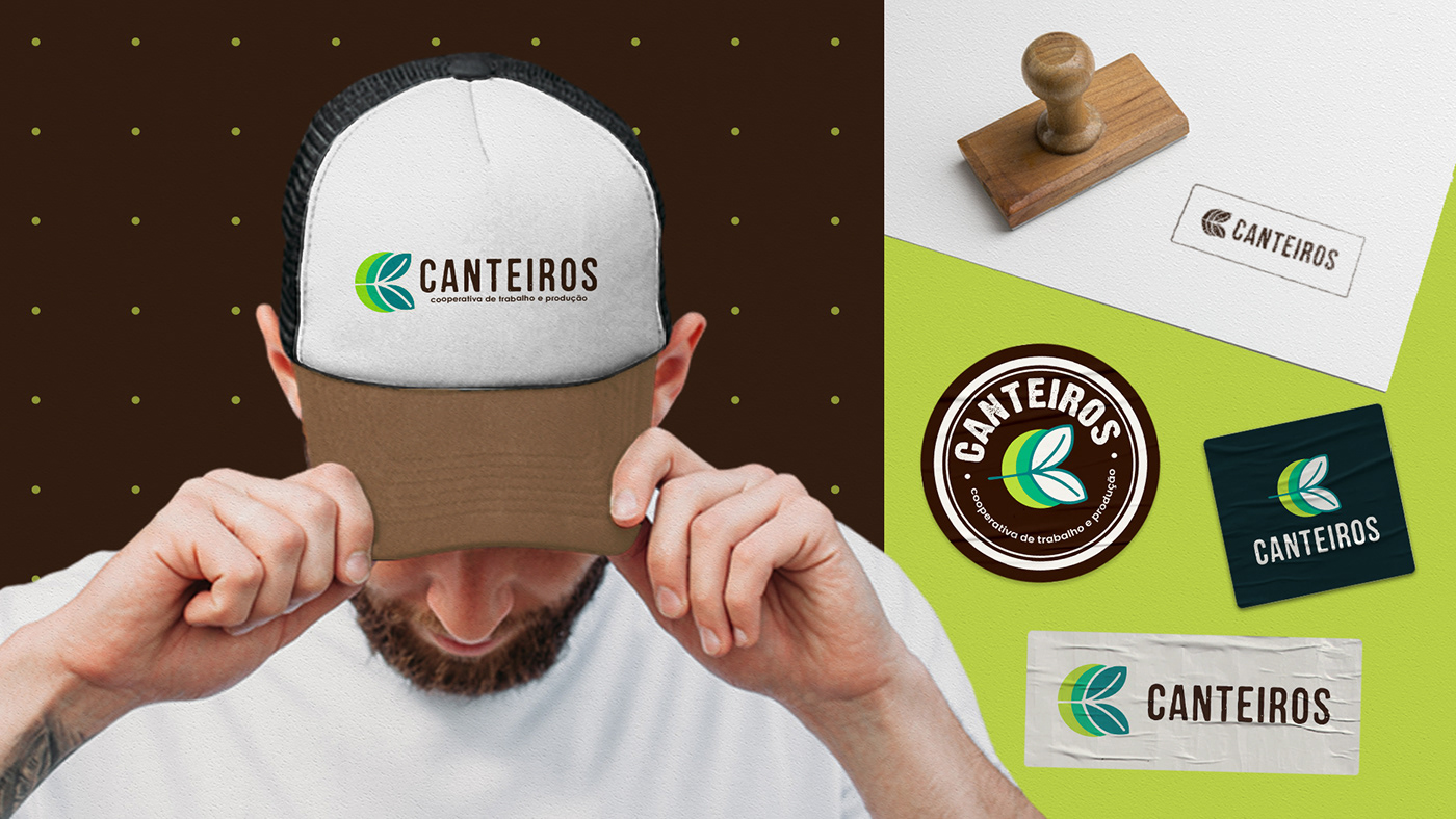
TYPOGRAPHY
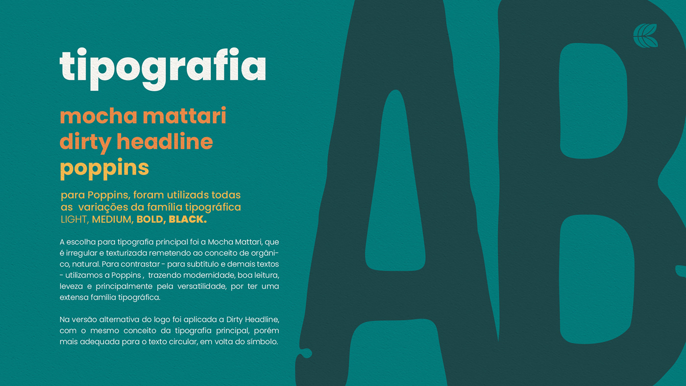
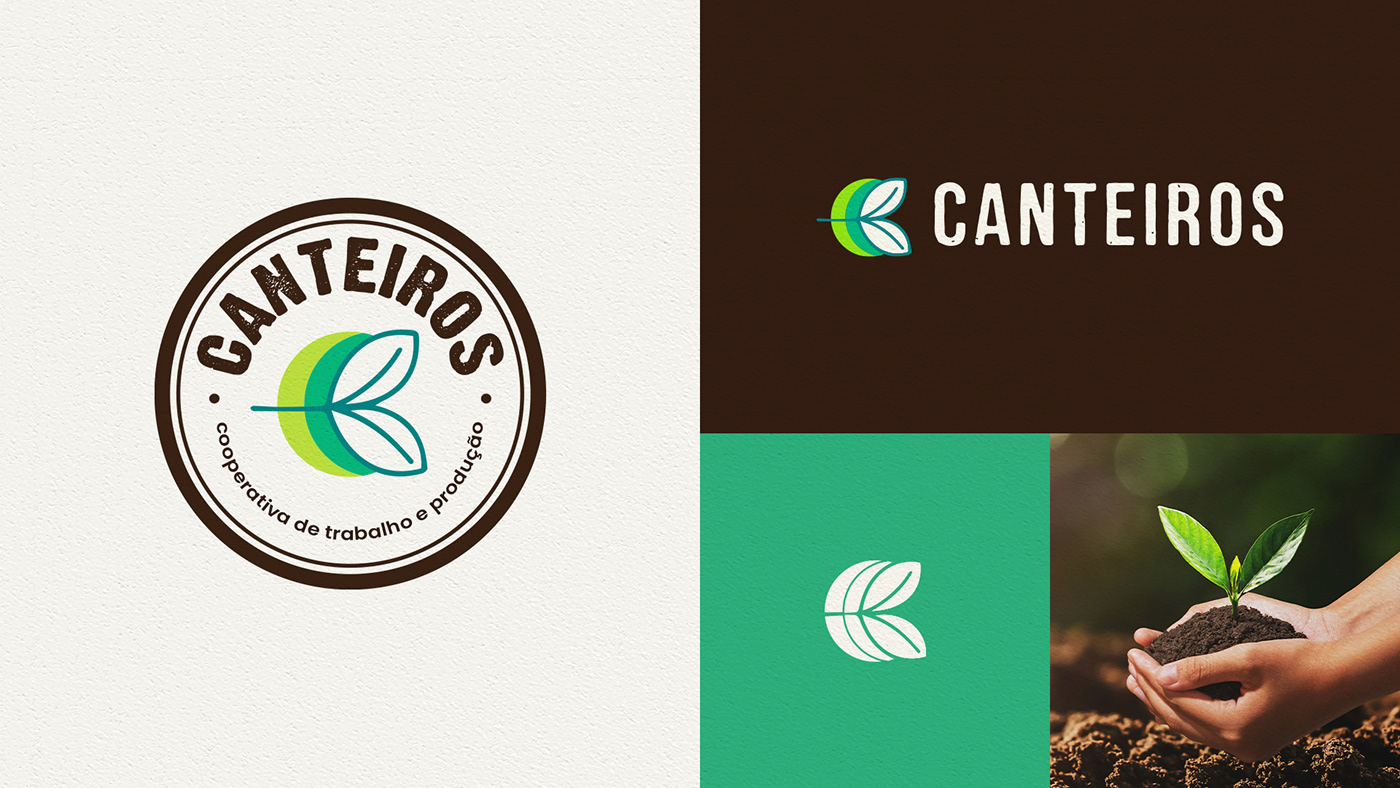
The choice for the main typography was Mocha Mattari, which is irregular and textured, referring to the concept of organic, natural. To contrast - for subtitles and other texts - we use Poppins, bringing modernity, good reading, lightness and especially for versatility, for having an extensive typographic family.
The choice for the main typography was Mocha Mattari, which is irregular and textured, referring to the concept of organic, natural. To contrast - for subtitles and other texts - we use Poppins, bringing modernity, good reading, lightness and especially for versatility, for having an extensive typographic family.
In the alternative version of the logo, the Dirty Headline was applied, with the same concept as the main typography, but more suitable for the circular text, around the symbol.
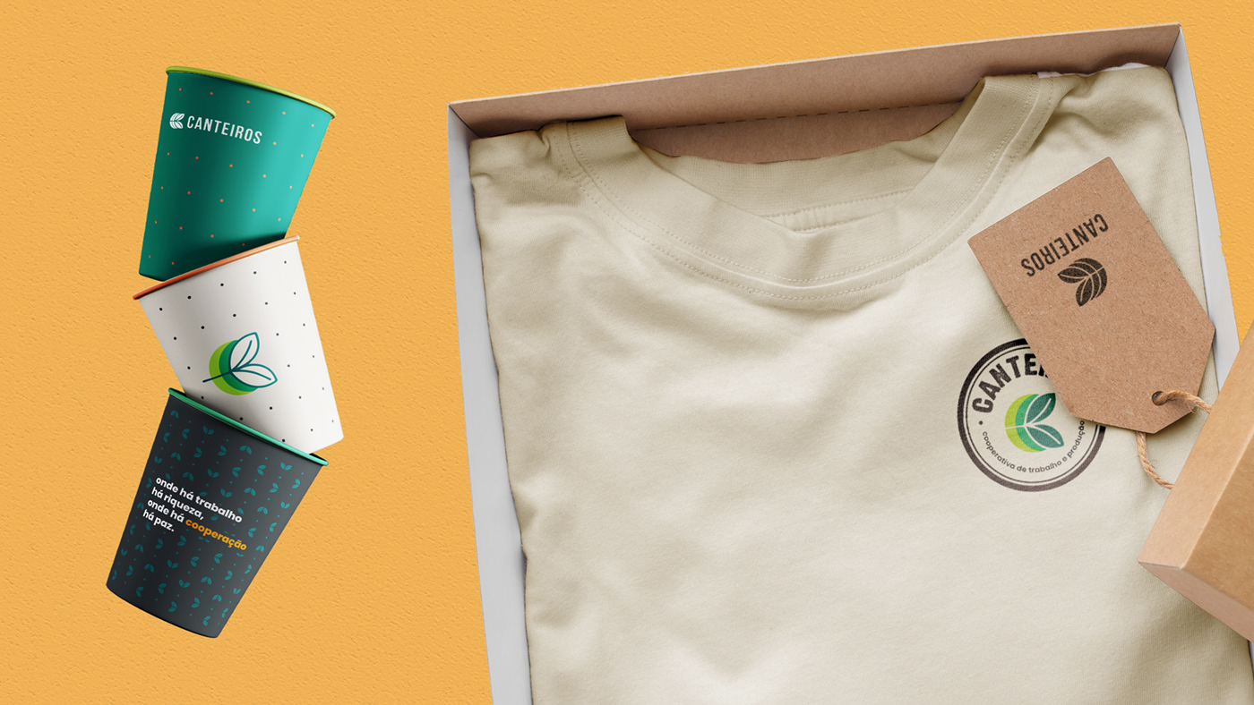
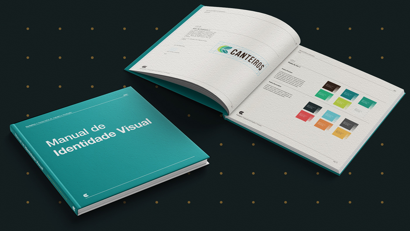
COLOR PALETE
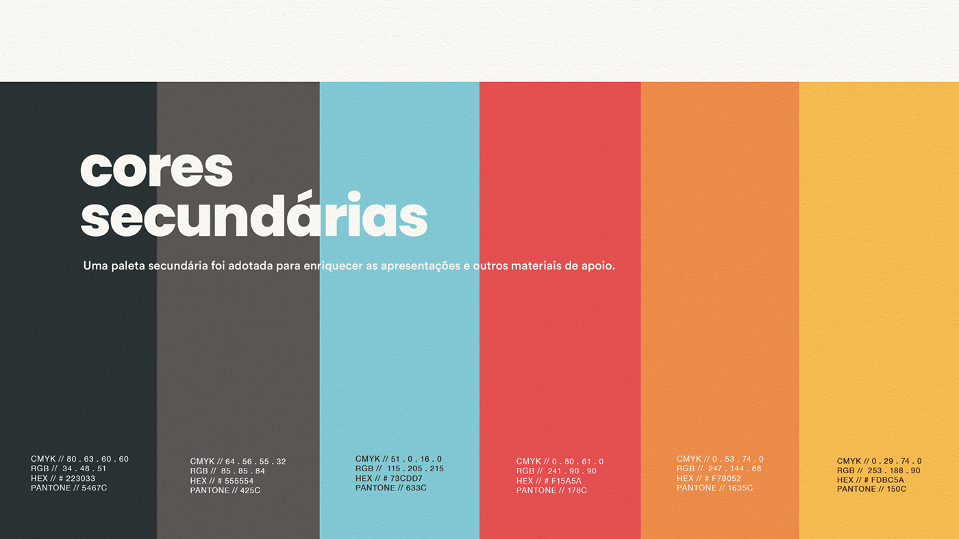
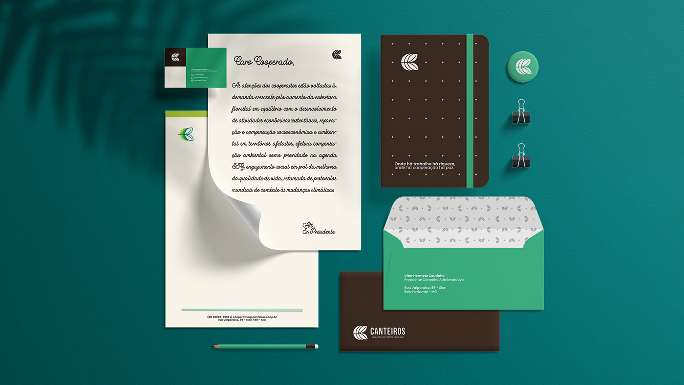
It was inspired by tones of nature, green of the leaves, brown of the earth and a very light tone, almost white to give contrast and highlight the other colors. A secondary palette was adopted to enrich presentations and supporting materials.

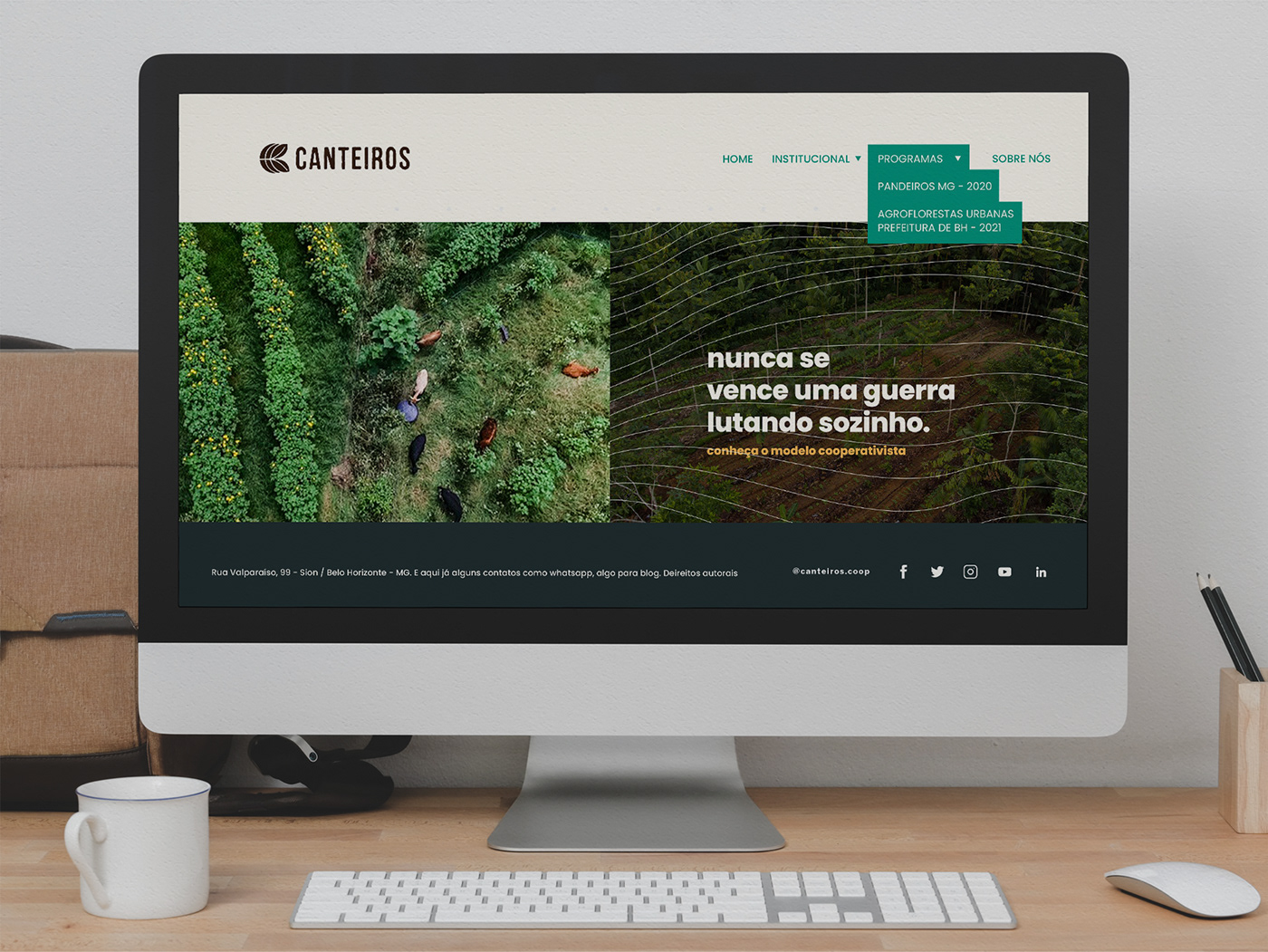

Watch the video of the most recent project carried out by the cooperative. It is an advisory service for the improvement of urban gardens and agroforestry in the metropolitan region of Belo Horizonte. Project in partnership with the city hall and local farmers:
For this same project, a magazine was produced containing the final report on the implementation of the program. Check this out:
CURIOSITY
At first, I was in charge of the cooperative's visual identity project. After introducing the brand, I was invited to join the team. A short time later I became communications coordinator, which I still do with great dedication and pride.
We defend a very noble cause which is to help take care of the environment. Do your part too!
THANK YOU FOR THE VISIT!