


Ryanair Airlines - Rebranding Concept
Brand identity, Illustration, Art direction
Backstory
Ryanair is one of the Europe's biggest airlines, with number of passengers growing from 75 million in 2012 to 148 million in 2020. Yet, its visual identity lacks personality. In post-pandemic world, flying became even more expensive. Budget airlines like Ryanair are usually the only way to fly for average people.
Goal
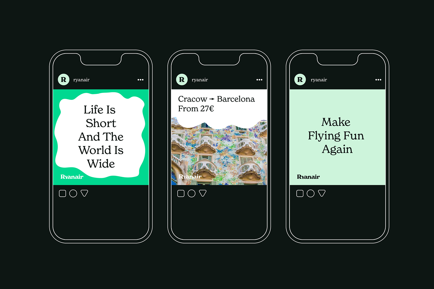
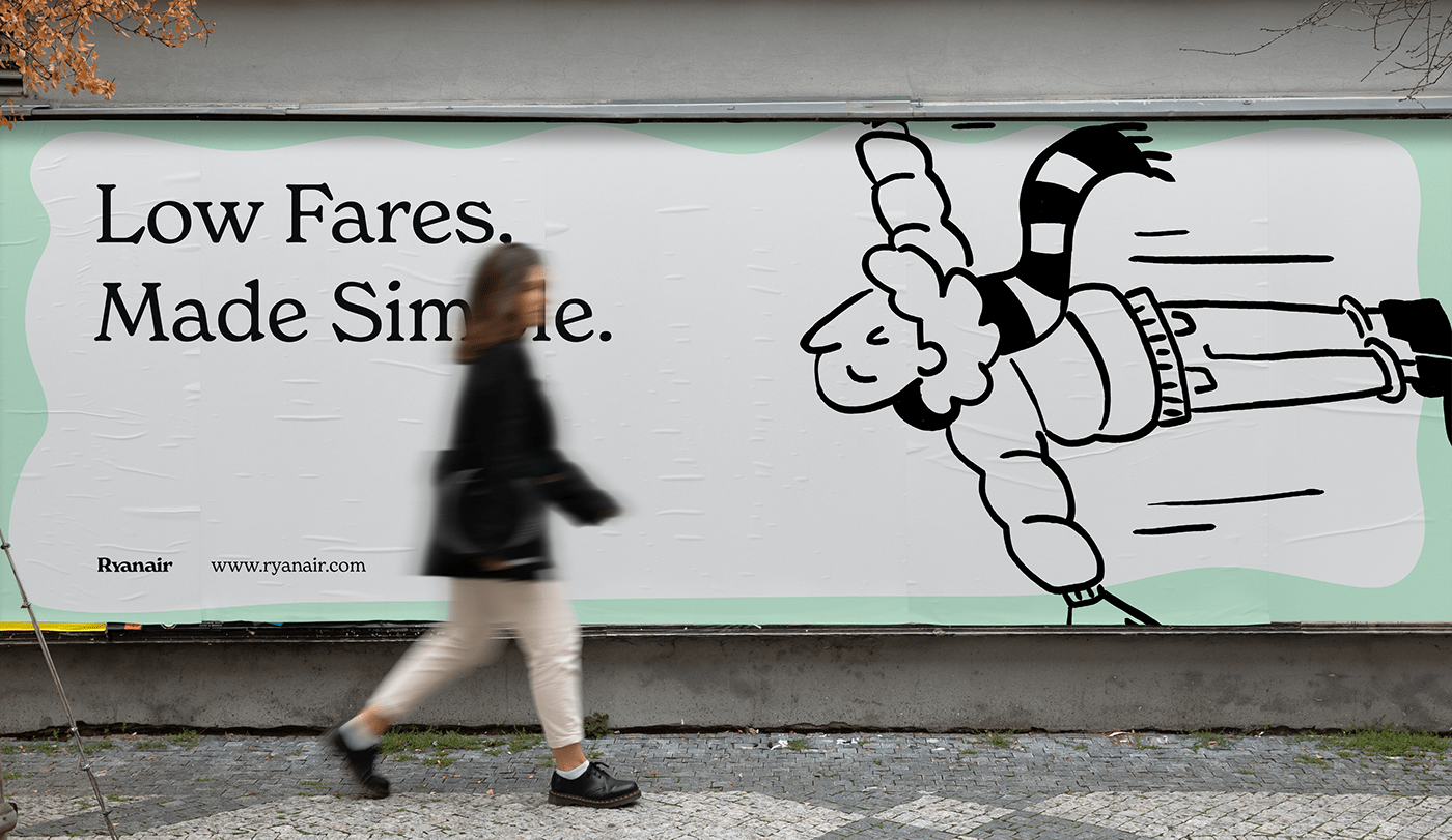
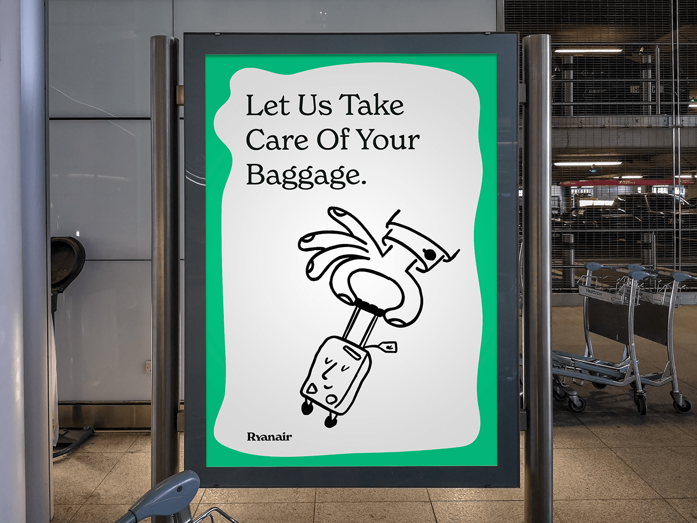
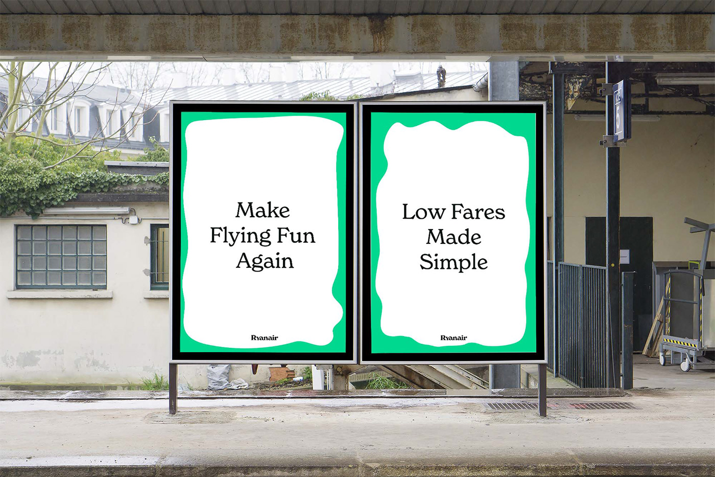
The goal of the project was to modernize Ryanair's branding, making its message less "we are cheap" and more "we are for the people". Also, I wanted to target younger audience.
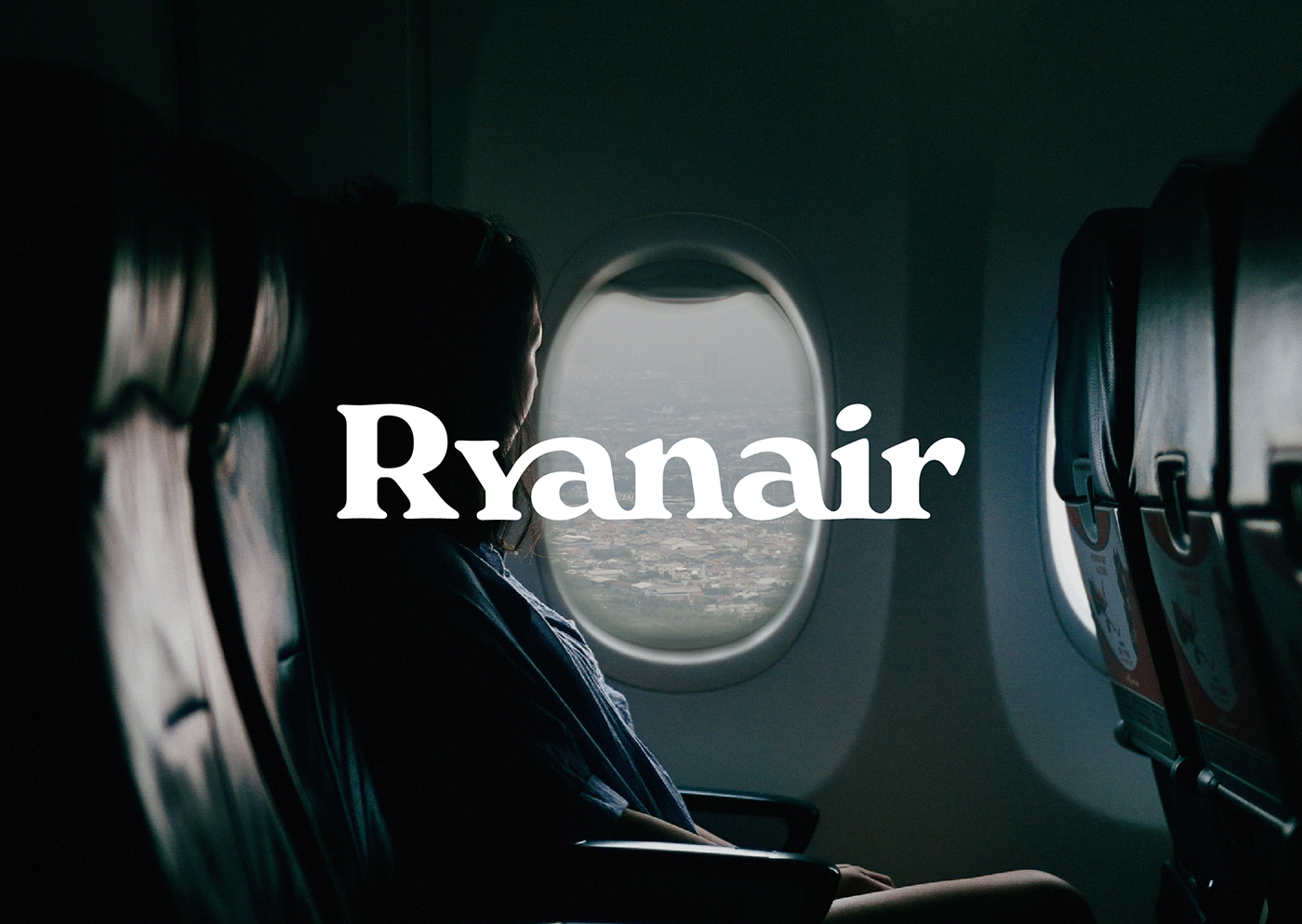
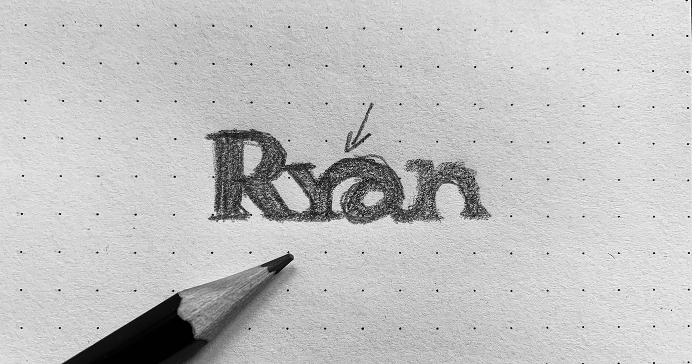
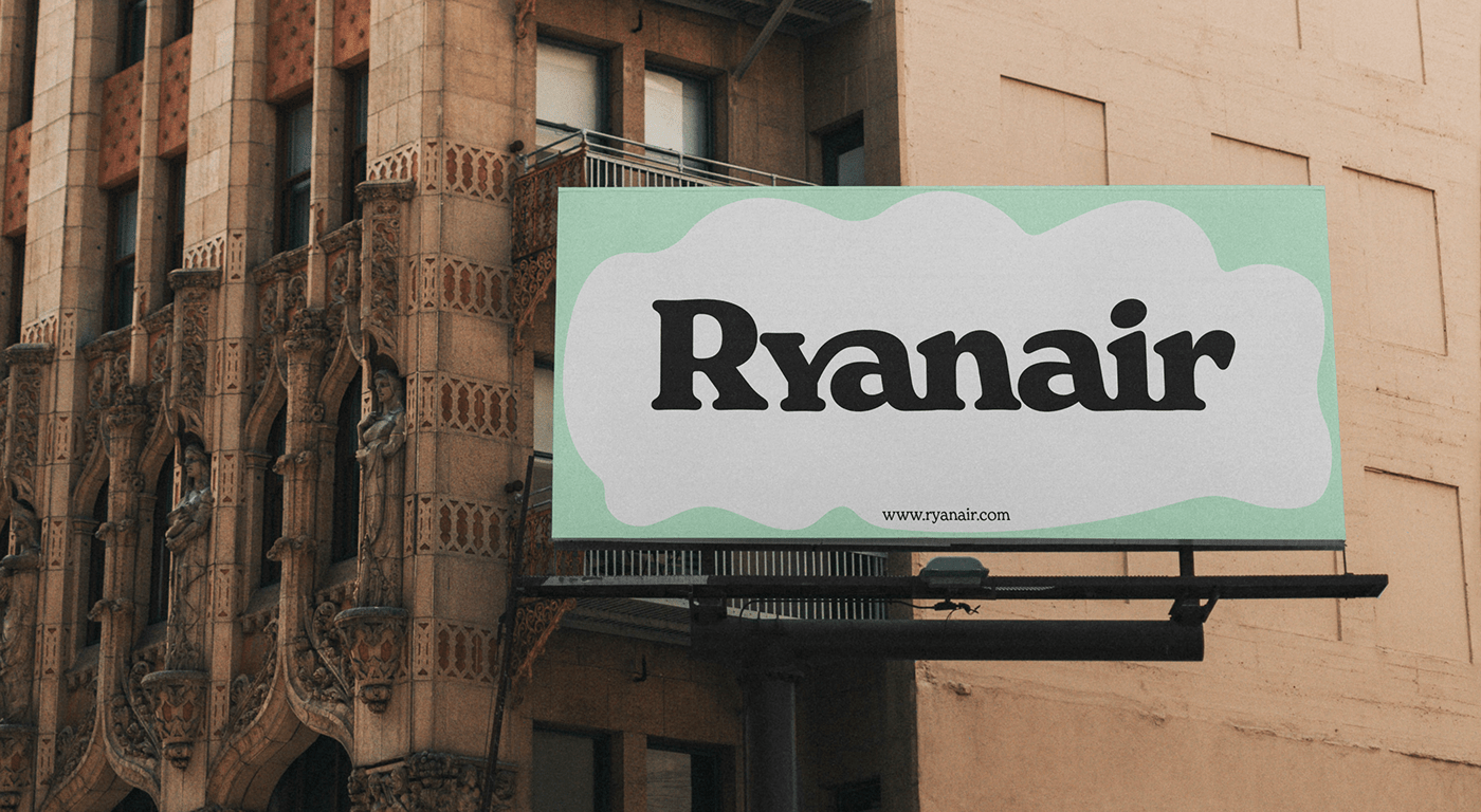
Logotype
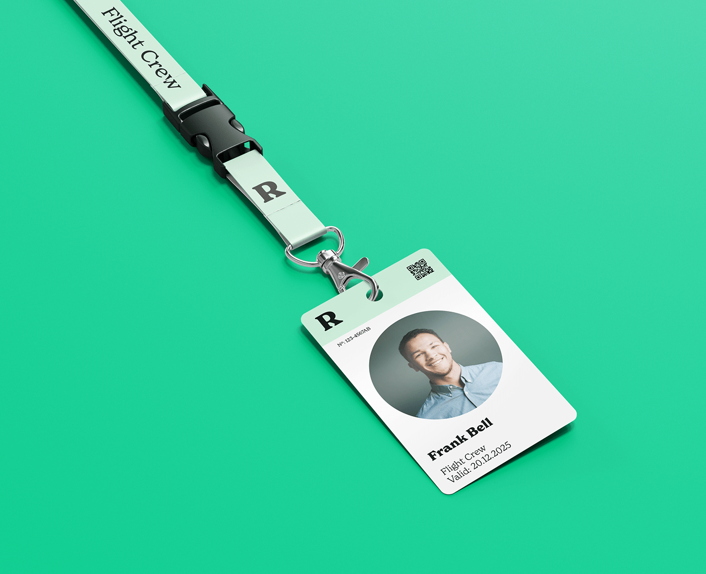
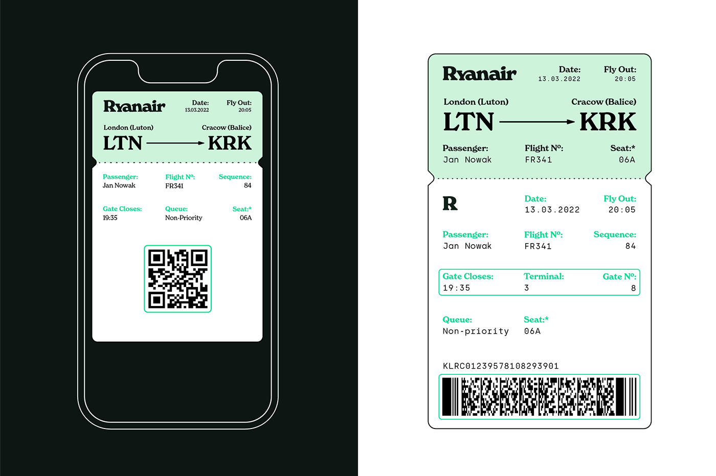
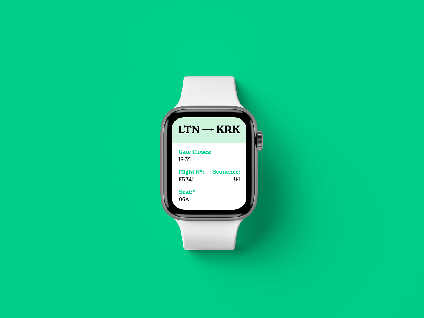
The wordmark is written in New Spirit typeface. New Spirit's features make logotype look more cheerful than corporate. The ligature between "y" and "a" symbolizes connection and journey from point A to B, which is the sole purpose of an airline.
New Spirit is used both as the display font and body text in the entire branding.
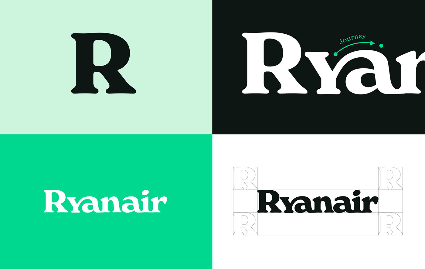
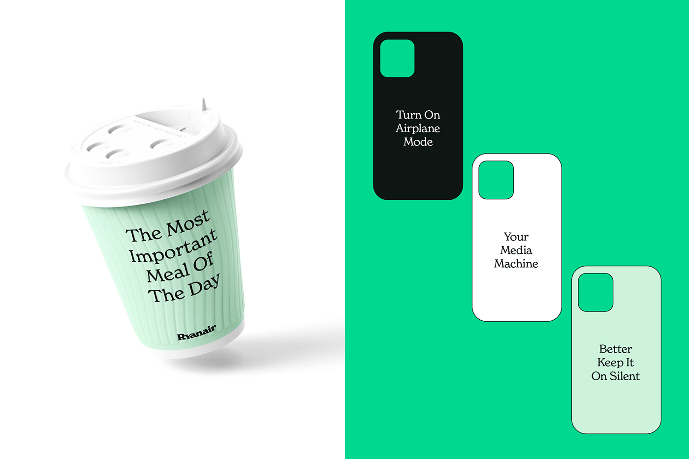
Colors
Most of airlines use navy blue color in their identification to communicate professionalism. It makes blue pretty hard to "own" as an airline. For the new colors I have chosen shades of green.

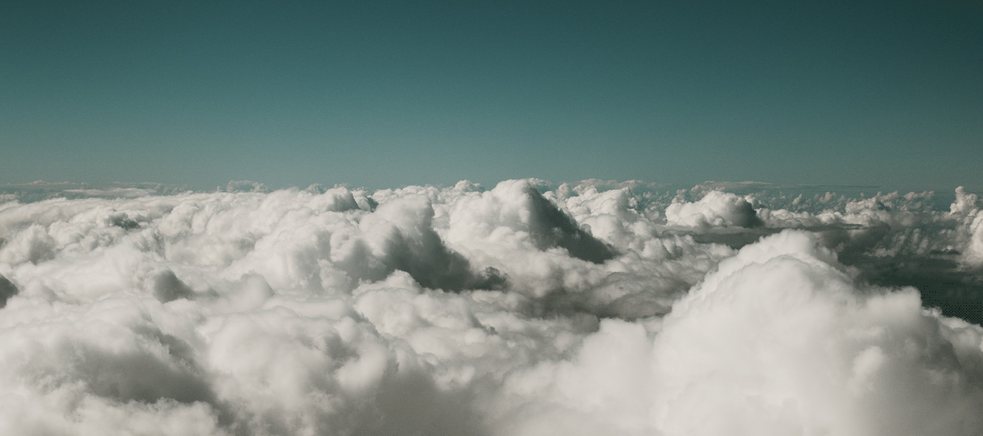
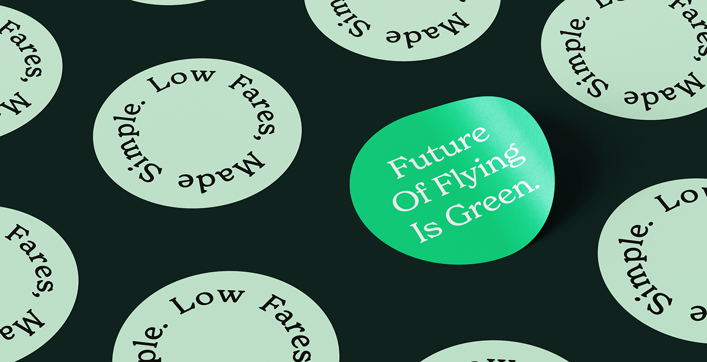
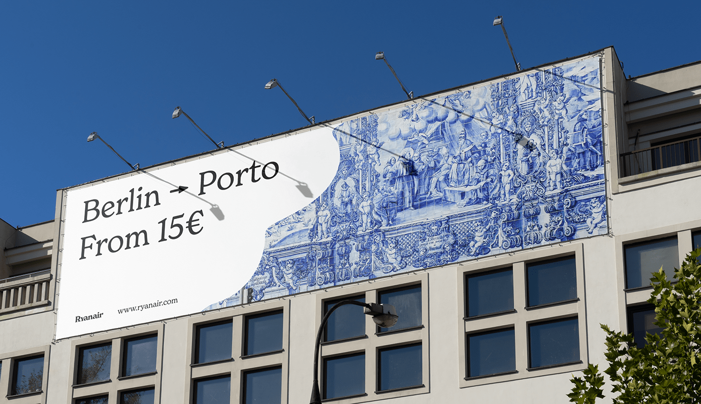
Key visual
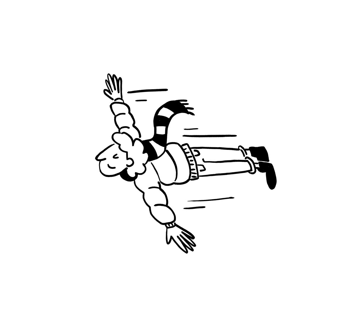
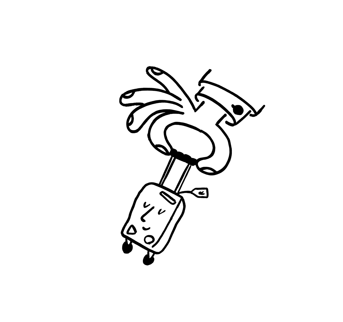
Design elements are inspired by irregularity of the clouds. Wavy, abstract shapes are used throughout the branding to strengthen the friendly character of Ryanair.


Kuba Góra, 2022
Apple Watch mockup: https://www.anthonyboyd.graphics/mockups/top-view-apple-watch-series-5-mockup/


