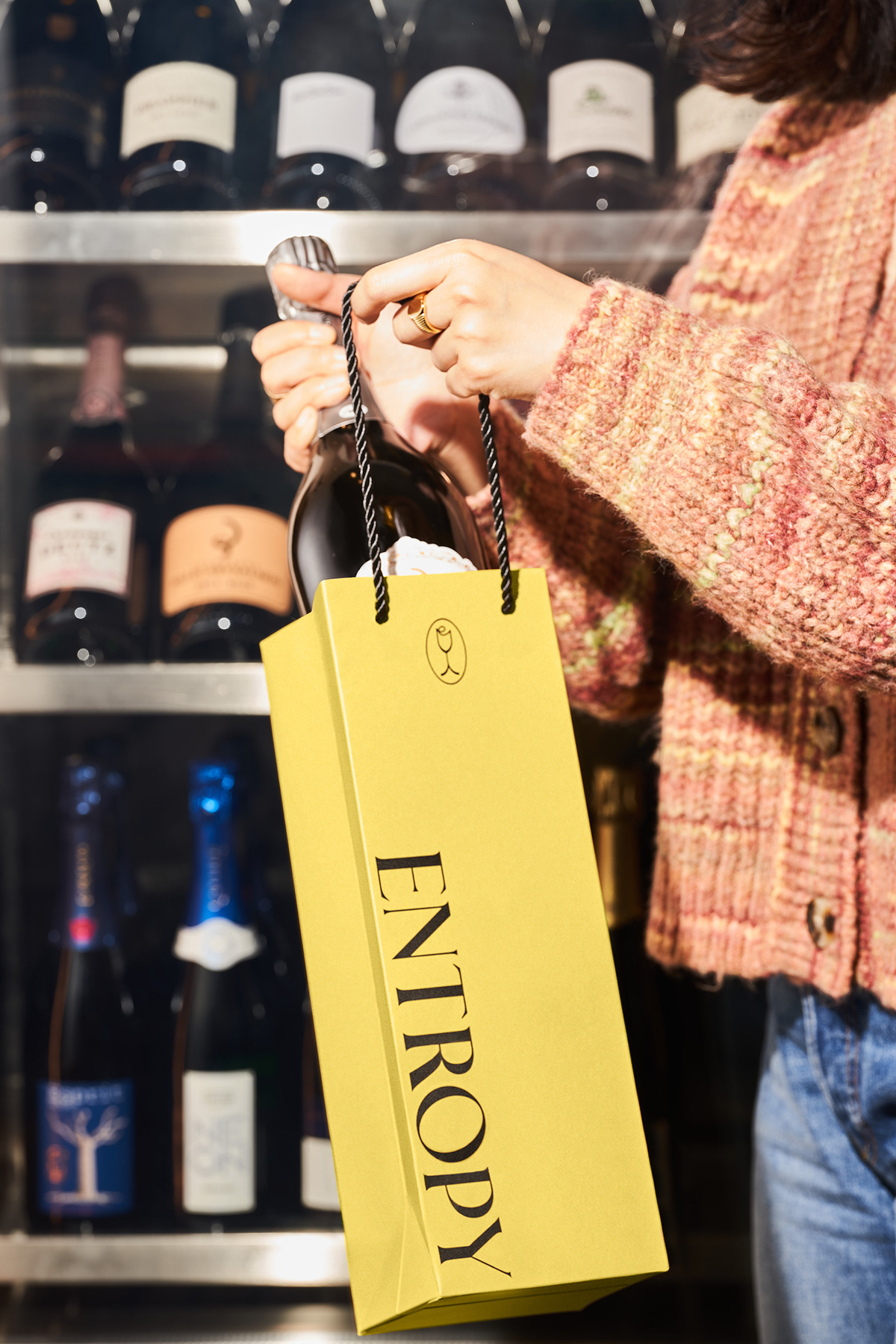
Entropy is a high-end Champagne bar. The owner wants to use its location at Grand Gateway to provide shoppers all-day Champagne experience. Logo design adapts serif type with a high contrast of font width, showing the brand's elegant yet modern style. The letter "o" is slightly slanted; it breaks the rhythm of the name and expresses the classy but not taken itself too serious attitude. Except for logotype, the champagne glass-shaped symbol using rounded lines illustrated the bottle of the glass; on top of the glass, the shape of the "e" mimics the moving liquid. The symbol draws the elegant and vibrant personality of Entropy.

Champagne usually stands for celebration. The pattern design applied the bottom half shape of the glass symbol; by repeating the graphic, it forms the shape of sparkles which also stands for celebration in visual language. Combining the pattern with mustard yellow, the whole identity of Entropy is formed. It's classy, elegant, and modern. Applying the graphic language on various packaging lets customers touch and feel the product with an extra layer.

Entropy 是一家主打香槟和咖啡一体的高端酒吧。创始人希望能利用其位置在恒隆广场,为商城购物的客人提供全天式香槟饮品。logo字体设计采用有粗细对比的衬线体,表现其优雅又现代的风格,位于中部的字母“O”微微倾斜,打破了整体字母的竖直感,承托了品牌要表达的高级但又不严肃的视觉效果。出字体logo外,图形logo为香槟酒杯形状,杯底用曲线代替直线,优雅活泼,杯上方模拟了液体在酒杯中晃动的动态效果同时也画出了首字母”e“,整体图形优雅又不失现代感。

香槟酒代表了庆祝,为配合logo设计,取用图形logo中酒杯形状的小半身,组合成了星光的图腾,作为视觉辅助应用于包装等物料。而选用芥末黄为品牌色将其高端不失优雅,有趣不失质感的感觉在包装物料上完整体现。 希望客人在接触到这些印有品牌形象的包装是,能感受到品牌附加的质感和体验。