Buoyant Aero Branding
Client
Buoyant Aero
Project Brief
Design the logo and color palette for a San Francisco start-up airship company.
Process
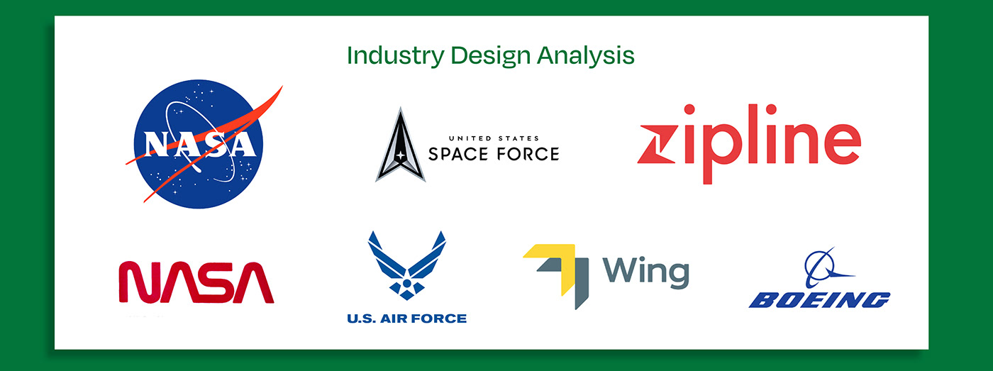
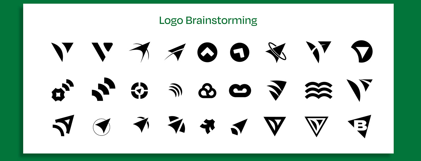
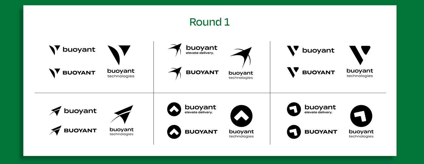
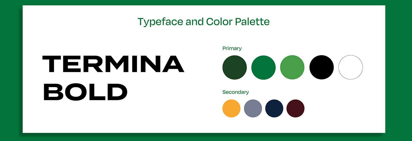
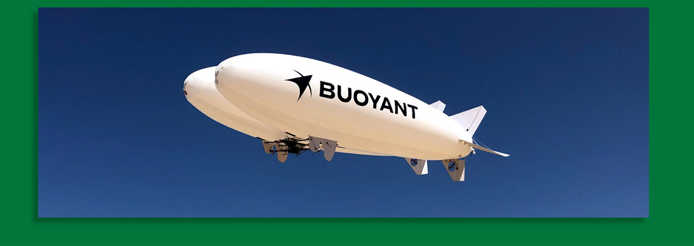
When I was hired for this project, I first interviewed the client to learn about the industry and to determine the art direction. We determined it must look and feel a serious part of the aerospace industry, and not look like a typical technology start-up. After analyzing the industries competing logos, I started the brainstorming process. I designed a large amount of marks, and went through 2 rounds of revisions to narrow down the possibilites. The final logo was chosen as it used negative space to look like the tip of an airship, as well as implying flight and lightness. The typography was chosen for its ability to stand out and stay legible when printed on the side of an airship from great distance. The colors were chosen with a deep forest green to evoke a sense of sustainability and nature. A photograph of the logo on the airship during a test flight is shown at the end. You can learn more about Buoyant on their website, and they were featured on TechCrunch. There is also a video of their prototype flying with the logo on it.
Tools
Adobe Illustrator