VKUS
Magazine concept // bachelor work
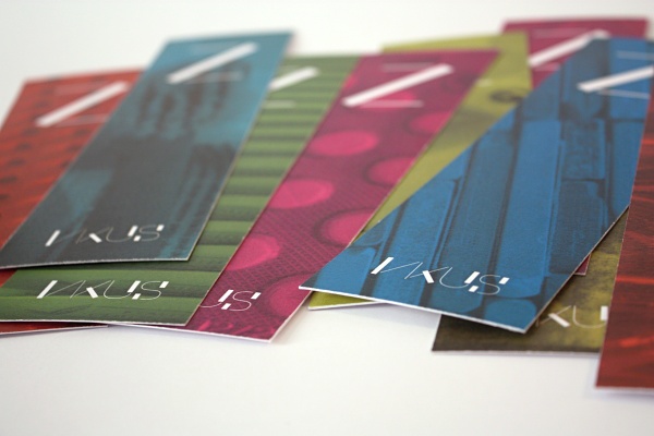
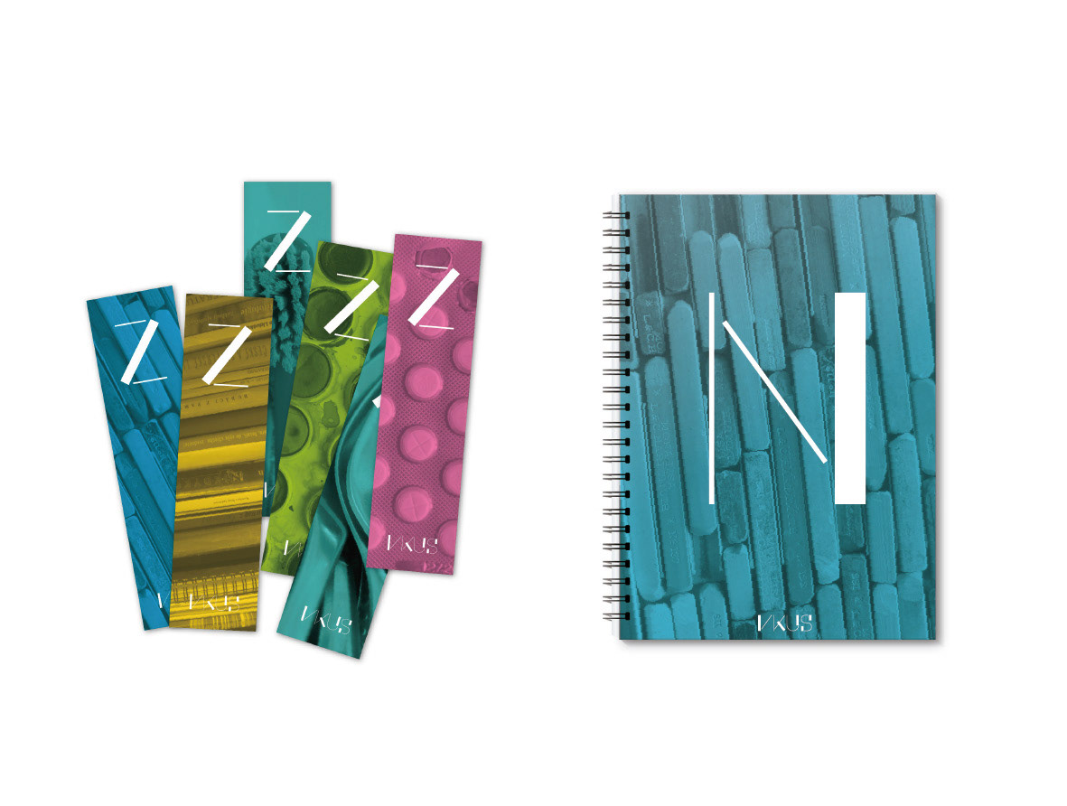
The main goal of my bachelor work was to design a cultural magazine. Apart from the layout, I aimed at creating a self-standing brand which would help to create a bond between a reader and the magazine. The brand is supported by a visual style that stems from the graphic style of magazine cover and the dividing pages. The final output also includes a set of merchandise tincluding bookmarks, notepad, coffee mug, buttons, T-Shirts and more.
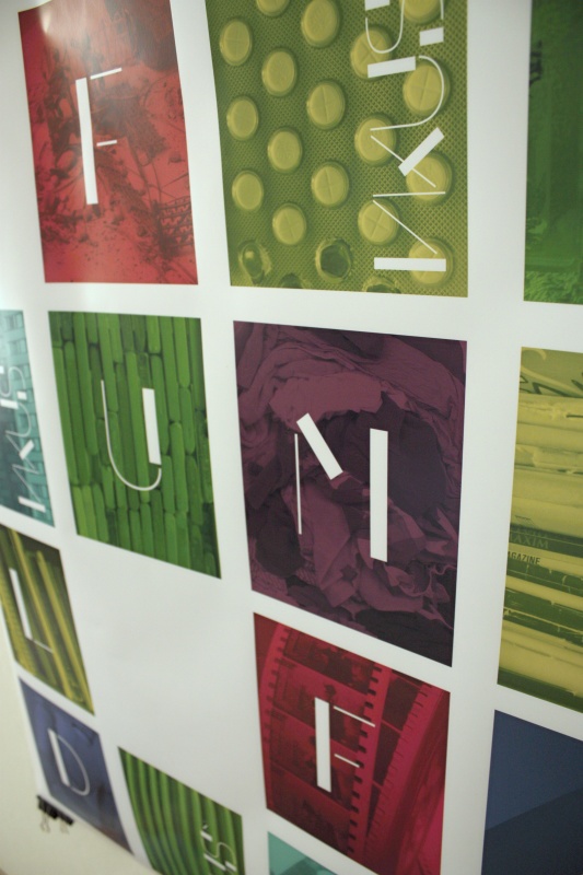
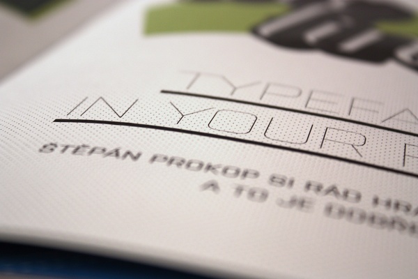
As part of my work, I also designed a custom typeface. It is a strictly constructed font which is actually a derivate from the VKUS logotype. This typeface is part of many elements of the visual style, including page numbers, dividing pages and merchandise.
VKUS font can be found here as separate project http://www.behance.net/gallery/VKUS-font/1593575
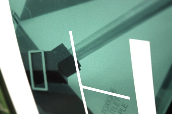
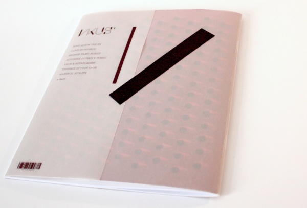
After opening the magazine, the black tape is meant to be sticked do the inner side of the cover.
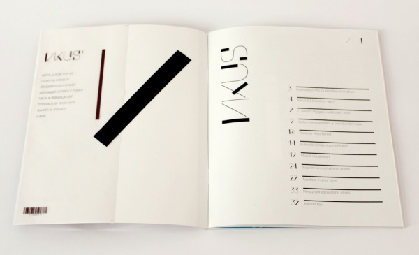
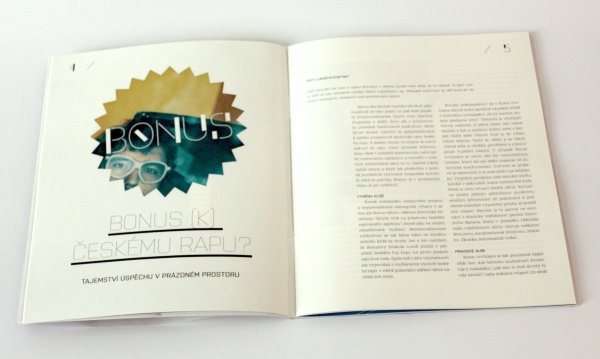
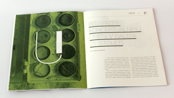
Preview of the page layout


Poster presenting a system of future covers and dividing pages