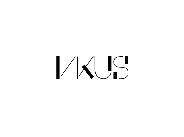
VKUS
Linear constructed sans-serif typeface
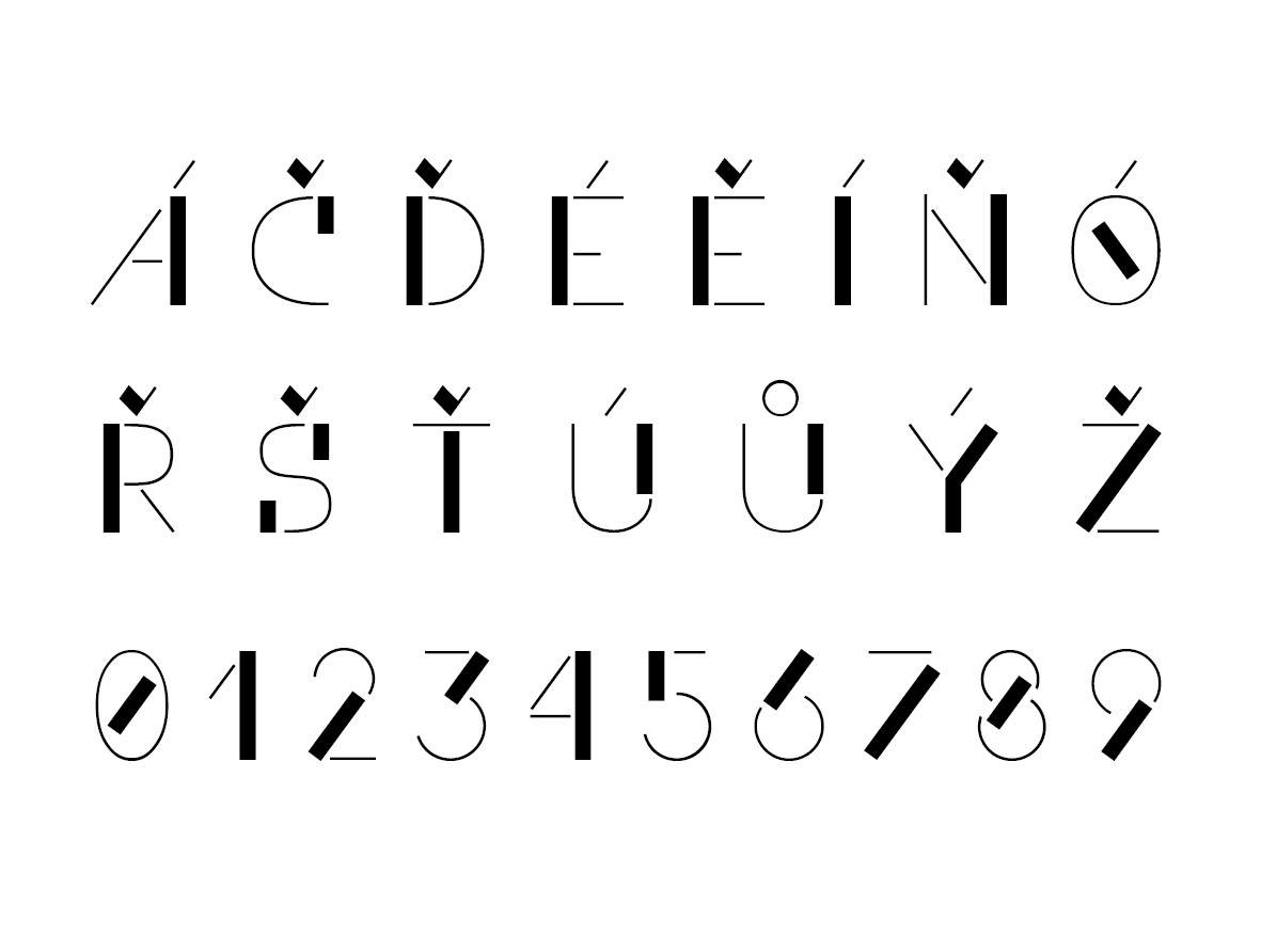
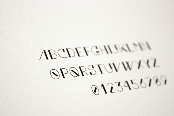
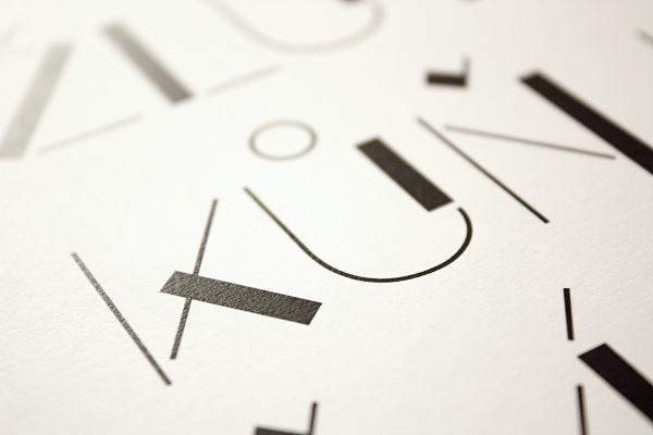
This font is part of a visual style of magazine called VKUS, which means a "taste" (in the sence of taste of music, fashion etc.) It's based on a strong contrast between the thin and the thick lines.
When I was designing it, I set two basic rules - every character must contain a combination of both line thickness and none of the thick lines should be rounded.
When I was designing it, I set two basic rules - every character must contain a combination of both line thickness and none of the thick lines should be rounded.