ESO visual identity
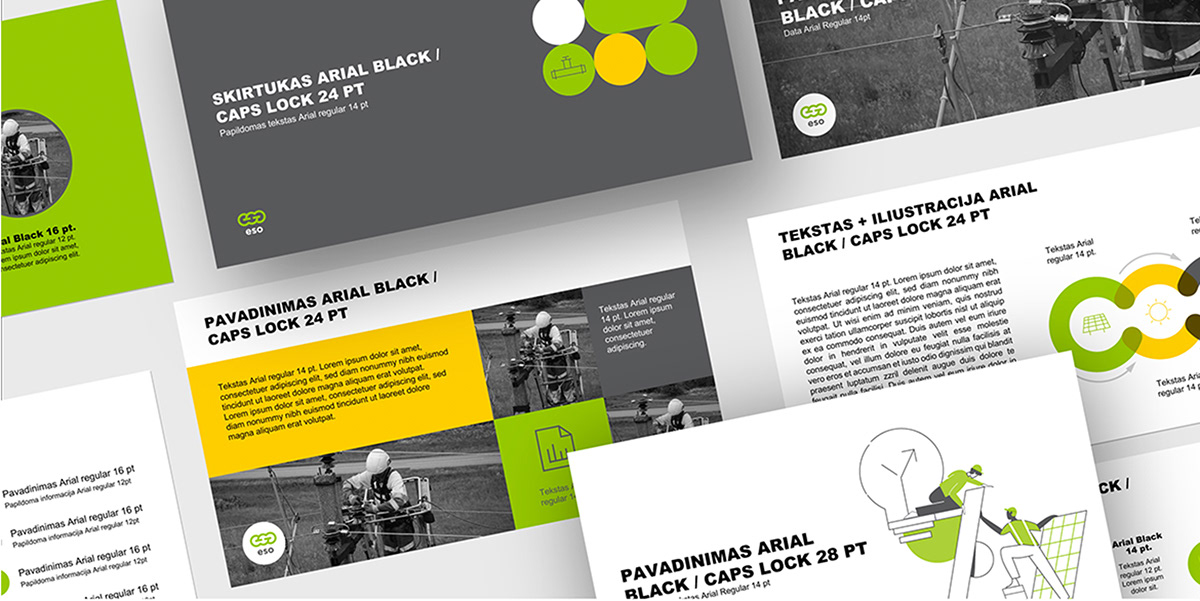
Our client ESO – an energy distribution operator – decided to have a new visual identity. Their previous brandbook was outdated and did not meet their communication needs. There was a plenty of different information that needed to be in consistent style. Our task was to create a clear and neat visual identity for all ESO communication.
Our created ESO graphic identity is based on a circle shape which is the key element in the logotype as well. The new logotype is formed from ESO letter monogram and symbolizes the energy chain of gas and electricity networks. Circles here acquire the switch symbol that reflects customer’s ability to use energy according to their needs.
Our created ESO graphic identity is based on a circle shape which is the key element in the logotype as well. The new logotype is formed from ESO letter monogram and symbolizes the energy chain of gas and electricity networks. Circles here acquire the switch symbol that reflects customer’s ability to use energy according to their needs.