Wedding Invitation
The following project is a design for a wedding invitation. In fact, it is the design for my wedding invitation. Through this project I will take you through my journey to creating my wedding invitation. I'll show you inspirations, my thoughts, and my strategies.
The inspiration for the wedding invitation came from a very special carving I did. This carving is special to both Karen (my fiance) and myself. It was more than two hours of delicate work put into our special tree, a calming meeting place we found one year while camping at the Oregon coast. This carving is really the creative content for the invitation.

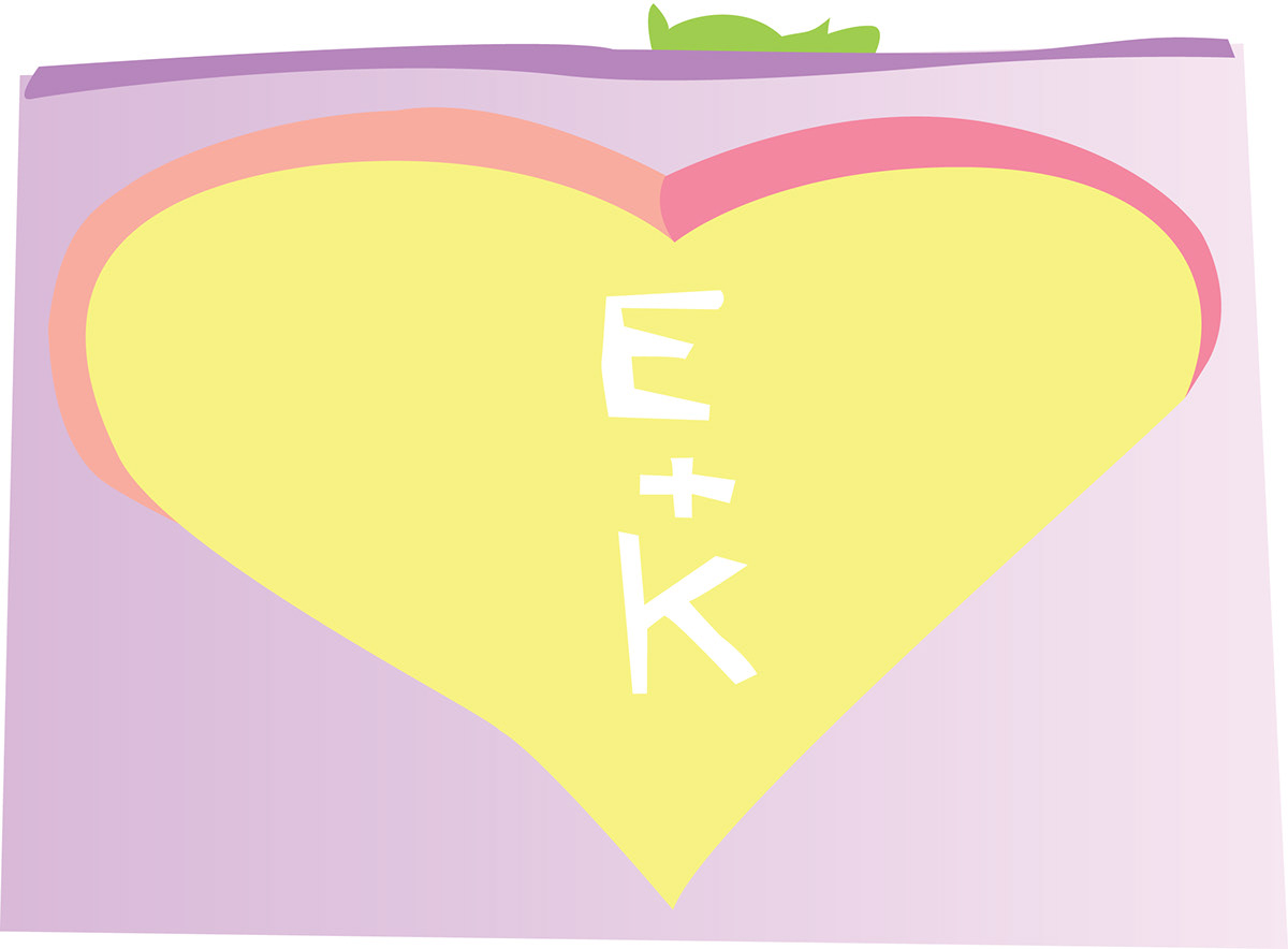
At this point I really wanted to capture the whole carving. So I starting toying around with different ideas in Illustrator. The main idea was to recreate the image in a very stylized or posterized manner. Our colors chosen for the wedding were purple (preferably on the darker site) and a bright green (similar to a lime green). Immediately I knew I was going to have to tweak the colors quite a bit to fit into our wedding theme. I quickly blocked in colors and changed them around, but the more I worked the more I realized a high level of detail would be required to really make the image come alive. And honestly, the image is not what the invitation is about.
I scrapped the idea and went back to my simplistic nature. Rather than focus on the entire carving and the scenery around it, I focused on what exactly the carving was. The new content became a simple heart with initials inside and cute swirls accompany. Since our carved heart was not perfectly curved or symmetrical, the heart in the invitation wasn't either. Nor were the swirls. This didn't completely sit well with me, but I was willing to see how it looked further ahead.
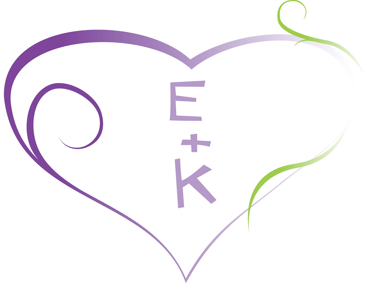
A very rough mock up demonstrated where my imagination was taking me. I wanted some sort of background for the heart. I was thinking of a water color feel, but I couldn't get it right and in general i wasn't satisfied. Karen and I both admired the decorative vine patterns found in many other invitations, but I wasn't thrilled with the majority of them as they seemed to carry on an old fashioned effect. I wanted something a little more modern.

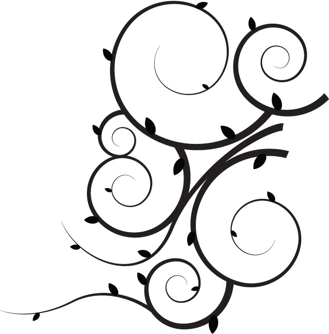
Utilizing Illustrator's spiral tool and a quickly made custom brush, I made a vine pattern that I felt fit our style better. With some creative placement and tweaking in Photoshop it could make a great addition to the invitation.
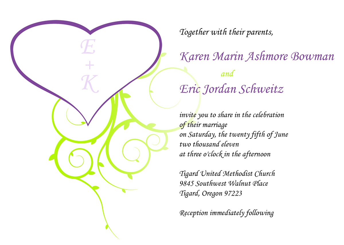
I also decided to redo the heart a little bit. The swirls in the heart were fun, but detracted from the elegance of a wedding invitation. I removed both the swirl in the heart and the green accents in favor of a simple, bolder heart and the vine pattern. I really wanted to make the text a shade of grey because I thought it added more depth than plain black and white, but black and white is easy to read and test prints with grey fonts showed the grey could easily turn out too light. So to make the text interesting, our names now have some color to them. Also, it puts the focus on us. After all, it is about our special day.