


BLACKROCK COFFEE BAR
UI UX APP REDESIGN
Blackrock Coffee Bar is an existing brand originating in Portland, Oregon. They serve a variety of drinks from coffee to tea and are in a market competing with top brands such as Starbucks and Dunkin'. I decided to redesign their app and rebrand their story because I thought they needed a refresh to the ever-changing younger demographic. My objectives for this project were to make the app more functional, easier to navigate, more consistent and overall more exciting.
◯
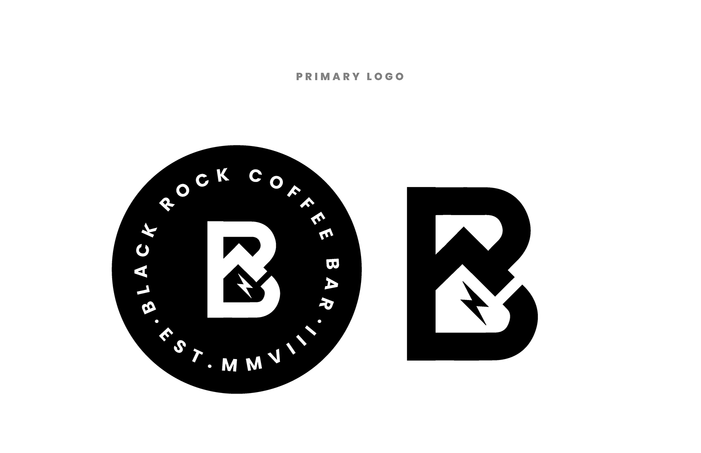
For this project, I made several design choices to elevate the existing brand standards. I rebranded the colour story from red to blue to cater more towards a relaxed audience, and used black and white imagery in order to hone into consistency. I wanted to focus on mountains for imagery and in their logo because I thought they needed something to tie them back to their roots. Additionally, I've added in illustrative elements to give the app more of an edge.
Kylie Marchitello ● Multidisciplinary Designer


Blackrock / App Wireframes

Blackrock / App Start Splash Screen

Blackrock / App Start Screens

Blackrock / App Home Screens

Blackrock / App Browse Drinks Screens
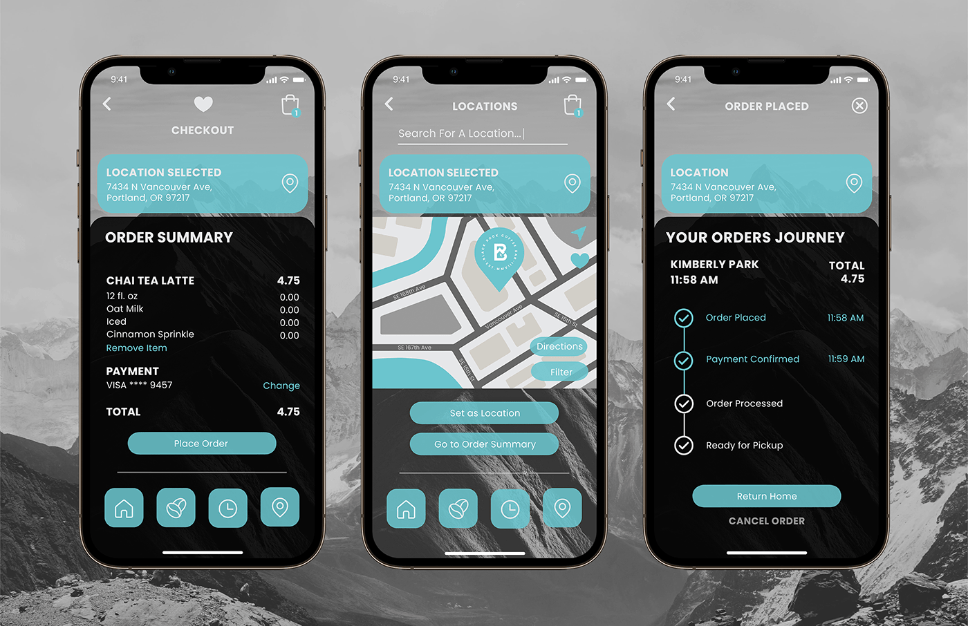
Blackrock / App Ordering Screens
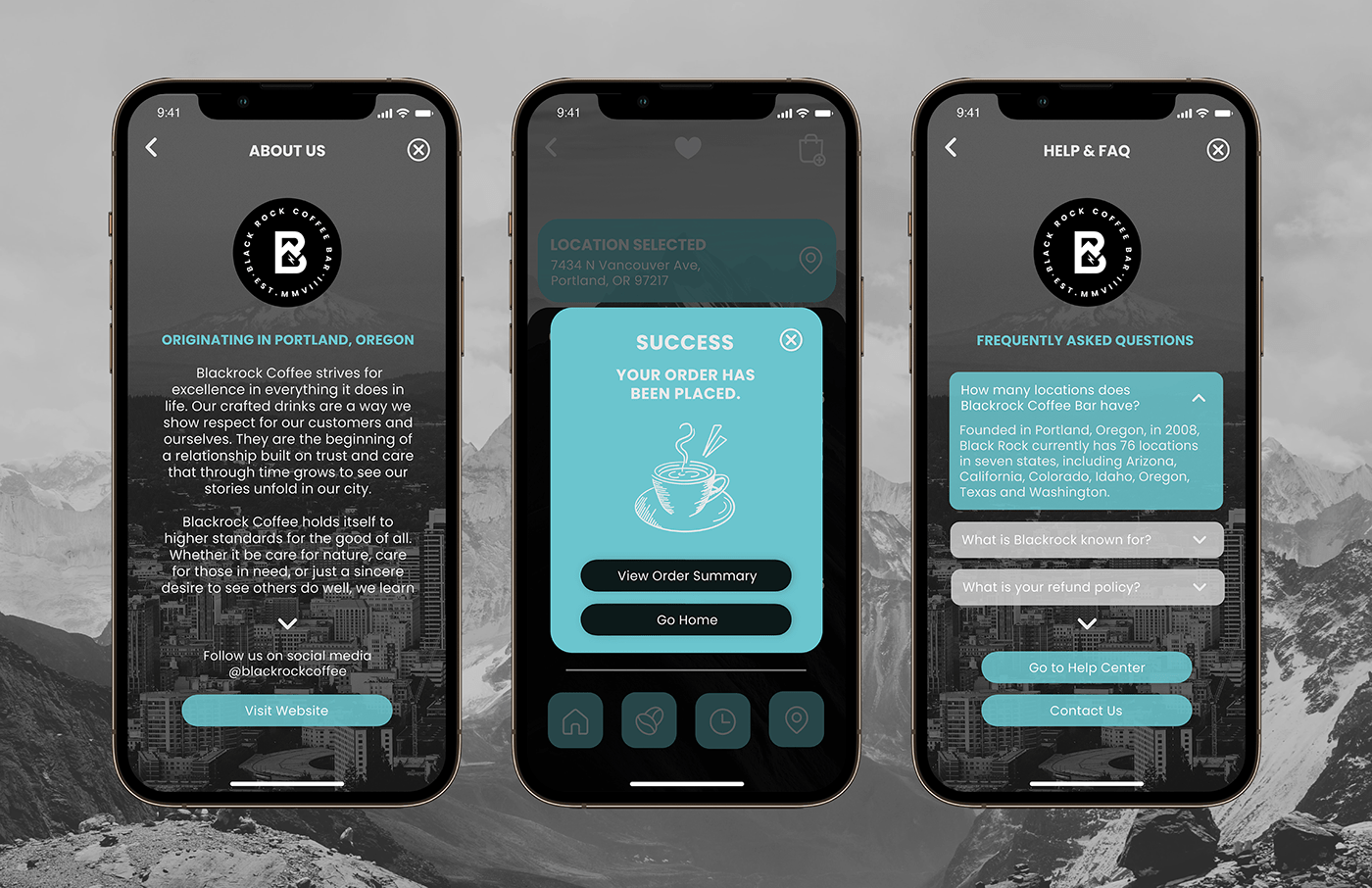
Blackrock / App Information Screens
Blackrock / App Prototype

Blackrock / App Screens
This App Redesign was created for a class project, with no affiliation to Blackrock Coffee Bar.
The use of the trade name in my student portfolio for identification and reference purposes only and does not imply any association with the copyright or trademark holder of their product or brand. My work is not affiliated, associated, authorized, maintained, sponsored, endorsed by, or in any way officially connected with these copyright or trademark holders. Blackrock Coffee Bar does not sponsor or endorse any of the shown work. I declare no affiliation, sponsorship, nor any partnerships with any copyright or trademark holders.
All photography used courtesy of Unsplash. Icons courtesy of freepic.


